


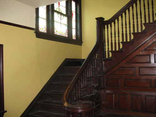
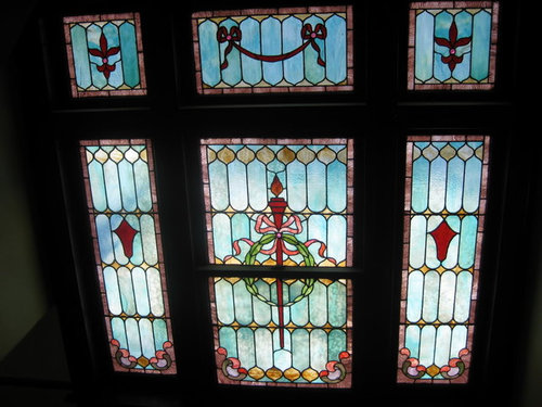
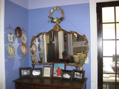
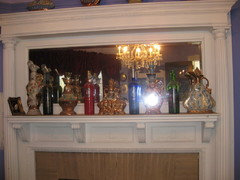
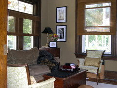
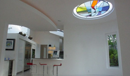
wall color to coordinate with stained glass window - please help
victoriajane
15 years ago
Featured Answer
Sort by:Oldest
Comments (31)

threedgrad
15 years agosuero
15 years agoRelated Discussions
Please help with a 'wood Coordinating question'
Comments (26)Allison, thanks for the link, the color of the window trim, with the polyeurathane finish on is the natural wood. It's pretty light. This is a picture of my front door, unfinished as of yet, but I want it in a deep rosewood color: and this is a pictue of my alder doors, unfinished as of yet,: and this is a picture of the fireplace with one of the windows that has the clear poly finish next to it, I will take a close up picture of it today, but it's the clear in the picture allison showed in the link: This is a picture showing where the trifold doors will go (they are unfinished alder and look like the door pictured above), the windows to the left and right are clear alder with the poly coat on them, notice the beam running across the room, it will be exposed, as well as the beam running the length of the room: Is this a delima or am I just over reacting? Thanks you guys, your saving my sanity.......See Morestained glass windows and wall color
Comments (3)You could select one of the colors in the glass. Personally, I think the best choice would be one of the greens, that would enhance the reds and blues, etc. that are in the glass panels. A darker shade of green would make the colors in the doors gleam like jewels and would also bring out the warm, rich color of the woodwork....See MoreFinally ready to fix wall color. Please help me coordinate.
Comments (33)Oakley- I like the Sisila but don't know that that works with the furniture. It also has gold in it. (Dang pinkish carpets.) I know it give the dimensions of the scale but it helps me to see the fabric IRL or a photo of it on something. I'll look around, thanks. I also like the Selim but the colors are little too cheery. I'm going to pass on the table. I like it but starting thinking it reminded me of a nightstand. I have bb wallpaper leftover. I actually have painted posterboard inside the ends, but could cover foamcore board. Tina - That made sense about preferring the color in accents. I think her pillows are from PB. I like all her pillows and would switch her houses, ha. Sadly, our PB outlet was really lacking the last time I was there. Tuesday - I really like those photos, thank you. Kswl - I like crewel work pillows. About the burlap tablecloth, with the wingchair being beige/tan you don't think that side would be lacking color; worsening the unbalanced feel? I've been meaning to get a glass top so will look into local. Geo, Val, Tuesday, Oakley, Kswl - I pick up a sample of the Saybrook. It is a pretty color and on and off over the past 6 months I've had occasional thoughts of painting the kitchen area (currently BM Olive Branch) a similar color. I think it would work better with the floor, etc. Anyhow, my biggest concern is I paint the room Saybrook and 6 months down the road we decide to replace the furniture. It's not in the plans but... I also think I'd feel more comfortable with a color like Shaker as it's similar to what I have. I was thinking about carrying the LR color through the foyer and hall, which also has the brown carpet, to help the flow. The color there is even worse than the LR color paired with the carpet. I never cared for it once on the walls. Geo - I like the idea of the Saybrook better for accents in the room. I'd be ok with changing the back of bookends to that color. I like the cream idea too. I probably could take the doors off but DH and I both like the glass. Also the ends light up and we turn them on a night. The shelves consist of mostly books and wooden ducks that are sentimental, but the few other things could change. This post was edited by sheesharee on Thu, Mar 7, 13 at 17:37...See MorePLEASE HELP ME COLOR COORDINATE A BEDROOM
Comments (63)I love the rug in there and how it ties in with the baskets, wall, etc., but if it were me I'd still exchange the bedding because it would drive me crazy to see the striped side when the bed is unmade (which it is 99% of the time in my son's room). With the bed made the navy works. I would also exchange the drapes for something lighter, but that's just personal preference; I love lighter window treatments! I'm boring and would probably do white, but think a pattern with coordinating colors could look great too. I love the baseball art in there; it's perfect!...See More
Oakley
15 years agoamysrq
15 years agoamysrq
15 years agoneesie
15 years agoparma42
15 years agoparma42
15 years agovictoriajane
15 years agooceanna
15 years agottodd
15 years agovictoriajane
15 years agottodd
15 years agovictoriajane
15 years agoteacats
15 years agoteacats
15 years agopalimpsest
15 years agovictoriajane
15 years agopalimpsest
15 years agobodiCA
15 years agovictoriajane
15 years agottodd
15 years agobodiCA
15 years agovictoriajane
15 years agovictoriajane
15 years agobodiCA
15 years agoparma42
15 years agobodiCA
15 years agomahatmacat1
15 years agovictoriajane
15 years ago


Related Stories
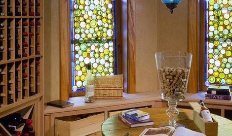
DECORATING GUIDESColor Your Home's View With Stained Glass
Interiors get an enchanting perspective with stained glass windows, doors and fixtures that dapple the light
Full Story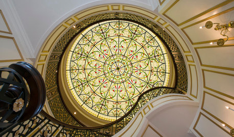
WINDOWSFlying Colors: Stained Glass Through the Ages to Today
Ancient palaces sported it. Monks were distracted by it. But today's stained glass designs may be more glorious than ever
Full Story
BATHROOM DESIGNKey Measurements to Help You Design a Powder Room
Clearances, codes and coordination are critical in small spaces such as a powder room. Here’s what you should know
Full Story
HOME OFFICESQuiet, Please! How to Cut Noise Pollution at Home
Leaf blowers, trucks or noisy neighbors driving you berserk? These sound-reduction strategies can help you hush things up
Full Story
COLORPaint-Picking Help and Secrets From a Color Expert
Advice for wall and trim colors, what to always do before committing and the one paint feature you should completely ignore
Full Story
Stained Glass for Every Style
Make your home glow with light and color from modern or traditional stained glass
Full Story
WORKING WITH PROS3 Reasons You Might Want a Designer's Help
See how a designer can turn your decorating and remodeling visions into reality, and how to collaborate best for a positive experience
Full Story
COLORPick-a-Paint Help: How to Create a Whole-House Color Palette
Don't be daunted. With these strategies, building a cohesive palette for your entire home is less difficult than it seems
Full Story
DECORATING GUIDESDownsizing Help: Color and Scale Ideas for Comfy Compact Spaces
White walls and bitsy furniture aren’t your only options for tight spaces. Let’s revisit some decorating ‘rules’
Full Story


palimpsest