


Working With Pros
Paint-Picking Help and Secrets From a Color Expert
Advice for wall and trim colors, what to always do before committing and the one paint feature you should completely ignore

You love color. You respect its power. But the idea of being left to your own devices to choose paint for an accent wall, a whole room or worse, your entire house scares the bejesus out of you.
Fear not, Houzzers; you’ve landed on the right ideabook. Color expert Amy Krane is here to share some of her trade secrets to guide you toward the right palette for your house.
Fear not, Houzzers; you’ve landed on the right ideabook. Color expert Amy Krane is here to share some of her trade secrets to guide you toward the right palette for your house.
Q. What colors do you wear?
A. I was an urbanite for almost 30 years until I moved to the country two years ago. Living in New York City, you can’t help but have black, white and neutrals as staples in your wardrobe. Having said that, if you step into my closest, you will see not only tons of black, white, gray, oatmeal and denim, but loads of color. My wardrobe is as diverse as the palettes I create for my clients: a color for every occasion and mood.
Amy Krane, shown here, likes to mix black and neutrals with shots of vibrant colors in her clothing and her home.
Q. And are these colors you wear the same as what have on your walls?
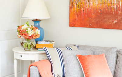
A. Yes. I can get quite adventurous but keep neutrals as the backbone of both my wardrobe and my home. My living room in the city had cream walls with a watermelon-colored sofa and orange room accents. Now I have a darling 1,700-square-foot colonial home, and I am constantly playing with the wall colors. I repaint often, working with different combinations. Right now I have a gorgeous accent wall in my living room [shown here] painted in C2’s Mistral. I’m about to repaint the main house color to either a very pale green, like Farrow & Ball’s Tunsgate Green, or an off-white, like Pointing, with a new accent wall of deeper blue, like Hague Blue, or an ocher, like India Yellow. The swatches are up, and painting test patches is next.
A. Yes. I can get quite adventurous but keep neutrals as the backbone of both my wardrobe and my home. My living room in the city had cream walls with a watermelon-colored sofa and orange room accents. Now I have a darling 1,700-square-foot colonial home, and I am constantly playing with the wall colors. I repaint often, working with different combinations. Right now I have a gorgeous accent wall in my living room [shown here] painted in C2’s Mistral. I’m about to repaint the main house color to either a very pale green, like Farrow & Ball’s Tunsgate Green, or an off-white, like Pointing, with a new accent wall of deeper blue, like Hague Blue, or an ocher, like India Yellow. The swatches are up, and painting test patches is next.
Q. For many of us who don’t know what we like, choosing color is easier said than done. What strategies do you use in your own home?
A. I first assess my design goals to determine what I want to achieve in the space. Sometimes I become inspired by something new I’ve seen, and I want to immerse myself in the emotions that inspiration evokes. It could be a photo, a work of art, a textile, a place or perhaps just a color itself. Then I riffle through my color swatches and narrow down the choices until I arrive at the best few. Light, cool and pale colors recede and make a room look larger. Dark, deep and warm colors expand and make it look smaller. This is not necessarily a bad thing, though; many spaces call out for dark, rich colors.
This room, in the Oranienbaum Palace in Germany, is a favorite of Krane’s for its light, refreshing palette. Lamp design and photo by Studio WM.
This photo is of Privet House, an antiques and curios shop in Connecticut; it shows what Krane considers to be a good use of dark color on walls. The space’s size and abundant natural light keep the dark hue from making the room appear smaller.
Photo by Amy Krane
Photo by Amy Krane
Q. OK, we’ve chosen what we think might be a fantastic color. Now what?
A. Even large paper swatches from paint companies can’t compare to what you learn when you paint on the wall in the finish you are considering. Always paint test patches before committing to a color. Without painting samples on the walls or building, it’s still just guesswork.
Seeing the paint in the chosen finish in 2-foot-square patches on the walls is the only way to know if you’ve arrived at the best decision. I stress this point to all of my clients. The patches should be painted across from a window, next to a window and next to any proposed accent wall or passageway into another room.
Light conditions greatly affect the appearance of colors. You need to test the color in areas of shadow and direct light, and observe it during the day and evening, when you switch to artificial light, to get a real sense of whether it’s right for you. Live with the colors for a couple of days, and the best option will become evident.
Q. What are your tips for combining colors?
A. I like to use unusual combinations wherever appropriate. The key is using colors with common undertones. One of my favorite combinations is golden yellow with khaki. They work together because each has yellow undertones. Ignore the paint color’s name. Sometimes they are accurately descriptive, but often they’re just a marketer’s attempt to entice you and are not informative at all.
A. I like to use unusual combinations wherever appropriate. The key is using colors with common undertones. One of my favorite combinations is golden yellow with khaki. They work together because each has yellow undertones. Ignore the paint color’s name. Sometimes they are accurately descriptive, but often they’re just a marketer’s attempt to entice you and are not informative at all.
Q. Tell us about finishes. This can be as intimidating a choice as the color itself.
A. Choose washable matte paint for walls if possible. Shine creates reflectivity, causing light to bounce around the room, which distracts the eye. Any color will look richer and truer in a flat or matte finish than it will with a shine.
If the room is highly trafficked, it may be better to use eggshell, because its texture can withstand abuse better. Save the satin or semigloss for trim.
Q. What about those of us who are faint of heart but really want to break out of our mold when it comes to color experimentation?
A. Try a pop of color in unusual places if you’re fearful of bold colors in large doses. Think about a closet or cabinet interior, a door or wainscoting for a shot of something deep or bright. If the space has large picture windows, consider bringing the colors of the exterior into the room.
If the home has an open-plan layout, take care where you make color changes. It’s usually best to carry the same color through such spaces using accent walls or doors for pops of color, or use different shades of the same color as you move through the house.
Q. Do bedrooms play by these same rules of color cohesion?
A. No, bedrooms are great places to try different paint treatments. Try painting patterns on your walls, like blocks or stripes, using different colors or the same color in different finishes, like matte and high gloss. I like painting bedroom ceilings a different color than the walls.
Q. Please walk us through a professional color consultation.
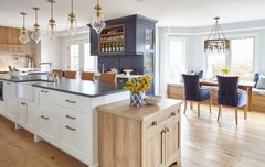
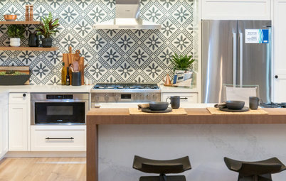
A. If creating a palette for many rooms, I start with the room with the most constraints. This is often the kitchen, as it contains many costly features that are unlikely to be changed, like countertops, backsplashes and appliances. Since it’s really important that there is a sense of flow and cohesion between rooms, I nail down that color first before moving to an adjoining room, always making sure colors relate to one another.
Q. How do you deal with a client who has no clue what he or she wants?
A. In this instance the ability to ascertain the client’s taste and sensibility is of utmost importance. Thankfully I’ve been an astute observer and listener my whole life, and these skills have served me well as a consultant. Choosing colors is very much a process of elimination, and although some people have a difficult time describing what they do like, almost everyone can point out what they don’t like.
Paint: Pale Hound, Farrow & Ball
Q. How should a homeowner prepare for a color consultation?
A. There are many questions you need to ask yourself before you’re ready to have a conversation with a color expert, such as:
• What kind of mood do I want to create in the space?
• Do I like trim that contrasts greatly with the body of the home or not?
• Do I want my home to blend in or stand out from those around it?
• Am I a neutrals person or drawn to bold color?
• Do deep, dark colors energize me or scare me?
• Is keeping a room light colored important to me?
Pull some examples to show the consultant what you like. If the property involved is a house exterior, take a look around your neighborhood at similar-style homes and get a feeling for what appeals to you. If there are two decision makers involved in the consultation, spend some time together discussing how to navigate your divergent tastes, so you can present a uniformed point of view to the consultant. Nothing wastes time more in a consultation than having to navigate the disparate views of two people with differing ideas.
Photo by Carl Bellavia
Q. How is a consultation typically structured?
A. I charge on an hourly basis with a two-hour minimum. If more time is needed, I charge at an hourly rate that is lower than the initial two. But a lot can be accomplished in two hours. My process begins with a phone interview about the project. I encourage my clients to give me as much information as possible about the nature of the project before my onsite review of the space. A description of the rooms or buildings, including the style, relevant materials used and any preliminary ideas or concerns are all details which aid me in creating an appropriate palette for them.
When I arrive at the property, I do a walk-through with the client and discuss the space. I’ll ask who uses the rooms and how each room is used, what time of day the rooms are usually inhabited, what the existing decor is like (if the furniture is already removed), what kind of natural and artificial light is/will be used, what furnishings will stay and what’s going. From there I’ll ask about the owner’s likes and dislikes in terms of both specific colors and types of colors in order to work towards getting an accurate depiction of the client’s personal style.
If it’s an exterior, we walk the premises and take note of the style of architecture, the direction the house faces, what materials it’s clad in, how close other buildings are to it, the landscaping and the feel and tone of the neighborhood.
If the property is a commercial one, the process is similar to a residential consultation but will also extend into branding, customer appeal, productivity, comfort and hospitality, and other factors that may be specific to the property’s function.
When we’re done with the consultation, my client will walk away with three colors selected for each space. They’re given a chart with paint brand, color name, number and finish for their painter.
Q. What are your personal favorite colors?
A. I love atmospheric colors that elicit sensations of the elements outdoors: muted gray-greens, like fog; soothing blue-greens, like water; pale Gustavian blues, like the sky on a winter’s day, all appeal to me. I love white walls for many different home applications. I’m always perplexed when people say it’s “just white.” Whites are incredibly difficult to get right, and each is very different from the next. Most whites have undertones that are warm or cool, and that has a tremendous effect on how they play in a room.
I think black can be used in small doses: a door, a fireplace surround, kitchen cabinets. I love chalkboard paint, especially the standard black. It’s rich and dense.
Pink and orange are two of my favorite colors. They signal joy, vitality and vibrancy to me. They’re very idiosyncratic colors, though, and are not for everyone. They can look smashing in the right space for the right person. However, in the end, neutrals serve as the workhorse in most people’s homes because of their great versatility. They seem almost unnoticeable but have very obvious effects when set into an environment. Neutrals are fantastic backdrops to an adventure in color created by textiles, furniture, art and accent pieces.
Paint: Sweet Celadon, Benjamin Moore
Q. What’s the most stunning use of colors you’ve ever seen?
A. Dar Faracha in Marrakech, Morocco, owned by the world-famous photographer Albert Watson and his wife, Elizabeth.
Photo by Albert Watson
A. Dar Faracha in Marrakech, Morocco, owned by the world-famous photographer Albert Watson and his wife, Elizabeth.
Photo by Albert Watson
Note: Watson designed both the building and the interiors. They are filled with rich, colorful pieces from all over the world.
Photo by Albert Watson
More:
17 Things Color Consultants Want You to Know
Find a color consultant near you
Photo by Albert Watson
More:
17 Things Color Consultants Want You to Know
Find a color consultant near you


A. Whether the space is urban, suburban or country, the approach is the same. When selecting colors from paint chips, pick your favorite, then choose one lighter and one darker as well. Colors look brighter on the walls than they do on a tiny chip. You may be surprised by which you ultimately go for.