


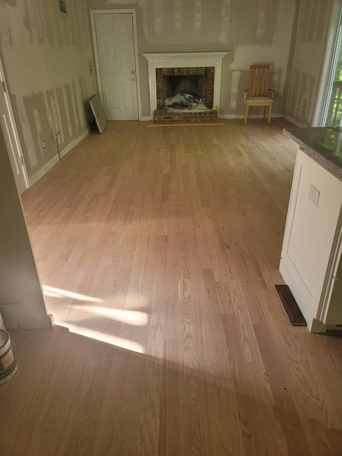
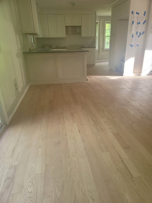
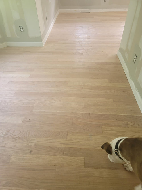
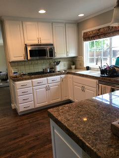
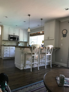
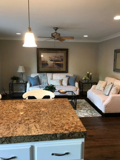
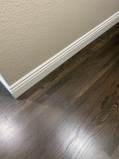
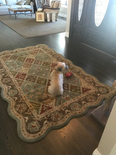
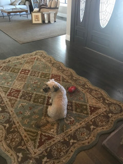
Trying to pick a floor color trying to keep them natural without pinki
Laney
last year
Featured Answer
Sort by:Oldest
Comments (14)

kculbers
last yearRelated Discussions
Trying to keep things growing in the winter
Comments (13)The key to garden during winter is to get crops mature enough to hold & use the garden as your refrigerator storing until you want to eat as well as figure out a way to reduce the rain pelting upon them. We pick the hardy greens (parsley, swiss chard, kale, arugula, corn salad, broccoli & sometimes spinach) all winter long. I let them all reseed except for broccoli. Freezing weather sets them back some, but we just go out & pick what has frozen then cook right away. Broccoli side shoots keep on producing during milder weather and as long as the stalk is alive will sprout anew in spring. Everything looks pretty ragged by March, but the kale still grows. Several carpets of kale, lettuce, radish, and parsley have sprouted in different areas after the rains returned. If they don't mature we'll just eat them as microgreens. Onion sets planted now produce green onions. We usually harvest the last of the potatoes & root vegetables by Thanksgiving. However, you can protect the beds from excessive rain helps a lot, too! I've used upturned clear totes (cheapies that have cracked from years of storage use) with stakes on corners to prevent wind damage and have one side a bit higher to let air inside. It's easy to remove stakes from one side & harvest. This year's mature kale, broccoli, & cabbage don't fit inside the totes, but I have hoops up ready for plastic covering hopefully by the weekend. I have used fabric row covers on cold nights in the past & it helps. Both purchased row cover or translucent window sheers or shower curtains work great! When our son was young he asked why I had decorated the garden with butterfly fabric when it was winter and no butterflies out there. I still use those some shower curtains, but my purchased row cover has tears in it after covering some of our tomato plants this fall. Hope that helps, Corrine Here is a link that might be useful: Read Linda Wilkeson's past articles on winter gardening...See Morefreezing up trying to pick fabrics -- pic and question
Comments (10)Thank you all again! Budge and Chicory, I like polka dots. I already have two large patterns (the red floral and carpet squares), so a small/medium size pattern makes sense. Plus, polka dots are happy :) I do worry, though about a black based ottoman in front of the piano. What do you think? Would this be too boring for the ottoman? It is a muted stipe (gold, grey, ivory, beige, black). Chicory, could you photoshop that onto the ottoman, leaving the dark fringe and trim? Amysrq, you might be right about blue. Here is a pic of a textured blue fabric that I bought. It goes with the blue in the paintings and isn't shiny like it shows in the pic. Last, I understand what Chicory is saying about color weight -- and why that calls out for a darker color. Viewing the room from another direction, however, shows a dark wood side table and lamp. From this direction, wouldn't a lighter color chair with a dark pillow make more sense? Ah fabric FREEZE. I so want to move onto the next stage. Thanks....See MoreTrying to pick a coordinating yellow(?) for an open floor plan
Comments (5)BenM Shaker Beige or Putnam Ivory. Each of those colors contrasts to Pineapple Smoothy in a good, interesting, complex way, IMO. Both could be considered as dulled colors and Pineapple Smoothy would be clearer or cleaner in comparison. You can juxtapose clear and dull paint colors. It's another layer of contrast. And we all remember the layers of color contrasts that can be used to make spaces balanced, interesting, and alive: ÂIntensity (dulled or clear) a.k.a Chroma (grayed or vivid) ÂHue (the quality by which we distinguish one color from another, red, green, blue) ÂValue (how light or how dark) ÂTemperature (warm or cool) Chroma is 'more correct' to use when speaking in paint color language. Saturation kinda means the same thing but saturation is more often used when speaking computer monitor and printing color language. Fine line between Chroma and Saturation. Almost no one uses the terms correctly. It's not a big deal, but Munsell defines them like this if you wanna know the diff: Chroma is the [visual] measurement of how pure a Hue is in relationship to gray. Saturation is simply the degree of purity of a Hue. Intensity can correctly interchange for chroma or saturation. Intensity, however, does not refer to value (light/dark). Confusion on this point is the most problematic. When some says colors are the same intensity, I'm thinking when eyeballin' the colors against a grayscale, they hit about the same place - that chroma and saturation part of color. If they actually mean that the colors are about the same in lightness and darkness, it's a whole 'nother *part* of color they're talking about and intensity is not the right word to use. If you take away anything, don't use the word intensity if you're talking about lightness/darkness value. There are other words that can be used to speak to lightness/darkness value that describes color in a similar manner as intensity speaks to chroma and saturation. Now that we have that extremely vital color tidbit cleared up the world can get back to spinning and we can get back to important life stuff like will Shaker Beige or Putnam Ivory work next to Pineapple Smoothy. âº...See MoreLosing my mind trying to pick a light greige color!! HELP!!
Comments (41)Not that anyone has been waiting with bated breath for an update on my paint dilemma, I thought I would finish out the saga anyway just due to the fact that I come here so often to read posts and am always disappointed when they are left unresolved. My husband had finally had enough of looking at patchwork walls and listening to me talk about paint colors so he scheduled a painter to start this past Tuesday and told me to just pick a color and be done with it!! He also said “it’s just paint if you hate it we can have them come back and do a different color”. I told myself the night before I was just going to settle on the Dunn Edwards color Crystal Haze with the accent wall in Metal Fringe. Needless to say when the painters showed up the next morning I panicked and was seeing a lot of yellow in the sample I had up so while they were prepping I decided I was going to just be safe and do the Gray Mist which was what I kept coming back to, with the ever popular Chelsea Gray as an accent wall. Needless to say when I came back with the quart of Gray Mist to try out on my biggest wall it looked too white. 😕😞 At this point I knew the painters were losing patience with me as they were ready to start so I just decided to go back and get a couple gallons of the Olympic Mountains and hope for the best! While they were mixing that I went back to the paint chip wall and found a color somewhat similar to Chelsea Gray called Squirrel Tail which looked promising so I grabbed a gallon of that color for the accent wall. As I was watching the paint go on I was certain I had picked the wrong colors but knew I wouldn’t be able to tell until it dried. So they finished the job in two days and after being unsure at first I am now really liking it!! Hallelujah!! I realize that I had become consumed with all the images of beautifully painted, perfectly designed rooms on the internet/hgtv and I guess was looking for that moment of surprise/elation that you see there and was frustrated at all the “perfect, tried and true no-fail” paint colors out there that just didn’t look good in my house along with the fact that although everyone says “it’s just paint” who in reality wants to fork out another $2000+ to redo it. Also the samplize sheets are good and eliminate all the leftover paint samples and using swatches painted on poster board is somewhat helpful but none of it is really indicative of what the color looks like when it actually goes on the whole wall. I guess the best lesson learned from this is to just pick 3-4 strong contenders and actually paint swatches on your wall and also realize you can actually go a little darker than you think because both rooms I’ve had painted now have turned out looking lighter than the actual little swatch. I will be needing to paint my upstairs sometime in the near future so hopefully I can follow that advice myself and not go back down the rabbit hole 😞 So in conclusion, while it may not be the perfect result I had envisioned I am happy with it. I probably could have gone a little darker/warmer but Olympic Mountains is a very nice light neutral. It may show a tiny hint of green at times during the day but I also haven’t put my shades/curtains back up yet so I’m getting a ton of light in here all day and I’m not super crazy about it at night but I didn’t find anything in this color range that looked great at night and since I’m unwilling to use anything but soft/warm light bulbs I’ll deal with it. The accent wall color (Squirrel Tail) is also not exactly what I had imagined either but it is a lovely rich velvety color that is a nice mix of gray/green/brown depending on the time of day. Anyway thanks to all on here for the advice/input and listening to me ramble on endlessly since my family was no longer listening 😕 Happy painting everyone!!! 😊...See More PRO
PROG & S Floor Service
last yearlast modified: last year
Laney
last year
Kathy Furt
last yearKathy Furt
last year
Tams
last yearTams
last yearkculbers
last yearstaceycarringto
last yearVal B
last yearstaceycarringto
last yearTams
last yearstaceycarringto
last year
Related Stories
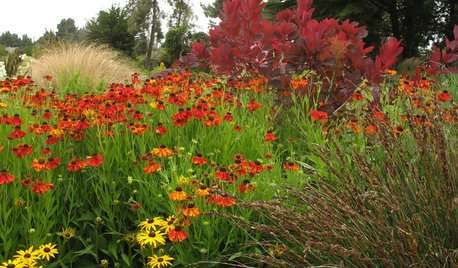
PLANTING IDEASWant a More Colorful, Natural Garden? Try a Perennial Meadow
Spend less time tending and more time taking in the sights by improving on Victorian and prairie garden designs
Full Story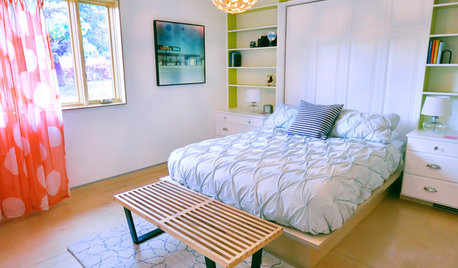
WOODTry DIY Plywood Flooring for High Gloss, Low Cost
Yup, you heard right. Laid down and shined up, plywood can run with the big flooring boys at an affordable price
Full Story
HOUSEKEEPINGHow to Clean Your Windows and Keep Them Streak-Free
Try these tips, tricks and tools to wash your windows so they’re crystal clear
Full Story
BATHROOM DESIGNTry These Bathroom Remodeling Ideas to Make Cleaning Easier
These fixtures, features and materials will save you time when it comes to keeping your bathroom sparkling
Full Story
DECLUTTERINGCan’t Figure Out What ‘Sparks Joy’? Try This Question Instead
If you can’t decide whether to keep something or let it go, shift your perspective to find the answer
Full Story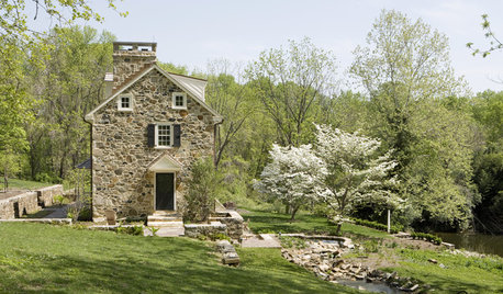
FUN HOUZZHomes That Might Be Trying to Tell You Something
Happy range hoods, a judgmental fireplace ... once you start noticing faces around the house, you may see them everywhere
Full Story
DECORATING GUIDES28 Decorating Moves to Try This Month
Treat your interiors to a pick-me-up with these quick and cheerful decorating tricks
Full Story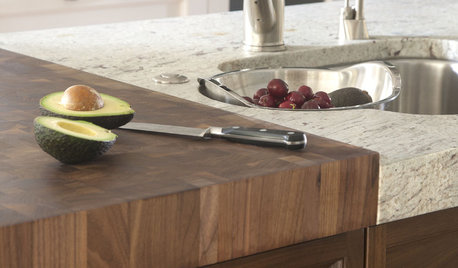
KITCHEN DESIGNKitchen Counters: Try an Integrated Cutting Board for Easy Food Prep
Keep knife marks in their place and make dicing and slicing more convenient with an integrated butcher block or cutting board
Full Story
DECORATING GUIDES10 Reasons to Try a Moroccan Rug
Unbelievably plush and durable, these carpets are a design obsession with good cause
Full Story
HOUSEKEEPINGGot a Disastrously Messy Area? Try Triage
Get your priorities straight when it comes to housekeeping by applying an emergency response system
Full Story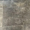

User