


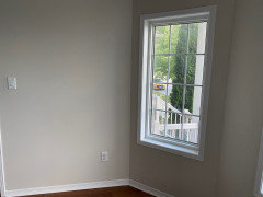
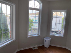
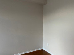
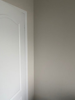
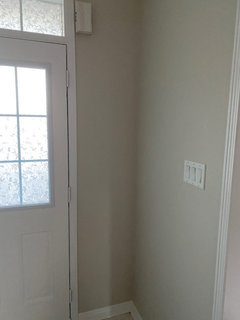
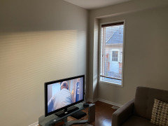
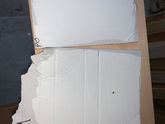
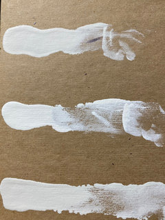
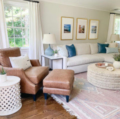
Losing my mind trying to pick a light greige color!! HELP!!
kwilmers
3 years ago
Featured Answer
Comments (41)

User
3 years ago
Em
3 years agoRelated Discussions
About to lose my mind over throw pillows!
Comments (27)Patricia- your story made my day! Sounds like something my father would do. I would love to wait on paint, but DH is insisting we do it before the new floor is in, which is happening well before the furniture is moved. *sigh* I guess he will learn about that part of decorating if we have to repaint because our color pick looks horrible with our furniture. anele- I was thinking about a creamy color I suppose, though I am so tired of living in a vanilla rental box. The biggest problem I'm running into with the couch is that many tones (even some non-neutrals) are making the couch appear yellow. So I'm still playing around with it. The other issue is that whatever color we pick for the living room will need to go down the hall (see my flooring x-post in this forum for a few pics) since there isn't a good place to transition the color. I will probably make yet another thread about paint after I take some good pictures tomorrow. holly-kay: I think I'm going to sneak the cow in and put her in the office with some fun, bright curtains! I think DH will let me get away with a little more in there :)...See MoreIs gray green, or am I losing my mind?
Comments (14)Wow, thank you for so many quick responses! Daisyadair, maybe we can trade colors? :-) Unfortunately the paint chip is the same color as the paint, but I did not expect it to look so green once it was on the entire wall. Mimi, thank you for "enabling" me, I am more and more convinced that I want the BM Gray Owl! Squirrel, you are right, this is BM Color Viewer. However, the BM Silver Satin looks very close to what's on the color viewer, I did not have the camera batteries to take a photo of the real room (and there are plastic covers and dropcloths everywhere). I did not catch the "green" before the paint job even though I was doing BM Color Viewer. It just looks so different in person! Flyleft, good advice and I should have followed it in advance. I did the posterboard thing for the other bedroom and decided on Vale Mist, and it is PERFECT. However, color chips and BM Color Viewer don't do the trick (as I am finding out). I will let you all know what I decide tomorrow morning at 7 when I talk to the painter - you all are great, thank you so so SO much for the quick feedback! ~Lynne...See MoreDesperately Need Helpï¼ I'm losing my mind for the Granite!
Comments (17)Of course. I love sharing pics of my kitchen. :) The first is before the faucet was installed and before we moved in but it shows a large piece. Ignore the dust and dirt. There were crews working most days. The slabs I picked were really large so the L shaped piece has no seams. Huge plus!!...See MoreBout to lose my mind over these light fixtures!!!
Comments (16)Please all you DIY's. do you realize in order fog the glass each fixture, and remember we're talking about 12 of them, they have to be disassembled? [...] Additionally, since the these are LIGHTS, the light bulbs will show any inconsistencies in the application of the DIY materials. Tragically tedious, yes, but when you're super picky, sometimes there's little choice left but to take matters into your own hands (especially when you're tired of waiting months/years for companies to make something that really appeals to you). :-D Heck, I've gotten to a point to where I'm considering buying components/light kits/wiring and creating my own darn lights, lol. Or forgetting the wiring entirely and just tossing flameless LED candles (that use remotes and timers) atop various wood pallets/frames/hollow globes or in metal birdcages/lanterns/candle holders/whatever. I'm tellin' ya... PICKY!!! lol It's a painful curse, it really is....See MoreUser
3 years agoUser
3 years agoUser
3 years agoEm
3 years agoUser
3 years agoUser
3 years agoEm
3 years agokwilmers
3 years agoEphma
3 years agokwilmers
3 years agovjwilkinson
3 years agolast modified: 3 years agokwilmers
3 years agoMarylee H
3 years agoMarylee H
3 years agokwilmers
3 years agovjwilkinson
3 years agolast modified: 3 years agokwilmers
3 years agovjwilkinson
3 years agokwilmers
3 years agovjwilkinson
3 years agolast modified: 3 years agovjwilkinson
3 years agolast modified: 3 years agokwilmers
3 years agovjwilkinson
3 years agokwilmers
3 years agovjwilkinson
3 years agolast modified: 3 years agovjwilkinson
3 years agokwilmers
3 years agovjwilkinson
3 years ago
Victoria
2 years agokwilmers
2 years agokwilmers
2 years agovjwilkinson
2 years agokwilmers
2 years agoyvaras
2 years agolast modified: 2 years agovjwilkinson
2 years agoEm
2 years agoamanda7731
2 years agojfsjfs
3 months ago


Related Stories

PRODUCT PICKSGuest Picks: Design With Your Funny Bone in Mind
20 picks to help you show off the best quirks in your personality
Full Story0
COLORDesigner Picks: 12 Soothing Light Blue Paint Colors
These sky-blue paint colors evoke a sense of calm and cheerfulness. Designers tell us why they love them
Full Story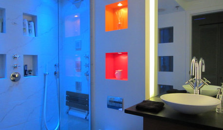
HEALTHY HOMEBath Design: Renew Body and Mind With Colorful Light
Take one tired, stressed-out self. Rinse in a shower bathed in blue light (or any color you like). Repeat
Full Story
ARCHITECTUREHouse-Hunting Help: If You Could Pick Your Home Style ...
Love an open layout? Steer clear of Victorians. Hate stairs? Sidle up to a ranch. Whatever home you're looking for, this guide can help
Full Story
COLORPick-a-Paint Help: How to Quit Procrastinating on Color Choice
If you're up to your ears in paint chips but no further to pinning down a hue, our new 3-part series is for you
Full Story
COLORPick-a-Paint Help: How to Create a Whole-House Color Palette
Don't be daunted. With these strategies, building a cohesive palette for your entire home is less difficult than it seems
Full Story
COLORPaint-Picking Help and Secrets From a Color Expert
Advice for wall and trim colors, what to always do before committing and the one paint feature you should completely ignore
Full Story
MOST POPULAR7 Ways to Design Your Kitchen to Help You Lose Weight
In his new book, Slim by Design, eating-behavior expert Brian Wansink shows us how to get our kitchens working better
Full Story
COLORBeyond Greige: 8 Sophisticated Paint Colors to Try Now
Ready for a shade that doesn’t rhyme with beige? Try one of these rich hues for your next room makeover
Full Story
COLORPick-a-Paint Help: 11 Ways to Mine Your World for Colors
Color, color everywhere. Discover the paint palettes that are there for the taking in nature, shops and anywhere else you roam
Full Story


User