


Trying to pick a coordinating yellow(?) for an open floor plan
filaw
14 years ago
Sort by:Oldest
Comments (5)
Related Stories
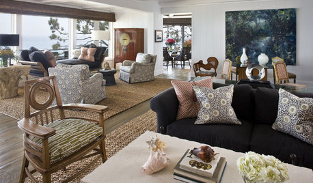
DECORATING GUIDESHow to Combine Area Rugs in an Open Floor Plan
Carpets can artfully define spaces and distinguish functions in a wide-open room — if you know how to avoid the dreaded clash
Full Story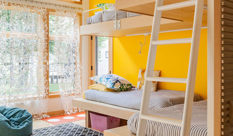
COLORDreaming in Color: 8 Eye-Opening Yellow Bedrooms
Start your day energized and cheerful with bedroom hues that sing of sunshine or golden fields
Full Story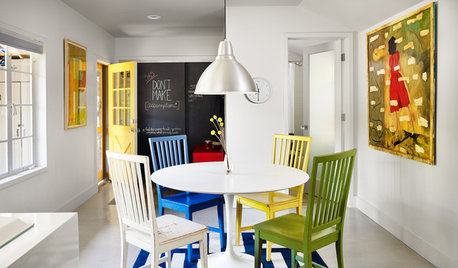
DECORATING GUIDES28 Decorating Moves to Try This Month
Treat your interiors to a pick-me-up with these quick and cheerful decorating tricks
Full Story
PRODUCT PICKSGuest Picks: 20 Sunny Yellow Fabrics to Brighten Your Home
Toast longer days with buttery-hued fabrics sporting flowers, folksy scenes, classic patterns and more
Full Story
COLOR12 Tried-and-True Paint Colors for Your Walls
Discover one pro designer's time-tested favorite paint colors for kitchens, baths, bedrooms and more
Full Story
MOST POPULARMust-Try Color Combo: White With Warm Off-White
Avoid going too traditional and too clean by introducing an off-white palette that brings a touch of warmth and elegance
Full Story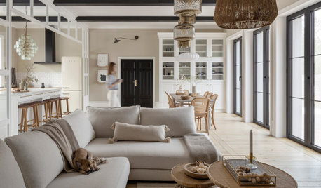
REMODELING GUIDES10 Things to Consider When Creating an Open Floor Plan
A pro offers advice for designing a space that will be comfortable and functional
Full Story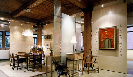
ARCHITECTUREDesign Workshop: How to Separate Space in an Open Floor Plan
Rooms within a room, partial walls, fabric dividers and open shelves create privacy and intimacy while keeping the connection
Full Story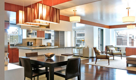
DECORATING GUIDESHow to Use Color With an Open Floor Plan
Large, open spaces can be tricky when it comes to painting walls and trim and adding accessories. These strategies can help
Full Story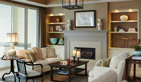
LIGHTINGGet Turned On to a Lighting Plan
Coordinate your layers of lighting to help each one of your rooms look its best and work well for you
Full Story

Lori A. Sawaya
domesticgoddesswanna
Related Discussions
grey and yellow couch with open floor plan, what color curtains?
Q
Urgent! Yellow paint color for first floor open floor plan
Q
Help me coordinate lighting in an open floor plan!
Q
paint color for open floor plan?
Q
filawOriginal Author
suzienj
Lori A. Sawaya