


Please help me make a decision....
johnatemp
15 years ago
Sort by:Oldest
Comments (36)
Related Stories

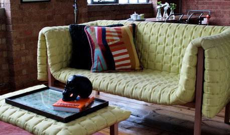
DECORATING GUIDESPlease Touch: Texture Makes Rooms Spring to Life
Great design stimulates all the senses, including touch. Check out these great uses of texture, then let your fingers do the walking
Full Story
LIFE12 House-Hunting Tips to Help You Make the Right Choice
Stay organized and focused on your quest for a new home, to make the search easier and avoid surprises later
Full Story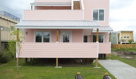
CONTEMPORARY HOMESFrank Gehry Helps 'Make It Right' in New Orleans
Hurricane Katrina survivors get a colorful, environmentally friendly duplex, courtesy of a starchitect and a star
Full Story

HOME OFFICESQuiet, Please! How to Cut Noise Pollution at Home
Leaf blowers, trucks or noisy neighbors driving you berserk? These sound-reduction strategies can help you hush things up
Full Story
ENTERTAININGGot Hand-Me-Down Dinnerware? Make a Memorable Meal
They might be mismatched and not your style, but those inherited plates and forks can help bring meaning to your table
Full Story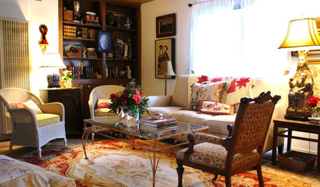
DECLUTTERINGDownsizing Help: Choosing What Furniture to Leave Behind
What to take, what to buy, how to make your favorite furniture fit ... get some answers from a homeowner who scaled way down
Full Story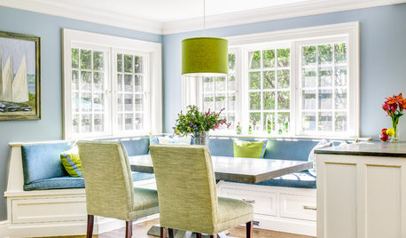
DECORATING GUIDESThe Dumbest Decorating Decisions I’ve Ever Made
Caution: Do not try these at home
Full Story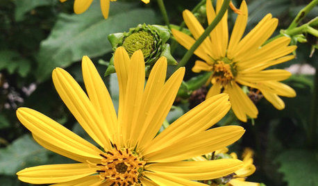
GARDENING GUIDESGreat Design Plant: Silphium Perfoliatum Pleases Wildlife
Cup plant provides structure, cover, food and water to help attract and sustain wildlife in the eastern North American garden
Full Story


norasnews
jen9
Related Discussions
Please help me with bathroom paint color...please?
Q
Cabots or TWP? Please help me make a decision. Going crazy here!
Q
Please help me make decision on cabinets
Q
help with pot filler finish!?!
Q
les917
mimi_2006
lpb313
igloochic
susanlynn2012
paint_chips
bigdoglover
johnatempOriginal Author
Window Accents by Vanessa Downs
Valerie Noronha
bigdoglover
anotherlinda
johnatempOriginal Author
Kathleen McGuire
Kathleen McGuire
ingrid_vc so. CA zone 9
johnatempOriginal Author
polkadots
Kathleen McGuire
teacats
mimi_2006
johnatempOriginal Author
Valerie Noronha
bigdoglover
les917
Kathleen McGuire
johnatempOriginal Author
johnatempOriginal Author
hoyamom
teacats
les917
bigdoglover
Kathleen McGuire
polkadots