


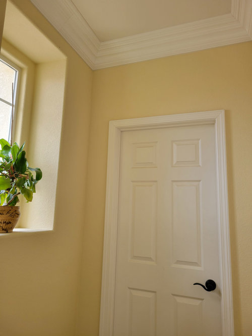
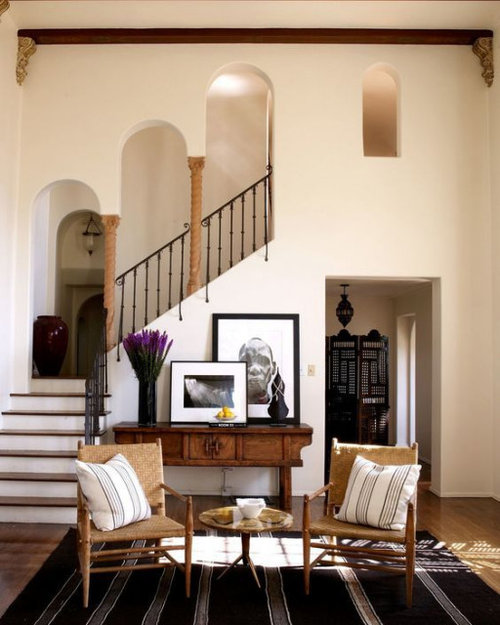
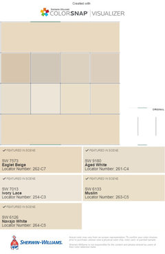
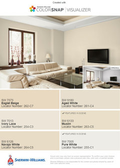
Need help with a warm, light neutral paint for a Spanish interior!
J.J.
7 months ago

Featured Answer
Sort by:Oldest
Comments (8)

apple_pie_order
7 months agoRelated Discussions
Need help picking a lighter warm neutral paint!
Comments (8)Hi there, I don't have a paint color to recommend to you but I wanted to point out that your carpet has a pinkish undertone, and, your hardwood floor has a yellow undertone. As long as you are choosing a paint with either a yellow undertone or a pink undertone one or the other room isn't going to look good. Might I suggest going either really light, like cream, or maybe head in a different direction, like green which would go with both undertones? A warm grey could work too but I have virtually no experience with choosing grey paint colors so I cant advise a specific color....See Moreneed help with a warm white/cream interior trim color
Comments (9)What's "creamy" to one is yellow or tan to another! Or even too white! I wish I could suggest a specific color but I really can't. Even though I probably have about 200 different chips of varying degrees of "off-white". I'm not familiar with the wall colors you have except I strongly considered Laura Ashley gold 2 for my bedroom. I recall that it is a complex, muted yellow/tan with green undertone. A really beautiful color. I assume that gold 4 is the same but deeper. I was amazed to see how a trim color can bring out the undertone in the wall or play it down; make the gold look either very green or more yellow or even dirty. So focus first on what undertones you need in your trim color. You already know you don't want blue, gray, pink/peach. You need some yellow but there are so many degrees of it. Take your wall paint chips to the color displays and hold them up--you will easily see which groupings of tones/shades don't work and you will be able to narrow down to the right family pretty easily. Wish I'd done that early on! You might also try taking your paint chips to Home Depot to use their scanner that will analyze your color & suggest coordinating colors from their line. That can at least get you started & when you start to see which tones are appealing to you the most when paired with your walls, you can take those chips with you to Lowes or elsewhere to look for the "just right" selection. Also, if you find a paint chip that has just the right tones but is just too light/white, (or the opposite, like if you wanted to use gold 4 but a lighter version of it) you can ask them to mix it with 150-200% of the colorant. Or cut it in half. I've done this with good success. All that said, I've just done the upstairs hall trim in Behr Navajo White, which to my eye when looked at alone is a creamy, muted yellow-- but looks great (and not yellow) with the several colors it needed to play with. And it took me many visits to paint stores, and many chips on the walls, to settle on my choice, but I don't regret the time I took now. Neither will you! Good luck!...See Morehelp with interior paint - is blue neutral?
Comments (27)Dee, I figured that, but these days with most painters using latex, clean-up isn't/shouldn't be an issue, IMHO anyway! I think they have been able to get away with it, so they keep doing it. I am old and cranky enough that I would look at the line item estimate, ask him how much more for several colors, and then tell him to just take all the painting charges off because I was going to bring in someone else to paint since I want more than one color in my house! :) If you brought in another painter and told the builder to take off the painting charges, I wonder what he would say. Although it is a slightly different situation, our painter whom we have had for years paints what ever colors I choose and he doesn't ever charge more if he is doing rooms in different colors-we've had him do it both ways with several rooms in one color and other times with every room he is painting being a different color. As I said, old and cranky and tired of having people take advantage. Of course, I would do it in the nicest possible way-how I had my heart set on certain colors and how we do understand that he is the best builder in the area which is why we chose him, but we just feel we need to hire an outside painter to make the house a home, we just can't imagine having EVERY room the same color, etc., etc. Faron, you want to weigh in here??? Of course, you may discover that you absolutely love one color throughout! In that case, no worries. Sometimes, I am tempted to try that and see how it looks-problem is that I can't decide what that one color would be-ha....See MoreNeed help picking neutral (whole) home interior paint color
Comments (101)Comedy of errors (only after we had a few drinks was it comedic) 1. We greatly underestimated the effort to paint textured walls, especially on the ceiling. That and we're 15 years older than many of the projects we've done the past. 2. Turns out we got the wrong color paint. I'm not sure why I had a different color paint stuck in my head and even though I checked color swatches I still got it wrong. And now that we're going to pay someone to do it I definitely want to make sure the color is right. Only after I came back to this post did I realize I gave the store the wrong color. We're going to suck it up and pay someone to do it which is good because that also includes trim and doors. Although now I have to take a week off of work. Good news: we can donate the paint to Habitat for Humanity ReStore....See More
mytwo cents
7 months agolast modified: 7 months ago PRO
PROHALLETT & Co.
7 months ago
Jennifer Hogan
7 months agoJennifer Hogan
7 months agokandrewspa
7 months agocalidesign
7 months ago


Related Stories

GRAYDesigners Share Their Favorite Light Gray Paints
These versatile neutrals can help create a range of moods in any room
Full Story
MORE ROOMSWarm Up Your Rooms With a Beautiful Off-White Paint
White paints warmed with a hint of color create radiant backdrops for countless interior design options
Full Story
COLOR15 Dramatic Interior Paint Makeovers
Light to dark, dark to light. Soft to bold or newly toned down. See how these homeowners transformed their interiors with paint
Full Story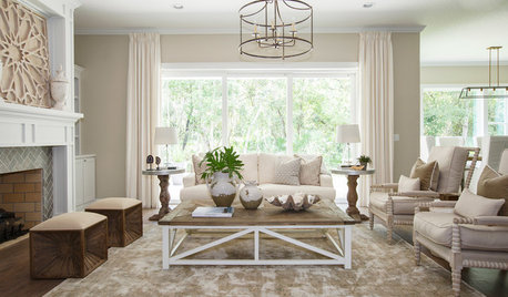
COLORBeige Is Back: Designers Share 10 Beautiful Warm Paint Colors
Enthusiasm for cool grays has waned, and warm neutrals have returned. See which beige and greige tones designers prefer
Full Story
COLORColor Palette Extravaganza: Room-by-Room Help for Your Paint Picks
Take the guesswork out of choosing paint colors with these conveniently collected links to well-considered interior palettes
Full Story
COLORHow to Give Neutral Paint Colors a Subtle Jolt
Don’t compete with your neutral hues — complement them!
Full Story
COLORDesigner Picks: 12 Soothing Light Blue Paint Colors
These sky-blue paint colors evoke a sense of calm and cheerfulness. Designers tell us why they love them
Full Story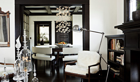
COLOR8 Reasons to Paint Your Interior Trim Black
Hide imperfections, energize a space, highlight a view and more with a little bit of darkness that goes a long way
Full Story
COLORWant Gorgeous Interior Colors? Look to the Light
See how to manipulate natural and artificial light — and learn about those baffling new bulbs — to get the exact room colors you want
Full Story
TRANSITIONAL HOMESHouzz Tour: Warm Neutrals, Contrast and a Rich Mix of Textures
A designer gives her clients’ home a warm and welcoming vibe before the birth of their first child
Full Story


BeverlyFLADeziner