


Designer Picks: 12 Soothing Light Blue Paint Colors
These sky-blue paint colors evoke a sense of calm and cheerfulness. Designers tell us why they love them

Summer is an inspiring time to consider ever-versatile, calming light blue paint colors to refresh our interior spaces. But which paint color to try? We’ve asked designers to share their favorite calming blues and why they like to use them.
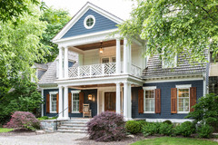
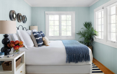
2. Skylight by Farrow & Ball
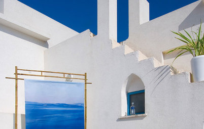
Bedrooms are wonderful places to use a serene shade of blue.
“We love this pale blue-gray because it provides a soft touch of color without being overbearing or drawing the eye away from this room’s main focal point: the ocean off the balcony,” Brittany Ullestad of Patterson Custom Homes says.
Shop for paint and wall covering supplies on Houzz
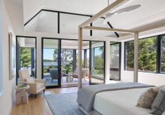
3. Cumulus Cotton by Benjamin Moore
While researching their book On the Porch, Sandra Mahoney and James Crisp unearthed an old tradition that has become a signature of Crisp’s firm: painting porch ceilings light blue.
“The light blue color was to keep the wasps from building nests on the porch ceiling because they thought it was the sky,” Crisp says. “I don’t know that there has been any scientific data collected on the subject, but I just like it.” Ever since, Cumulus Cotton has been his go-to paint color for porch ceilings.
Other Southern traditions, particularly in the Lowcountry, credit fear of “haints” as the reason for the blue. According to legend, haints are restless spirits that won’t cross water, and painting a porch ceiling blue tricks them into thinking there’s water between them and the house. This is where “haint blue” gets its name.
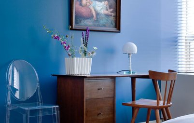
4. Retiring Blue by Sherwin-Williams
“I love this color for its not-quite-turquoise, not-quite-light-blue hue,” interior designer Sabrina Alfin says.
“It’s watery, calming, relaxing and cheerful all at once. It’s a perfect choice for a beachy palette but would also be great in a guest room or sunroom.”
Here Alfin used another Sherwin-Williams color, Extra White, for the trim and ceiling.
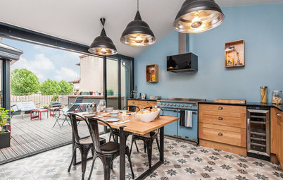
5. Borrowed Light by Farrow & Ball
Just as they do with bright white, light blues work well with gray. The designers at McGrath II find Borrowed Light a wonderful partner for warm neutrals such as ivory and gray.
Just as they do with bright white, light blues work well with gray. The designers at McGrath II find Borrowed Light a wonderful partner for warm neutrals such as ivory and gray.
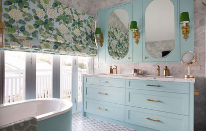
6. First Snowfall by Benjamin Moore
Interior designer Tracey Stephens finds light blue a good choice for bathrooms. “I often use a pale blue for the walls in a bathroom because it’s calming and peaceful, bringing to mind sky and water,” she says. She finds the right shade to complement whatever tile she’s using. In this case, the floor tile has lovely hints of powdery blues and periwinkle. “First Snowfall is a warm gray that reads pale blue, with the tiniest hint of periwinkle,” she says.
Another tip: “If the wall is partially tiled at the bottom, I often wrap the wall color up onto the ceiling to help it feel more spacious,” Stephens says.
7. Watermark by Behr
“This color is very fresh, light and serene,” well-suited to a master suite retreat, interior designer Reem Tomeh says.
“This color is very fresh, light and serene,” well-suited to a master suite retreat, interior designer Reem Tomeh says.
8. Glacier Blue by Benjamin Moore
“I love this color, especially when working with warm-toned wood floors,” interior designer Heather Alton says. The designer also considers it a top choice for lake and beach homes.
“We definitely have a preference to use cool blues like this one near lakeside or coastal homes,” she says. “It’s such a natural choice and it doesn’t feel like a forced ‘beachy’ color because it falls into the backdrop. After all, the star of the show is the view outdoors.”
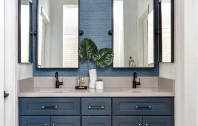
9. Interesting Aqua by Sherwin-Williams
“In spaces where I want to evoke a historic feeling mixed with a modern vibe, I have found Interesting Aqua to be a great color,” designer Michelle Ruber says. “This bathroom is in a fully renovated early-1900s house. We played with both modern and classic shapes and materials in the bathroom, and the color helped pull it all together.”
“In spaces where I want to evoke a historic feeling mixed with a modern vibe, I have found Interesting Aqua to be a great color,” designer Michelle Ruber says. “This bathroom is in a fully renovated early-1900s house. We played with both modern and classic shapes and materials in the bathroom, and the color helped pull it all together.”
10. Winter Ice by Benjamin Moore
“Winter Ice looks ethereal and soft in this dining room because so much natural light pours into the room,” designer Heather Blue Harkovich says. (Yes, her middle name really is Blue.)
“We introduced orange and blue throughout the home, as it is the client’s favorite color combination. For the dining room we selected the bold mandarin-colored drapery and balanced it with the softness of the Winter Ice paint.”
11. Glass Slipper by Benjamin Moore
In the same house, Harkovich opted for a different light blue in the master bedroom, one that’s a smidge more toned-down than Winter Ice. “Glass Slipper is a lovely soft blue with gray undertones. It evokes a feeling of serenity and pairs with neutrals and bedroom linens like a dream,” Harkovich says. “It is the perfect color for a bedroom or bathroom where you are looking for a peaceful retreat.”
In the same house, Harkovich opted for a different light blue in the master bedroom, one that’s a smidge more toned-down than Winter Ice. “Glass Slipper is a lovely soft blue with gray undertones. It evokes a feeling of serenity and pairs with neutrals and bedroom linens like a dream,” Harkovich says. “It is the perfect color for a bedroom or bathroom where you are looking for a peaceful retreat.”
12. Silver Strand by Sherwin-Williams
Interior designer Jami Meek chose this hue for a farmhouse dining room and the adjacent living room. “Silver Strand is my favorite blue paint color, hands down,” she says. “It is such a versatile color — it goes well with other blues, gray, aqua and warmer tones as well. I love to use this color when there isn’t a ton of natural light because it automatically brightens the room without being overwhelmingly blue.”
A note about testing paint colors: Remember that paint can look different on your wall than it does in the store or in these photos. Where you live, your home’s orientation to the sun and other colors in the room (such as in a rug) all can make it look different. Be sure to test a large swatch and check it out from morning through night to see how the color changes during the day. And it’s better to see it with the furnishings you’ll be using instead of in an empty room.
Your turn: Do you have a favorite relaxing blue hue? Please share the paint color and manufacturer with us in the Comments and include a photo!
More on Houzz
Designer Picks: 9 Beautiful Saturated Blue Paints
Read more stories about decorating with blue
Find a paint professional
Shop for home decor


The owner of this Texas house wanted to envelop her room in a cheerful blue that would remind her of her house on Cape Cod. Interior designer Dona Rosene knew just the paint color. “Beach Glass is from Benjamin Moore’s Classics collection, which means it’s one of their timeless colors that goes with many different schemes,” Rosene says. “It’s a gray-blue but has a green undertone, and it looks very different in different lighting, from paler and softer to a little bolder color.”
Find a local designer to help you select your paint colors