


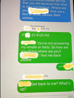
iPhone Text screen colors question — green versus blue background
petalique
last year
Featured Answer
Sort by:Oldest
Comments (8)

petalique
last yearlast modified: last yearRelated Discussions
Color in the garden: white
Comments (28)It has been really fun reading all these comments: I'm glad so many people shared their ideas! Please note that I never said I didn't like white! I love white flowers, and have quite a weakness for white roses--'Mme. Plantier', 'Mme. Jules Bouché', 'Mme. Hardy', loving them for their great purity, coolness, and refinement. It was the question of how to use them that I was commenting on. White goes wonderfully well with cool colors, as in Alicia's photos above, and as in linrose's first photo (and all your photos are beautiful!). I love white in dark places and at dusk, as others have said: I used to have a stand of mostly white foxglove in the shade of my apple tree which was quite wonderful, and for a long time white was the only color I could tolerate in hyacinths--I still can't stomach the red violet kinds. I love pale narcissus, pale magnolias, mature pear trees with their massive white bloom. I like impure whites, along with other pale colored roses, to relieve the heaviness of more strongly colored varieties; I just think the balancing act requires a nice judgement which I don't always observe in gardens. I've certainly thought before, in a theoretical fashion, about how to design a white garden: the delicate and varied whites of roses would be wonderful with various deep greens of box and yew, and with the silver and steel and blue hues of mediterranean aromatic plant foliage. But there are ways to use white well and other ways that, for me at least, don't work, and that's what I focused on. About the Rosa foetida. Luanne, your roses are absolutely gorgeous, but I don't think they'd work: it's pure vs. impure colors again. Nor white. I like Jeri's combination too, but R. foetida is far brighter, far more intense, than the yellow rose in the picture. My own idea would be the same...what? hue? of yellow but paler, like in the paint store when you use the same combination and ratio of pigments but at lesser intensity. Same for the green; and in a different visual arrangment: that is, stripes versus the blobs of the roses, like an iris with variegated foliage, or perhaps a perennial with tiny blooms dotted through its foliage. Or a small woody plant with variegated leaves. Or one with a basal rosette and flower spikes. In violation of my own stated theory that pure and impure colors don't mix, I'm tempted to try a companion plant with pale flowers of yellowish cream--I can't quite visualize the color, but the thought is lurking. It's almost February! Spring is getting closer!! Thanks to everyone for sharing their thoughts. Melissa...See MoreAre light colors 'classier' than darker colors?
Comments (106)sandyponder - that's a beautiful color. It works so well with the wood, the stone, the leather, and the oriental rug. I think this is an example of a "classy" dark color. "Classiness" doesn't have to enter into it... any shade can be classy, though of course people have personal preferences and may still not like a dark palette, or a light palette. But I suppose "classiness" (meaning lack of tackiness and a professional look) can enter in... as I wrote above, I think it can come down to a homeowner picking the WRONG shade... and I suppose "classiness" (or lack thereof) comes into it in that if they do pick the wrong shade it can look amateurish and tacky. Low-class. It's simply harder to make an egregious mistake with lighter colors... hence less of a chance to veer into the "tacky" and "unclassy" realm. (It's also much easier to paint with light colors - small errors in application do not show that much.) But I would never look at a well-done dark color and think it wasn't classy simply because it was dark, or even simply because it wasn't my particular cup of tea. Also... I think it comes down to current styles. Light is 'in' right now. White kitchens, light neutrals in the living areas, etc.. And bucking the trend can be perceived as less-than-classy even if it isn't....See MoreLocation of art piece question.
Comments (48)Wow! I am catching up here, and have to say how different the lighting/room view/color issue is from the first photo posted to the last one at 16:16 with the Christmas decor. That one, it looks wonderful and warm and looks like it belongs. The first photo the fireplace and even the walls had a more gray cast to them, which I think is why the picture and the reds/burgundy looked a bit like a miss. Amazing what lighting does. I was also going to add that the mirror storklady just posted looks lovely- if you were still thinking mirror- size looks perfect, it's affordable and it does have the black that you were seeking (but its not too heavy looking at least in my opinion). And, you had asked- my fireplace is a very generic brick with a very unattractive mantel that I have ignored for the 20 years I have lived in this house. Finally - I meant to say originally that I LOVE that fan....See MoreFinal Kitchen Pics (long winded text)
Comments (33)elizpiz- The island and the base cabs where the soapstone sink is are painted a subtle green which sometimes seems almost grey. To make the transition to the white frig panels and to make the area under the speed oven seem more furniture-like, we painted the drawers the same green as the cabs and the background the same white as the frig and the uppers. I wanted to make the little drawer under the speed oven special and had planned on making it the sole drawer painted orange. Unfortunately, I didn't get my knobs in time to match so I made that the only drawer with a different piece of hardware. Also, you are seeing the library where the cookbooks are. I'll have my husband take more of a close-up so you can see the books. I'm a sick, sick puppy. And no I probably can't get rid of anything but I'd be happy to have you take a look. newbieremodeler - The cabs are custom. I based the sizes on what I needed to put there. I'm attaching my plan to give you an idea. I not only mixed slab and inset but some cabs are framed and some are frameless. The cooking side of the island is frameless and the side with the doors are framed. My cabinet maker did not love me. a href="http://www.flickr.com/photos/42398147@N05/4604516040/" title="0001dR by Carem2, on Flickr"> Pretty obsessive, huh?...See Morepetalique
last yearpetalique
last year
colleenoz
last year
Related Stories
BEDROOMSDreaming in Color: 10 Beautiful Blue Bedrooms
Whether soft and sleepy or bold and splashy, see why blue can be the perfect hue in your bedroom
Full Story
DECORATING GUIDESColor Guide: How to Use Light Blue
Whether you call it powder, sky or baby blue, this ultratraditional color lends fresh-faced appeal
Full Story
COLORColor of the Week: Spring Green
Spring has finally sprung for many of you — and here's how to bring some of that green inside
Full Story
COLORS OF THE YEARGreen Is the Top Paint Color for 2022
Major paint companies reach a rare consensus, anointing various shades of green as their 2022 color of the year choices
Full Story
COLORNature’s Color Wisdom: Lessons on Blue From the Great Outdoors
Take some cues from the sea and sky to find a blue to match any taste and mood
Full Story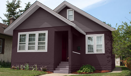
EXTERIOR COLORChoosing Color: 1 Home Has Fun With 5 Different Color Schemes
See a home’s potential for transformation with several new hues. Do you have a favorite?
Full Story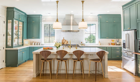
MOST POPULARIs This the Year Blue and Green Kitchen Cabinets Edge Out White?
Neutrals still dominate cabinet color. But some of the most popular recent kitchens on Houzz tell a different story
Full Story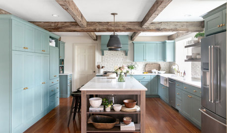
KITCHEN MAKEOVERSKitchen of the Week: Blue-Green Cabinets With Rustic Wood Details
Designers found on Houzz help a couple create a better layout with a large island, more work surface and extra storage
Full Story
BEDROOMSHouzz Quiz: What Color Should You Paint Your Bedroom Walls?
Cool and soothing, or warm and spicy? Answer these questions and learn what hue is right for you
Full Story
DECORATING GUIDESNo Neutral Ground? Why the Color Camps Are So Opinionated
Can't we all just get along when it comes to color versus neutrals?
Full Story

gardengal48 (PNW Z8/9)