


Are light colors 'classier' than darker colors?
jockewing
13 years ago
Featured Answer
Sort by:Oldest
Comments (106)

cliff_and_joann
12 years agolast modified: 9 years agobeekeeperswife
12 years agolast modified: 9 years agoRelated Discussions
Trim color: need a shade darker than S-W 7562 Roman Column
Comments (0)Good morning! I am very close to finalizing my paint selections for my new build. I love the wall colors I've selected but my trim color is still a little whiter than I'd like; I wanted something creamier. I do not want to do any antiquing. The trim will be used on doors, trim, crown molding, and most of the cabinetry in the house. The wall colors include: + S-W 6107 Nomadic Desert (same color card as Latte, just one shade lighter) + S-W 6105 Divine White (same color card as Latte, just three shades lighter) + S-W 7687 August Moon + S-W 7509 Tiki Hut The currently selected trim color is S-W 7562 Roman Column. It's a very nice white and looks creamy in most light, but now that I see it painted next to my wall colors on the sample boards, it looks too white. Most of our floors will be walnut stained red oak. The carpeted areas will be a regular ol' beige-brown carpet. Any suggestions? I do plan to call Sherwin-Williams today to see if they can recommend something 1 shade creamier. Thanks! try_hard ......See Morechange light wood to darker color?
Comments (7)I would take a different route. For small shifts, you can use a glaze that is a heavily pigmented product that you apply between coats of finish. But you can do moderate, not extreme shifts with a glaze. Some people use a gel stain as a glaze. Once the glaze has thoroughly dried, apply a top coat compatible with the glaze and under coat. You can also use a toner, that is a finish with color in it. The real issue with this is it almost has to be sprayed to be even. You also need some decent experience with a spray gun. You can also effect smaller color shifts but a large shift might leave you looking at an opaque layer that looks like paint. I consider the all-in-one products like Polyshades (r) technically a toner, but it is very difficult to brush on without streaking. But your first thing is to find out what kind of finish is on there now. Chances are it is a lacquer of some type if it is a factory finish. Shellac hasn't been used much commercially for sixty years, and varnish is a slow and craftsman-applied finish and would be quite rare for a production piece....See MoreNeed a color with a little more gold and a smidge darker than
Comments (3)I used BM Straw hat in my kitchen. Almond Bisque, on the same strip, is a lighter version. It has a slightly greenish undertone in some light, more golden in natural light....See MoreShower caulk a darker color than the grout....?
Comments (19)I've been in touch w the contractor. He'll be coming here to review. I'm confident that we can get this fixed/resolved. As a novice, my post really was intended to determine that this was a problem, not typical....and to learn about remediation. These forums are a terrific educational tool, and my thanks to those who offered helpful comments & opinions....See Morerucnmom
12 years agolast modified: 9 years agosuero
12 years agolast modified: 9 years agoamysrq
12 years agolast modified: 9 years agoHIWTHI
12 years agolast modified: 9 years agolyfia
12 years agolast modified: 9 years agogwbr54
12 years agolast modified: 9 years ago
Bumblebeez SC Zone 7
12 years agolast modified: 9 years ago PRO
PRODiane Smith at Walter E. Smithe Furniture
12 years agolast modified: 9 years ago- PRO
Diane Smith at Walter E. Smithe Furniture
12 years agolast modified: 9 years ago miniscule
12 years agolast modified: 9 years agoHIWTHI
12 years agolast modified: 9 years ago
IdaClaire
12 years agolast modified: 9 years agopalimpsest
12 years agolast modified: 9 years agoigloochic
12 years agolast modified: 9 years agoamysrq
12 years agolast modified: 9 years agoCEFreeman
12 years agolast modified: 9 years agojterrilynn
12 years agolast modified: 9 years agoUser
12 years agolast modified: 9 years agoamysrq
12 years agolast modified: 9 years agosuero
12 years agolast modified: 9 years agobeekeeperswife
12 years agolast modified: 9 years agoamac
12 years agolast modified: 9 years agojterrilynn
12 years agolast modified: 9 years agoHIWTHI
12 years agolast modified: 9 years agoIdaClaire
12 years agolast modified: 9 years ago PRO
PROLori A. Sawaya
12 years agolast modified: 9 years ago
riosamba
12 years agolast modified: 9 years agokatrina_ellen
12 years agolast modified: 9 years agolucillle
12 years agolast modified: 9 years ago
awm03
12 years agolast modified: 9 years agoawm03
12 years agolast modified: 9 years agolucillle
12 years agolast modified: 9 years agoawm03
12 years agolast modified: 9 years agolizzie_nh
12 years agolast modified: 9 years agolizzie_nh
12 years agolast modified: 9 years agolucillle
12 years agolast modified: 9 years agoawm03
12 years agolast modified: 9 years agoUser
12 years agolast modified: 9 years agodianalo
12 years agolast modified: 9 years agolizzie_nh
12 years agolast modified: 9 years agolucillle
12 years agolast modified: 9 years agoLazarus St. Bernadine
8 years agolast modified: 8 years ago PRO
PROBeverlyFLADeziner
8 years ago- PRO
Lori A. Sawaya
8 years ago Bumblebeez SC Zone 7
8 years agorosesstink
8 years ago
monicakm_gw
8 years ago


Related Stories
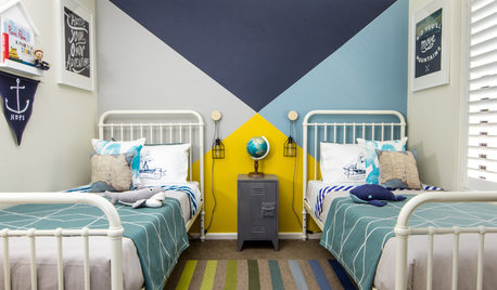
COLORWhy You Should Paint Your Walls More Than One Color
Using multiple colors can define zones, highlight features or just add that special something
Full Story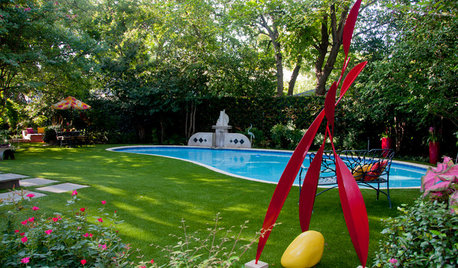
COLOR8 Ways to Rev Up Your Garden Color With More Than Just Plants
Bring energy and excitement to your outdoor space by going bold with color, from small touches to big changes
Full Story
COLORYou Said It: ‘Adding Color Is About So Much More Than Shock’ and More
Highlights from the week include color advice, Houzzers helping Houzzers and architecture students building community housing
Full Story
DECORATING GUIDESJazz Up Your Dining Room for Less Than $500
New lighting, colorful dishware, fun fabrics and other small updates add up to a big-time facelift on a little bitty budget
Full Story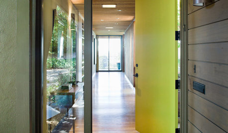
CURB APPEAL5 Bright Palettes for Front Doors
Splash bold green, blue, orange or red on your front door, then balance it with a more restrained hue on the rest of the house
Full Story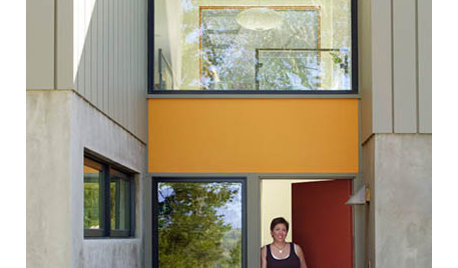
BOLD COLORColor Guide: How to Work With Primary Colors
Go beyond the ABCs with Mondrian-style renderings and eclectic takes using these notice-me color foundations
Full Story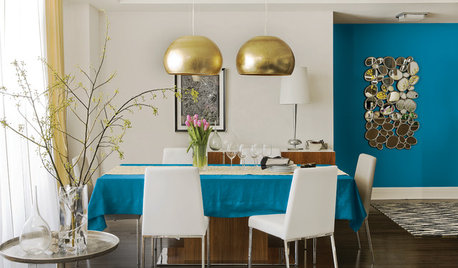
COLORBest Uses for the Boho Blue Color of 2015
PPG Pittsburgh Paints’ Color of the Year is a bold bohemian blue best used in small doses
Full Story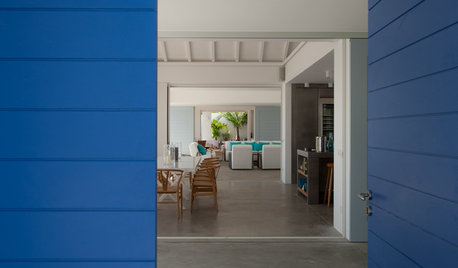
COLORBest Uses for the Saturated Blue Color of 2015
Kelly-Moore’s selection is a classic shade of blue worthy of chunky accents around the home
Full Story
COLORColor Feast: 6 Deliciously Uncommon Dining Room Color Combos
Give your mealtime space a generous helping of hues paired in a most refreshing way
Full Story
BEFORE AND AFTERSA ‘Brady Bunch’ Kitchen Overhaul for Less Than $25,000
Homeowners say goodbye to avocado-colored appliances and orange-brown cabinets and hello to a bright new way of cooking
Full Story

IdaClaire