


Color Feast: 6 Deliciously Uncommon Dining Room Color Combos
Give your mealtime space a generous helping of hues paired in a most refreshing way

Previously in this series about dining room color, we discussed dining room color in terms of one dominant hue in the space. Let's step it up, color-wise, for the finale, and focus on multihued dining spaces.
This may seem like advanced color selection to some; it can be tricky to integrate multiple bold colors in a space and not have it resemble a game board. The key is to pick colors that harmonize with one another, and to use brighter hues sparingly. Mix in some light neutrals or lots of natural light, and you'll have a stunning space for sharing meals with family and friends.
Here are some of my favorite colorful dining spaces on Houzz, along with suggested palettes for you to try in your own dining room.
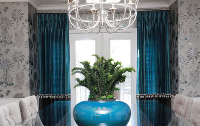
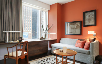
2. Cool blues and grays. This elegant dining room shimmers in shades of deep blue and gray. Generally, a darker hue on the ceiling will visually lower it, but cooler colors also have a tendency to make a wall or ceiling recede. I think this dark sapphire color makes the room feel more intimate and evokes the feeling of dining al fresco at night.
A great trick for getting light to bounce throughout a dining room, which adds sparkle, is to give the walls a semigloss or high-gloss finish. Just be aware that the glossier the paint sheen, the more you will notice the texture — and any flaws — on your walls and ceilings.
A great trick for getting light to bounce throughout a dining room, which adds sparkle, is to give the walls a semigloss or high-gloss finish. Just be aware that the glossier the paint sheen, the more you will notice the texture — and any flaws — on your walls and ceilings.
Example palette: From left to right, all from Behr: Sapphire Sparkle, Silver Screen and Dark Ash.
How to Hire a Painter to Do Your Interiors
How to Hire a Painter to Do Your Interiors
3. Dramatic deep maroon with red. These are intense colors, but because they're such similar shades of purplish reds, they don't fight with each other.
Example palette: From left to right, all from Mythic Paint: Spring Cosmos, Royal Masterpiece and Romantic Charm.
Example palette: From left to right, all from Benjamin Moore: Ryan Red, Canyonlands and Glazed Green.
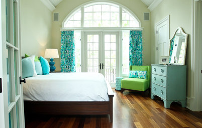
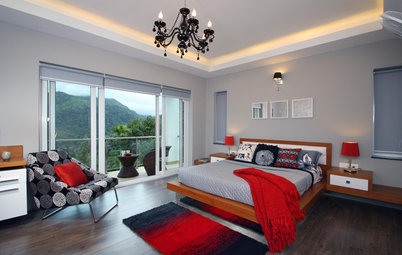
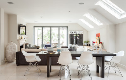
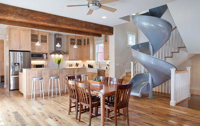
5. Red, white and blue. This is a bold, contrasting color palette, but it works here because the bright hues appear in relatively small amounts. White and neutral wood tones wash over the rest of the space.
Find professional painters in your area
Find professional painters in your area
Example palette: From left to right, all from Benjamin Moore: Aruba Blue, Raspberry Truffle and Million Dollar Red.
Example palette: From left to right, all from Sherwin-Williams: Stunning Shade, Light French Gray and Frolic.
Tell us: Do you favor a mix of bold colors in the dining room? Please share a photo in the Comments section below.
More
Get inspired by more colorful kitchens
Find a color consultant to help with your project
Tell us: Do you favor a mix of bold colors in the dining room? Please share a photo in the Comments section below.
More
Get inspired by more colorful kitchens
Find a color consultant to help with your project


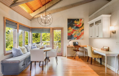


Add some spring greens for a harmonious vibe, as yellow and green are adjacent on the color wheel.