


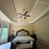
Yellow Toned Off White/Cream
4 years ago
Featured Answer
Sort by:Oldest
Comments (7)
 PRO4 years ago
 PRO4 years ago
Related Discussions
RL Studio Cream,Deep Cream, Flour Sack White, Faded Clouds: tone?
Comments (6)OSH, thanks for giving it the old college try, as the saying goes. The carpeting is pale beige, trim is (alas) honey oak, and not getting painted any time soon. Red, completely agreed. The reason I asked for input is that I think my eyes are crossing after looking at about 20 paint chips too many: a LOT of the RL pale neutrals look really grey to me. And many of the gazillion colors I've tried to test have looked grey in my MBR anyway, even in full sun or with every light on at night! (I know -- new bulbs and more lighting -- it'll happen but not soon.) Some of the greyness has come from bad colormatching, and maybe I'm choosing hues with a lot of grey in them b/c I subconsciously like it, but it's really not the color I want in this room. I'm after a warm, very light brown (read a real estate stager's blog in which she called it "dark white", is that counterintuitive or what?). But wait.... I just realized something. Can HD colormatch BM colors in the RL paint? Hmmm... (no, someone tell me to stop!) Rmkitchen, given my growing grisophobia (irrational fear of grey), I really appreciate your post. Evidently the RL colors are very complex, pigmentwise, and another poster here said hers looked *lemony* in her space -- which I could see, when I took the paint chip into my much sunnier LR/DR. If this helps at all, I think I'm narrowing it down: Studio Cream, Flour Sack White, with Deep Cream a distant third. If my HD can colormatch BM, I might ask them to try mixing me a quart of Ivory Tusk in the RL paint....See MoreSoft white cabinets -- what company makes the least yellow/cream?
Comments (4)White has to have some color undertones to be "off white". Those color undertones can be bluish (very cold feeling). Greenish (also cold, and throws other colors off) Red (most people HATE pink undertones in their cabinets, despite it being a fairly flattering undertone for complexions) Grey (a true gray that has no mix of any other tint in it than black will take on different tones in different lights, but most do feel "cool") Yellow (This is what most "cream" colors have their basis in as it's a warm tone. Too much can leave it feeling "nicotine stained" though.) Orange (This is a VERY tricky undertone to pull off, but it can work quite well to give a warm feel to the white. ) Yellow undertones are the most popular off white, and they are the easiest to work with when planning a room as most woods have yellow undertones. Grays are popular at the moment, but as a long term choice, they will not stand the test of time as an "off white". They do better standing alone as "gray" by choosing a dark enough tone that it shifts to that rather than "off white"....See MoreHelp! Trying to tone down brand new SW Dover White cabinet-too yellow
Comments (33)Can any color experts out there tell me if SW Moth Wing would be a good choice for the island? Would it give an ample contrast to the SW Dover White. First, I loveDover White. I think it's a pretty white. Some whites are "okay" and some are "pretty" and I think Dover White is pretty, so you could have done a lot worse, IMO. Dover White belongs to the yellow hue family. So, the data validates exactly what you're seeing. If I painted the walls SW Accessible Beige with a PPG Delicate White Trim, would that clash? I'm hoping the paint color I choose will help neutralize the yellow I see. They would not clash. Those three colors go together well - they relate nicely. And it is possible that Accessible will lessen how yellow Dover White looks. Moth Wing doesn't really fit in. It's too close in terms of hue family and chroma to Accessible Beige and I don't care for the relationship on paper or lookin' at the chips. I know Moth Wing and Accessible Beige are on the same strip but that doesn't really mean anything. Color harmony is not built-in guaranteed just because colors are on the same strip. Very often the similar color attributes that land colors on the same strip are the very reasons they don't go together - Accessible Beige and Moth Wing are a good example. If you're not happy with Balanced Beige and don't want to just leave it and see how it works out, then I'd get off that strip of colors and go another color direction....See MoreHelp! Picking kitchen cabinet colors, need help with off-white/creams
Comments (14)Aw man, thanks for the comments guys! After being in this house with small kids for eight years, the cabinets are showing wear and there is quite a bit of water damage on many of them and some are broken (didn’t show you that photo!). So...that was where my head was at with going ahead and painting the cabinets. They are already priming today so this is a done deal! In my area, painting cabs is still a big thing (we might steer behind the times a little) and a big thing people look for in resale (we could be moving in a couple years). Honestly, it might not be trendy but I still love my granite! It hides stuff so well and never looks dirty. And I never even notice my backsplash and I just don’t care that much about it. It’s hard for me to warrant changing something just for cosmetic reasons (counter and backsplash) versus need (cabs). We got an amazing deal on the painting so I feel good about it. I’m going full steam with Antique White. After looking at it forever and being in complete decision making paralysis, that’s what I’m going with! I’m going with brass/gold knobs to add a little bit of funky and I have lots of Anthropologie-esque and plants to add character. I have a very open floor plan with my living room right there in all it’s colorful glory, so I’m thinking the lighter will look nice. I’ll be happy to post a pic when I’m done. Thanks for listening!!...See More 4 years ago
- PRO4 years ago
 4 years ago
- PRO4 years ago
Related Stories

MOST POPULARMust-Try Color Combo: White With Warm Off-White
Avoid going too traditional and too clean by introducing an off-white palette that brings a touch of warmth and elegance
Full Story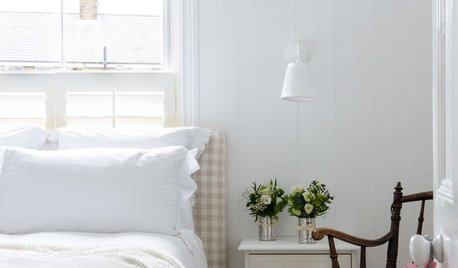
COLORWhite vs. Cream: Which Neutral Paint Color Is Right for You?
Do bright white rooms give you the chills? Are off-whites too drab and boring? Let’s see which is a better fit for you
Full Story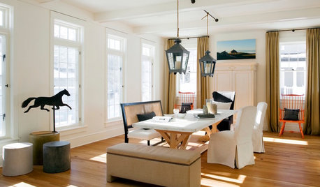
WHITEDesigner Secrets: 10 Pros Share Favorite Off-White Paints
From creamy white to barely beige, these hues will warm up your room
Full Story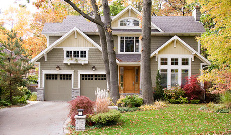
EXTERIOR COLORDynamic Duo: How to Pull Off a Two-Tone Exterior Color Scheme
Why stick to one main house color if you can easily and beautifully combine two?
Full Story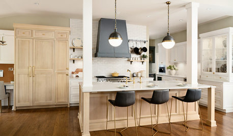
KITCHEN DESIGNBleached White Oak Cabinets Star in This Two-Tone Kitchen
The cabinets and a new layout transform a once-dark New Jersey kitchen into a light and bright space
Full Story
COLORColor of the Year: Off-White Is On Trend for 2016
See why four paint brands have chosen a shade of white as their hot hue for the new year
Full Story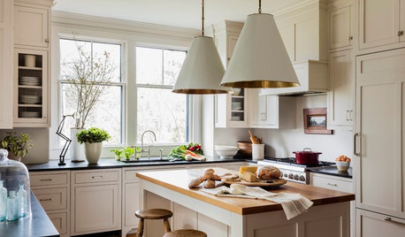
MOST POPULARHouzz Tour: Easygoing and Elegant in White, Cream and Gray
The renovation of an 1860s Massachusetts home creates a sophisticated, serene and comfortable living space
Full Story
WHITE3 Easygoing Rooms With Creamy Off-White Walls
Look to this colorless color for warm, relaxed style with elegant undertones
Full Story
COLOR PALETTES9 White-and-Yellow Paint Color Pairings to Consider
Get design tips for working with these two versatile hues and learn about specific paint colors to try in your own home
Full Story


Rachel KOriginal Author