


Designer Secrets: 10 Pros Share Favorite Off-White Paints
From creamy white to barely beige, these hues will warm up your room
Becky Harris
September 26, 2019
Houzz Contributor. Hi there! I live in a 1940s cottage in Atlanta that I'll describe as "collected."
I got into design via Landscape Architecture, which I studied at the University of Virginia.
Houzz Contributor. Hi there! I live in a 1940s cottage in Atlanta that I'll describe... More
Choosing an off-white paint seems easy enough, but it actually can be tricky. Undertones from other colors in the paint work differently in different lights and can skew toward other colors such as yellow, pink or gray. We’ve asked 10 designers what their surefire off-white favorites are.
As you’re considering each shade, note that paint colors work differently in different parts of the country and at different times of day, and they can even look noticeably different from one side of your house to the other. So be sure to test your paint in a large swath in the room you want to use it in and check on it throughout the day and night with different lighting schemes. Also, look at it next to the trim color or stain, furniture, rugs and artwork you’d like to use in the room to see how it works with everything.
As you’re considering each shade, note that paint colors work differently in different parts of the country and at different times of day, and they can even look noticeably different from one side of your house to the other. So be sure to test your paint in a large swath in the room you want to use it in and check on it throughout the day and night with different lighting schemes. Also, look at it next to the trim color or stain, furniture, rugs and artwork you’d like to use in the room to see how it works with everything.
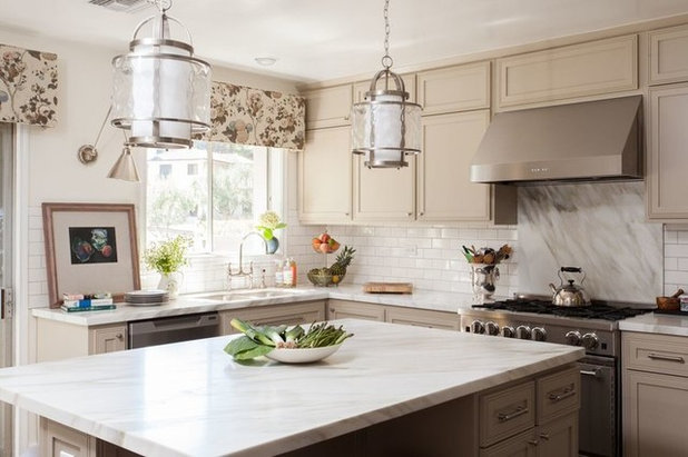
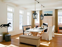
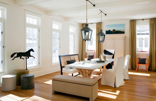
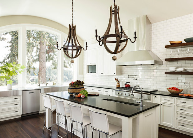
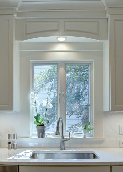
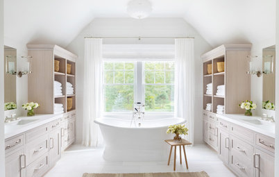
Pointing by Farrow & Ball
“Pointing is a beautiful creamy white that glows but doesn’t read as yellow,” Los Angeles-based interior designer Lindsay Pennington says. “It elevates the standard white wall by adding depth and dimension and looks terrific against artwork, because it contrasts just enough with white matting or paper to set those off and doesn’t compete with richer, more intense colors.”
In this kitchen, Pennington used Pointing as the wall color to subtly complement cabinets that are painted in Farrow & Ball’s Stony Ground. “Pointing is equally happy at home with warmer and cooler tones,” she says.
Trim/ceiling paint: All White, Farrow & Ball
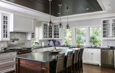
Elmira White by Benjamin Moore
Interior designer Charmean Neithart works on a lot of Spanish Colonial homes in Southern California, which are often full of warm wood architectural details and a mix of textures on the walls. “I use Elmira White a lot, especially in Spanish houses. It looks good with smooth and textured walls,” she says. “It has no yellow or pink undertones, so it looks beautiful with neutrals.”
Find an interior designer on Houzz
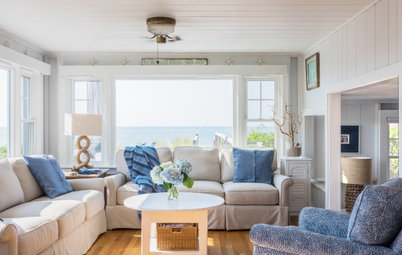
Mayonnaise by Benjamin Moore
“This is a warm white that mimics sunshine, even on a cloudy day,” says interior designer Lisa Tharp, who is used to the early sunsets during long New England winters. “It cheers the soul while creating an atmospheric backdrop, letting people and furnishings take center stage.”
“This is a warm white that mimics sunshine, even on a cloudy day,” says interior designer Lisa Tharp, who is used to the early sunsets during long New England winters. “It cheers the soul while creating an atmospheric backdrop, letting people and furnishings take center stage.”
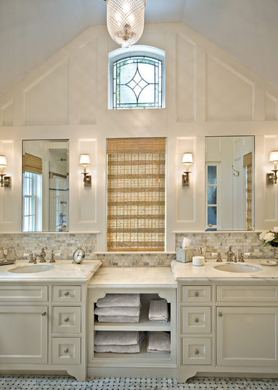
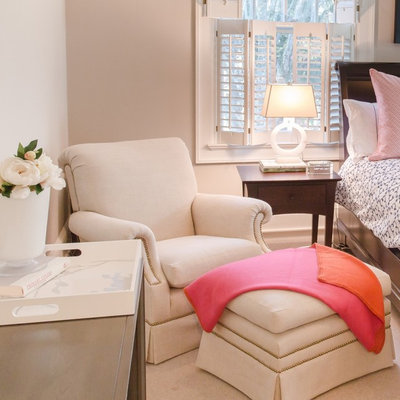
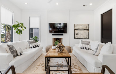
White Dove by Benjamin Moore
“I’ve used Benjamin Moore’s White Dove in many projects, including this master bath extension, as all the trim in a beach house and on a sun porch in a suburban home,” interior designer Diana Bier says. “I find it to be a calming, creamy off-white with no yellow or pink undertones. It’s perfect with the white marbles that are so popular right now for kitchens and baths.” She also notes that it works with both warm and cool colors equally well (except with yellow, where she prefers the crisp contrast of a brighter white).
“I’ve used it with blues, grays, reds and lavender,” she says. Her painter concurs and told her that these days it’s probably the most popular off-white color he’s come across in the Long Island, New York, area.
Shop for a bathroom vanity on Houzz
Floral White by Benjamin Moore
Interior designer Jenni Leasia calls this shade “under the radar.” She’s found that it works well in the Pacific Northwest, where gray skies are common. In this photo, she used it on all the trim and cabinetry.
“I have used it on ceilings in a house where we wanted to keep them bright but soft,” she says. “It’s perfect for cabinetry, where clients want white, but not bright white. Sometimes when we show a swatch to a client, they will think it is too creamy, but it really reads as white — a soft, creamy, easy-to-live-with white.” Depending on the light, the designer says, sometimes it reads a little more white, sometimes a little more creamy, but it never looks yellow or washed-out gray.
Shaker Beige by Benjamin Moore
“I love Shaker Beige because it works in every situation,” says interior designer Margaret Handley, who works on a lot of projects in the mountains of North Carolina. “It’s not too light or too dark, and it takes on the color properties of whatever it is mixed with. It’s the perfect go-to color!”
“I love Shaker Beige because it works in every situation,” says interior designer Margaret Handley, who works on a lot of projects in the mountains of North Carolina. “It’s not too light or too dark, and it takes on the color properties of whatever it is mixed with. It’s the perfect go-to color!”
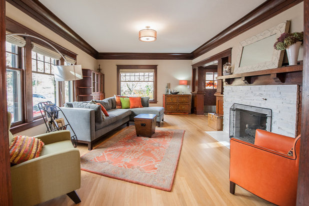
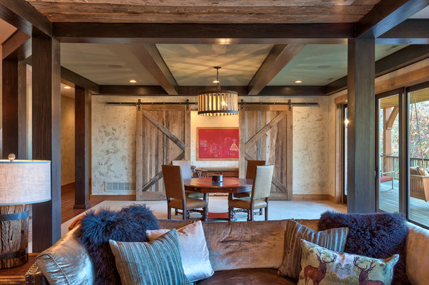
Devine Pecan by Devine Color
“We used Devine Pecan as the color for the living room and dining room of this transitional style remodel,” says interior designer Michelle Ruber of Portland, Oregon. “The color works well with the dark woodwork, allowing it to contrast and blend.” Her client wanted to make sure the walls had a warm undertone rather than a stark contrast against the wood. “This almost pulls pink, in the photo more than in person, which is what she desired for the warm feeling,” she says.
“We used Devine Pecan as the color for the living room and dining room of this transitional style remodel,” says interior designer Michelle Ruber of Portland, Oregon. “The color works well with the dark woodwork, allowing it to contrast and blend.” Her client wanted to make sure the walls had a warm undertone rather than a stark contrast against the wood. “This almost pulls pink, in the photo more than in person, which is what she desired for the warm feeling,” she says.
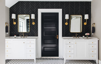
Dover White by Sherwin-Williams
“The majority of my clients select this soft white for their kitchen cabinet color because it feels white but is not a harsh or antiseptic white,” says interior designer Tracey Stephens, who specializes in kitchen and bath design in northern New Jersey. “It is the ideal warm neutral color because it pairs well with a wide range of tile, countertop and wall colors.”
“The majority of my clients select this soft white for their kitchen cabinet color because it feels white but is not a harsh or antiseptic white,” says interior designer Tracey Stephens, who specializes in kitchen and bath design in northern New Jersey. “It is the ideal warm neutral color because it pairs well with a wide range of tile, countertop and wall colors.”
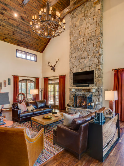
Navajo White by Sherwin-Williams
“I always use Navajo White for a base anytime I am doing a texture with the glaze on top,” says North Carolina-based interior designer Pam McKay. “It is a neutral and warm option for the lighting in our high country projects. It works well with white trim or a stained wood trim.” The quality of natural light varies greatly around the country, and this affects paint choices. McKay opts for warmer tones in the mountains of North Carolina, while she chooses brighter, clearer colors when she’s working on projects in Florida. “The light is so different,” she says.
Side note: Here’s a little more from McKay about the unique texture on the walls in the photo above: “The texture is applied with drywall mud to resemble plaster. The wall is painted with an eggshell paint sheen so the glaze sits on top; I use the Navajo White. An oil-based glaze is applied or wiped on the surface and wiped off. The tinted glaze hangs up in the crevices of the texture. It is like a plaster. The Navajo White gives me a warm base but allows me interest on the wall without doing dark and heavy.”
Slipper Satin by Farrow & Ball
“Slipper Satin worked perfectly in this room because the windows faced north, and the light was a little cold,” says interior designer Kirsten Kaplan, who designs in the Middle Atlantic region. “So we warmed it up, and now it’s inviting even on the grayest days.”
Your turn: Do you have a favorite off-white paint? Please share it with us and tell us why you love it in the Comments.
More on Houzz
Designer Secrets: 10 Pros Share Their Favorite White Paints
Browse millions of photos for ideas and inspiration
Find a pro to help with your next project
Shop for home furnishings and decor
What are you working on?

Related Products

Dream Baths is a complete design-build-remodel firm located in the Historical German Village area of downtown... Read More
Related Stories
Decorating Guides
Designer Secrets: 10 Pros Share Their Favorite White Paints
By Becky Harris
Decorating experts look to these hues when they want a go-to white they can count on
Full Story

Decorating Guides
Design Pros Share 10 Favorite Creamy White Paints
By Becky Harris
These off-white color choices include versatile tones, warming hues and pleasingly soft shades
Full Story

Decorating Guides
9 Ways to Layer Warm Neutral Colors for Comfortably Refined Rooms
By Becky Harris
Design pros share advice for building an inviting palette, introducing high contrast and mixing textures
Full Story
Exteriors
10 Off-White Paint Colors for Home Exteriors
Pros share the off-white shades they used to complement the architecture of these remodeled and new-build homes
Full Story
Housekeeping
How to Keep Your White Spaces Looking Great
Brighten up your white walls, floors and furniture with these cleaning and maintenance tips
Full Story
Color
8 Ways to Use White in the Bathroom
By Jennifer Ott
See how to incorporate this popular color in your bathroom while avoiding a clinical look
Full Story
Color Palettes
What to Know Before You Paint Your Walls White
A coat of white paint can do wonders in one room and wreak havoc in another. Here are tips for using the popular hue
Full Story
Bathroom Color
How to Decorate With Black and White in the Bathroom
By Becky Harris
This classic color combination makes for a chic and clean look in any style of bathroom
Full Story
Kitchen Workbook
8 Elements of Classic Kitchen Style
For this timeless style, go with white or cream cabinetry, simple architectural details and high-quality materials
Full Story
@bholness, Benjamin Moore's Simply White OC-117 was the Color of the Year several years ago because they tested all 200 whites, and found it was the most consistent in all lighting: daylight, incandescent, LED, halogen, neon, flourescent. Since you have both bluer light from the north, and yellower intense light from the South, it might work well, if you want one white color for both areas.
Recently moved into a house that was having a room repainted. I liked the color so much that I continued painting with the color. Aged Beige by Behr.
We discovered Grandma's China (Benjamin Moore) and used it in several rooms with Simply White (BM again) as the trim. It's kind of a pale "greige," I guess. In my room with only a few north windows and lamp light, it reads warmer, but in the sunny, south-facing rooms, it looks closer to an off-white with less pigment.