


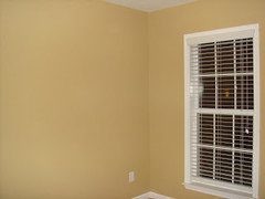
Anybody use Adam"s Gold from BM's historical collection? Post a photo?
gramarows
9 years ago
Featured Answer
Sort by:Oldest
Comments (11)

gramarows
9 years agoRelated Discussions
Has anyone used Pale Gold2 - Valspar, Laura Ashley
Comments (20)Thank you so much. So, since I am useless at design and color can you tell me what are considered "clean colors" and muted colors? In my living room I have chocolate sofas and almost back side tables, coffee table. I would guess they are muted?? I like the paint color enough now that I got used to it, but I guess you maybe right that my other items are not working with it. I'll try to post a photo soon. Love your foyer MomtoSethC :-)...See MoreBM color fan--warm neutral for LR, grayish-blue for DR? (LONG)
Comments (10)Thank you, voila, for coming out of lurkdom to help me! This HAS been painful in the sense that I really dislike being in limbo, uncertain, and indecisive, which has also been time-consuming since I have been looking at paint colors off and on for 2 or 3 years, and stewing around about them trying to figure this out. To clarify regarding the Carlisle Cream with the hint of pink: this is not the trim color. I will try to see if I can find the name somewhere in my files, but the color of the trim for all of the house and most of the ceilings has a yellowish cast. The Carlisle Cream is only on the ceiling in the DR & MBR (and the paint chosen for the DR will also be used in the MBR which faces NW), as well as the walls of the mudroom, laundry, powder room, and MBath. You are correct that it fights with yellow, because the tiles have hints of yellow tones, and it does not look good there. Except for the 2 ceilings, the Carlisle Cream will be changed to something that goes better with all of the tiles and countertops that probably need a color with some yellow, rather than pink, in it. When we painted our former N facing foyer with Pittsfield Buff, it really pulled together the colors of the 2 small rugs and tile, which are almost the same as what we have now. But that is a whole nuther story. Wythe & Palladian Blues are on my "possible" list, so I will give them further consideration. The HC 139-141 at first glance under kitchen lighting seemed minty, but the lighting in the LR is halogen, so they look different in there. I will need to see them on a sunny day. Another vote for HC 146, 147, and Gray Wisp is good! And I really like your suggestion of Quiet Moments. It is interesting that you say, "all greens seem to go together", which I had heard before. The reason I got a new LR rug was that my old one had multiple colors of green and greenish gold on a cream field, and to me it clashed with the fireplace in daylight. I moved it into the kitchen eating area that has the same slate tile on the other side of the 2-way FP where it only gets light from the NW which is not directly on it as it is in the LR, and it looks perfect in the different light! Also, if I turned the LR rug around, it would look much better upon entering the room, but to me the green from that direction looks awful with the FP green. I think it will be a lot easier to choose the DR paint than that for the LR. I will definitely pursue looking at grayed colors for both rooms, but I would still like to try maybe a rich tan that does not lean to red or yellow and see if that could work in the LR to pull out those colors in the rug, but maybe nothing will do this? I suppose that would only add to the blendy feeling that I am so good at achieving. I had originally imagined having a sort of rich, dark cream, but I guess that would mean yellow, so it is out. A correction regarding the "drapes." They are actually 4 drapery panels on each side of a 7 ft triple casement that help to set off the piano and a small chest near the creamy beige rug, and at each end of a 4 window bank (each 42" wide) next to the chest and behind the mauve wing-back near the FP. They are not directly next to the 9 x 12 "green" rug. The 2 rugs are separated by the sofa, so you do not see much of the Bokhara when entering the LR. I know that all the detail causes many people not to read this, but I welcome comments from anyone who has the patience to work through them to give me additional guidance. Anne...See MoreAnyone used metroquartz? Specifically the Luce collection...
Comments (59)Thank you!! Its so hard to tell from a small sample & we dont live close enough to see it in person. The sample looks murky but the online pictures look more white. i also considered Luce Claro— back background looks gray in the sample but MetroQuartz site says the background is bright white. Such a big decision! Thanks for the help!...See MoreWhat accent color for BM Bryant Gold?
Comments (50)Not quite done, but very close! Bryant Gold with Swiss Coffee trim and Sage Mountain accent (all Benjamin Moore). The gold reads more tan/ochre on the north-facing side of the house, but is closer to the sample swatch/rendering on the south-facing side where it gets direct sun. Very glad we didn't go with the lighter golds because I think they might well have pushed into the beige zone (but DH is still wishing we'd been braver and gone with BM Turmeric!) Gray-green accent color is too dark for his taste and too light for mine, so I guess that means we hit the sweet spot?? And here's what the Benjamin Moore Color Viewer thought it would look like--not too far off: I think we could have gone with a more off-white trim, but the Swiss Coffee also worked out fine in the end. Still needs new mailbox, house numbers, and wisteria trellis, but one thing at a time....See Moregramarows
9 years agolast modified: 9 years ago
tibbrix
9 years agolast modified: 9 years ago
lkplatow
9 years ago
grapefruit1_ar
9 years agogramarows
9 years agolkplatow
9 years agolf72
last year


Related Stories
SELLING YOUR HOUSE6 Tips for Staging Historic Homes
Putting a period home on the market requires a unique level of attention to detail. Here's how to preserve its historic appeal
Full Story
MY HOUZZMy Houzz: Historic Textures Meet Modern Touches in Texas Hill Country
An oft-renovated former log cabin now features a soothing palette and nods to New Orleans
Full Story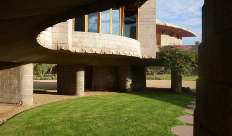
FRANK LLOYD WRIGHTStep Inside a Frank Lloyd Wright House Saved From Demolition
The historic Phoenix property is now part of the architect’s school at Taliesin, where it will be used as a design lab
Full Story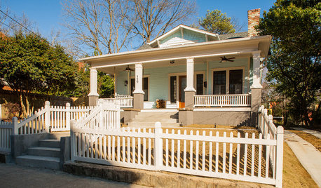
BEFORE AND AFTERSHouzz Tour: New Life for a Historic Georgia Fixer-Upper
Renovation restrictions didn't limit a couple's enthusiasm for this well-sited Decatur home
Full Story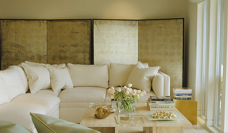
DECORATING GUIDESA Glimmer of Gold Leaf Will Make Your Room Shine
Make a unique, unexpected statement in any space with this precious metallic finish
Full Story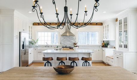
WHITE KITCHENS4 Dreamy White-and-Wood Kitchens to Learn From
White too bright in your kitchen? Introduce wood beams, countertops, furniture and more
Full Story
ECLECTIC HOMESHouzz Tour: A Toronto Home Comes Back From the Brink
Not even squatters deterred an interior designer from turning an abandoned 4-bedroom into a chic, unique home
Full Story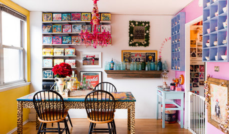
HOUZZ TV FAVORITESCandy-Colored Collections Wow in Manhattan
Pez dispensers, cheerful toys and pop culture memorabilia bring personality to this apartment
Full Story
ORGANIZINGHelp for Whittling Down the Photo Pile
Consider these 6 points your personal pare-down assistant, making organizing your photo collection easier
Full Story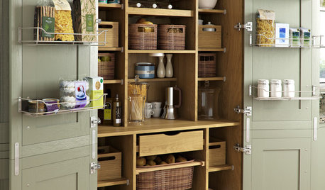
KITCHEN PANTRIES80 Pretty and Practical Kitchen Pantries
This collection of kitchen pantries covers a wide range of sizes, styles and budgets
Full StorySponsored
Columbus Design-Build, Kitchen & Bath Remodeling, Historic Renovations


lkplatow