


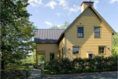
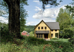
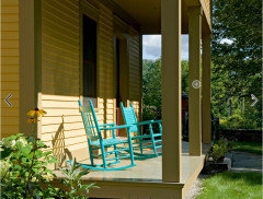
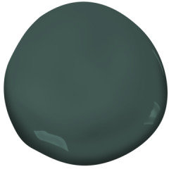
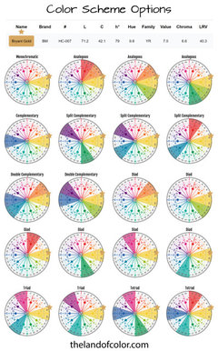
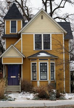
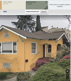
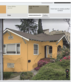
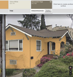
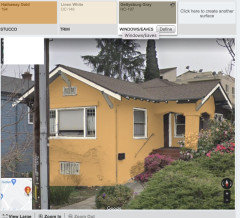
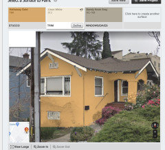
What accent color for BM Bryant Gold?
artemis78
last year
last modified: last year

Featured Answer
Sort by:Oldest
Comments (50)
Related Discussions
What accent color to use with BM van courtland blue?
Comments (8)I would also suggest orange, but with a easier-to-hear name like Coral. ;-) I am thinking of a deep, earthy kind of orange, leaning toward red with a touch of brown. Here's a link for coral (literally) and blue together. Here is a link that might be useful: coral & blue...See MoreAccent color suggestions for BM Weston Flax
Comments (1)This is my inspiration pic for BM Starburst Orange...See MoreAccent color for BM Berkshire Beige?
Comments (11)Oh my, thanks for the suggestions Annie! I'm a bit more overwhelmed now though, lol! I will try to post pics of the space to give a better perspective. I really like the berkshire beige but I see how you would think it is kind of dark for all that space. The great room and foyer have 18' ceilings with the main part of the balcony overlooking the great room. We will have oak trim stained special walnut. The floors in the great room, foyer and possibly dining area will be a medium/dark hardwood. The fireplace in the great room will have ledgestone all the way up to the ceiling and we will have cabinets installed on each side of the fireplace in a medium maple color (matches the trim). I hope all this makes sense. Thanks again- I'm going to check out the colors you suggested....See MoreAccent color for BM Palladian Blue Bathroom?
Comments (4)We have a similar paint color in our master bath (medium oak cabinet instead of dark) and for years I had dark blue and rose towels. They've finally worn out and I was really sick of the rose, so I went looking for a "splash of color". I went to Target and bought a floor rug in every single color, except burgundy because it doesn't go with the new color scheme in the bedroom which is greens and blues, they had in the Waverly line (their Thomas O'Brien and Fieldcrest lines are great, but costs twice as much and we're not really that hard on towels). DH and I laid them out and analyzed. A few we ruled out right away. DH didn't like the Hotel Gold, but that might work for you with the yellowish sink top. We settled on Loch Ness, a mossy green shade. I wouldn't have thought it would work, but it did. You might try the burgundy as well. Anyhow, the cashier looked at me kind of funny when I checked out 8 different colors of the same rug, but she understood when I explained. It really helped to see them firsthand. I was surprised by what we ended up choosing, but like it very much....See More
artemis78
last yearlast modified: last yearartemis78
last year
elcieg
last yearartemis78
last year
tracefloyd
last yearartemis78
last yeartracefloyd
last yearlast modified: last year
Jilly
last yearlast modified: last year- PRO
Patricia Colwell Consulting
last year Jilly
last yearlast modified: last yeartracefloyd
last yearlast modified: last yearartemis78
last yearlast modified: last yearJilly
last yearlast modified: last yearartemis78
last yearlast modified: last yearartemis78
last year
RedRyder
last yearartemis78
last yearlast modified: last year PRO
PROartemis78
last yearartemis78
last yearlast modified: last yearartemis78
last yearartemis78
last yearartemis78
last yearartemis78
last yearJilly
last yearartemis78
last yearartemis78
last yearartemis78
last yearlast modified: last year
Lori Sawaya
last yearartemis78
last yearartemis78
last yearartemis78
last yearartemis78
last year
la_la Girl
last yearRedRyder
last yearartemis78
last year


Related Stories
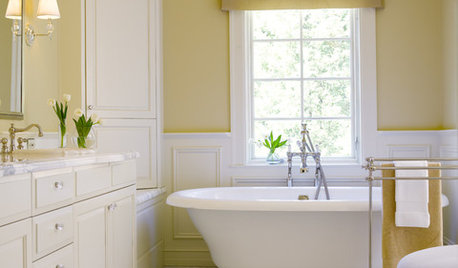
COLORBathed in Color: Favorite Yellows and Golds for the Bath
Get a golden glow for your bathroom with these expert paint picks and ideas for yellow walls
Full Story
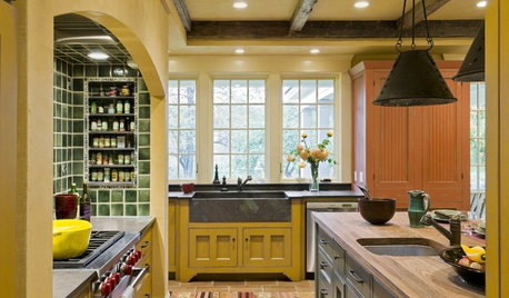
YELLOWFind Your Fall Color: Harvest Gold
See the many ways, large and small, to incorporate this rich autumn shade into your home
Full Story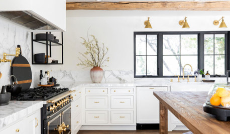
KITCHEN DESIGNNew This Week: 3 Beautifully Balanced White Kitchens
See how designers use cabinet hardware, wood and other accents to bring layers of interest to mostly white kitchens
Full Story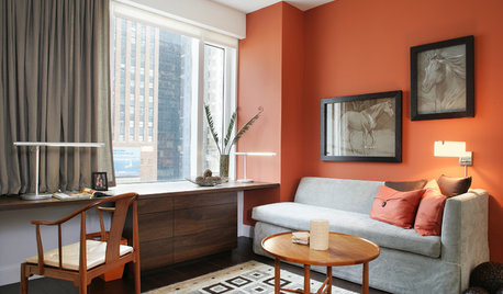
MOST POPULARFalling for Color: 9 Ways With Pumpkin Orange
From racing stripes to accent walls, see how to work this vibrant hue into your home
Full Story
DECORATING GUIDESHot Color Combo: Cool Blues and Warm Brass
It's trending all over, but navy or royal blue with brass or gold just also might become a new classic pairing
Full Story
COLOR10 Pretty Ways to Refresh a Gray Palette
Energize your favorite gray shades with pick-me-up accents as fresh as a spring day
Full Story
DECORATING GUIDESLighten Up — or Brighten Up — With Yellow
You can use this versatile color to create a buttery backdrop, add a zesty accent or make a bold design statement
Full Story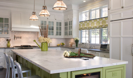
KITCHEN ISLANDS9 Kitchen Islands That Look Gorgeous in Green
Whether soft and sage-y or loud and lime-like, green is a natural choice for an island accent
Full Story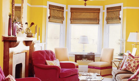
YELLOWYour Colors: Stick Around, Sunshine
Warm up the season with yellow walls, fabrics and sunny accents
Full StorySponsored
Columbus Area's Luxury Design Build Firm | 17x Best of Houzz Winner!

elcieg