


color xperts:is a 'cream' really another word for 'light yellow'
beekeeperswife
12 years ago


Featured Answer
Sort by:Oldest
Comments (41)

franksmom_2010
12 years agolindac
12 years agoRelated Discussions
Yet another yellow hunter: cool neutral yellows.
Comments (5)I think what you are gravitating to, and calling a "cool" yellow, are the yellows with a green undertone. I'm also a big fan of the greenish yellows - I have greenmount silk in my house and also dunmore cream. How dark of a shade are you looking for? I had the greenmount silk mixed at 50% strength and it was very pretty (though still ended up being too yellow for what I wanted). If you like it, but it's too strong, you can always have it mixed at a lesser strength. To me Dunmore Cream reads as more of a tan than a yellow, but again it has a definite green undertone. It's also a very pretty color, but much darker on the wall than the greemount silk is. That said, I ended up picking BM's Lancaster Whitewash for the majority of my house. On the chip it reads as a grayish off-white, but, at least in my house, it reads as a light greenish-grayish yellow. It's not a showstopper of a color (it's pretty bland, actually) but it's just what I needed to complement my cabinets and flooring, etc. (The cabinets, particularly, are the weirdest shade of gray-green and nothing looked right next to them until I discovered the lancaster whitewash.) You might want to test it out. You definitely will want to stay away from the yellows with the red/brassy undertones -- that is what is making them read peachy. I tried a bunch of the Laura Ashley Pale Golds and they all ended up too peachy for my taste. At the paint store, stand in front of the paint chips and look for the spot where the yellows meet the greens and the colors are grayed out (not screaming bright) -- that's probably where you'll want to be if you like Greenmount Silk. Good luck! Picking paint colors is such a PITA!...See Moreyellows, creams, tans oh my!!!!
Comments (11)For some reason I can't find SW Tavern Tan, wondering if it's an older color? Anyway, the problem is metamerism. You say that Tavern Tan looks consistenly bright yellow "on other walls", yet there are two other individual walls where it changes dramatically and looks like completely different colors on each. Simple definition of metamerism is objects (or walls in this case) match in one light source but do not match or do not appear to the assessor (you) with reasonable consistency in another exposure of light. It would seem that the colorants in Tavern Tan and the other colors you have tried add up to a color that inconsistently or clumsily deals with the inherent lighting of your foyer. A room is three dimensional. One directional exposure of light enters the room through an odd collection of different sized squares and rectangles and sometimes other shapes a.k.a. windows and doors. And just maybe the room is exposed multi-directionally. Windows and doors face more than one geographic direction so it gets even more complicated -- the inherent natural light that enters the room is not evenly balanced across the visible spectrum. You can't change or manage that *down* to anything less than what it is. The light is the light and it's boss. It decides how a paint color is going to react, merge, mesh, and amalgamate with everything in and about that space -- the light more than anything else defines a space. One of the pitfalls of color by committee is then what is called "observer metamerism". You're seeing these big swings of color differences wall to wall and its affecting the way you feel about the room, how you function in it. Others whom you may ask may not have the same level of sensitivity, the same accute color vision that you have. In other words, they may not see it at all, or as dramatically, and don't understand what you're talking about. That doesn't make what you are experiencing any less real though. I understand what it is you are experiencing and I know how frustrating it is. To *correct* this 3D form of metamerism you can either adjust the light source so it's more even and balanced or you can change something about how you're coloring the space. Adjusting the light source really isn't feasible unless you live in a Lego house. Alternative methods of coloring are out there and they can often be the solution to rooms with challenging and complex natural light. Full spectrum paint colors would be the first thing I'd check out in that space. Regular paint colors are put together differently than FS. FS purposely is built from the inside out with multiple colorants, that's where "full spectrum" comes from. Hit complex light with complex color. Fight fire with fire. Here is a link that might be useful: Full Spectrum Paints...See MoreCream/Yellow with Beige -help!
Comments (4)If I were building a custom home, the first thing I'd do would be to hire a good color consultant. You're dealing with two tricky colors there, both the combo and the colors, themselves. So much depends on the light orientation. In some people's homes, Kilim is the perfect neutral, but in other's it can lean pink or green. Now, I happen to have Ivoire in a good portion of my own home. Love it, but in lower light settings it can read pretty yellow (very subtle yellow, but yellow all the same). If you just paint a bit on the wall it will seem beige, but IRL, when on all four walls, the yellow magnifies. The other part of your question, about mixing beige and creamy yellow, just screams for a pro's advice. That is one of the toughest combos to do correctly. For the record, I have seen Ivoire used in the kitchen setting you describe. It looked lovely....See MoreCreams, yellows, and browns - seeking backsplash advice
Comments (16)So a few months have passed and I thought I'd update this thread. We are slowly getting closer to completing the last few outstanding items, and are looking forward to being in a position to finally post finished pics. We will move on to a large landscaping project when spring eventually (?) arrives here in eastern Canada, so we hope to finish this up in the next couple of weeks and focus our attention outdoors! The backsplash behind the cooktop was completed last week. We knew we wanted glass tile and were willing to take a risk on something different and interesting. We searched high and low for inspiration, and we both instantly agreed that we had found the right tile when a local tile dealer introduced us to the Metallic Glass collection at Saltillo Imports. It has a wavy surface texture, and the tile background is in a metallic glaze with matching contours. We chose the EM113 Las Vegas (brown) in a 2x4 subway pattern (see link below). It was a challenge to install as it does not have any straight edges or flat surfaces, but we are very pleased with how it worked out. We feel it works well as a feature wall, however the darker color will not work terribly well throughout the kitchen. We have chosen lighter, more conventional crema marfil polished marble in 2x4 subway pattern for the other areas of backsplash throughout the kitchen (see below). Here is a link that might be useful: Saltillo Metallic Glass...See More
4boys2
12 years agoerinct
12 years ago
Lyban zone 4
12 years agominiscule
12 years agoanrol
12 years agoscarlett2001
12 years agooceanna
12 years agoelle3
12 years agobusybee3
12 years ago
Sueb20
12 years agokatrina_ellen
12 years agottodd
12 years agoteacats
12 years agodebbie1031
12 years agobeekeeperswife
12 years agoAngela
12 years agormkitchen
12 years agobeekeeperswife
12 years agobeekeeperswife
12 years ago4boys2
12 years ago
Kathleen McGuire
12 years agokathec
12 years ago4boys2
12 years ago4boys2
12 years agooceanna
12 years agoschoolhouse_gw
12 years agojessicaml
12 years ago4boys2
12 years agobeekeeperswife
12 years agodebbie1031
12 years agobeekeeperswife
12 years agobeekeeperswife
12 years agoAngela
12 years agojen9
12 years agobeekeeperswife
12 years agosayde
12 years agohonorbiltkit
12 years agobrianadarnell
12 years ago


Related Stories
HOUSEKEEPINGDon't Touch Another Stain Before You Read This
Even an innocent swipe with water may cause permanent damage. Here's what to know about how rugs and fabrics react
Full Story
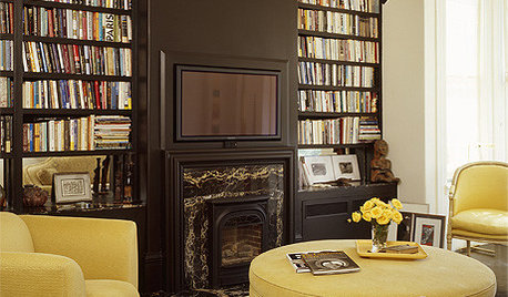
MOST POPULARHouzz Tour: Easygoing and Elegant in White, Cream and Gray
The renovation of an 1860s Massachusetts home creates a sophisticated, serene and comfortable living space
Full Story
MOST POPULARThree Magic Words for a Clean Home and a Better Life
Not a natural tidying and organizing whiz? Take hope in one short phrase that can change your life forever
Full Story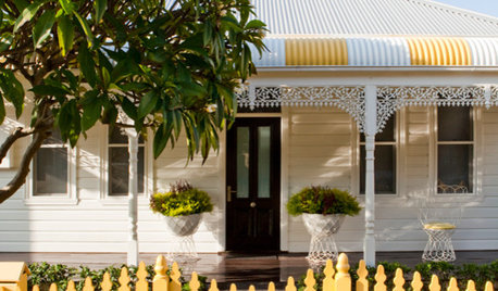
DECORATING GUIDESLighten Up — or Brighten Up — With Yellow
You can use this versatile color to create a buttery backdrop, add a zesty accent or make a bold design statement
Full Story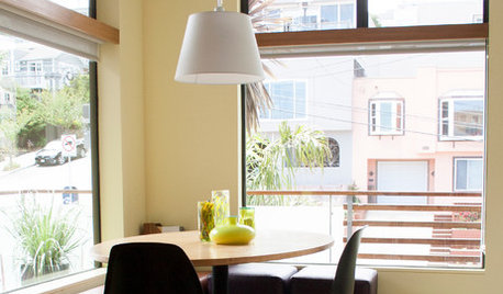
COLORColor of the Week: Spring Blossom Yellow
Tired of winter yet? Bring on spring with our featured color of the week
Full Story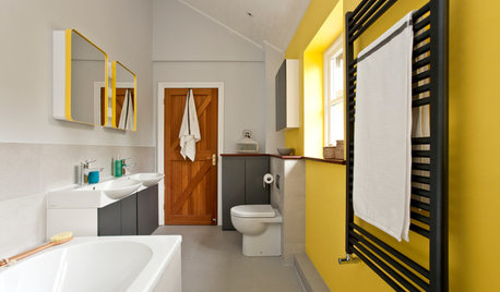
BATHROOM COLOR7 Tips for a Sensational Yellow Bathroom
Counter the late-winter blahs with a blast of sunny yellow in the bathroom
Full Story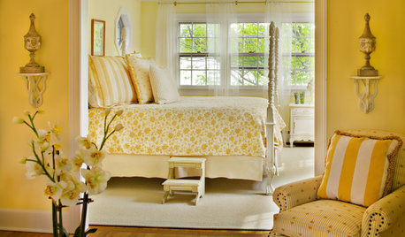
COLORWelcome Yellow Around Your Home for an Instant Lift
Keep on the sunny side with shades of yellow from buttery and soft to dynamic and bright
Full Story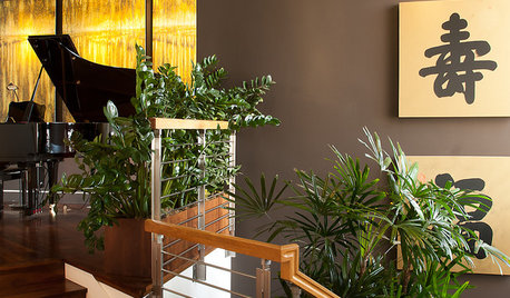
COLORTricky Yellow — Friend or Foe?
It might rev you up or wear you down. Learn what the experts have to say about using this complex color at home
Full Story


jessicaml