


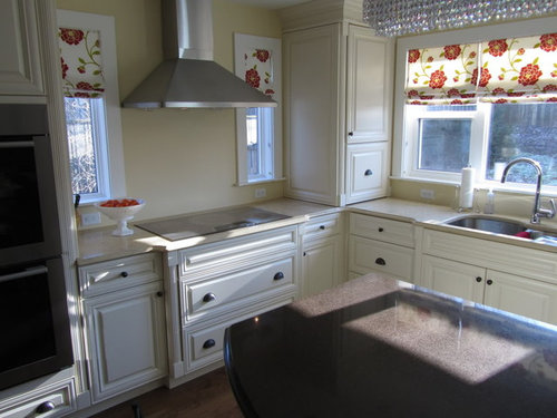
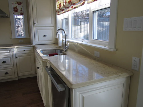
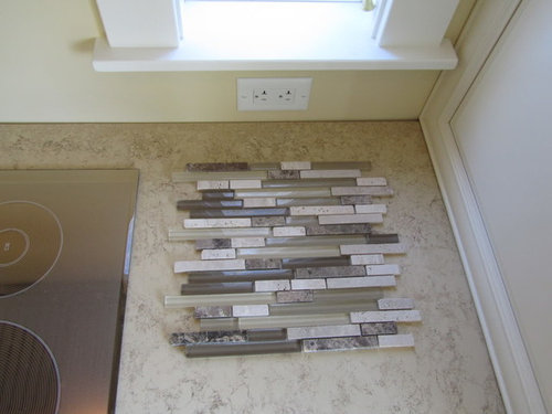
Creams, yellows, and browns - seeking backsplash advice
thynes1501
13 years ago
Sort by:Oldest
Comments (16)
Related Stories
DECORATING GUIDES10 Design Tips Learned From the Worst Advice Ever
If these Houzzers’ tales don’t bolster the courage of your design convictions, nothing will
Full Story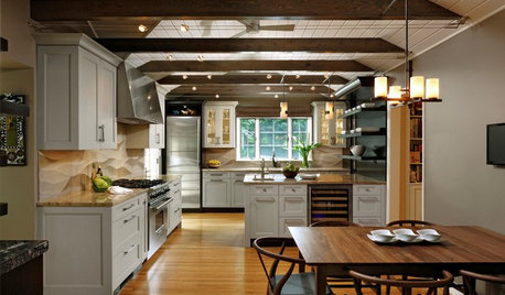
KITCHEN OF THE WEEKKitchen of the Week: Seeking Balance in Virginia
Poor flow and layout issues plagued this kitchen for a family, until an award-winning design came to the rescue
Full Story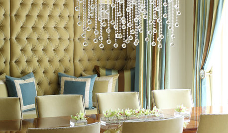
UPHOLSTERYSeeking a Quiet, Relaxed Spot? Try Upholstering Your Walls
Upholstery can envelop an entire room, a framed panel or a single wall. See some design options and learn what to expect
Full Story
DECORATING GUIDESDecorating Advice to Steal From Your Suit
Create a look of confidence that’s tailor made to fit your style by following these 7 key tips
Full Story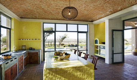
KITCHEN DESIGNKitchen Color: 7 Sensational Yellow Backsplashes
Warm up a white kitchen or add some zing to wood tones with a backsplash that glows
Full Story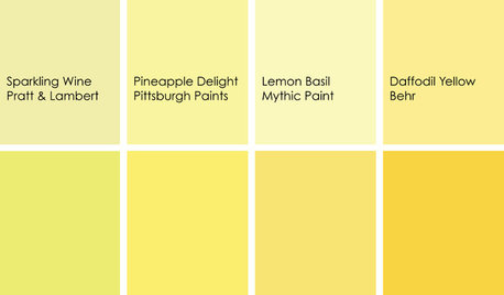
KITCHEN DESIGNCooking With Color: When to Use Yellow in the Kitchen
Perk up your kitchen with a burst of Pineapple Delight or a dollop of Top Banana on the walls, cabinets or countertops
Full Story
COLORTricky Yellow — Friend or Foe?
It might rev you up or wear you down. Learn what the experts have to say about using this complex color at home
Full Story
KITCHEN DESIGN3 Dark Kitchens, 6 Affordable Updates
Color advice: Three Houzzers get budget-friendly ideas to spruce up their kitchens with new paint, backsplashes and countertops
Full Story
COLORBest Ways to Use the Soft Yellow Color of 2014
You may fall for PPG Pittsburgh Paints’ Turning Oakleaf if you like your hues warm, mellow and cheery
Full Story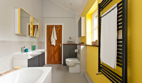
BATHROOM COLOR7 Tips for a Sensational Yellow Bathroom
Counter the late-winter blahs with a blast of sunny yellow in the bathroom
Full Story

honorbiltkit
mikomum
Related Discussions
What backsplash with cream cabinet/antique brown granite?
Q
Help with backsplash to lighten up busy granite with cream cabinets
Q
countertop with cream cabinets kitchen and backsplash advice please!
Q
Tile Back-Splash Placement Advice Needed
Q
doonie
boxerpups
blfenton
regina_phalange
amysrq
stephcil
sumnerfan
thynes1501Original Author
amysrq
thynes1501Original Author
marcydc
francoise47
Pevo
chocolatebunny