


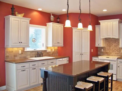
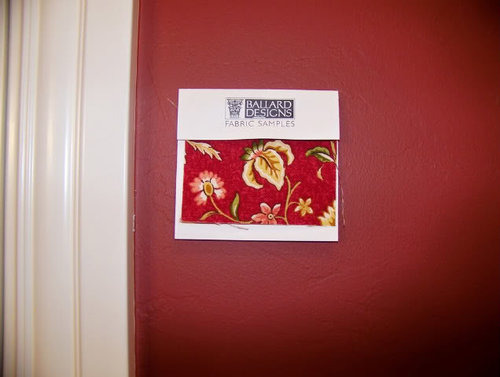
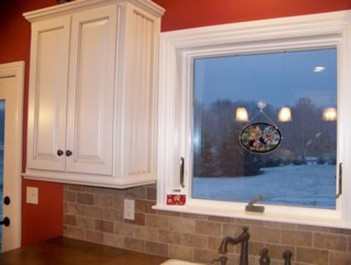
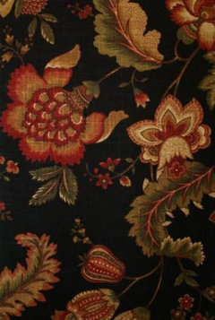
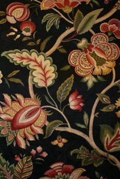
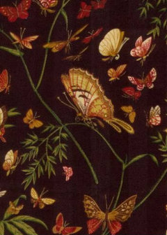
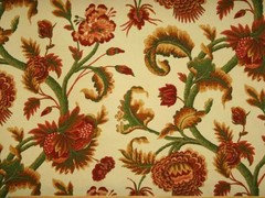
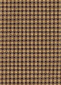
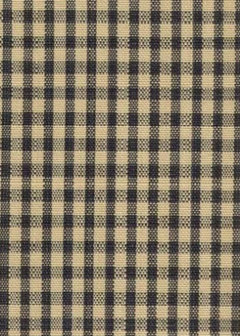
This Fabric for my Kitchen Valance?
jan_in_wisconsin
16 years ago


Featured Answer
Sort by:Oldest
Comments (51)

sallymo2015
16 years agoRelated Discussions
Could someone do me a favor?
Comments (15)Sujafr - thank you so much! Do you have to use a special program to do that? Allison ~ yes it seems to be taking FOREVER (yrs. in planning)! We wanted to be in by now but we've been having a hard time coming up w/ the down payment to purchase both the house and the business together. Together (us, current owner of business/house & the acct.) we thought we'd finally figured out a way to do it by purchasing the business w/ the money we get from selling current house and 'renting' the one we are moving to but then of course the bottom fell out of the market so we're scrambling now. We are praying that we can be in somehow by September for DS1 to begin Kindergarten in that district. We shall see. The current owner is DH's boss and is WONDERFUL to us. Anyway, here are some interior pics of the place: LR (it's so small it's hard to get a pic of the whole thing in one shot): DR: Kitchen: Upstairs (both bedrooms are identical): We will be adding an addition of MBR, Mbath, BDR and laundry/mudroom....See Morenow that kitchen is painted... onto valance fabric!
Comments (57)I don't know if this will help. I finally picked a blue fabric that I love. I was afraid to do totally blue as I need to tie in some chestnut linen drapes, gray walls, and mossy gray green couches in the family room attached on. I wanted to find a fabric that would work in all areas since it's all open. I'm going to do a pillow and trim out a pillow in the fabric besides the window. Find a color that you'd like throughout your home for flow. Then, the blue (if that is where you are going) won't be so jarring to you. Especially if you're afraid of bold and blue. Schumacher fabric is pretty expensive, but the quality and the colors are so, so lovely. It's really more beautiful in person. Since you're only making valances (I'm making a cafe curtain), the cost isn't as much for a wow statement. But, it's still kind of pricy. You can find tons of schumacher fabric on ebay. Maybe in a colorway you'd like. I ended up buying this beauty for a song. Seriously. Three yards for eight dollars. Enough for some pillows and a cafe curtain. It's normally 100+ per yard! For the price, I thought I'd try it. And, it worked out more than perfect. You'd be surprised what you'll find given time. Don't jump into anything you aren't sure about or love. I've attached a link the fabric. I think it would also work in your home. The darker blue and medium blue aren't scary. They are really rich. Also, make sure to take into consideration the actual fabric if you're making them yourself. This is 100% linen. Linen will droop eventually. I will end up shortening my cafe curtain 1/4 of an inch at least to allow for it. Obviously cotton will shrink when you wash it. Things like that. Good luck! Kim Here is a link that might be useful: Schumacher- chalfont....See MoreTo: my3dogs - question about valance fabric
Comments (4)Wow - thanks! Yes, It's 'Seaworthy' in blue (color 15) by Covington. I have put a link to it below. I bought it locally in Portland, Maine and paid 11.99 a yard at the 'Curtainshop'. I just called them and they have it in stock. They do ship fabric, so if you want to order it from them, their number is 207-772-2526. Ask for the custom gallery. My favorite clerk there is Linda Carmichael. It's great fabric - you'll love it! Here is a link that might be useful: Seaworthy fabric...See MoreWallpaper to match my valance fabric in powder room?
Comments (17)Nice but most would not fit in with your sage paint. I’ve found the easiest way to get your room coordinated is to find the fabric (or wallpaper) you want to use first and to pull colors from that for the other elements in the room. Now that you’ve decided to redo the cornice, you need to either find a paper that will work with your paint or find a wallpaper that makes your heart sing (which it really should) and then you can choose the colors from the print for the paint and window fabric. If repainting isn’t an option (which I can totally understand if it isn’t) What might be a good idea for you to do is to take a sample card of your paint color to the wall paper store and see what options it has that will work with your color choice....See MoreUser
16 years ago
jan_in_wisconsin
16 years agoojoy119
16 years agojan_in_wisconsin
16 years agosallymo2015
16 years agosandra12
16 years agoparma42
16 years agolynninnewmexico
16 years agoideamom
16 years agoigloochic
16 years agostraitlover
16 years agoojoy119
16 years ago
tinam61
16 years agojan_in_wisconsin
16 years agoparma42
16 years agoojoy119
16 years agoles917
16 years agomrsmarv
16 years agojan_in_wisconsin
16 years agosallymo2015
16 years agoUser
16 years agon2cookin
16 years agojan_in_wisconsin
16 years agoupa_lazy_river
16 years agoles917
16 years agojan_in_wisconsin
16 years agojan_in_wisconsin
16 years agoparma42
16 years ago
Kathleen McGuire
16 years agoles917
16 years agoupa_lazy_river
16 years agosallymo2015
16 years agojan_in_wisconsin
16 years agoles917
16 years agonellie820
16 years agolorriekay
16 years agojan_in_wisconsin
16 years agoparma42
16 years agooceanna
16 years agokyshine3
16 years agowmjc
16 years agojan_in_wisconsin
16 years agosarah08
15 years agojan_in_wisconsin
15 years agosarah08
15 years agosarah08
15 years ago
queenofmycastle0221
15 years agobaltozmom
15 years ago
Related Stories
DECORATING GUIDES13 Ways With Window Valances
A swoop of fabric above the window hides the hardware and frames the view in style
Full Story
WINDOWSWindow Valances for Every Style
Save a Little Cash, Add a Bit of Flair by Dressing Just the Top of Your Windows
Full Story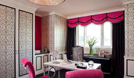
DECORATING GUIDESThe Art of the Window: A Valance for Every Look, from Country to Glam
Which of these 11 top treatments is right for you?
Full Story
DECORATING GUIDESTextile Textbook: Vintage Fabrics Tell a Story
We share a dozen ways to honor the past with heirloom textiles
Full Story
UPHOLSTERYFabric Focus: Make Your Interiors More Durable With Outdoor Fabric
Indoor-outdoor fabric is strong and beautiful, whether in the backyard or the living room
Full Story
FURNITUREOutdoor Fabric Joins the In Crowd
Stepping out in even the poshest interiors, durable outdoor fabrics have transcended sidekick status
Full Story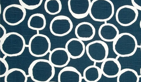
PRODUCT PICKSGuest Picks: 20 Blue and White Fabrics Perfect for a Cottage
Dress your furniture or accessories in a classic color combo done up in pretty patterns
Full Story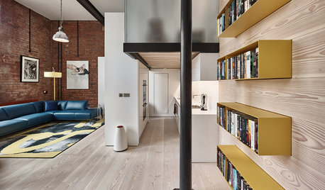
APARTMENTSHouzz Tour: Fresh Look for a Loft in a Former Victorian Fabric Mill
Better use of space and brighter light were priorities in this contemporary makeover in northern England
Full Story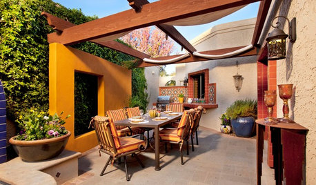
GARDENING AND LANDSCAPINGPatio Details: Sliding Fabric Panels Filter the Light Just Right
Stepping up to the harsh sun and heat of the desert Southwest, this intimate patio is an exotic escape right outside
Full Story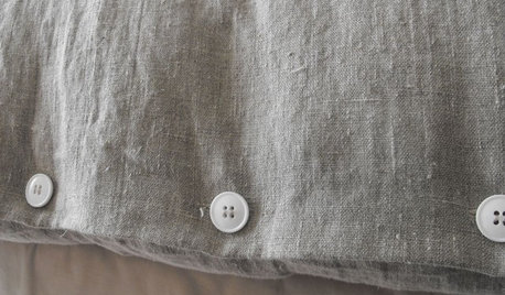
UPHOLSTERYFabric Focus: There's Nothing Quite Like Linen
Classic, understated, durable and mildew-resistant, linen is a casual fabric fit for any home
Full Story


sallymo2015