SHOP PRODUCTS
Houzz Logo Print
hey_j

Is SW Blonde orangey tan for you?

Janice
15 years ago

I've taken the opinions of many who love 'Blonde' and purchased the sample quart,

and boy am I glad I did!!! It looks really orangey on my walls! It has, (for me) a very

southwestern feel! I guess I'm really after a lighter golden tan instead!

I've got SW's Ivoire on some of my walls, having purchased the sample can and I

like that--although a tad more gold would be good and I guess I'll settle for it but

on the wainscoting we're installing I want a complimentary color in the tan family!

Anyone have any ideas for me!

Thank you so much!! I love this forum almost as much as the Hosta Forum!! :o)

I don't say much, here, these days, but I'm out here, listening in on your discussions!!!

Janice

Comments (32)

  • eliza_824
    15 years ago

    OH MY GOSH, you MUST try the old Duron Tobacco Road-- Sherwin-Williams can mix it. Just ask for a $5 sample of the old Duron Tobacco Road. They have it in their system. It's a gorgeous gold, but warm and not too bright. No orange undertones whatsoever. If you google "Duron Tobacco Road" there are three pages of links about THIS ONE color! Even on this forum, you can do a search and find lots of great things about this color. Here's one of my favorite links. I'm going to put this color in our new house,for sure!

    http://nestingplacenc.blogspot.com/2008/02/paint.html

  • parma42
    15 years ago

    A few of us have just posted our Blonde walls. I've provided a link to the current post.

    I'll admit to being thrown, a bit, when I sampled the paint on my wall, as it appeared to have orange in it. 20 quarts later, I went back to the Blonde and painted a much bigger sample in my kitchen. The orange vanished as you can see in the link.

    Here is a link that might be useful: Blonde

  • Related Discussions

    What shade of white trim with SW Blonde, Ivoire

    Q

    Comments (6)
    We're building a new home, and I've been wandering around into all the model homes (ones that range from $600-$900k) I can find in the area for inspiration (color-wise). My favorite so far uses Blonde for the dominant color (the LR and the DR each use the darker colors--Mannered Gold and/or Restrained Gold). At first, I thought the ceiling was the lighter color, Ivoire, but the best I could tell after further examination, it was painted Blonde throughout. The trim, then, was the lightest on the strip, Navajo White. Looks fantastic! What about repainting your ceiling in either the Blonde or Ivoire and then using the Navajo White as the trim?
    ...See More

    SW San Antonio Sage? Colors to coordinate w/Blonde?

    Q

    Comments (2)
    I'm not sure whether you really have your heart set on a sage for your great room, or if this idea is just too boring, but what about simply continuing the LA Gold #3 in the great room? Based on your description of your furniture and fireplace, I actually think a gold might be just the ticket for the room (I have a room painted SW Blonde, so I know what it looks like). It might also create a really nice flow with your kitchen, making it feel like a more unified space (unless you're going for a more separate feeling). Just a thought.
    ...See More

    SW Blonde, Pics please

    Q

    Comments (20)
    Princesssusan--I was in search of "that color" too! I think I tested about 25 varying shades/versions of that color. My favorites, though quite different from each other were BM 'Audubon Russet' (but too dark for where I was going to use it--a basement room) and Laura Ashley 'Spice' (you can find a paint chip at Lowe's), which won out, matched in SW paints. 'Spice' is what I call a "dusty pumpkin" color. The 'Audubon Russet' would more probably match the color of the building in your picture as it's a dusty brownish brick color. When I tried lighter "versions" of AR, they were too pink, according to my husband.....so that's why we ended up with a lighter, but more orange, color. On my monitor, the upper left paint chip you have looks similar to my 'Spice'. I'm about ready to give my kitchen a paint job, and the first color my husband suggested was 'Spice', and after trying other samples, I think it will be used there too. By the way, I'm a HUGE 'Blonde' fan and would like to use it in my kitchen, but I don't know how well it would go with gray (color of my countertops) or the soft smokey gray of the walls in the adjacent great room. Tracey
    ...See More

    Familyroom color suggestions? SW Blonde? Denim sofas

    Q

    Comments (4)
    I love SW Blonde, and decided to paint my great room this color 2 years ago when I built (in sunny SW FL). The great room does have tinted 8', triple sliders and a porch overhang.. and my room was sooooo dark, it drove me nuts! I ended up repainting the entire great room and dining room in SW Compatible Cream. It's lighter, but not much! I wish I went even lighter as it still is very cave feeling, and dark. :( I love SW Blonde in everyone else house, but just too dark for mine.
    ...See More
  • Janice
    Original Author
    15 years ago

    Eliza and parma--thank you so much for your helpful links and thoughts!

    On my wall, the color (seems to be toning down like you said, Parma) still looks like the color of Pattiem's first pic.
    on the link you (Parma) gave! If it could look like your pics. do, (on my monitor which is a light blonde) I would love it!

    Eliza--on that wonderful link you provided, several folks commented that 'Tobacco Road' was very much like
    'Blonde'!! That is my fear! I like the blonde (in pics), but it needs to be toned down (less intense or dark) for my room, I feel.

    The problem is, that the room is a family room 14'x 19' with two windows facing east (either side of a large fireplace) and a bay window facing south! The light coming in the room mid-day and bouncing off the wall I intend to accent just seems to be doing a number on that color. I like it at night, though! So, the dilemna, as so many have--finding something that will work day and night!

    I removed the dark barn-side paneling on that wall to make the room more open feeling! Funny--originally (30 years ago) I wanted a cozy
    rustic den-like feeling. Now, I want warm and yet airy! All the woodwork is stained dark. I'm thinking to paint it all a cream color but fear taking that step, since the bay looks so nice in the stained look with wooden shutters on the side windows (bottom only) and wooden blinds on the picture window. The front windows are trimmed in wood stained moulding and the windows all are stained! The sashes are white, though!

    I may look at a few other suggestions for 'tan' or warm beige I've picked up on this forum:

    S.W. Basket Beige, Whole Wheat, Plantation Beige and BM Shaker Beige, Plantation Beige and Millet!

    I have no idea what colors they really are but I'll find out!

    Eliza--do you feel the T.R. is as dark as the Blonde? Have you seen both colors to really know!! Loved the site you sent me too!!!!

    Again, thank you so much for your efforts to help me!!! I knew I could count on folks here to try and help a gal out!! :o)

  • parma42
    15 years ago

    One reason my color may look a bit different...I used SW's Cashmere base. Nice, rich look, however it lost some of its warmth (read 'orange' here if you'd like).

    My granite is a mix of rusts and cooler tones, something that only nature seems to be able to do, without a lot of hand-wringing, IYKWIM. I was a bit unnerved in the beginning and called the store after I had done side by side comparisons from the gallon the painter had used and my quarts-to-go sample.

    It appears that the SW Cashmere base is different, so they use different colorants in the mixture as well. While the sample had one red, the Cashmere used a another. Subtle change but a change I could notice. The result was a bit cooler color.

  • eliza_824
    15 years ago

    I have a swatch of the Blonde and an actual paint sample of the Tobacco Road. I got the Tobacco Road sample in the satin finish and it just looks gorgeous. While the blond looks similar in color, I think the blond looks more muted and less neutral if that makes any sense. I don't know what to say other than to maybe get a sample in both paint colors and paint a section on your wall to compare. I think the Tobacco Road is richer, but if it's too bright for you, you could maybe go with the Plantation Beige (which SW can also mix), which is a shade lighter.

  • eliza_824
    15 years ago

    You might also try SW Macademia-- I have three friends who put that in their home and it looks beautiful. Neutral, but golden (mildly) and warm.

  • equest17
    15 years ago

    I have SW Camelback, on the same card as Whole Wheat. I just love it. I also tried a Lowes color very similar to Blonde all over one wall and it was very orange (at least, in my low light north facing dining room). Camelback is very golden on my walls, just the right blend of warm tannish-gold I was looking for from Blonde.

  • tfm1134
    15 years ago

    Have a look at SW Believable Buff. It's a great color. I also looked at Blonde and Tobacco Road but ended up with Whole Wheat and BB and I am glad I did (although I would love to find a place to use Tobacco Road one day). Like equest17 said, they have the right amount of tannish-gold

  • Janice
    Original Author
    15 years ago

    Well, my list is getting longer, thanks to equest and tfm! LOL

    I'm also adding SW Macadamia as you suggest, eliza! :o)

    Parma--when you say your blond had a "Cashmere base", are you talking about in the color formula or as in the primer?
    As you can tell, I'm not very versed in paint lingo!!!

    And, Parma, do you have a can of your 'Blonde' left with the formula--it seems you might if you got that info. If so,
    does it have the full formula numbers on it, that you'd be willing to share?

    I'm wondering if my sample quart was mixed accurately!

    Again, thank you everyone for your experience and your sharing with me!!

    BTW---anyone know of a good very light olive color--not dark but a cheery version of it, sort of like split-pea
    soup with some white in it???

  • pumpkin_spice
    15 years ago

    I completely sympathize. I fell in love with Blonde seeing it in others' homes, so I painted my laundry room with it without testing first. Big mistake. It's very orangy tan! It's just a color that's very dependent on lighting I guess. Luckily it's just my laundry room, which I don't spend a lot of time in. I don't want to repaint because I don't want to have to move the washing machine and dryer.

    Most of my living area is painted in Tobacco Road, which I had mixed by SW. I adore that color.

  • mpwdmom
    15 years ago

    Check out BM Pittsfield Buff...it's a nice tan, with no orange. :)

  • CaroleOH
    15 years ago

    I have SW Whole Wheat in my LR - I posted a photo in a previous post per Phoggie's request. It is in a south facing room and gets good light. I would say it has a tiny tinge of green in it. Very pretty color.

    I have BM Wilmington Tan in the kitchen - true gold color very pretty. Blonde was just too much yellow/orangey in my house. I do like that color, but I think in some homes/lighting it is too much. I also have BM Pittsfield Buff in the FR. It is a beautiful color - soft gold, not yellow, but definitely a light muted gold.

    I also tried Believable Buff, but it was too light and the Pittsfield Buff was perfect.

  • parma42
    15 years ago

    The Cashmere base (actual 'type' of paint used from SW) formula is 6-32 and 1-128 of black, 1-32 and 1-64 of maroon and 2 oz and 42-32 of deep gold. Cashmere base of extra white. I used low lustre.

    Quarts-to-go Blonde is 8-32 and 1-128 of raw umber, 1-64 of new red and 28-32 + 1-128 of deep gold. Of course that's a quart so would have to be multiplied to get the gallon formula.

    I think if you're really afraid of any orange tinge, you might want to sample the gold I've used upstairs. It's a beautiful color with no beige, green or orange to it. Just a subtle gold. It's SW Biltmore Buff.

  • Janice
    Original Author
    15 years ago

    Okay--you all are so awesome! I've got my list in hand, now having all your suggestions.
    I have to babysit the grandboy this a.m. but after that, I'm on my way to check them ALL out! Whew!!!

    I SO appreciate your advice!!!! I'll let you know what I wind up with, for sure! I'll do some photos too!!

    I'll be back--you know I will! ;o)

  • Janice
    Original Author
    15 years ago

    I thought I'd share the list to check out with you--it also has some greens I want to see on it:

    Sherwin Williams colors:
    Whole Wheat:
    Softer Tan
    Macadamia
    Relaxed Khaki
    Universal Khaki
    Grassland
    Restrained Gold Hearts of Palm
    Sassy Green
    Duron's old formula 'Tobacco Road' #8214
    Duron Plantation Beige & Millet

    Benjamin Moore colors:
    Shelburne Buff
    Pittsfield Buff
    Wilmington Tan (true gold--no orange--tint of green)
    Northampton Putty
    Shelburn Buff
    Dill Pickle
    Dill Week
    Geoa Green Pittsfield Buff
    Lenox Tan
    shaker Beige
    Monroe Bisque

    Walmart:
    Colorplace-wistful Beige

    Lowes:
    Bayou Shade
    Toadstone

    Surely, there's something on there that will work! LOL

  • parma42
    15 years ago

    When you are in the SW store, you could pick up the card with Stonebriar on it. It's a very close match to Ben Moore's Wilmington Tan. Then you could keep it all in one family if you go with SW.

  • ttodd
    15 years ago

    Blond is one of those crazy chameleon colors as many people here will attest to. For me both Blond and Restrained Gold (next shade down from Blond) had awful green undertones to them in every rm. that I tried. On a last ditch effort I put RG on a wall in one last rm. and it was the most perfect camel color!

    I've seen SW Camelback used in people's rm.s here and it always seemed like a really nice alternative to when Blond goes gold.

    I've also tried BM Pittsfield Buff and Powell Buff. Whichever one the darker of the 2 is I thought was beautiful. No gold or green undertones.

    Good luck!

  • eliza_824
    15 years ago

    Pumpkin spice, if you get a minute, would you mind posting what the formula is for your Tobacco Road? Since I got mine mixed at SW, too, I want to make sure mine was mixed right! THANKS!

  • Janice
    Original Author
    15 years ago

    Okay ya'll--I have two versions of 'Tobacco Road', one made at Lowe's with a formula on the can that is not helpful at all and
    one made by SW! Here's that formula, eliza!

    BAC COLORANT OZ 32 64 128
    N1-Raw Umber - 19 (should line up under the '32' above) - 1 (should be under the '128' above)
    Y3-Deep Gold - 24 (should line up under the '19' above) - -

    The gal at Lowe's said there is a pinch of red in their forumlation as well as some black!

    Here's all that's on the Lowe's can: 101-1 107-7.75 109-0.25

    I have both on the wall, with the one being satin (Lowe's) and the other flat by SW. There is a difference.
    The Lowe's formula is darker! I even used Polycrylic on the SW finish (to see if the shine made the difference)
    and it still looked lighter (tad more yellow) than the Lowe's satin finished version.

    These are both nice colors but they were put on my walls late in the day so I'll see what I think tomorrow.
    On the main wall where it will be on wall to ceiling pine V-groove wainscoting, it looks rather dark. Thats the wall facing east.
    On the walls facing west, it looks rather yellow gold--with a lamp nearby and the wall to the north looks more tan/beige. Weird, huh!

    I have one more I'm planning on painting on the walls--SW Whole Wheat! I think it might be the better, for
    our space. I just don't want anything too dark due to having just removed VERY DARK barn side type of paneling
    and wanting the space brighter. When I put up the Blonde, it made the walls feel dark and closed in again. If I put
    anything too light on the walls, then at night they look bleached out too light!!! What in the world!!!!

    I'll wait and see how the 'Tobacco Road' looks tomorrow in better lighting!

    The two Buffs you suggested, Parma, look bleached out at night in our situation! Groan!!!

    I'm not giving up--I can't you know!!! :o)

    By the way--when I was checking for the formula on the side of the SW container, earlier this evening--at this computer,
    I apparently had not put the lid back on tight and dumped 3/4 of the quart on the desk, keyboard and floor underneath!!
    Stop laughing--it was HORRIBLE!!!! I salvaged the keyboard by immediately turning it upside down and the waterfall
    continued from the desktop through the slideout for the keyboard and puddled nicely underneath, thankfully on the
    large plastic mat made to accomodate a rolling computer chair! You should see the keyboard! I was able to clean it up
    pretty good but it will never look right again! Still works though!!!! Sigh!!!

    Tomorrow--there's always tomorrow, Lord willing!!! :o)

    Janice

  • elle3
    15 years ago

    Janice, I have the same formula for the sw tobacco road--also put it up yesterday. The guy at sw said he had several formulas for TR--I asked for the Duron TR, and he said he had it.

    I'm also waiting to see it in the daylight. I posted the formula on the "color obsessed fandeck holders" thread. As I mentioned on that thread, I have it painted next to the blonde, and it(TR) is a darker, more golden tan. My dh didn't like blonde as much as I did.

    I tried powell buff and pittsfield buff and they didn't read right in my room either. I took note of what parma said about the blonde in her lovely home being mixed in a cashemere base, which might make the outcome slightly different--I really love the blonde and want to use it somewhere!

    Gosh I'm sorry about the spilled paint!

    I can't wait to have this project done...
    Good luck to you :)

  • Janice
    Original Author
    15 years ago

    So what do you think, 'today' elle3? I'm a mess, myself! I fear it will be too dark all over the wall!

    Did it go brassy olive or gold on you on the lower halves of your walls in incandescent lighting--last night?

  • elle3
    15 years ago

    TRoad definitely changes throughout the day. But I think most colors do that--I'm just noticing it more because I am looking for it. At night it did seem to have a greenish cast, but I remembered what someone else said on this board about not deciding on a color until you paint a big section of the wall. I did that today, and the greenish cast seems to have disappeared. My husband and I both love rich warm colors, so this is right up our alley. We will buy a gallon and paint this weekend.
    My camera is not working, so no pics. I'll see if I can borrow one--this color always seems to have a lot of interest, and it's annoying when you can't see the finished product.
    If you go on the nesting blog site that has been referenced before (Eliza linked it, I think)and you scroll down to the entry with the white molding 1/2 way up, I would say that is pretty close to what it looks like in my house.
    I really like this color! I hope it works:)

  • eliza_824
    15 years ago

    Yea! I'm so excited for you, elle!! We all definitely want to see pictures when you're done! I'm jealous b/c I have to wait about 6 more months to put TR in my new home!!!!

  • Phobie Privett
    15 years ago

    I wanted Blonde also, but it looked like a flesh colored crayon in my house! I ended up going with Believable Buff, that is supposed to look tan, but looks golden beige (just like what Blonde should have looked like) in my light! I really like it!

  • elle3
    15 years ago

    Honestly, we should send this thread to Sherwin Williams and tell them there is a lot of interest in the old Duron formula for tobacco road. They should bring it back on a new card with lighter and darker hues:)

  • parma42
    15 years ago

    I had the same reaction to the Blonde as superchick when I first sampled it. That's why I went through 20 more quarts and when nothing was working, took the plunge and painted a much bigger section.

    It's also very helpful, when you've narrowed down a selection, to buy a gallon of the paint in the base that you're going to use. Sometimes the samples just don't compute to what you will get in the final product. They could have such a small part of a colorant, that it won't be in the quart but could alter the look.

    Hey j, I reread the top of this post. The Ivoire will have more of a gold when you have the gallon(s) on the wall.

  • ttodd
    15 years ago

    Janice - don't you hate spilled paint?!

    A few months ago I'd forgotten that I'd already pried the lid off of an old can of paint to do touch ups. I'd forgotten that I'd done that and when I came back to do the job I shook the paint can to mix it up. I had Baby Turtle all over my wood floors!

  • Janice
    Original Author
    15 years ago

    Good morning ya'll! Yeah, I'm from the south originally, well sort of--Florida, but should have gotten over
    most of the mixed accents and lingo of those who live there from birth to 21 years--you'd think!!! Actually,
    I have (lived in the North, now, for more years than I did in Fla.) I'm just trying to stay upbeat this morning~~

    Parma--I put the 'Ivoire' on a 12"x12" swath on our completed pine and primed wall! It definitely looks
    'buttery' this a.m.! I like it but hubby doesn't! Slump!!

    When you say 'gold' is that as in yellow-gold with very little 'blonde' type of gold or is it leaning toward 'blonde'?

    I love the 'blonde' in your pics. but as I agonized before, it comes across dark in a large painted area on our drywall,
    before the pine was put up.

    The cashmere base you speak of, would that be appropriate for the pine portions? I always think the least shine, on
    wood, that would be acceptable is the eggshell!

    Now, in daylight, I'm looking at 'Powell Buff' as a possibility but remember reading on some
    post that it was way too 'yellow' for someone. I guess I really want a color that perhaps would be best
    described as coffee with a fair amount of cream in it!!

    I also held the chip of 'Believable Buff' and it looks like it might work, too--surprisingly!
    When I had the 8 1'2 x 11' sheet of the color it seemed to disappear at night when taped to that wall!!

    I'm so tired!! But--I'm pressing forward--have to or I'll just be stuck with this problem forever!!!

  • Janice
    Original Author
    15 years ago

    Oh, I missed your post, ttodd, while 'constructing' mine!

    LOL--funny how it sounds funny when such a thing as you and I've described happens to someone else!

    When my fiasco happened, I got quiet as a church mouse, because I didn't want hubby to see how bad it was till I did my best
    to clean most of it up! I expected him to freak out! Cleaning it up and praying that he wouldn't get as upset as I expected, he
    came looking for me and of course realized what had happened. THANKFULLY--he didn't react as badly as I expected him to!
    Of course, by the time he missed me, the waterfall from desk top to keyboard drawer to floor had finally subsided and I had
    most of it off the desk, papers thrown (that had been swallowed up in the tide) and was working on the keyboard slide out! It was still
    puddled on the mat which was, THANKFULLY, on the carpeting which was a total blessing! I used up almost all of one roll of Bounty
    and finished up with a wet hand-towel!

    Now, as I'm typing, I still see a smeary residue on the keyboard but, so far, it's still working!!!

    Thank you for sharing your experience--it helps to be able to laugh a little about it now!! :o)

  • parma42
    15 years ago

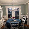
    I'm losing track of what threads I've posted these pictures on and apologize if you've seen them before.

    I've added one of our entry (also Ivoire) from just after we moved in.


    The Cashmere is just a base and can come in many finishes. I used Low Lustre but you can have more sheen.

    You've really thrown me for a loop when you said "coffee with cream". Before, you wanted more gold. I don't see any gold in my coffee, lol.

  • Janice
    Original Author
    15 years ago

    I KNOOOOWWW, Parma--I've thrown myself!! Sigh!! Daylight and night have really done me in!!

    Right now----I have many chips in hand and have decided (in daylight) that 'Believable Buff' may be an option
    if it doesn't go too olive green at night for me.

    BM's Monroe Bisque or Pittsfield Buff also look good with the leaning toward the more 'tan' of the MB
    being a better match for our sofa (which I've come to hate the fabric of)!It's a plaid (groan) that incorporates
    a deeper teal green stripe (1/2") with crosses of stripes that look more tan/peach (groan)and other crossings that
    create almost a grey/green! I know---but, I thought it was wonderful 15 years ago!!!

    I'd get rid of it and go for something new, except it is a very good quality built 'Bern'(amish families--kin to the Smith's,
    both in Indiana who also make a great line of furniture) line, substantial, an all-wood construction with all the details that
    make for an excellent piece--except for the fabric--NOW.

    I know there is no yellow in the fabric. I know it probably doesn't make any sense to go that direction,
    but I love the warmth of yellow and hope it can be considered 'neutral' going with almost anything!

    I have EK's 'Buttercream' in our master bedroom with her 'Ashen Green' trim and it's an awesome look but not
    for this room. The green would wash out to grey (tried it) and the Buttercream would bleach out, too! I've considered
    the 'Honeysuckle' but I really can't deal with too much in the way of 'peach' tones which I fear it could gravitate
    toward in that room! However, I bet it would work if I could tolerate the moments of pinkish yellow! It sounds
    more right for the funiture!

    I also need to get this done, because the flooring goes down on the 28th and I fear I could not get a sample pot from EK
    fast enough to get it all done, if it's not what I like in the end!

    I've recently reupholstered a platform rocker for our youngest daughter and am seriously considering undertaking
    recovering this sofa--into a single color (more neutral)and with texture! Another project!! Sigh!

    I'm off to the stores!!!!! Groan!!!!

  • Janice
    Original Author
    15 years ago

    No, I'm not off to the store! I'm thinking to go ahead and take the plunge--be an idiot and take a chance,
    and order EK's Honeysuckle and Sand!

    Someone, talk me out of this!!!!! Unless---it's what I'll really ultimately like day and night--of course!!!!