


Color Guide: How to Work With Beige
If you yawn and dismiss it, you're missing out on beige's infinite subtleties and the possibilities it brings to room designs
Samantha Schoech
October 10, 2012
Houzz Contributor. I am a former magazine editor specializing in travel and design. I just completed my first remodel, turning my crumbling 1941 kitchen into a beauty of grays, whites and natural wood. If I could, I'd sleep on the countertop. That's how much I love it.
You can also read my parenting blog on Baby Center http://blogs.babycenter.com/author/sschoech/
Houzz Contributor. I am a former magazine editor specializing in travel and design.... More
Oh, beige. So overused, so undervalued. Beige is like the plain, dutiful city clerk. She keeps the town running smoothly, but no one throws her a parade. But boring old beige doesn't have to be boring. It's just that it is too often used as a default, with no real thought about tone, hue, value and what other colors might look great with it. It's slapped on cheap apartments and homes about to be put on the market.
Beige is nearly infinite in its subtlety. Which beige you choose can alter the entire mood of a room. It looks different depending on the architecture and kind of light.
Beige is also known as tan, buff, cream and even khaki. It varies from nearly brown to very pale cream. It can have warm yellow undertones or pink undertones or be nearly gray. "Greige" seems to be the "It" neutral at the moment.
Warm, yellowy beiges look great with teals, turquoises and other yellow-blues. True red looks vivid and elegant next to darker warm beiges. Beige and pink also looks lovely, no matter the undertone.
Layering beiges creates a soft, calming look; it makes you feel like you're walking into a room made of cashmere. And all beige tones, no matter how light or dark, work with bright white trim; nothing looks crisper or more traditional than this combo.
Beige is a favorite of traditional styles, but it is really everywhere — even in wide-open modern spaces and wild, eclectic boho spaces. It's the unsung workhorse of the decorating world. And if you can see past its bad reputation, you can appreciate its subtle beauty.
Compare: More Houzz color guides
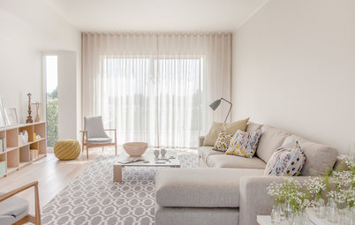
Beige on the Walls
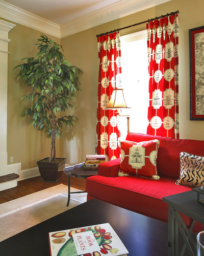
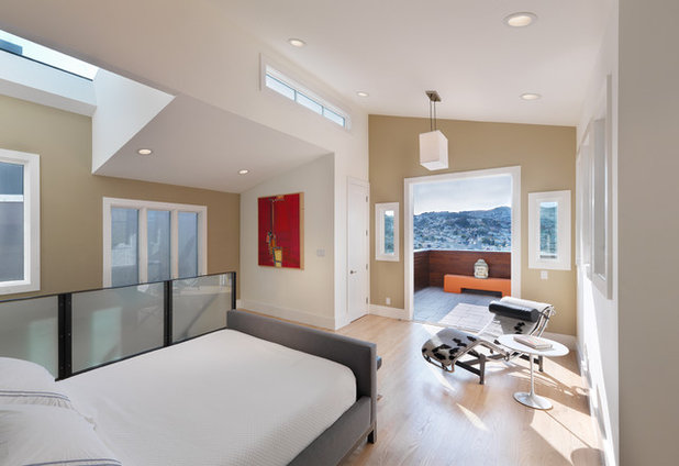
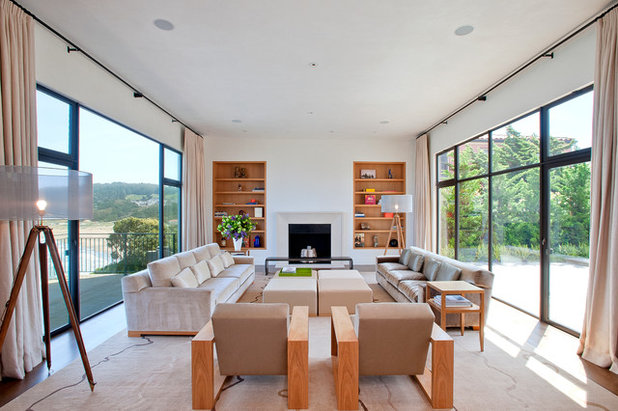
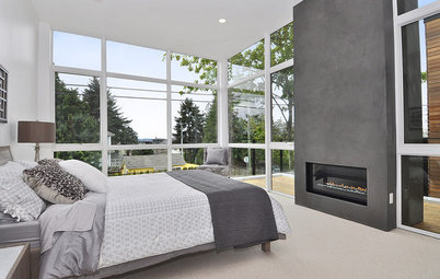
A light, cool beige in this giant room adds a little warmth but remains steadfastly modern. Light beiges are a great alternative to bright white in modern spaces.
Find a local painter to get your own beige walls
A light, cool beige in this giant room adds a little warmth but remains steadfastly modern. Light beiges are a great alternative to bright white in modern spaces.
Find a local painter to get your own beige walls
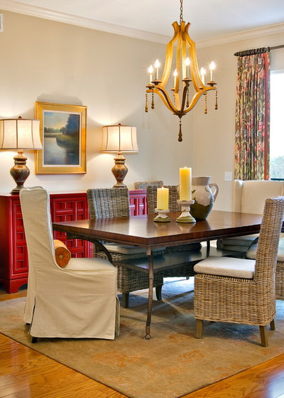
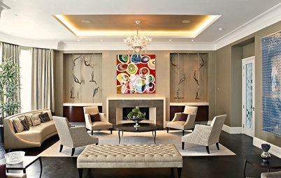
A rich, warm beige with bright red is always a winning combination. Bright white trim keeps it all crisp and clean.
Layers of beige — from a very light cream to a dark tan — add to the airy, calm feeling of this room.
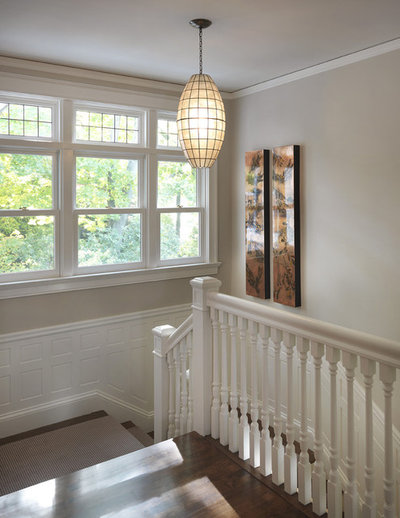
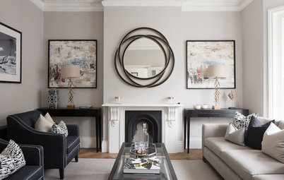
The beautiful architectural details in this stairwell are enhanced by the contrast between the beige walls and the white trim.
A warm, dark beige with a light, warm blue. Sand and sea, a classic combination.
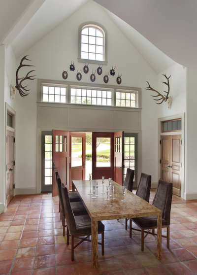
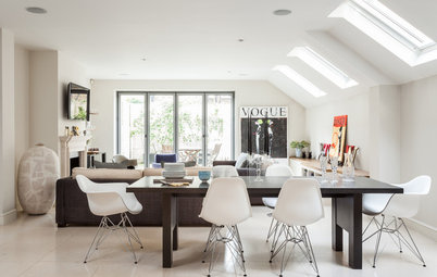
Beige is a great backdrop for an eclectic room with lots of color. It’s warmer than bright white, and it doesn’t compete with the accessories and furniture the way another color might.
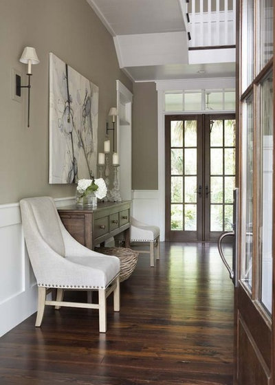
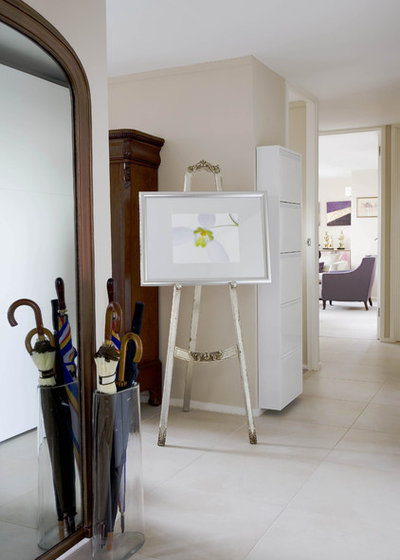
This grayish beige gives this hallway a very elegant, very traditional feel.
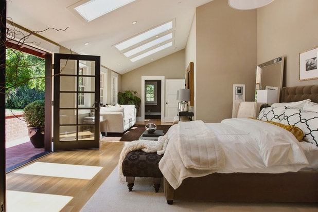
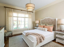
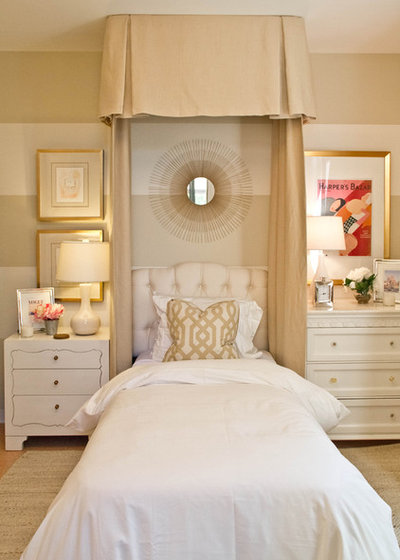
This is a well-thought-out use of beige. There are different hues and tones on the walls, ceiling, bedspread and floor. And, again, the layers create a feeling of sanctuary.
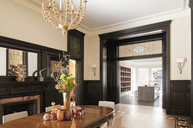
A light, creamy beige with glossy true-black trim. It's elegant and less predictable than white. I love this room.
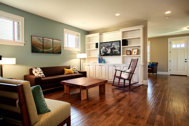
Too often beige is just slapped up as the base color. But it can work as an accent too. These beige walls highlight the angles in this room and give it depth.
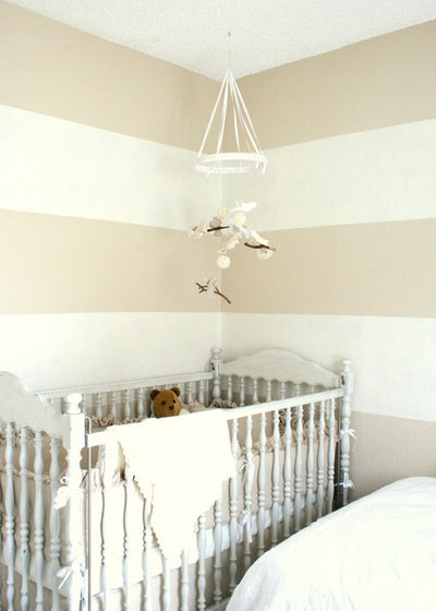
These subtle and chic beige and cream stripes are a great alternative to the pink and blue nursery. So soft and calming.
How to Paint Perfect Wall Stripes
How to Paint Perfect Wall Stripes
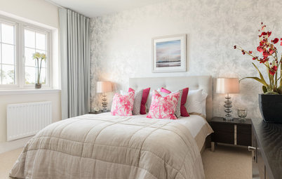
Pink-beige gives this room a softness that a cooler or darker shade would not.
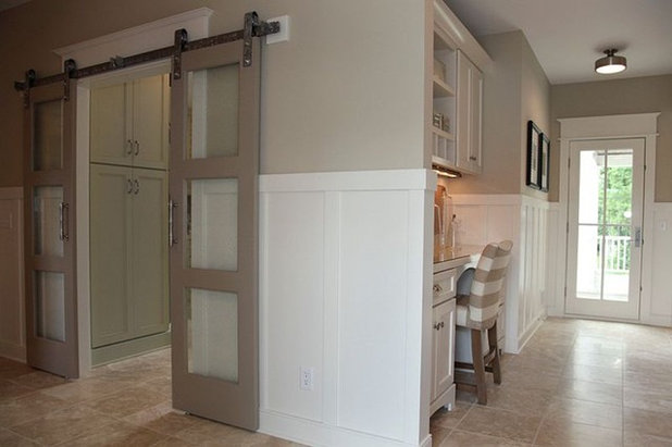
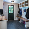
Beige doesn’t have to be the wall color; it can be the trim. These dark beige doors look great with these white and light beige walls.
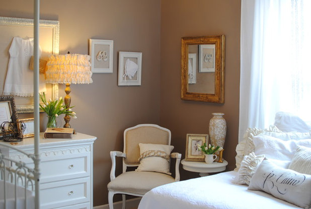
Feminine white furnishings are anchored by this dark beige wall color. And it looks great with gold too.
Beige walls with a dark beige trim. Painting trim darker than the walls is the opposite of what most people do, and it always looks fresh and modern — even here, with traditional wainscoting and other flourishes.
Beige in the Bathroom
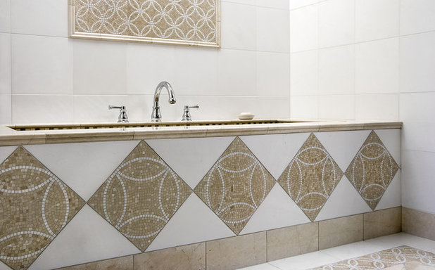
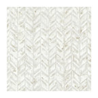
This beige tile design is such a beautiful contrast to the bright white in the rest of the bathroom. Eye catching but subtle.
This beige tile design is such a beautiful contrast to the bright white in the rest of the bathroom. Eye catching but subtle.
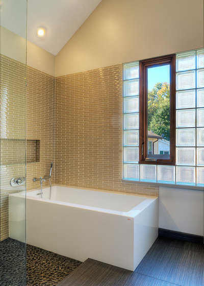
The beige tiles behind this tub are rich and caramely. I think I would have continued the white from the ceiling onto the upper wall, to create even more contrast.
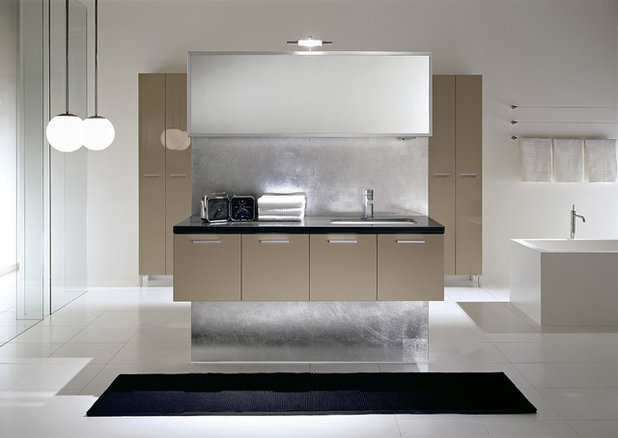
Beige gets modern. I love this shiny foil finish for a modern and sophisticated bathroom.
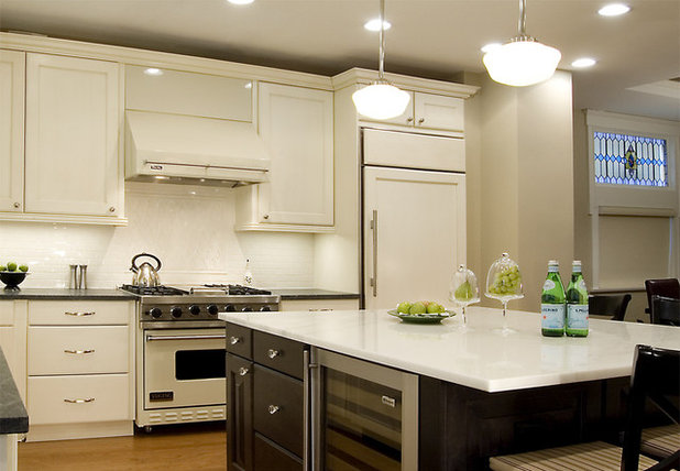
Beige in the Kitchen
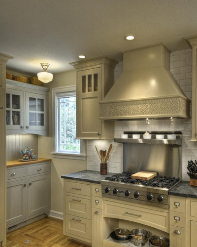
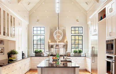
Beige cabinets and appliances are a nice alternative to bright white. Everything is still crisp and clean looking, but a little less severe.
Beige cabinets and appliances are a nice alternative to bright white. Everything is still crisp and clean looking, but a little less severe.
Here, light greige walls set off the modern white cabinets and appliances.
Decorating With Beige
The beige sofa, rug and walls are the perfect foils for other colors and textures. It’s traditional meets eclectic.
The beige sofa, rug and walls are the perfect foils for other colors and textures. It’s traditional meets eclectic.
Minimalist and modern and beige.
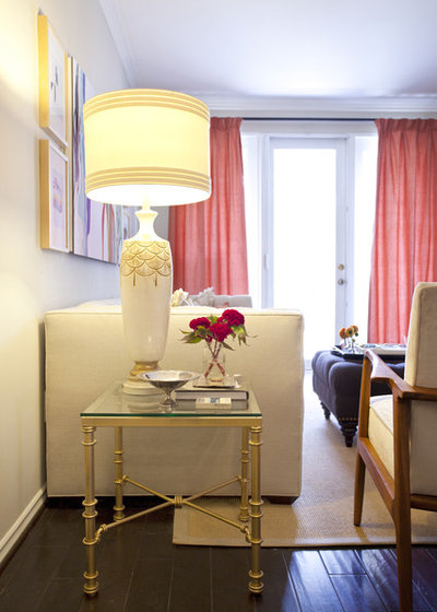
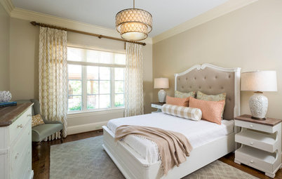
A creamy beige sofa, walls, rug and chair with warm pink curtains. This room is so refined and lovely.
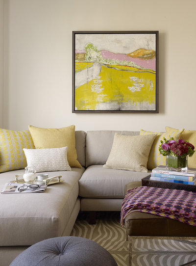
Beige as an accent with warm white. Used like this, beige becomes a color full of possibilities.
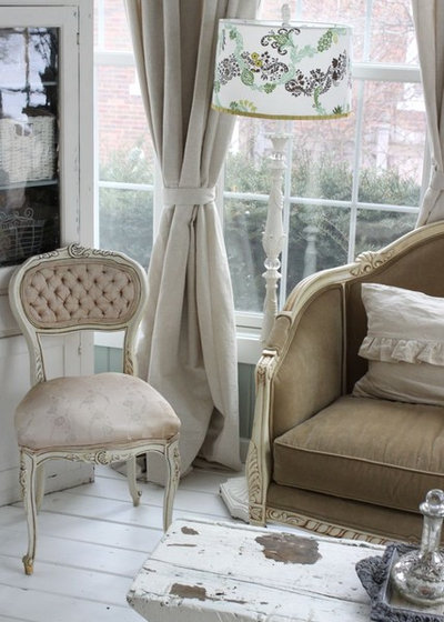
Traditional chairs upholstered in various shades of beige linen. The word "beige" comes from a type of undyed cotton. This room has a very airy, stately feel. It's shabby chic in the best way.
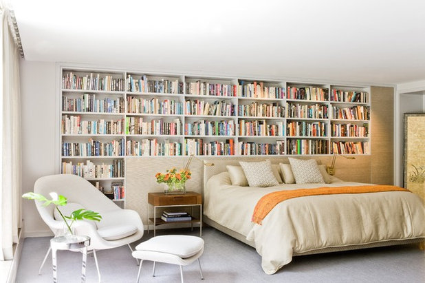
Beige but not boring. All the different shades of beige here are the perfect backdrop for the multicolored wall of books and the various pops of bright color. Love it.
Beige Outside
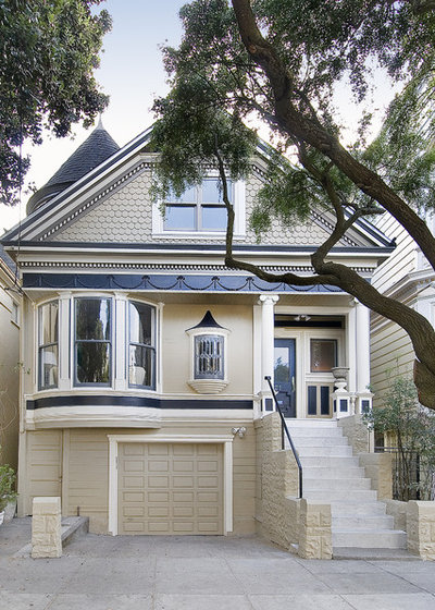
A beige Victorian with navy trim. A classic.
A beige Victorian with navy trim. A classic.
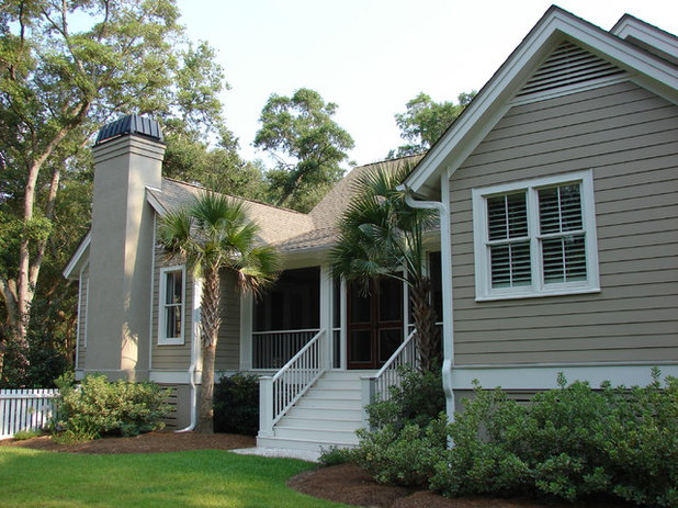
The old standard: beige with white trim.
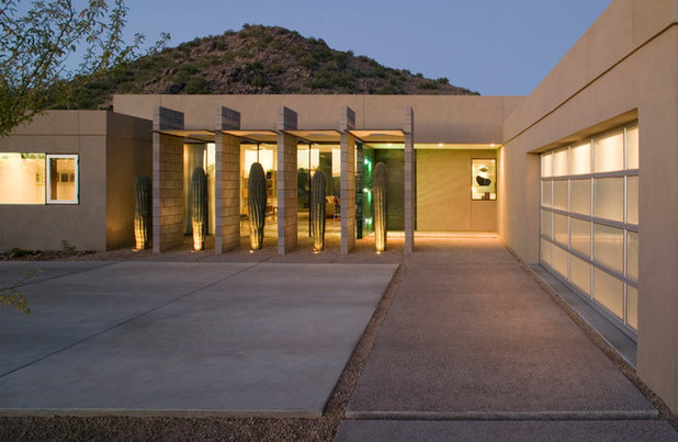
A sandy desert beige.

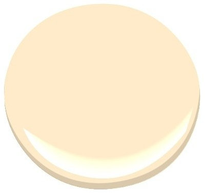
Benjamin Moore
A dark true beige.

A lighter true beige.

Benjamin Moore
A pink-hued beige.

Still pink but even warmer — a salmon beige?

Benjamin Moore
Pink and yellow undertones.

Benjamin Moore
Pale pinky beige

Benjamin Moore
A light tan with green undertones.

Benjamin Moore
Lighter but still cool and green. Kind of an ecru.

Benjamin Moore
Another greenish beige but a warmer one. Imagine it with a bright white trim — very crisp.

Benjamin Moore
A very warm, yellowy beige. Great with red.

A warm medium beige.

Benjamin Moore
A very yellow beige. This would look stunning with a warm blue.

Benjamin Moore
A warm greige.

Benjamin Moore
A cooler greige.

Benjamin Moore
Nearly dove gray but still a beige.
Benjamin Moore
A light, creamy beige. Many of these are in the white family.

Benjamin Moore
A tad darker but still very creamy.

Related Products

We at Frasure Home Improvements feel like everyone deserves our best. We constantly push for excellence. We truly... Read More
Related Stories
Kitchen Design
8 Ways to Jazz Up a Neutral Kitchen
By Neila Deen
See these creative ideas for giving a white, gray or otherwise neutral kitchen more personality
Full Story
Kitchen Design
10 Ways to Rev Up a Neutral Kitchen
By Laura Wheat
Texture, shine and paint tricks energize monochromatic cooking spaces
Full Story
Bedrooms
Creams and Champagnes Warm This Guest Room
By Becky Harris
The homeowners said, ‘No gray in this house,’ so in come golden-wheat, tan, beige and off-white shades
Full Story
Living Rooms
10 Design Ideas for a Neutral Living Room
Strike a balance between character and calm with these classy design ideas. How many are you already using?
Full Story
Most Popular
Rethinking Beige in a World Gone Gray
By Janet Dunn
Gray, the ‘it’ neutral of recent years, has left beige in the shade. But is it time to revisit this easy-on-the-eyes wall color?
Full Story
Color Palettes
How to Prevent Your Neutral Decor From Falling Flat
By Laura Wheat
Dodge the bullet of bland interiors with these tips for enhancing a neutral color scheme
Full Story
Color
How to Create Calm and Character With Light Colors
By Kelly Porter
Light paint and pale woods can feel rich and cozy too. Here are 7 design twists and colors to try
Full Story
Most Popular
What’s Your Neutral: Beige or Gray?
A designer shares 10 tips for using the neutral shade that works best for you
Full Story
Color Palettes
How to Do Neutrals With Attitude
By Laura Wheat
Add a little edge to a neutral palette with pattern, texture, contrast — and a dash of color
Full Story
Color
8 Great Color Palettes: Surprising Bedroom Neutrals
By Jennifer Ott
Peaceful plum, relaxing black and many shades of gray show an unpredictably neutral nature in the bedroom
Full Story
So I’ve been hearing, grays are passé, and like any overdone trend I’ll be happy when something else dominates the market.
Beiges are beautiful in their own right. Well, maybe except for pink beige. I’m craving a more fresh and clean paint palette in 2019.
I just painted my north facing bathroom no less than three times. I should have gone with my gut and used BM Inner Balance but I avoided it due to the beige-is-boring stigma. Regrets.
We have (Menards) Colorado Canyon stacked stone accent walls in the bathroom, and dark gray and cream/beige colors in the stone - very pretty. I tried BM Alaskan Husky - too light, went a little purple in the north light. Then I tried the next color on the strip, nope that one went little boy blue, so then I just tried BM Winter Solstice and well it’s a little purple too and just too dark for this north room. Disappointed. My adjoining master is a beautiful ethereal blue, BM Lookout Point, nice light fresh and airy, and I think inner balance would have coordinated well, like a sand and beach feel to it. I shouldn’t have let some stigma overpower my original instinct.
Happy Painting and Happy new year