I started to post on another thread regarding "lay-out pet peeves" and stopped because I realized that most everyone was talking about things that were more a matter of preference than truly poor design.
By "poor design," I am not talking about the kinds of things that different people tend to feel differently about such as whether closets should or should not be accessible only via the master bath; or whether the master bedroom should be close to secondary bedrooms or at the opposite end of the house for extra privacy.
I am talking about the kinds of things that make a house less than "user friendly" for EVERYONE regardless of their decorating preferences or whether they're 25 with 3 small children or 75 and retired. And I'm especially talking the kinds of things that folks who are not floor-plan savvy are unlikely to notice when looking at a plan.
After looking at about a kajillion on-line stock plans and dozens of custom plans posted here, it seems to me that the same kinds of truly poor floor-plan layouts crop up often enough that it might be helpful to compile a list of things that everybody starting a plan search (or working with an architect for the first time) might want to watch out for.
These can be major issues that you've noticed showing up on a lot of plans that you think either ought to be cause for rejecting such plans completely or relatively minor things that can usually be rather easily modified to make the plan better.
I'll start...
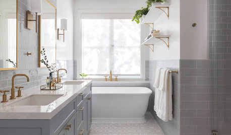
1. View lines from the front door directly into a bathroom (especially view lines that let you look right at the toilet)
2. View lines from from the kitchen or dining areas directly into a bathroom.
3. Small toilet rooms with doors that swing into the room. (If someone passes out while on the throne and falls to the floor, his/her body blocking the door will make it harder for EMS to get in to provide aid.)
4. Long long narrow dark hallways.
5. Hallways with several bends and twists that will make it nearly impossible to get furniture into/out of rooms.
6. Closets that are not really wide enough or deep enough to actually hang clothing as indicated by the drawings. Hanging clothing requires about 24 inches of space from the wall. So, you simply cannot have a 5 or 5.5 ft wide closet and hang clothes on both side walls because it won't leave you with enough room for an aisle down the center. But I see this sketched all the time on stock plans and even occasionally on custom plans!
7. Walk-in closets that are about 4 ft deep and 6 to 8 ft wide or wider with a single door in the middle of one of the long sides. This is a waste of space and no one is going to enjoy sliding between wall and clothing to get to the clothes that are hung at a distance from the door. Better to make the closet a normal reach-in closet with a couple of out-swinging doors and incorporate the rest of the floor space into the main room.
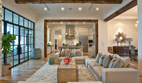
8. Kitchens with "barrier" islands. If you have to detour AROUND the island to get from sink to refrigerator to rangetop to sink, it's a barrier island. Cooking in such kitchens often results in bruised hips as one careens off the island while moving from one work area to another.
9. Kitchens with no work space next to the range top and no counter space beside the refrigerator. Both places need at least SOME work space beside the appliance.
10. Kitchens with aisles that are too narrow. Watch especially for designs with the sink and stove directly across a narrow aisle from one another.
11. Kitchen designs that show refrigerators the exact same depth as the countertop. Even expensive "counter-depth" fridges stick out into the aisleway a little bit. The typical modern non-counter depth fridge will stick out as much as 12 inches into the aisle. If the aisle in front of the fridge is only 3 to 3.5 ft wide, you'll have a hard time even opening the fridge door and squeezing past the fridge on a daily basis will be a PITA.
12. Kitchens that show barstool seating without enough room for someone to actually sit on those barstools at the counter while someone else walks behind them.
13. Any room that won't actually accommodate the typical furniture that one would expect to find in such a room. (i.e., bedrooms with no place to put a bed and nightstand and at least on chest of drawers; living rooms with so many necessary pathways thru them that there is no way to arrange a sofa plus a couple of chairs and side tables, dining rooms that are too narrow or too short for a standard sized dining room table for six plus chairs and room to get around the table to get in/out of all the chairs.
14. Garages that are so big they totally overwhelm the house.
15. Garages that are not wide enough or deep enough for the number of cars that they are supposed to hold. Garages need to be at least a couple of feet deeper than the length of the longest vehicle you ever expect to own and you need at least a couple of feet of clearance on each side in order to be able to open car doors. And, if you plan on storing anything in your garage, the garage width/depth should be made bigger in order to accommodate storage. Also be aware of any staircases leading up to the man-door to the house and know exactly how far into your "parking space" they will extend. One person I know started building a house from an online plan and discovered that she would need something like 7 steps to get up to the door to her house. Those 7 steps extended so far out that there was no way she could still park a car in the remaining space. (But while making sure the garage is big enough to accommodate your garage needs, keep #14 in mind!)
16. Big homes where the entry from the garage walks you right in front of the washer and dryer. I totally understand that in smaller, less expensive homes, the most space effective spot for the washer and dryer may be in the garage entry may be but when square footage climbs up over 2000 sq ft, one really ought to be able to find a better place to do laundry. Family members and close friends should not have to step over/around piles of laundry every time they come in!
17. Room where the ceilings are higher (or nearly as high) as the rooms are wide. Even worse, rooms where the height is the greatest dimension in the room! Such rooms tend to feel like elevator shafts. They are hard to heat/cool, almost impossible to decorate effectively, and totally uncomfortable for conversation or watching TV due to echos.
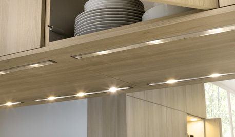
18. Can lights over stairwells. When a can light bulb that is 12 to 20 feet above the staircase burns out, it is very very difficult to replace it because there is no safe place to put a ladder. Who wants to have to go out and rent scaffolding in order to replace a light bulb? If your stairwell is wide enough, wall sconces are a much better solution for lighting the stairway. Otherwise, hanging pendants that you can actually REACH while standing on the stairs are a much better choice.


lavender_lass
Annie Deighnaugh
Related Discussions
Trying things out when your plans go awry
Q
What else to consider when running wiring
Q
What do I need to consider when choosing counter height bar stools?
Q
Consider new home - need input/thoughts on floor plan
Q
nightowlrn
zone4newby
ILoveRed
cpate
okpokesfan
Arhsub
Annie Deighnaugh
Annie Deighnaugh
lazy_gardens
jdez
LawPaw
jeff2013
Spottythecat
bird_lover6
lavender_lass
annkh_nd
joyce_6333
lavender_lass
Zoe52
estrella18
bevangel_i_h8_h0uzzOriginal Author
Annie Deighnaugh
emmachas_gw Shaffer
chicagoans
bpath