


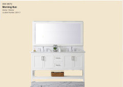
Is Sherwin Williams morning sun color too yellow for my master bath?
Marie K
2 years ago
Featured Answer
Sort by:Oldest
Comments (10)
Related Discussions
Sherwin Williams light yellow tan
Comments (4)SW Whole Wheat may indeed have green undertones -- in some other house somewhere but who's to say it will in yours. There are two kinds of undertones. Inherent and in situ. Some colors have no characteristic of undertone at all, just masstone. Inherent undertones may remain true in context or might not. Sometimes when the color is viewed in context of the room and its contents, the inherent undertone shifts as it is affected by the surroundings and quality of light. So, an inherent green undertone detected in a Whole Wheat color chip could completely shift and disappear when the color is sampled in the room. Likewise, just because Whole Wheat shows with a green undertone in one room doesn't mean it will in all rooms. If you're thinking Whole Wheat, test it. The other issue is while color forumlas and mixing is relatively accurate and consistent, there's no guarantee that all quarts and gallons and sample pots are mixed the same. With Blonde specifically, I've seen two gallons of the color from the same store with the presumably same formula paint out and show as two markedly different colors. That's why some people box paint. And also why it's a good rule to start and stop batch to batch in corners....See MoreSuggestions on Sherwin Williams off-white,cool tone paint colors?
Comments (11)I can say I might trump you on living in a dreary area! I'd buy some 4 poster boards from Michael's or where ever you have locally cut them in half so you have 8 pieces to sample 2 colors. Leave a 2" border of white all the way around and paint the rest with any of the colors you choose or any I have mentioned. I'd go for City Loft or Aesthetic White. Shoji is another that will lean slightly gray, but I didn't sample it as I'm familiar with it in other spaces and for my space and furnishings in the eat in sunroom I knew it would not work. It really is a lot of work, but to get it right.... You have some interesting colors and the only way to know is to try even though it's a pain. I'm not done, but here is a photo of Aesthetic white in my sunroom. TALK ABOUT DREARY and you can see high it leans a bit slight gray. I cropped the photo as this is the only spot I have 2 coats to have you best see. The room has three taller windows left and right with a paned single door to the backyard and on the back wall 4 large paned windows so there is a lot of light in this space. As you move in to the kitchen it's not as bright, but the light from the sunroom toward the kitchen makes the paint look a pinch lighter more like the bottom of the photo. I hope it helps you and as I mentioned paint can change from room to room. I found it a nice compromise I was very torn between Egret and City Loft and Aesthetic White all having slight nuances that differ, yet barely. I had used Aesthetic in an office I did recently and loved it so I tried in in my home and well.... I do love it and will use it more in the future....See MoreWhich Sherwin Williams color would be just slightly deeper than Downy?
Comments (20)why do you think that Ben Moore and Sherwin Williams don't post the color information on their paint chips like Glidden does? Oh, gosh. Lots of thoughts on this. Will try to keep it as short as possible. First, all paint brands already have these data values and notations for every color - they couldn't MAKE paint colors without it. It's that color DNA I'm always talking about. Sherwin-Williams used to share the Munsell notations for all their colors. Learned this from a color scientist who used to work for SW - and I acquired that original PDF. We don't use the SW Munsell notations, however, because we do our own here at The Land of Color. Just because I have major control issues when it comes to the data - it has to be perfect. The Glidden notation is their own proprietary color system developed in 1978. It has its own color wheel, and LRV and Chroma scales. It's all published in the front of The Master Palette fandeck. Their proprietary system is different from the Munsell color notations I like to use. Munsell is my favorite for several reasons but mostly because I've used it for so long it's second nature to me. Glidden's system is a damn good order system. It is the first and, one and only, color system designed specifically for architectural coatings. Its formal name is the Acoat Codification System. So, yeah, color order systems for paint colors specifically have been a thing for 42+ years. All things considered from a color science perspective, I think paint brands choose to talk about undertones, color trends, and forecasts because they are intangible - no one is ever wrong talking about undertones, trends, and forecasts because you can make up whatever you want; there's a kind of banal safety in the inherent subjectivity of each one. They don't have to hire anybody with any special color knowledge or experience to market their paint if they focus on intangibles like undertones, forecasts, and trends. Because, again, everybody is making it up as they go anyway. When you get into the color science, data values/notations in particular, that's a special skill set. You can't just make up whatever you want when it comes to the science of color, how color really works, because there's 100+ years of well-researched and well-documented sources and standards to reference about all things color spaces and systems. And anybody can Google and find it - all of it. Before I publish ANYTHING anywhere, I like to have 3, academic level, quality sources to cite in my back pocket. I don't do Wikipedia and I'd eat nails before citing a blog as a source for color information. When you're speaking to color in such evidence-based, tangible terms, when you're talking about quantifying how the human eye sees color, you have to know what you're talking about. Because it's science. It's physics. It's psychophysics. I suspect that's more work, responsibility, and accountability than paint manufacturers are capable of dealing with. The murky world of undertones, trends and forecasts is cheaper, easier. And, honestly, probably more fun to spin in the intangibles and espouse opinions with reckless abandon, giving zero !@#$s if it's accurate or not. The problem is, it's 2020 and the color tech tools like Color Muse, NIX, Color Reader is making the science, an evidence-based approach to color - data values specifically - available to anyone who knows where to look for them in the apps. Which means more and more people are learning about the color systems that have been around for 100+ years and want to know why the frameworks of color data values and notations have been unshared. I will say this, whichever paint brand is the first to "get it" when it comes to an evidence-based approach to color and publishes Munsell notations on their apps, website, and paint chips, is going to win not only the internet but paint world in general....See MoreCoverage on Sherwin Williams colours with high reflective white base
Comments (4)I can speak only to having done our master bath and closet, and it seemed crazy to me that the previous color was SW Accessible Beige (not dark) and we were redoing in BM Super White. The painters did not prime bath area before painting saying they prefer to just use the paint in more coats, which was absurd to me at $75 a can of BM paint! Took them 3 coats. I was responsible for doing the large closet and although I primed first, still it took two coats for full coverage. I would insist on priming 2 coats if necessary (and cheaper), matter of fact have the primer tinted to the room color might help too. I swear paint is getting thinner requiring more coats no matter what. I've used Behr, SW and BM and find this to be the case. Good luck to you!!...See More
Marie K
2 years ago

Related Stories
COLORBathed in Color: Favorite Yellows and Golds for the Bath
Get a golden glow for your bathroom with these expert paint picks and ideas for yellow walls
Full Story
COLORBest Ways to Use Exclusive Plum, Sherwin-Williams’ Color of 2014
Pretty, moody, maybe even a neutral, this toned-down grayish purple can work in any room. Here's how
Full Story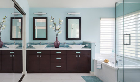
BATHROOM DESIGNRoom of the Day: Breezy Colors Soothe and Relax in a Master Bath
An ocean-inspired palette lends a calm spa feeling to this bathroom designed for a busy couple
Full Story
INSIDE HOUZZWhat’s Popular for Toilets, Showers and Tubs in Master Baths
Self-cleaning toilets and tubs with heated backrests are among the novel choices cited in a 2018 Houzz bathroom study
Full Story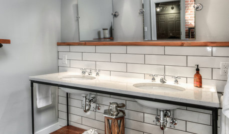
BATHROOM MAKEOVERSRoom of the Day: A Master Bath Replaces an Awkward, Unused Space
See before-and-after pictures of a Nebraska bathroom built from scratch
Full Story
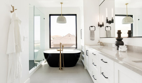
BATHROOM MAKEOVERSRoom of the Day: Craftsman-Style Master Bath With a View
A designer rethinks the layout of a Colorado bath to give the homeowners more storage and a cozy corner shower
Full Story
COLORBathed in Color: When to Use Pink in the Bath
Even a sophisticated master bath deserves a rosy outlook. Here's how to do pink with a grown-up edge
Full Story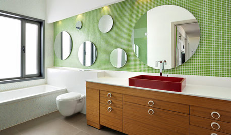
COLORBathed in Color: When to Use Green in the Bath
Splash some spring-conjuring green paint, tiles or accessories around your bathroom for natural appeal
Full Story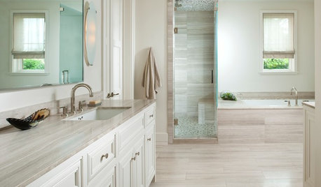
COLORBathed in Color: How to Get White Right in the Bath
Get the pure look you want without going institutional by paying attention to tone, texture and sheen in an all-white bathroom
Full Story


Beth H. :