


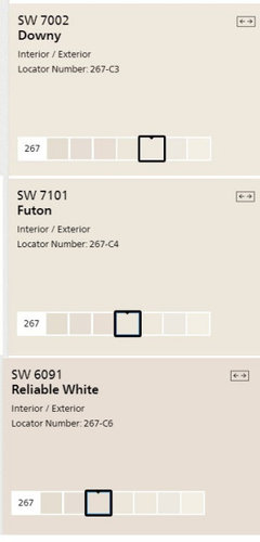
Which Sherwin Williams color would be just slightly deeper than Downy?
laddie903
4 years ago
Featured Answer
Sort by:Oldest
Comments (20)
 PRO
PROBeverlyFLADeziner
4 years ago
laddie903
4 years agolast modified: 4 years agoRelated Discussions
What is Your Favorite Trim Color and Sheen (Sherwin Williams)
Comments (32)we are thinking of using SW Dover White (flat) on all the walls in our small open concept house to unify them; I like the slightly creamy undertones, however, cannot decide on a color for the trim. I am thinking maybe SW Alabaster in semi gloss. Anyone have any experience with the best trim to use with SW Dover White as the wall color? House does not get a lot of natural light....See MoreWhich Sherwin Williams white paint color to get this look?
Comments (22)And I also caution you to evaluate your paint with all samples of all hard elements together - so any wood, stone, tile, carpet, major textiles like sofas, bedding, etc ALL together at the same time...again, pure white is great for cabinets and trim but something soft and not so bright for the walls will look more pulled together and ‘finished’. Your first inspiration pic where all walls and trim in all one color is not a bright white like Pure White. Your second inspiration pic which shows only trim/wainscot is probably a brighter white like Pure White however then I ask what was the wall color used with it and with what other fixed materials? If you want a complete white on white look like your first pic you will need to go darker than Pure White (IMO and Maria Killams:)...See MoreSmall windowless master bath, which Sherwin Williams white to use?
Comments (33)Very nice !! Love the area behind the mirror and the tie-in with the fixtures, looks quite sharp! I do have a question, though -- how do you get the vanity drawers open with no handles on them?...See MoreWhich Sherwin Williams paint?
Comments (3)Hi. Don’t paint the ceiling 50%. Cutting the colours quite often turns out weird results and it’s too late then as you’ve paid for it! Let me k ow what blue you choose and i will find you a lighter version, which is very similar, only lighter. When you cut the colour, you alter more than just how light it is,...See More PRO
PROLori A. Sawaya
4 years agoladdie903
4 years agoladdie903
4 years ago- PRO
Lori A. Sawaya
4 years agolast modified: 4 years ago laddie903
4 years ago- PRO
Lori A. Sawaya
4 years agolast modified: 4 years ago - PRO
Lori A. Sawaya
4 years ago  PRO
PRODiana Bier Interiors, LLC
4 years ago- PRO
Lori A. Sawaya
4 years agolast modified: 4 years ago - PRO
Diana Bier Interiors, LLC
4 years ago - PRO
Lori A. Sawaya
4 years ago hollybar
4 years ago- PRO
Lori A. Sawaya
4 years agolast modified: 4 years ago hollybar
4 years ago
Related Stories
COLORBest Ways to Use Exclusive Plum, Sherwin-Williams’ Color of 2014
Pretty, moody, maybe even a neutral, this toned-down grayish purple can work in any room. Here's how
Full Story
COLORWhy You Should Paint Your Walls More Than One Color
Using multiple colors can define zones, highlight features or just add that special something
Full Story
PORCHESThese 8 Relaxed Porches May Be Just What You Need
You’ll want to put your feet up and watch the world go by from these inviting porches from Florida to Sydney
Full Story
TRADITIONAL HOMESHouzz Tour: Just the Right Touch for a Historic Renovation
A designer preserves period details while integrating the owner’s personality in this thoughtful redo of a Georgian townhouse
Full Story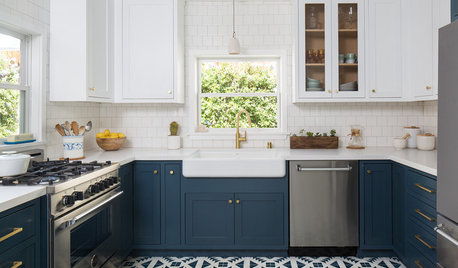
KITCHEN DESIGNThese Kitchens Do Blue Cabinetry Just Right
Tired of all white? Consider a contrast with cobalt, navy, indigo or midnight hues — exact paint colors included
Full Story
EXTERIORSThe Joyful Exterior: How to Give Your Home Just the Right Touch of Blue
Here are ways to add blue to the outside of your house — and 8 palettes to try
Full Story
COLORWhite vs. Cream: Which Neutral Paint Color Is Right for You?
Do bright white rooms give you the chills? Are off-whites too drab and boring? Let’s see which is a better fit for you
Full Story
BATHROOM DESIGNSee How Swapping Out Just 3 Things Changes This Bathroom
What a difference a new vanity, rug and wall color can make
Full Story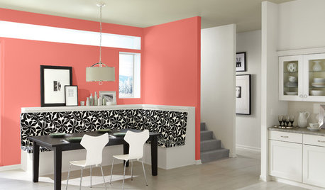
COLORBest Ways to Use This Coral Color of the Year
Sherwin-Williams goes for a preppy pop of color in its paint pick for 2015
Full Story
MOST POPULAR50 Shades of Gray
Gray is hotter than ever, thanks to a hit novel full of risks and dark secrets. Tell us: Which paint shade possesses you?
Full Story


Lori A. Sawaya