


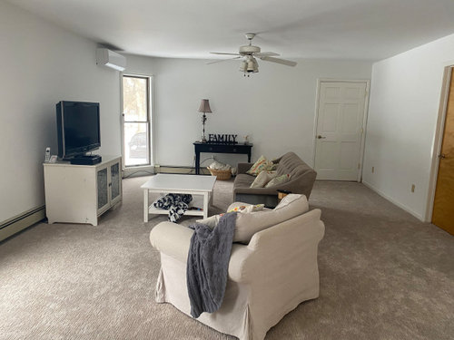
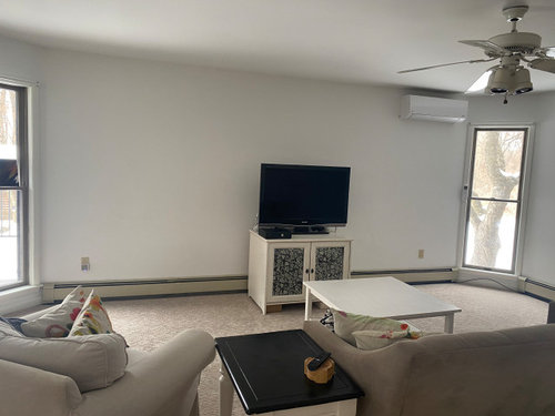
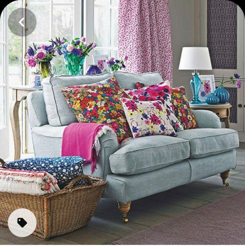
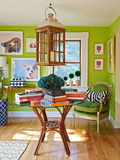
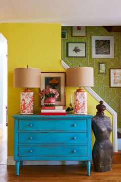
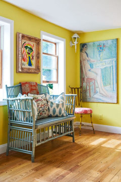
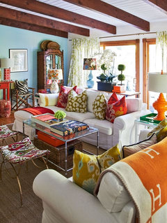
Can you help me choose Colorful furniture? tired of neutrals!
3 years ago
last modified: 3 years ago
Featured Answer
Sort by:Oldest
Comments (9)
 3 years ago
Related Discussions
Can you show me a nice 'neutral' color for the entire house?
Comments (22)1) Neutrals will take an undertone, so it is important to know which neutrals according to the primaries...red, yellow, or blue? 2) Then, once you know that, choose cool or warm of those undertones. Then, light or dark. (think skin here. Why does gray look so bad on some people and yellow look great? Why does yellow make some people look sick, and gray makes them look fresh and hip?) 3) Natural daylight. No natural light in the house? Unless you like a cave-like feeling on a Sunny day, limit yourself to the first top 3 colors of the card in the paint fan. If you like a cave look during the day, go ahead and use the bottom 3 or 4. If you have a house with tons of windows and natural light, lucky you, paint every room in deep saturated color....it's great in the day with light, and there is nothing like dark walls at night. Okay......that being said, here are some great colors I've used. BM Aura .... HARMONY This is the ultimate beige/ neutral. It goes with yellow, taupe, green, blue. It can be warm, or cool, depending on what's in the room. It's nice. Cut it in half and the color is a light, pleasant creamy color. BM SMOKEY TAUPE....the EXACT color of that beautiful linen sometimes called 'flax' (the sample looks like it has a green undertone, but it goes competely gray gorgeous taupe in my cream and white bedroom. It's classy, and fabulous with white trims. SW NUTHATCH: Dark and gorgeous brown without looking like you tried too hard. I had it in a bedroom with white trims and off white carpet. Caution: Ceilings look really bad when you have these dark colors if you leave them white. Paint the ceiling a few shades lighter (go up the card sample in the same color....that always works.) BM - PATRIOTIC WHITE. This is a quick change white. It can go white with a tinge of ocean blue, or ocean blue-green. It's cool one minute, then turns warm in the sunlight. At night it's warmer. It's a very fresh white. It's great if you need light in the room from lack of windows. Pair this wall color with very white trims. With ebonized floors,blacks, browns and greys, driftwoods, and touches of sunny yellows this color would be so chic. SW Spaulding grey, Garret Grey, : these are great deep colors of taupe/brown. I painted my exterior with Garrett Gray....it was a dark purply taupe. I had blue-green shutters, soft white trims, and a cherry stained front door. Very, very beautiful. Inside, Spaulding grey is a dark purply brown. Very nice with cherry wood, or maple. Great for a feature fireplace wall. Makes medium or light stained wood, stone, brick "pop". SW Mystic Beige: a medium light nice warm beige...goes with everything. Some people would call it boring, but if you have nice architecture, or nice furniture, fabrics, or paintings, this color will let them be the star. One opinion: I really don't like the paint "rules" you'll be told at the paint store. I'd stay away from asking advice in there. Find out if they have a color consultant on the payroll who you could talk to. Also, if you read decorating magazines, keep a file in your file cabinet for "paint color" .......almost all of these magazines have a section on what colors to use. Rip out the pages, and stash them in the file. When you need to pick a color, you'll have the names, and the descriptions, and sometimes pictures of the rooms using the colors....See MoreCan you help me pick a color for cherry furniture?
Comments (11)We have cherry furniture just about everywhere and have used SW Svelte Sage or Grassland in several rooms because it just looks so good together. Everytime I go to choose a new color, if we have cherry furniture there, we keep going back to those greens. However, I do love Blonde with cherry too, and would love to have cherry cabinets in my kitchen (instead of my whites ones) because then I would use Blonde in there. Oh, and I also have an area painted in Laura Ashley 'Spice' (think dusty pumpkin) without any cherry furniture, but once when I had placed some in there temporarily, I thought how nice it looked too (which I wouldn't think would've worked). I know you didn't ask about those colors, but they're so much "richer" than beige when it comes to making cherry stand out. However--I was in a $500k home the other day which used Latte throughout and they had cherry floors and several things "cherry" and it looked great. So....Latte would be my vote if you were set on using something along those lines....See MorePlease help me choose a paint color
Comments (33)The concepts of color "depth" and "complexity" might be the most difficult to pinpoint and explain. Deeper, depth, complex are words that get tossed around a lot. No one wants a Plain Jane paint color when "complex" sounds like it would be so much prettier and better, right? These descriptions of color are about nuance. Nuance is not the same as LRV. Lightness value (LRV) and grayscale value (usually 10 gray squares) is where most people get confused. And, really, it is understandable. They're both scales of gray squares - but the gray squares are not the same grays. LRV and grayscale are inextricably tied but are distinctly different parts of color that can be measured and plotted separately. LRV is measured by device. Grayscale is a visual assessment. I just answered a question on the Paint forum that's similar. I think the images included help illustrate the difference. Here is a link that might be useful: LRV and Nuance...See Morewhich granite would you choose? (so tired of decisions)
Comments (17)Oh gosh. Yes, I am sick of choosing stuff :-) And I haven't seen a granite I just "love". Maybe I'm just not meant to find the granite love of my life (heck, I'm lucky to have the human one!). Now, I have seen some granites I'd love to have on the island, but when it comes to an all-over choice, I don't want to use them everywhere (too busy and light). I've toyed with a dark perimeter--but don't want Absolute Black--and an accent island. I've pretty much given up that idea. Hubby wants input on the granite choice but has entered his busiest time of the year at work and won't be able to go look at granites again. I need to choose next week since the cabs are going in on Monday and we're trying to meet the June 30 deadline for the tax credit. Thanks for the suggestions and the pics! What I've not done is seen these granites side-by-side, but will do so on Monday. I have seen a kitchen done in Emerald Pearl, which is where I first "found" it. The cabs are the same as mine and their wall color looks to be Blonde, also. So, to me, that was a safe choice since I've seen it done and liked it. Maybe it wasn't love at first sight, but I think we could have a long and comfortable relationship together. Thanks!...See More 3 years ago
- 3 years ago
- 3 years agolast modified: 3 years ago
- 3 years agolast modified: 3 years ago
- 3 years ago
 3 years ago
- 3 years ago
Related Stories
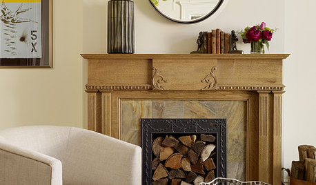
DECORATING GUIDESDownsizing Help: Color and Scale Ideas for Comfy Compact Spaces
White walls and bitsy furniture aren’t your only options for tight spaces. Let’s revisit some decorating ‘rules’
Full Story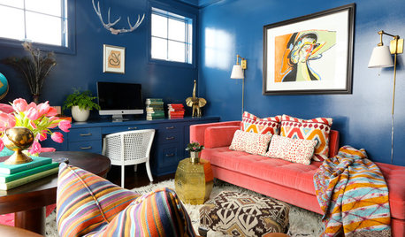
DECORATING GUIDESMove Over, Neutral Sofa — Here Comes Color
Sometimes it makes sense to ignore the conventional wisdom about furniture and make a bold, colorful statement
Full Story
NEUTRAL COLORSDare to Choose a More Colorful Neutral
Understanding Shades of Hue Helps You Go Beyond Gray, White and Beige
Full Story
DECORATING GUIDESNo Neutral Ground? Why the Color Camps Are So Opinionated
Can't we all just get along when it comes to color versus neutrals?
Full Story
COLORColor Fix: Energize Your Room With a Colorful Club Chair
Less commitment than a sofa but making a major impact, club chairs in vivid hues can work wonders
Full Story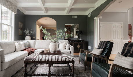
DECORATING 101How to Choose a Paint Color You Can Live With
See 8 tips and tricks that can help you commit to a color you’ll love
Full Story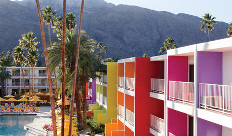
COLORColor Me Dazzled: The Saguaro Hotel in Palm Springs
No dusty neutrals for this desert hideaway — The Saguaro hotel revels in electrifying color from every arc of the rainbow
Full Story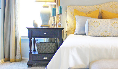
COLOR8 Color Palettes You Can't Get Wrong
Can't decide on a color scheme? Choose one of these foolproof palettes for a room that feels both timeless and fresh
Full Story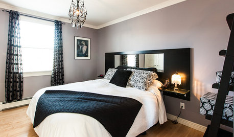
COLORDreaming in Color: 5 Fab Not-Beige Bedroom Neutrals
Go soothing without slipping into yawn territory, with purples, blue-grays and more on bedroom walls
Full Story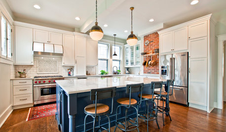
KITCHEN DESIGNKitchen Combo to Try: Neutral Cabinets, Different-Colored Island
Avoid a too-sterile look and establish a focal point with a contrasting island hue
Full Story


Sarah