8 Color Palettes You Can't Get Wrong
Can't decide on a color scheme? Choose one of these foolproof palettes for a room that feels both timeless and fresh

I have a love-hate relationship with paint chips. Thumbing through racks of them at my local home center gives me a jolt of excitement — and a frisson of panic. The sheer volume of potential palettes overwhelms me. Citron and turquoise? Eggplant and khaki? Kelly green and daffodil yellow? Forget it, I inevitably conclude. I'll just paint everything white.
Lately, though, I've decided to take it easy on myself. Instead of doing laps around the color wheel or settling for neutrals, I'm narrowing my options down to simple, classic palettes that are practically impossible to mess up. If, like me, you find yourself paralyzed by possibilities, take a look at these eight color schemes for inspiration.
Lately, though, I've decided to take it easy on myself. Instead of doing laps around the color wheel or settling for neutrals, I'm narrowing my options down to simple, classic palettes that are practically impossible to mess up. If, like me, you find yourself paralyzed by possibilities, take a look at these eight color schemes for inspiration.
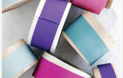
1. Yellow and blue. Like salt and pepper or toast and jam, these hues make a perfect pair. It's hard to find two shades of either one that don't work together — as primary colors, they share an uncomplicated, elementary quality that keeps them in sync. Most people think of yellow and blue as traditional, and they are, but you can spin them into transitional or modern territory by choosing tailored lines and subtle patterns like the ones shown here.
2. Black and white. Need I even mention this one? It's dramatic, sophisticated and as classic as you can get. In any room, in any amount, it's absolutely fail-safe, and you can mix in dabs of whatever accent color appeals to you. Click here to see this palette carried throughout an entire home.
3. Pink and green. Why does this perennially preppy combo strike such a chord? Well, think about nature: pink flowers atop green stems, blooming from shrubbery, surrounded by foliage. If you want to make pink and green look less Lilly Pulitzer, try layering two or three saturated, slightly dirty shades of each color, as in this bedroom.
4. Navy and white. A starched white button-down topped with a navy blazer never goes out of style, and neither does a navy and white room. With this pairing, it's easy to default to the nautical approach (stripes, sailboats, white linen). But this living space turns convention on its ear: navy walls set off by crisp white millwork and a painted coffee table, with an overscale rug that ties the scene together.
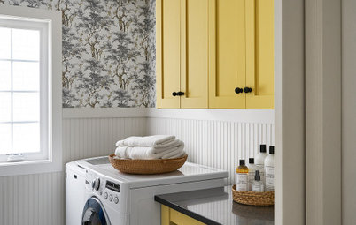
5. Yellow and gray. Like the odd couple of the color spectrum, these two hues couldn't be more different. Yet they complement each other perfectly: Ebullient yellow helps somber gray to lighten up; gray calms yellow down and keeps it from bubbling over. It's a win-win.
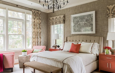
6. Red and beige. This combination bears a certain similarity to yellow and gray — one has an outsize personality, while the other is more reticent. What makes them such natural partners is the warm undertones they share. Temper a bold stroke of red with a swath of beige to create a rich, inviting, but still mellow space.
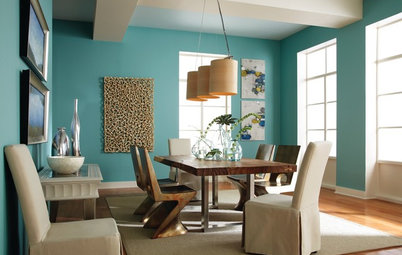
7. Orange and blue. They're opposites on the color wheel, and paradoxically that means they go well together. If you can't abide the thought of a vibrant tangerine and cobalt room, go quieter. This serene living area is washed in pale turquoise and soft coral, diluted versions of orange and blue that make no less of an impact for their restraint.
8. Chocolate and lavender. Really? you're thinking. Yes, really. Sweet, pale purple and rich chocolate bring out the best in each other. The key is to keep the lavender from getting too bright — a chalky pastel shade works best and looks luminous against deep brown. A lavender accent wall is all this cozy space needed to bring it to life.
What's your go-to palette? Tell us in the Comments section!
More:
Pick a Perfect Color Palette
10 Ways to Make Your Neutral Palette Shine
What's your go-to palette? Tell us in the Comments section!
More:
Pick a Perfect Color Palette
10 Ways to Make Your Neutral Palette Shine