SHOP PRODUCTS
Houzz Logo Print
momofthreema

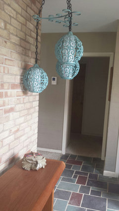
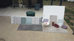
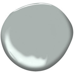
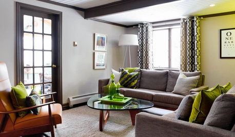
Paint Color Help, Please :)

Momofthree Ma
4 years ago

Finishing our kitchen Reno and the painters are coming in the next couple of weeks.
Cabinets and trim are BM simply white, backsplash is Jeffrey Court Riverwash and counters are a blue grey Alaska White granite. I thought I was going to use BM booth bay grey, but it’s looking really green in the space.
Anyone have suggestions for a nice, medium/light, blue/grey paint?

Comments (58)

  • PRO
    Flo Mangan
    4 years ago

    Do you want strong contrast? Most colors posted are pretty dark. I will look up Comet and get its DNA for you. Bb after dinner.

  • Momofthree Ma
    Original Author
    4 years ago

    Thanks Everyone! Lots to look at!
    I will go get samples tomorrow to look at in both day and evening light. The lights are dimmed about half in the pics above. But, I don’t really like the lights all the way up, it’s sooooo bright. So, more than likely, the lights will always be dimmed at night. The electrician said these lights have warmth settings, as in I wouldn’t need to replace the bulb but switch the setting. I have no idea how to do that, but I will try to work on the lighting.
    I get afternoon sun, from about 12pm on.
    I don’t want anything too cool because I think that the cabinet color and the tile lean warmer when the lights are on. The tile reads much bluer during the day. This is daylight, plus undercab lighting before the grout was finished.

  • Related Discussions

    Family room wall paint color help please!

    Q

    Comments (0)
    Looking for help picking an appropriate color for my family room. I’m thrown off by the orange in the fireplace which I do not care for. Thank you!
    ...See More

    Paint color help please!!

    Q

    Comments (6)
    Seeing color via the internet sucks. What you are seeing may or may not be correctly represented on our screens. That said - orange and blue are complements of one another. Magnetic Gray may be playing off your floors. (color of the center block against gray orange and blue backgrounds. Adding some blues and greens to the room may help it not feel as blue. The other option is to up the chroma. Sometimes really low chroma leads to a powder blue haze that may not show on pictures, but when it is in your room you see it. Oyster Bay is basically the same color as Magnetic Gray with a bit more color saturation. Light and hue are almost identical, but the chroma (colorfulness) is 2 degrees higher. That little boost can really help with the blue undertones.
    ...See More

    Exterior Paint Color Help Please!

    Q

    Comments (9)
    Not sure I got the color right but here's a few attempts with SW Deft (first) and SW Stardew (second). I use the Sherwin-Williams ColorSnap Visualizer on their website. Benjamin Moore has a visualizer too that I think is easier to use but they don't seem to have as many colors. Just google Sherwin Williams or Benjamin Moore color visualizer and you'll find them. I do it on my laptop but there might be an app too. I didn't fool with the trim although the shutters painted. You can really get a lot of detail and multiple colors if you do the setup right.
    ...See More

    Paint colour help please!

    Q

    Comments (6)
    https://www.sherwin-williams.com/homeowners/color/find-and-explore-colors/paint-colors-by-collection/top-50-colors If your painters are coming tomorrow you should have asked this question a month ago. It is difficult for people to choose a color for you as colors on monitors don't look the same in person. The standard recommendation is to sample a couple colors before paying to have a large expanse painted. I have pasted in the URL for the section of the Sherwin Williams website that shows their 50 best sellers. I'm sure one of them, and probably even more than one, would work for you. However, you'll see that there are varying levels of gray and beige, some are a little of both, and there are varying levels of color intensity. I don't know what you're envisioning, so I really don't know which one to recommend. However, if you're not sure you want to go gray or beige, it's probably best to go greige. Some of their gray colors actually have a fair amount of beige in them. If you are forced to pick one tomorrow, go to the paint store with the contractor and ask someone at the store to point you in the direction of a greige and choose one that is the degree of light/dark that you are looking for. Be aware that it will look darker on your wall than it does on a chip.
    ...See More
  • PRO
    Beth H. :
    4 years ago
    last modified: 4 years ago

    i believe there is a switch on the fixture that will change the temp setting for you. But I was talking about your recessed lighting. they look a little warm


    get a sample of the Silver Half Dollar. I bet that one will work.

    if you want more gray, try Gray Cloud or Sweet Innocence. But for sure get a sample of Sil.half dollar


  • Momofthree Ma
    Original Author
    4 years ago

    Thanks, Beth! I think he said there is the same kind of switch on the recessed lighting too. I will reach out to him tomorrow and ask and then I will head to BM to get samples :)

  • PRO
    Flo Mangan
    4 years ago

    Ok. Comet has a hue angle of 265. That puts it in the Purple/Blue cool segment close to area most likely to reveal purple. So it will go purple no doubt. Manor Blue has an LRV of 56 so reflects more light than Comet. It has a Hue Angle of 251 which puts it the Blue Hue family but right next to Purple/Blue so it could go slightly purple too. If you want lighter color that is silvery blue, take a look at BM Marilyn’s Dress. It has an LRV of 89 so quite light and a Hue Angle of 214. That puts it on the far end of the Blue/Green hue family only 6 degrees from Blue hue family so it will go blue.

  • Momofthree Ma
    Original Author
    4 years ago

    Wow, Flo, thank you! Love the color science, I don’t totally understand it, but I definitely don’t want purple. I will grab a sample of Marilyns dress when I go to BM tomorrow :)

  • eam44
    4 years ago
    last modified: 4 years ago

    The thing is, you have to choose a blue that works with your tile primarily. Tile and wall paint are on the same axis - vertical - whereas your stone is horizontal. Riverwash has purple undertones itself so you might want to choose a blue that is almost gray. SW Rarefied Air above and Tinsmith below


  • PRO
    Flo Mangan
    4 years ago

    Here is the Color Strategist Color Wheel. The degree marks on the outer edge indicate where a color sits on the color wheel. So, Marilyn’s Dress comes in at 214. Find 214 and follow line to inner marks. 214 sits between 7.5 BG and 10BG. Hence the Blue/Green Hue Family. I get the basic color DNA from another website that has the notations for thousands of colors. It is complex but once you get the understanding, it is great. Go check out Lori Sawaya’s website Camp Chroma for more information. Truly changed my thinking about color forever!! I took her course The Four Pillars of Color and received my Color Strategist Certificate. Fascinating stuff.

  • Mary Glickman
    4 years ago

    I chose Marilyns dress for a bath with no natural light and it reads a very pretty pale purple-gray. I’d recommend painting a card and moving it around with this color - I want to love it but I don’t; I also don’t want to spend $80 on another gallon of paint so it stays...

  • houssaon
    4 years ago
    last modified: 4 years ago

    Wow! I love that tile. It looks hand made.

    Never heard of the manufacturer, but I just did a Houzz search and see it is used by some top designers.

    Here is one kitchen that has your exact color. The pale gray they used on their walls looks good. But I've looked at quite a few pictures just now and I really don't like most of the wall colors. They seem to compete with the color of the tile. Why not do white on the walls?

    Classic 1940s Whole House Remodel · More Info


  • Jennifer Hogan
    4 years ago
    last modified: 4 years ago

    Although I understand color science and own a color meter, which can tell you what colors are more blue and which are more green, but the truth is your eyes can do the same thing.

    You painted part of a wall and it looked too green. Did it also feel too dark, did it feel too colorful or too drab?

    Simply take that sample and pick some samples that are less green, less dark, less drab or whatever isn't clicking.

    We have all been coordinating color for most of our lives, we pick out outfits and coordinate the dress with the stockings, shoes and coat and nail polish and jewelry. We select lipstick, blush and hair color that works with our skin tone. Were exposed to beautiful color combinations every time we look at nature.

    We also should be picking colors that work together for the entire home. I have too often seen beautiful rooms that feel like they belong in a different house. No one has bothered to ask if you have blues and grays in the rest of your house or will this room be the only blue gray room and the rest is decorated with orange and tan?

    Another fact is that if colors go together, they go together in all lighting. You don't pick your makeup and clothing based on lighting. We wear the same thing in the house and outside in the bright sunlight. If your makeup looks good in bright daylight it will look good in any other lighting. You may go heavy handed with the lipstick or blush if your lighting is dim and look like a clown when you go in bright daylight, but if it looks good in the sunshine it will look good in any lighting. The same thing goes when picking colors for your house. Take all of the colors you are using in the kitchen and lay them on a table covered with a white sheet in the back yard at 2:00 in the afternoon on a clear day. You want to cabinet, counter and back splash samples to be placed where you can lay a single color swatch in the middle and see it next to all 3 colors.

    Lay two down at a time and keep removing the one that you like the least. The end result will be the one you like best. Swatches are free at the paint store - don't be shy, grab a few dozen.

    If you want to do this in a more scientific manner you can do it without any fancy equipment or 'DNA' readings.

    Take the sample of your back splash to the paint store. Find the color swatch that is closest to the color of your back splash.

    Look up the color on this website: https://www.easyrgb.com/en/compare.php

    In the find similar colors page enter the name of the sample that matches your back splash.

    I guessed that it would be close to Cabot Trail


    Pick the hex value from EasyRgb

    Go to Paletton.com

    Enter the Hex code, select the settings that I have pointed to with the red arrows. (Dist=30)

    You can hover over the colors to see the Hex Codes. All of these colors will look good with your original sample.

    I picked the lightest color on the bottom right and see the hex code '8E9699'


    I can now go back to EasyRGB and enter the Hex code in the Match color to commercial color tool - pick the brand of paint I want and I found that Brewster Gray is the closest match to the color I picked.

    If the color is still too dark you can use the fine tune button on Paletton and make the colors "Brighter". If it feels to bright and you want it a bit grayer you can lower the saturation. What you don't want to do is change the Hue.


    If I increase the brightness by 10 degrees I get a hex code of B3B8BB

    Enter that into Easy RGB and Blue Springs is my closest match.


    The trick is to make sure you have a good match to your backs splash. Take the sample swatches outside and look at them in good daylight to make sure that it is the best match.

  • eam44
    4 years ago
    last modified: 4 years ago

    Mom -

    • Actually - the wall paint you have now looks great with your tile and your counter. And a neutral greige would make the blue in your counters pop. Are you sure you want to paint the space blue?
    • By now you should know better than to encourage the color people - you're not new here!

    "but the truth is your eyes can do the same thing"

    Jennifer - color acuity varies with the individual. Different retinas have different overall numbers of cones, and even slightly different ratios of R/G/B cones (although they roughly divide 64%, 32% and 2%). Add to this other differences in visual and systemic health and age-related changes to the eye, and, well, different people see color differently. Luckily, paint manufacturers give you the RGB values of each of their shades.

    Want to test your color acuity? There's an online test that is free and set up by the University of Chicago. Scores range from 0 (best) to 128 (worst) - but it's an online test so take it with a grain of salt.

  • tartanmeup
    4 years ago

    Good points by Jennifer Hogan and eam44. Thanks for sharing those sites, Jennifer. They're new to me.

    On my monitor, OP's counter and backsplash don't look blue to me at all (I would have guessed green before blue) and the current wall colour was looking like a strong match, albeit dark. That's a huge variable in online decorating: screen accuracy in rendering colours. The chance we are all seeing the same colours is slim. Not to mention how infrequently cameras capture colours accurately. My advice would be to bring a backsplash tile (or two) to the paint store and ask them to scan it for their closest match. Pick up the strip with that colour along with the adjoining ones (if they're arranged chromatically - the rep should be able to tell you) and check everything in your natural light at home to see the top 3 contenders for paint samples to buy. Lighting is everything when perceiving colours and if you like a colour in daylight but not in artificial light, adjusting the bulbs to a cooler temp will often fix that, as mentioned by Beth. You have to trust your eye though because you're the one living in your house.

  • PRO
    Flo Mangan
    4 years ago

    Yes, color is all in the eye of the beholder. I too wonder, momofthree, why you are looking for a blue? What actual color are your cabinets? They will be perceived differently with different lighting. So get your lighting set up first. Once you have narrowed down your choices with paint chips from paint store, then get samples from Samplize.com. They have 12x12 samples with the back sticky enough to hang on walls you want to paint. This is less costly and no disposing properly of leftover paint samples. Your light in your spaces is a variable that is very important. So hope you consider other colors that work with your cabinet color in your light conditions.

  • Mary Glickman
    4 years ago

    eam44 totally obsessed with that test now. Scored a 0 (perfect score). Not that an online test matters but it was fun to do! :)

  • salonva
    4 years ago

    So many new to me sites being shared on this thread. The kitchen does look wonderful!

    And I am thinking I will be trying the test as well but in the meantime- I will be asking @Mary Glickman :) Just kidding.

  • Momofthree Ma
    Original Author
    4 years ago

    So...my whole house is balboa mist, living room, two story foyer, and the kitchen use to be edgecomb grey. I just wanted something with a little more personality...but I will likely end up with more balboa mist :) I’ve added pops of aqua through pillows and accessories in the living room, so maybe I just need to accessorize here.
    I know colors are tricky online...thanks for the help!
    Cabinets are simply white.

  • Mary Glickman
    4 years ago

    @salonva lol!!! My dream job (English Major) was always to get to name paint colors. ;) ;)

  • mark_rachel
    4 years ago

    Have you tried Gray Owl? It reads slightly blue/green, but it's a nice gray. I would personally go with a greige. Have you looked at Edgecomb gray?

  • tartanmeup
    4 years ago

    Thanks for that online test, eam44! Fun to do. I scored a 2 and the site showed my hue weakness. It's a colour slice that's very close to colours I'm not drawn to. Wonder if there's a link?

  • Momofthree Ma
    Original Author
    4 years ago

    Mark_Rachel...I’ve had edgecomb grey in my kitchen for the last 7 years...I guess I am a creature of habit :)

  • tartanmeup
    4 years ago

    Same here, Mary Glickman. Paint or cosmetics colours. :) Just retook the test and scored a zero. (Let's start a business. ;-))


    What type of monitor/screen do you have, btw?

  • eam44
    4 years ago
    last modified: 4 years ago

    Mary & Tartan - I scored a 0 too. It is fun - most people have color weakness in the blue/green range - least number of cones. Low color acuity is really common in men (1 in 12) less common in women. When you have all of those colors next to each other you can put them in order pretty easily. It doesn't necessarily make it easier to find a paint color.

    Mom - the take home message is that you need to coordinate with your tile color. Your current paint color looks great to me. If you want a change, by all means change it, but consider staying in the grieves as opposed to blue (unless you really really want blue paint)

  • Momofthree Ma
    Original Author
    4 years ago

    I really wanted something blue in the space...but the blue in the counters isn’t as obvious to most, even our friends and family who’ve been in the space. So, I will have to find a way to accessorize with some grey/blue if I can’t find a good paint color that doesn’t look jarring next to the tile.

  • salonva
    4 years ago

    Hanging my head in shame I got 14.

    Back to the paint color for momofthree, I think if you don't use a blue family paint for the walls, and use th greige as suggested, the blue on the counters may become more apparent. In any case, I am sure that the accessories in the blue family will be great.

  • PRO
    Flo Mangan
    4 years ago

    People often think they can "pull" a color from granite but it usually is only one piece of the overall color picture. First, your cabinets with BM Simply White is in the Yellow Hue family. That means it goes to a yellow cream. Your backsplash color is unknown (Internet colors never accurate) but from your description, seems to have some gray/brown tones. The way to integrate these colors is going to a more saturated color and not try to "match". If you want a blue (and I don't think that is the colorway that will work best), then find a tone that works with yellow/brown/black that is in your granite, cabinet color and backsplash. Have you looked at BM Pale Oak? How about SW Accessible Beige? Just depends on which color direction you want to take.

  • PRO
    Flo Mangan
    4 years ago

    Also, if you want to keep neutrals, SW Agreeable Gray; SW Worldly Gray; are additional options. These are all potential options, depending on your light and what you want in your kitchen.

  • Momofthree Ma
    Original Author
    4 years ago

    Here’s the collingwood and Balboa mist with the tile, as well as some blue greens.

  • Momofthree Ma
    Original Author
    4 years ago

    This is the silver half dollar.

  • Molly
    4 years ago

    Interesting test eam44. I got a zero which is a good score here. lol


    Momofthree - love your backsplash and paint is hard! :) Have you looked at KylieM at all, she is very informative. https://www.kylieminteriors.ca/cool-gray-paint-colours-the-3-undertones-you-have-to-consider/

  • PRO
    Flo Mangan
    4 years ago

    Those photos are all over the place on my monitor. You will have to use your "eyeballs" to discern what you like best. I am familiar with the basic granite and it is "cool" in feel, so I wouldn't go too warm with paint color.

  • Momofthree Ma
    Original Author
    4 years ago

    My phone camera doesn’t take the best pictures, but the difference between the daylight and the kitchen lights is what happens daily. It looks very blueish grey in daylight and Taupey at night.

  • PRO
    Lori A. Sawaya
    4 years ago
    last modified: 4 years ago

    My phone camera doesn’t take the best pictures,

    Not even the best camera in the world would help. :) You can't take a picture of color and derive any useful information about its color attributes.

    Those photos are all over the place on my monitor.

    But they do a GREAT job of proving the point of why color online (RGB values and HEX codes) are all kinds of wrong and don't apply in any way whatsoever to how paint colors in real life really work.

  • Ephma
    4 years ago

    Fun test, I got a 0 too! I just wanted to come on here and say that I know you agonized somewhat over your backsplash and it all looks very nice. I was also going to ask if you’d considered Balboa Mist or Edgecomb Frau but i see you’ve already been there LOL

  • Ephma
    4 years ago

    *edgecomb Gray (my German spellcheck took over haha)

  • Momofthree Ma
    Original Author
    4 years ago

    Maybe if I call it Edgecomb frau it will feel more exotic ;)

  • tiggerlgh
    4 years ago

    I got a 0 as well! I expected to miss something! I am no help on colors but love you kitchen so far and love the idea of adding some color to the walls vs the same old colors.

  • eam44
    4 years ago
    last modified: 4 years ago

    You're just going to have to try samples in person. Of your paint strips I would consider 2121-60, and OC25 - I'm more of a SW gal. Beware of setting everything flat. I know it's easier to photograph, but irl your tile sits vertically, and it looks different when upright.

  • Molly
    4 years ago

    Samplize.com worked well for me and no paint mess. They carry BM and SW color lines.

  • Momofthree Ma
    Original Author
    4 years ago

    Thanks, Molly, I will order some of those!

  • Jennifer Hogan
    4 years ago

    "Momofthree Ma

    So...my whole house is balboa mist, living room, two story foyer, and the kitchen use to be edgecomb grey. I just wanted something with a little more personality...but I will likely end up with more balboa mist :) I’ve added pops of aqua through pillows and accessories in the living room, so maybe I just need to accessorize here."


    Here is an idea that might work well for you.

    Quiet Moments or Beach Glass


    Pulled some samples from BM with Balboa Mist and Simply White, set them over your kitchen photo.


    These are both gray blue greens. Work nicely with Balboa Mist and should complement the teal accents.


  • Jennifer Hogan
    4 years ago

    Here is a room from the BM visualizer - painted the ceiling teal to bring that color in with the others.


  • Momofthree Ma
    Original Author
    4 years ago

    I love BM’s beach glass! One of my fave colors. I was thinking of it for my master bath, but maybe it could work in the kitchen too!
    I found this kitchen with Sea Glass in the eat in area...it’s really pretty!

  • Jennifer Hogan
    4 years ago

    I love Quiet Moments and Beach Glass. Using both in my reno. I also love repeating colors through a home - creates harmony.


    I have not made final decisions on everything, but my start was my slate entry, which is purple, green and red slate. The green is a gray blue green. The purple is a very dark gray purple.


    To create harmony I am repeating the blue green and purple grays in some way in each room

    Guest Bedroom - Quiet Moments - dark purple gray flooring

    Guest Bath - Beach Glass with Night Train Cabinets dark purple gray flooring.

    Master Bath Quiet Moments - purple gray towels lighter flooring

    Master bedroom - purple gray walls lighter flooring

    Painted the entry lamp in a slightly brighter blue green.

    Looking for an area carpet for my office that will have the blue greens and purples.


    Here is a pic of my foyer after painting the light fixture (excuse the dry wall dust coating everything)


    Not perfectly happy with the bedroom purple yet - have tweeked the taupe to get the right combination of not too gray and not pink.


    Master bath in progress -


  • Sammy
    4 years ago
    last modified: 4 years ago

    When I posted the picture of the fan deck, I almost cropped the card with Comet out because it wasn’t meant to be in the mix and I was afraid you might pick it. And you did! Ha! The colors I was hoping for you to focus on were on the card to the right primarily Silent Night and Pelican Gray. And I also wanted to show you how you really can see the green in Boothbay Gray when it’s next to those other grays. :)


    Silent Night:


    Boothbay Gray:


    Pelican Gray:


  • Sammy
    4 years ago

    Btw, that granite is really striking. I’ve seen it a thousand times but there’s something about your particular cut...

  • Momofthree Ma
    Original Author
    4 years ago

    Jennifer, everything looks great! I love the color in the master bath!

    Sammy...ha, I guess I am really predictable! I like silent night after looking at it again. I will grab it when I order the sampleize samples :)

  • Momofthree Ma
    Original Author
    4 years ago

    Hub and I sat down last night and made the choice to stick with the Balboa mist we have in the rest of the house. Thanks for all the input, I will post pics when the project is complete :)

  • PRO
    Flo Mangan
    4 years ago

    Sounds like this is a nice color for you and will have enough chroma difference to create interest without looking like you tried to match things up! Look forward to seeing the results. You can always add accessories to punch up things once you get the "background" done!