


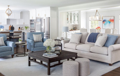
10 Bedroom Design Ideas to Please Him and Her
Blend colors and styles to create a harmonious sanctuary for two, using these examples and tips
Judith Taylor
September 18, 2013
In many houses, women still do much of the home furnishing and nest feathering. But I find it troubling to see an overly feminine main bedroom that is shared by a couple. Whenever I'm designing a bedroom for a man and a woman, if at first glance I can't see a man being comfortable, then I get back to work.
Color seems to be the common theme in overly feminized rooms, more than individual motifs or other elements. Lace, for example, decidedly feminine, probably appeals more to a man when it's black, right? The use of soft pastels and pinks, but also the absence of dark colors in general, can leave a bedroom feeling too girly.
One rule of thumb in design is that every room needs a touch of black to anchor it. Here's another color insight: Orange and blue make for the most appealing complementary color combination in advertising to reach a male audience. Picture the New York Mets uniforms.
Indeed, color is key, but how much do you need? Often subtle shifts are enough.
His and Her Style
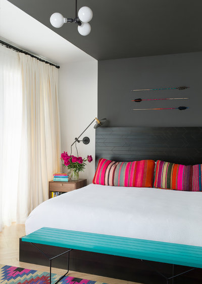
This smoky backdrop dramatically defines the sleeping zone while setting other colors ablaze with vibrancy. Hand-crafted Native American–inspired flat-weave rugs with colors that pop meet a clean-lined discipline. Arrows step in as objets d'art above the bed.
Vive la différence. If she likes a streamlined style but wants to display something rustic or tribal, like a collection of arrows, celebrate them in a minimal display with graphic interest. If he likes contemporary graphics and hot colors, let him pick the accents. Put them together and everybody wins.
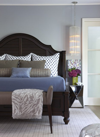
Masculine Meets Traditional
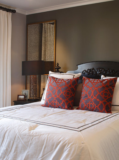
The elements are all traditional in this European-inspired room. Pinch-pleat drapes, dark wood drapery hardware, a curved headboard with ornate carving and toss pillows in a classic pattern deliver a traditional look that can also feel decidedly masculine.
Her style, his colors. If you love traditional but your mate feels left out, take notes. The success here starts with the deep smoky wall color. This alone keeps the room from being too feminine. If you enjoy traditional motifs and patterns, pick a simplified version for accents in a bolder color combination, as with these toss pillows. They repeat the smoky wall color in the background and add a hit of rich color to tie together a layered look. Use soft white bedding, as done here, but keep it crisp and tailored.

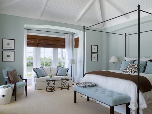
Orange and Blue
This classic scheme draws on complementary colors that appeal to masculine tastes but are offered in a female-pleasing interpretation.
Color for two. Keep both parties happy. A subtle shift from orange and blue to coral and aqua may be more pleasing to women. Choose an artful mix of bold patterns and anchor it with charcoal to get this look right for both of you.
Minimal Color
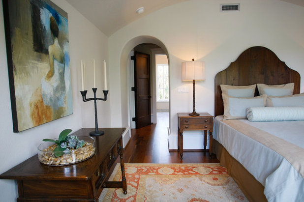
Orange and blue are used in small portions here. In this mostly achromatic scheme, orange notes in the rug contrast the blues in the artwork while not overpowering. I love the choice of midtoned wood as a marriage saver.
Use color sparingly. Paint walls white to highlight a beautiful headboard silhouette. It will showcase the shape and the wood grain. Pick an antique rug like this with a border that brings in color from artwork — and stop there.
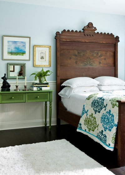
Punchy Color
These greens and blues please many people. The soft pastel wall color is pleasingly feminine, but the strong masculine headboard adds balance.
Maximize blue and green. To balance a soft wall color, inject punchy green and blue, as was done here with the bedside table and quilt. Select saturated colors to brighten pastels. ("Saturation" refers to the purity or intensity of a color. A highly saturated color is one that does not contain any white, which would create a tint, or black, which would create a tone.)
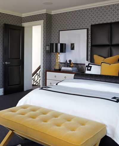
Hello, Yellow
This universally gender-neutral color steps in to rescue the most style-challenged couples.
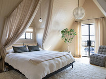
Tip: Set yellow against black to balance it. Use tufting, like on this bench, for softness, and black trim on bedding to add an edge. It's nice how this dark trim echoes the railing detail on the stairs.
This universally gender-neutral color steps in to rescue the most style-challenged couples.
Tip: Set yellow against black to balance it. Use tufting, like on this bench, for softness, and black trim on bedding to add an edge. It's nice how this dark trim echoes the railing detail on the stairs.
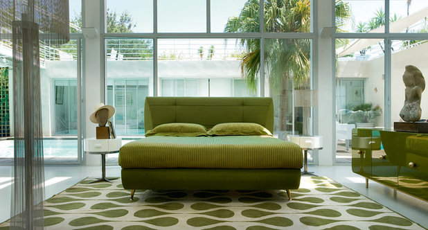
Keen for Green
Green is always a great gender-neutral option.
Green is always a great gender-neutral option.
Brown and Cream
This is a classic go-to combo.
This is a classic go-to combo.
Punctuate With Black
Thin outlines in dark wood are just enough to keep this palette from erring on the side of too soft.
Tip: Outline light colors with black. Take a cue from Johannes Itten (one of the main pedagogical forces behind Bauhaus and a contributor of a unique theory on color). "Light colors on light backgrounds can be greatly strengthened if outlined in black," he said.
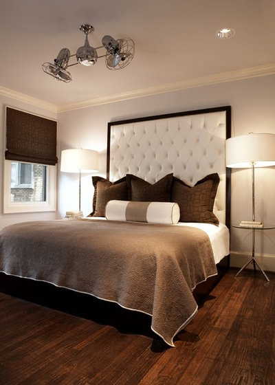
Blue Is the Hue
A dark headboard adds curve appeal, too. Blue is universally the most loved color. Break it up with soft gray and white to get the balance just right.
Tip: Use white backdrops for dark colors. "Dark colors appear most striking against white," Itten said. This room lands right in the Goldilocks zone: not too manly, not too girly — just right.


What are you working on?


Related Products


Related Stories
Organizing
How to Create a Joyful, Clutter-Free Home Office
Follow these steps to get rid of the paper piles and make room for beauty and better organization
Full Story
Remodeling Guides
15 Ways to Create Separation in an Open Floor Plan
By tidgboutique
Use these pro tips to minimize noise, delineate space and establish personal boundaries in an open layout
Full Story

White
Design Pros Share 10 Favorite Creamy White Paints
By Becky Harris
These off-white color choices include versatile tones, warming hues and pleasingly soft shades
Full Story
Entryways
4 Designer Tips for a Fashionable Entry
By tidgboutique
A pro shows how adding color, statement pieces and more to a foyer can set the right tone for the rest of the home
Full Story
Most Popular
7 Major Decorating Mistakes and How to Avoid Them
By tidgboutique
Gain confidence to start your interior design project with this advice from a professional designer
Full Story
Living Rooms
4 Must-Have Features for a Small Living Room
By tidgboutique
A designer shares important ways to live large in a tight space and make it look stylish
Full Story
Most Popular
7 Common Decorating Mistakes to Avoid
Pros share solutions to design problems they often find in people’s living spaces
Full Story
Most Popular
How to Decorate a Living Room
By tidgboutique
A designer offers tips for creating a comfortable space that reflects your style
Full Story
Budget Decorating
Where to Splurge and Where to Save When Decorating
By tidgboutique
See where it makes sense to invest in durable essentials and focal pieces, and where to economize on other things
Full Story
Lighting
Pro Tips for Lighting 10 Rooms and Outdoor Areas
Get professional advice for lighting your kitchen, bathroom, living room, office, patio and more
Full Story
Politically correct or not, finding a common meeting ground for couples is one of the most difficult tasks we face as designers. I am happy if the article can help one or two who struggle with differing taste.
Пастельный розовый - цвет рассвета и глубокий синий - цвет моря. Рассвет над морем) именно такие цвета в своей спальне решили сделать.
Спасибо за подход думаю его можно применять не только в спальне и да пусть женщинам и мужчинам может нравится диаметрально противоположные цвета нежели в приводимых примерах, важно что автор поделилась своим опытом и самое главное опытом профессионала