


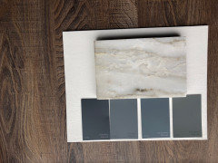
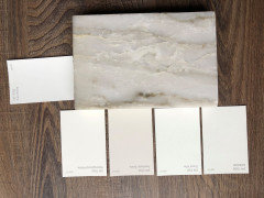
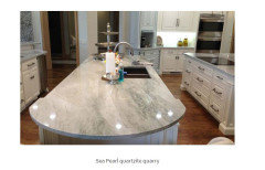
Cabinet color HELP for Sea Pearl (New Madre Perla) w/pics in comments
C DeV
4 years ago
Featured Answer
Sort by:Oldest
Comments (26)

C DeV
4 years agoC DeV
4 years agoRelated Discussions
Kitchen Advice Need w Pics
Comments (38)A 12" overhand won't be very functional. I'm a visual person. Get out a ruler, sit in a chair, and put the end of the ruler even with your knees. Notice how much difference is left between where the granite will drop off, and you will begin? That's going to be uncomfortable to sit at, not to mention horrible for ergonomics. Builders like 12" overhangs because they (say) they don't have to support the overhang. Corbels will do wonders, and so will at least 3" more overhang. :) Your vent & cooktop look the same size. 42" hood is best paired with a 36" cooktop. I would probably move the microwave. It's either going to be opening into the wall, or into the vent hood, where it is now. I may have missed this - will you be adding a table in that big open area by the window? Or is the island your only seating? If your fridge is truly recessed that deeply into the wall (in your plan the wall protrudes past the fridge, so it would have a negative reveal, so to speak), then you won't be able to fully open the left fridge door. Looks like it's a good 4" - 6" difference. If you forget and try to open your door all the way, I'm afraid you'd dent your door and chip your corner....See Morebacksplash ideas for Sea Pearl or Volga Blue
Comments (66)Flevy, I am the b*tch too. How dare you make my child learn? Usually they change their minds after they start the next grade. They realize that they learned a lot from me. One girl said to me this year that this year was the first year she has retained anything. Sept actually said in staff meeting to only teach math and reading...nothing else. I told school board press in Dec that I was leaving in may. This was my first year there since we moved south. I also told supt that I refused to only teach math and reading. So I am not a team player. My fifth graders had five tests. Flevy,, I have been saying it for years. We are not always sending our brightest students to college. Some get grants to go and put little effort out. Why should they? They aren't paying for it. That is a beautiful kitchen. Love the cool green tile, window light fixtures, and glass doors. What is the cabinet on the left with the mixer on it? Unusual base cabinet....See Moresea pearl quartzite
Comments (65)Yea, I think I'm going to have to wait till I actually get the Travertine in to see what it looks like, they didn't have a sample of it at the design center. I'm leaning towards a Perla Light Quartzite, hoping that there will be more grey/silver (and some beige) in the backsplash. I'll find out in a few weeks probably....See MoreGreige Kitchen Reveal (before and after pics!!)
Comments (47)THANK YOU so much for all the wonderful feedback! I'm sorry I've dropped off the face of the earth but btwn going back to work after 2 weeks off and having a sick kid at home I feel like I've been hit by a fast moving train... I wish I knew how to hyperlink back to specific people so I can respond directly but I will try to address a few questions that I've seen! Table -- we definitely had to replace that sucker! It was Pottery Barn circa the mid-90's, and was very "well loved"!! We did have a smart idea that actually my PAINTER suggested -- we painted it (the same color as the island, b/c we had a lot of it left over and loved the color - Black Fox), and moved it up to our playroom to use as a game table (took the leaves out). It looks like a million bucks, and it's so nice to be able to reuse it! I do love our new table (which was the last thing to arrive, just last week!). I definitely wanted round so we had more space to navigate, but we were torn btwn 60 and 54"... Went with the smaller one which is perfect for five, but might be tight for more people! But, I do think any bigger would have been a little crowded down at that end of the room. I had to keep reminding myself to think about our day to day needs as opposed to much more infrequent entertaining or hosting situations. Day to day it is perfect!! And yes we did just keep our existing chairs and reupholster. Tried to tie in a couple of "pop" colors (turquoise and orange) so it was not so monotone. We also had considered painting the chairs to match the table more closely, but I like the contrast of the wood! Here is a close up picture (with one chair removed): Hutch -- definitely was a great idea to hide clutter! Funny story: My 11 yr old took one look at it once the glass was installed and was horrified! "Mommy did you actually PAY for it to look that way? It's all spotty!" :) Very funny to see things through the eyes of a child!! Here's a close up of the mirror: Oven/Range -- I hope I love my griddle some day! I'm really intimidated by it. I actually bought steaks to make on it tonight. I wish I could find a griddle cookbook!! Please lmk if anyone knows of such a thing! I need to just keep trying and hopefully the love will grow... :) My husband uses it for breakfasts but that's about it so far! Outlets - we did include just one pair of outlets at the hutch, and tbh we have not really plugged anything in except the phone. So we have an outlet and a phone connection in there. Otherwise, we put an outlet on each end of the island (facing the window wall). We do not have any outlets on the other side (facing the pantry wall), which sometimes is annoying but mostly I would use it for my laptop, and I can just reach around. Aesthetically it would not have been the best. Also, for some reason my GC was very down on installing plug mold under the cabinets. He did not want to put it in, and I did not want outlets on the backsplash. Ultimately he put regular 2-gang outlets (?) up under the lip of the cabinets, mounted against the bottom of each cabinet -- genius idea. So now I have two plugs (if that makes sense) under each of the three cabinets. Definitely more than I need! And we put a couple of outlets in the coffee bar, and had a couple on the walls. So far so good! Floors - One more thing I'm really glad we did while we were redoing the floors, which I never would have thought of, is to replace our old metal A/C registers with wood ones that are flush with the floor. My GC suggested it, and I think they were like $10 a piece -- another genius idea!! They look SO great compared to the old ones! I love the small updates that end up making a big difference! Microwave - this was a tough decision as well. We were going to put it in the island, but I was worried about it being too crowded wherever it went. We really only use it for popcorn and an occasional reheat. It's definitely not a super convenient location, but I thought it was the lesser of two evils! (ie in the way, or out of the way!!). It is also nice to be able to close those doors and not look at it, too. TV over fridge -- someone on this site gave me that suggestion, literally at the very last minute, and I'm really glad we did it! Funnily enough, my husband wanted to put it between the two windows by the table, but then I realized we would not be able to see it b/c of the light fixture. So then he wanted to put in recessed cans, which I briefly considered, but I really like having a hanging fixture there. So over the Refrigerator it went. Here is a picture of it taken from the family room with the TV cabinet open. A great side benefit, which we did not plan for, is that apparently my husband can sit on the sofa and watch two football games at once, since we arched that doorway -- he can clearly see it from the other room! While I'm at it, here is a pic of the kitchen from the Dining Room (other doorway). I was hesitant to put the oven against the wall b/c this is literally the view you have as you walk into my front door -- you can see through the dining room and into the kitchen. But, I figured, it's a beautiful appliance, and at some point you just have to make the best decision you can with what you have. It was either on the island (I was not crazy about having a ceiling-mounted hood), or against the wall, so the wall is where it ended up. Last thing -- this is pretty much off topic, but I wanted to share my favorite "score" during our reno!! Unfortunately we had some scope creep, and since we were redoing the floors, we ended up redoing a couple of bathrooms and the laundry room - partially... Husband did not want to rip and replace cabinets b/c after all it's just a laundry room! So we kept the boxes, replaced the ugly doors, repainted inside and out, installed new floor tile that we found at Home Depot (previously had been linoleum), got new sink/faucet, and then I was left with what to do about countertops. I looked and looked at builder-grade granite, but it was all speckly and just not what I wanted. There were so many great options but all were more than I wanted to spend. One day at Home Depot I happened upon the laminate area, and lo and behold, there was a laminate in the SAME PATTERN as my quartzite - Mother of Pearl! I ended up spending $325 on the countertops, which I think look AWESOME, and coordinate w/the rest of the house really well! I'm afraid that if there is such a thing as over sharing, I crossed that boundary LONG ago... Sorry for such a long post!!!!!! Oh and the pig - I do love that guy! He is a pitcher actually. Still need to do some work on "accessorizing" a rather monotone kitchen... I admit that I had to google towel pig and now I must try to find one!!! :)...See MoreC DeV
4 years agolast modified: 4 years agoC DeV
4 years agoC DeV
4 years agoC DeV
4 years agoC DeV
4 years agoC DeV
4 years agoC DeV
4 years agolast modified: 4 years ago
Kristin S
4 years agolast modified: 4 years agoC DeV
4 years agolast modified: 4 years agoC DeV
4 years agolast modified: 4 years agoC DeV
4 years agolast modified: 4 years agoC DeV
4 years agoC DeV
4 years agolast modified: 4 years ago PRO
PROLori A. Sawaya
4 years agoHU-628651120
3 years agoCindy Smith
last year


Related Stories
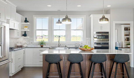
NEW THIS WEEK4 Kitchens With White Cabinets and a Wood Island
Try this classic kitchen combination for a design that’s warm and inviting
Full Story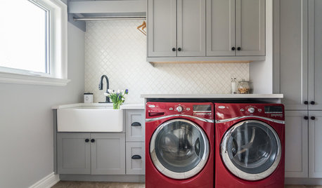
TRENDING NOWBlue, Green and Gray Cabinets Star in the Top New Laundry Rooms
White cabinets are still the most common choice in laundry rooms, but these trending photos tell a more colorful story
Full Story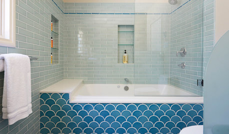
BATHROOM TILE13 Baths Tiled in Beautiful Sea Glass Blue
Let your cares slip away as you wade through these rooms of turquoise and blue
Full Story
KITCHEN DESIGNPearls of Wisdom From a Real-Life Kitchen Remodel
What your best friend would tell you if you were embarking on a renovation and she'd been there, done that
Full Story
DECLUTTERINGDownsizing Help: How to Edit Your Belongings
Learn what to take and what to toss if you're moving to a smaller home
Full Story
COLORPick-a-Paint Help: How to Quit Procrastinating on Color Choice
If you're up to your ears in paint chips but no further to pinning down a hue, our new 3-part series is for you
Full Story
KITCHEN CABINETSKeeping Cabinet Color on the Down Low
Give just base cabinets a colorful coat for a kitchen sporting character and a spacious look
Full StoryWHITE KITCHENSWhite Cabinets Remain at the Top of Kitchen Wish Lists
Find out the most popular countertop, flooring, cabinet, backsplash and paint picks among homeowners who are renovating
Full Story
SELLING YOUR HOUSEHelp for Selling Your Home Faster — and Maybe for More
Prep your home properly before you put it on the market. Learn what tasks are worth the money and the best pros for the jobs
Full Story
KITCHEN CABINETSHow to Update Your Kitchen Cabinets With Paint
A pro gives advice on when and how to paint your cabinets. Get the step-by-step
Full StorySponsored
Your Custom Bath Designers & Remodelers in Columbus I 10X Best Houzz


Lori A. Sawaya