


need help for pale blue-grey paint (not purple!)
m111675
4 years ago
Featured Answer
Sort by:Oldest
Comments (58)

Holly Stockley
4 years ago
E F
4 years agoRelated Discussions
oh no....blue/gray paint looks.....purple!!!!
Comments (16)Well, here is the problem... here is the BM Color Preview palette as it would be displayed in the store. The blue arrow is Sweet Innocence, the red arrow is Gull Wing Gray the color that looks a tad purple in my room. Now, I don't claim any color expertise, I'm just am going off of what the design consultant at my BM store told me. Gull Wing Gray is not Purple, it's Blue Green, (she showed me the color notation in a database). BM makes things harder by mixing paints of different hues on the same strip. If what I read online is correct, Sweet Innocence is also in the Blue Green family. As I said, I'm not an expert, but I have spent a lot of time pondering gray paint. I love gray! The idea that something supposedly blue green can look purple boggles my mind, and I'm trying to understand it. (sorry, I just edited this post to correct a typo and it messed up the picture :( if you click on it, you can see the whole thing)...See MoreBen Moore Pale Gray Update--Help!
Comments (24)I don’t quite know why Houzz sent me a link to this older thread but my update is this: Joan from For The Love of a House Blog knows what she’s doing. Her Ashwood was lovely in my master bedroom. Then, when we bought a new build house in 2013 I decided to try Titanium, also Ben Moore, also from her house. It read soft but tiny hint of green in my well-lit western exposure master bedroom. We paid an up charge to the builder to have a nice light taupe painted throughout the new house so my husband thought I was certifiable to be on a ladder repainting the Titanium over the new walls on the first day we had keys. Of course he was busy taking up all the carpet so he could lay wood floor the same day. The Titanium was wonderful. This past year we moved to the Deep South and I used her Gray Owl throughput the entire house we are in now. It’s my favorite and does read just a bit blue in some lights. (There May Be BM Stonington Gray in the kitchen and both baths. Just sayin’) And totally agree with 6009kitty on sample pots. Never paint without a sample on your wall. And I don’t mean a 12” square either. Light makes a lot of difference. Greenery out the window can change things too. Test it. Red...See MoreLooking for a medium blue-gray with slight purple tinge -- help!
Comments (13)DE has some gorgeous colors and they also list the Munsell Code for their chips -- sweeet! So if you're shopping there you need to know how to take advantage of that information because when you're splittin color hairs like you kinda are, the info can help... First Snow and December Sky both have the PB notation which indicates they are a purple-blue. Just what you're looking for. Munsell notations are: First Snow 4.61PB / 9.0 / 2.1 December Sky 3.24 PB / 8.2 / 0.7 First number: The Hue scale is ten steps or integers. So you can see that December Sky at 3.24PB is not as purple-blue as First Snow coming in at 4.61PB. December Sky is at the beginning *steps* at 3.24 coming out of blue into purple-blue and First Snow is almost smack in the middle of being a PB at 4.61. When you look at the chips you can see that edge of blue in December Sky. Second Number: Next is Munsell Value which speaks to whiteness to blackness. This is a grayscale value ranging from 0 for black to 10 for white. For these two colors the Munsell value is close, with December Sky being more grayed 8.2 and First Snow less grayed or toned at 9.0. (This is not like LRV lightness darkness. LRV is a different *part* of color from Munsell Value) Third Number: Last is chroma. This is where the color is. The chroma scale starts at 0 for neutral colors and really has no end number because you can go all the way to fluorescent colors and who knows what else. Easier to understand this number with these two colors as example especially when you consider that December Sky is a DEW color which means Dunn Edwards Whites. December Sky has a Munsell notation of 0.7 which means there is little chroma or color - just what you'd expect for a "white". First Snow has a chromatic notation of 2.1 so we can tell that it has more color to it than December Sky. I'll list some other colors from ICI/Dulux as options if the two DE colors do not work. The ICI notations or color numbers are kinda similar but are still very different from Munsell notations but I won't go into that. :~D ÂCloud Motif 10BB 73/026 ÂStar Glow 30BB 72/034 ÂMoonlight Blue 30BB 72/045 ÂBlue Haze 30BB 72/028 ÂMing Dynasty White 49BB 76/037 ÂEvening Light 50BB 72/045 ÂWhistle Stop 50BB 72/032 Hope you find one that works....See MoreShould I paint the living room pale blue or leave it gray?
Comments (5)I'd pick my art first and see what colors I bring into the decor. With other accessories such as pillows you might very well be fine keeping the wall neutral Agreeable Gray....See Morem111675
4 years agom111675
4 years ago PRO
PROLori A. Sawaya
4 years agom111675
4 years agoUser
4 years ago- PRO
Lori A. Sawaya
4 years ago m111675
4 years agom111675
4 years agoHolly Stockley
4 years agom111675
4 years agoAudrey
4 years ago
Carolae
4 years ago- PRO
Lori A. Sawaya
4 years ago m111675
4 years agom111675
4 years ago- PRO
Lori A. Sawaya
4 years agolast modified: 4 years ago m111675
4 years agom111675
4 years agoHolly Stockley
4 years agoMary Elizabeth
4 years ago PRO
PROVirgil Carter Fine Art
4 years agom111675
4 years agoCarolae
4 years agoUser
4 years ago- PRO
Lori A. Sawaya
4 years agolast modified: 4 years ago m111675
4 years ago- PRO
Virgil Carter Fine Art
4 years agolast modified: 4 years ago Carolae
4 years ago PRO
PROJudyG Designs
4 years agom111675
4 years agomillalm
4 years ago- PRO
Lori A. Sawaya
4 years agolast modified: 4 years ago - PRO
Virgil Carter Fine Art
4 years ago - PRO
Lori A. Sawaya
4 years ago 
Cheryl Hannebauer
4 years ago PRO
PROAnglophilia
4 years ago- PRO
Lori A. Sawaya
4 years ago 
shead
4 years ago- PRO
Virgil Carter Fine Art
4 years ago - PRO
Lori A. Sawaya
4 years ago - PRO
Virgil Carter Fine Art
4 years ago - PRO
Lori A. Sawaya
4 years ago 
alley2007
4 years ago PRO
PROSabrina Alfin Interiors
4 years ago
Deb
4 years agoJennifer Svensson
4 years agom111675
4 years ago


Related Stories

GRAYDesigners Share Their Favorite Light Gray Paints
These versatile neutrals can help create a range of moods in any room
Full Story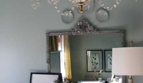

GRAYChoosing Paint: How To Pick the Right Gray
Which Version of Today's 'It' Neutral Is For You?
Full Story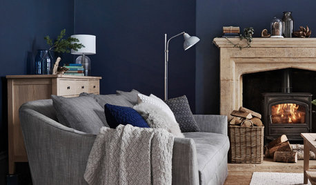
DECORATING GUIDESHow to Combine Blue and Gray in Your Living Room
Let these 10 versions of the versatile color combination inspire you
Full Story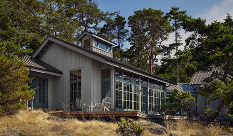
EXTERIOR COLORWhen to Paint Your Home Gray
This perfectly neutral and highly versatile color can create subtle distinctions among exterior architectural elements or stand on its own
Full Story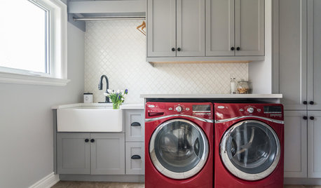
TRENDING NOWBlue, Green and Gray Cabinets Star in the Top New Laundry Rooms
White cabinets are still the most common choice in laundry rooms, but these trending photos tell a more colorful story
Full Story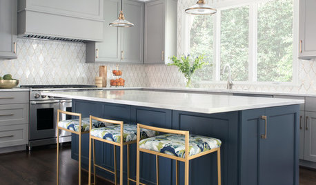
KITCHEN DESIGNThoughtful Style and Storage in a Gray-and-Blue Kitchen
This North Carolina kitchen features a marble-and-brass backsplash and carefully planned cabinet organization
Full Story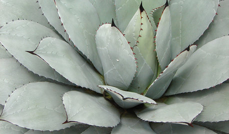
FOLIAGEGet a Cool Garden Look With Gray and Blue Plants
Looking for plants that calm with color in the heat of summer? Look no further than these 14 soothing beauties
Full Story
COLOR PALETTES8 Purple Paint Colors That Work Well in a Kitchen
See how this versatile hue plays with gray and other undertones to give a kitchen a stylish accent color
Full Story
TURQUOISEHow to Pick the Right Blue Paint
Periwinkle, Turquoise, Midnight or Sky? Here's Help Choosing the Blue for You
Full Story

Lori A. Sawaya