


8 Purple Paint Colors That Work Well in a Kitchen
See how this versatile hue plays with gray and other undertones to give a kitchen a stylish accent color
Jennifer Ott
May 25, 2021
San Francisco-based architectural color specialist and design writer. Jennifer's work has been featured in many print and online publications. Her recently-published book, "1000 Ideas for Color Schemes," is a beautifully illustrated and easy-to-navigate guide that takes the guesswork out of selecting the perfect color palette for your home or special event. For more information on Jennifer Ott Design, visit http://jenottdesign.com/.
San Francisco-based architectural color specialist and design writer. Jennifer's... More
I’ve been noticing more people interested in using uncommon colors in their kitchens. And that’s refreshing. If our recent story on six attractive pink paint colors for the kitchen aroused your interest, consider the unusual yet appealing sway of purple. Here are eight purple paint colors that work well.
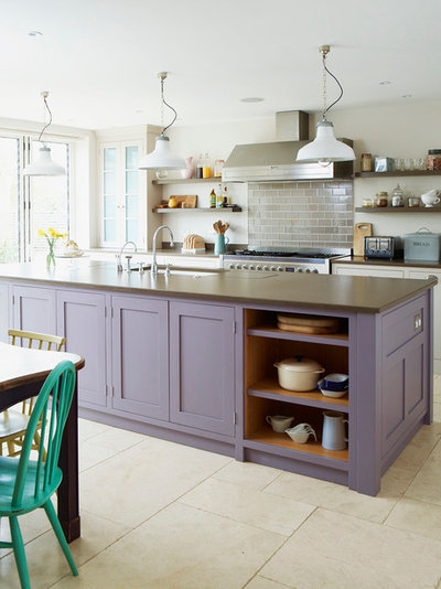
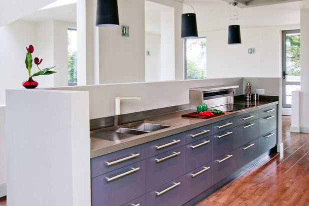
1. Muted Violet
What I love about purple hues is how well they mix with gray. Unlike blues and greens that can veer cold or gloomy as they become muted with gray tones, purple-grays tend to retain warmth and life.
The centerpiece of this charming kitchen is the beautiful subdued violet island cabinetry. This particular color is a nice midtone purple — not especially dark nor light — with just a touch of gray to tone it down from a more pure shade of purple.
Find an interior designer or decorator
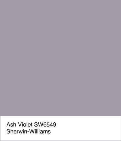
For a similar look: Ash Violet by Sherwin-Williams is a shade of purple that plays well with a variety of other hues, from warm reds and yellows to cooler blues, grays and greens. It’s a sophisticated color that’s in no way stuffy.
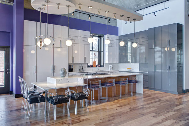
2. Cool Purple
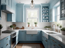
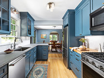
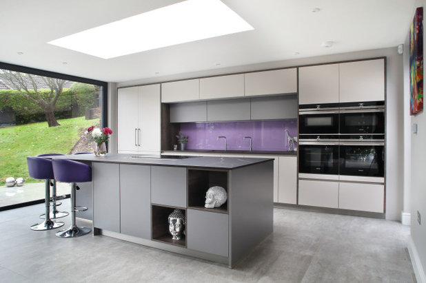
A cool kitchen deserves a cool color and this spectacular contemporary kitchen gets a healthy dose of it. If you look at various shades of purple, you’ll notice some veer more blue and others pink-red. The former are what I refer to as “cool purples” and they pair really well with cool shades of white and gray. Balance is key, of course, so a warm element such as wood floors or cabinets keeps the space from going too cold.
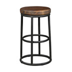
Shop for bar and counter stools
A cool kitchen deserves a cool color and this spectacular contemporary kitchen gets a healthy dose of it. If you look at various shades of purple, you’ll notice some veer more blue and others pink-red. The former are what I refer to as “cool purples” and they pair really well with cool shades of white and gray. Balance is key, of course, so a warm element such as wood floors or cabinets keeps the space from going too cold.
Shop for bar and counter stools
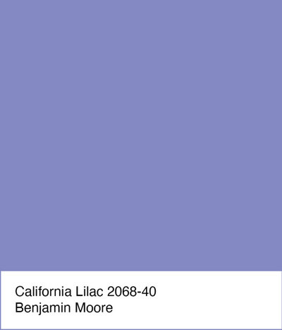
For a similar look: California Lilac by Benjamin Moore is a blue-purple hybrid that’s bright and cheery, making it an excellent candidate for an accent color in a modern or contemporary kitchen. Plus, as a cooler color, it works well for homes in warmer climates.
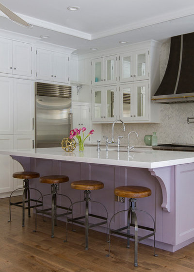
3. Warm Purple
This purple has pink rather than blue undertones, making it a warmer purple compared with the previous example. This touch of warmth makes it a great choice in an otherwise cool, white and bright kitchen.
This purple has pink rather than blue undertones, making it a warmer purple compared with the previous example. This touch of warmth makes it a great choice in an otherwise cool, white and bright kitchen.
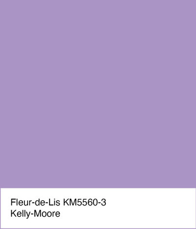
For a similar look: Those residing in cooler climates might favor a warmer purple over the previous cool example. Fleur-de-Lis by Kelly-Moore is a purple shade with pink undertones, which takes the chill off.
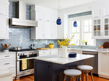
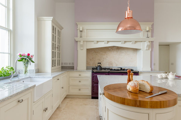
4. Light Lilac
Traditional kitchens need not stick to traditional color schemes. This soft shade of lilac purple is as pretty as it purpose-serving. It provides contrast in this mostly white kitchen, but with a soft touch rather than a heavy hand.
If the island was painted white in this kitchen, it wouldn’t stand out as well. A soft wash of color transforms it into a focal point.
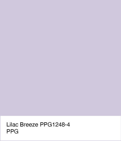
For a similar look: Lighter than the previous example, Lilac Breeze by PPG is a soft and pretty purple that works well in any style of kitchen, from traditional to contemporary.
5. Soft Orchid
Even lighter than the last example, this soft purple blush hue adds just a touch of color and is another example of successfully using less-traditional colors in traditional and transitional spaces.
I would argue that while the stunning plum-colored range is the focal point of this beautiful kitchen, the soft pinkish-purple accent wall serves a solid supporting role.
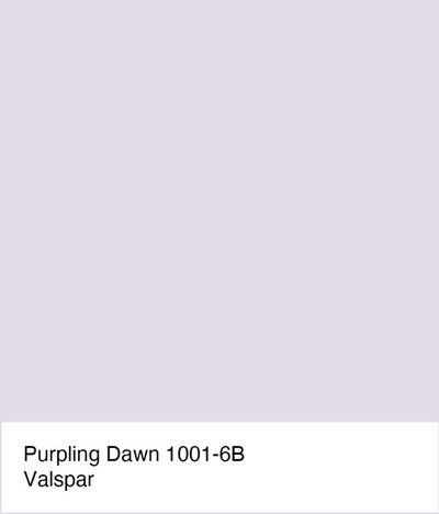
For a similar look: Purpling Dawn by Valspar is a sweet hue that’s perfect for anyone looking to add some color to the kitchen while keeping the space light and bright.
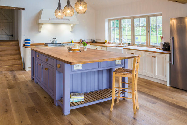
6. Purple-Periwinkle
I speak a lot about my childhood love of periwinkle — my favorite crayon color from way (way!) back in the day. Named for the flowering plant with pretty flowers that run from warm blue to cool purple, periwinkle brings a fun and fresh vibe into a kitchen.
Periwinkle shades tend to be more vibrant, with less gray and more pure purple and blue tones, so they’re best used to clad architectural elements that you want to capture the eye.

For a similar look: This is no wallflower hue, so in most cases a little bit of Dahlia by Sherwin-Williams is all you need to create a stunning focal point in the kitchen.
7. Gray-Grape
If periwinkle strikes you as too vibrant, take a look at purple shades that have a healthy dose of gray in them, such as the color applied to these base cabinets. It’s not a neutral hue but it has enough gray in it that it doesn’t come on too strong.
If periwinkle strikes you as too vibrant, take a look at purple shades that have a healthy dose of gray in them, such as the color applied to these base cabinets. It’s not a neutral hue but it has enough gray in it that it doesn’t come on too strong.
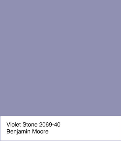
For a similar look: A shade like Violet Stone by Benjamin Moore is a nice compromise between light and dark and vibrant and neutral. It’s just right.
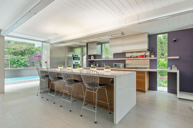
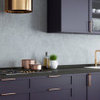
8. Deep Purple-Gray
Dark gray has been a popular accent color for a while now, but it’s starting to get nudged out by warmer hues such as bronze and purple-grays. This dark gray-purple hybrid really defines this modern kitchen and provides a bit of pleasing contrast in an otherwise white and light kitchen.
Dark gray has been a popular accent color for a while now, but it’s starting to get nudged out by warmer hues such as bronze and purple-grays. This dark gray-purple hybrid really defines this modern kitchen and provides a bit of pleasing contrast in an otherwise white and light kitchen.
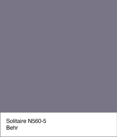
For a similar look: A heavily toned-down purple like Solitaire by Behr can be called upon to serve as a neutral. If you’re seeking a dark accent hue but would rather not tap black or grays, a deep purple-gray like this is a good option to consider.
Your turn: Which shade of purple is your favorite? Tell us in the Comments.
More on Houzz
Read more Color stories
Hire a kitchen remodeler
Shop for kitchen products
Your turn: Which shade of purple is your favorite? Tell us in the Comments.
More on Houzz
Read more Color stories
Hire a kitchen remodeler
Shop for kitchen products


We are a family owned business with four generations of experience in whole house remodeling. For over 25 years,... Read More
What are you working on?

Related Products

As a full-service, family-owned remodeling company in New Albany, OH, we strive to bring our clients incredible... Read More
Related Stories

Decorating Guides
Design Pros Share 10 Favorite Creamy White Paints
By Becky Harris
These off-white color choices include versatile tones, warming hues and pleasingly soft shades
Full Story

Color
Pantone Picks a Peach for Its 2024 Color of the Year
By Jennifer Ott
See how to use this juicy hue to create calm yet flourishing spaces inside and outside the home
Full Story

Colors of the Year
10 Paint Colors Ready to Take Over in 2024
By Jennifer Ott
Blue is huge, but dark hues and warm tones also find favor among major paint companies’ 2024 Color of the Year picks
Full Story

Events
7 Color Trends for 2024 at Maison & Objet
By Claire Tardy
New harmonies and unexpected pairings at the fall 2023 trade fair set the tone for next year’s interiors
Full Story

Decorating Guides
9 Ways to Layer Warm Neutral Colors for Comfortably Refined Rooms
By Becky Harris
Design pros share advice for building an inviting palette, introducing high contrast and mixing textures
Full Story
Exteriors
10 Off-White Paint Colors for Home Exteriors
Pros share the off-white shades they used to complement the architecture of these remodeled and new-build homes
Full Story
Color
Pantone Chooses a Vibrant Magenta for 2023 Color of the Year
By Jennifer Ott
Viva Magenta is a bold, cool red hue meant to promote optimism and joy. See how to use it around your home
Full Story

Colors of the Year
7 Paint Colors Set to Be Big in 2023
By Jennifer Ott
See the soft neutrals, warm pinks and deep blue-greens defining major paint companies’ 2023 Color of the Year choices
Full Story
Events
Color Trends for 2023 at Maison & Objet
By Claire Tardy
Interior spaces get infused with colors both soft and bold
Full Story
Events
Trending Color Palettes for 2022 at Maison & Objet
By Claire Tardy
Houzz France editors share four key color schemes for interiors at the iconic trade fair in Paris
Full Story
Love all that!
Thank you for these. I also love them all. I'm trying to work some pink into my kitchen remodel but curiously am meeting resistance from my husband🤔. Stories like these might just help do the trick! Nicely done
Definitely periwinkle! So bright and cheerful when you want a pop of color.