


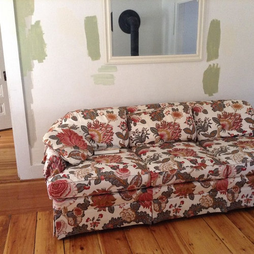
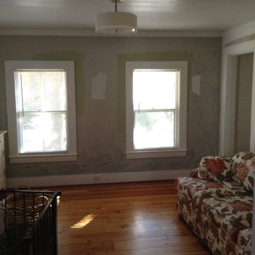
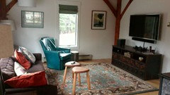
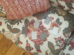
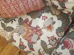
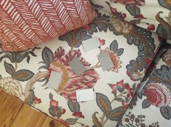
Please help me put together our living room!
Momshouse
7 years ago


Featured Answer
Sort by:Oldest
Comments (67)

Momshouse
7 years agoRelated Discussions
Help me put 'hurried' kitchen together please!
Comments (7)I do think you should be thoroughly satisfied that you can't have wood before giving up or giving in (if wood is your first choice)...But just to throw this in: I looked at the Daltile Concrete Connection tiles when I thought we were doing large format tiles on our counters...Love them. I don't really see how it would limit your counter choices with that color still being a neutral...Just a neutral with more character than blah beige. :-) However, I am one to believe in deciding the 'whole package' before being tied to one choice. Make sure there are counter options you'll like before getting to the 'no turning back' place on the floor....See MorePlease help put together my family room!
Comments (14)For the rug, I would do two of the same rug in different sizes/shapes. Would stick with grey, teal and orange theme to warm it up. Something like This rug . You could also do a custom bench cushion to go over the cabinet for window seating here . It can be customized any way you want - fabric, color, pattern, style. Just make sure those cabinets can support the weight of full grown adult. For a table- would probably stick with rectangular. If you want something "different", round may work depending on the type. Would do a weathered grey wood table to keep in line with the rest of the colors like This If you were going to do a solid color rug, then I would probably use a tufted ottoman as a coffee table in a brick orange to add some texture and color. But I love the way grey and orange look together....See MoreNeed help making our new house feel more put-together
Comments (25)I think the dining room rug is a little dark but I would make your other changes before replacing it - maybe it'll look okay once you've done everything else. You could also try removing it for a while and see if you like the area lightened up. If you do, you could look for a lighter rug or just leave it out. And I would also center it under the table if you can. I hate to say it but I think the new curtains might be a tiny bit too short but I am no curtain expert and don't have any in my house. I think I like the Accessible Beige or Agreeable Grey mentioned above better than Maison Blanche or Antique White, but that boils down to personal preference. I just sampled Antique White in my own house and it looks more tan/yellow than I prefer and reminds me a little of your current wall color....See MorePlease help us pull together living room
Comments (22)What a stunning old house with fantabuous detailing! I thought you must be haunted by a spirit, and the reason the long floor was in the living room was so you could catch it! If not, please remove that mirror. In its place, please put a bar cart, and mover the side table to the other side of the chair. Find a coffee table for in front of the sofa. I would not spend a lot for it. I wouldn't spend a lot for the bar table either. After all, this is a rental, you don't know how long you will be here, where you will end up next and what will suit your next place. Scour garage sales, charity stores, etc. What I would do is find some throw pillows or throw pillow covers (or make them yourself) that marry the lighter color of your sofa and the darker color of your chair. I like the look of a fireplace screen too, but I wouldn't invest the money in it for a rental, either. If you can pick one up for a song second hand, then go for it, otherwise, forget it. Then if you want, you can spray-paint it with heat resistant spray paint....See MoreMomshouse
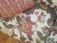
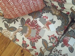
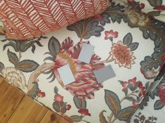
7 years agoMomshouse
7 years agoMomshouse
7 years agoMomshouse
7 years agoMomshouse
7 years agolast modified: 7 years agoMomshouse
7 years agolast modified: 7 years agoMomshouse
7 years agoMomshouse
7 years agolast modified: 7 years agoMomshouse
7 years agoMomshouse
7 years agoMomshouse
7 years agoMomshouse
7 years agoMomshouse
7 years agoMomshouse
7 years agolast modified: 7 years agoMomshouse
7 years agoMomshouse
7 years agoMomshouse
7 years agolast modified: 7 years agoMomshouse
7 years agoMomshouse
7 years agoMomshouse
7 years agolast modified: 7 years agoMomshouse
7 years agoMomshouse
7 years ago


Related Stories

PETS6 Ways to Help Your Dog and Landscape Play Nicely Together
Keep your prized plantings intact and your dog happy too, with this wisdom from an expert gardener and dog guardian
Full Story
SMALL SPACESDownsizing Help: Where to Put Your Overnight Guests
Lack of space needn’t mean lack of visitors, thanks to sleep sofas, trundle beds and imaginative sleeping options
Full Story
SHOP HOUZZShop Houzz: Putting Together a Pop Culture Living Room
Pull off a cool, pop culture living room with colorful furniture, eye-catching art, lighting and more
Full Story0
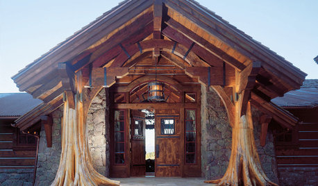
THE ART OF ARCHITECTUREOutside In: You, Me and Nature, Cozy Together
From reclaimed tree trunks to soaring coastal views, designers and homeowners are finding ways to bring the inspiring outdoors inside
Full Story
COFFEE WITH AN ARCHITECT10 Tips to Help You Put Off Procrastinating
Blank page staring at you? Look it in the eye, then vanquish it in 10 only slightly meandering steps
Full Story
LIFEYou Said It: ‘Put It Back’ If It Won’t Help Your House, and More Wisdom
Highlights from the week include stopping clutter from getting past the door, fall planting ideas and a grandfather’s gift of love
Full Story
MORE ROOMSTech in Design: Where to Put Your Flat-Screen TV
Popcorn, please: Enjoy all the new shows with a TV in the best place for viewing
Full Story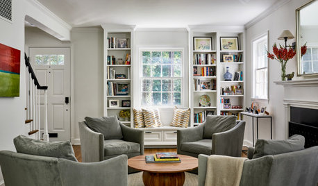
ENTERTAINING10 Steps to Pull Together Your Living Room Before the Holidays
Boost comfort, flow and visual appeal in your main entertaining room to make guests feel more welcome
Full Story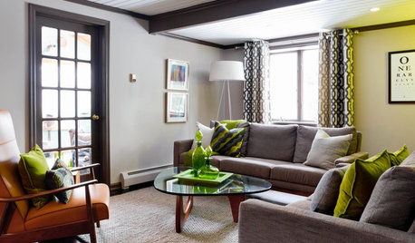
LIVING ROOMSCurtains, Please: See Our Contest Winner's Finished Dream Living Room
Check out the gorgeously designed and furnished new space now that the paint is dry and all the pieces are in place
Full StorySponsored
Leading Interior Designers in Columbus, Ohio & Ponte Vedra, Florida


annz3