


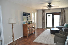
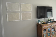
I'm not sure Revere Pewter is working in my living room..
rushing_wind
8 years ago
Featured Answer
Sort by:Oldest
Comments (21)

rushing_wind
8 years agoRelated Discussions
Revere Pewter for my dining room
Comments (19)RP contrasts enough with white trim -- it's the light wood furniture and the different undertones that aren't working. Your low contrast art adds to the effect. If the furniture stays, I'd look at the RP for the hall and more color in the DR. RP would go great with eggplant if you are considering that direction. The eggplant would also look good with the teal glass in your cabinet. The new photo with the test swatch of RP also shows some Asian china pieces. This grey was one I mentioned earlier (evening dove) and it would look great with the orange/paprika color as well as the dark blue in those. You can see the pairing with peachy and orange tones in the pillows and flowers. Might be easier for DH to handle a deeper grey too. Some guys can't deal with anything resembling purple (you could tell him it's warm or fruity cocoa -- LOL). I think it would also transition well with RP in the entry (look at the ceiling -- a similar idea). Looking at RP on the BM website, they show it with mink and dalton blue-- that goes to a darker grey brown (almost a slightly greyed cocoa) and a pale grey blue (that could go on the ceiling if you get adventurous). Your crystal chandelier (see it in the reflection) would be very pretty against any of these darker colors. Have we confused you more? Will the RP work in the entry so the painter can keep painting? LOL...See MoreBM Revere Pewter or Gray Owl in north facing/low light room
Comments (35)Boy, I can relate to all of these posts. I have RP in my open floor plan. On the walls that have natural light, it looks OK (not my favorite) but the adjoining family room with the screened porch next to it blocking the light, the walls look like green/yellow mud and I am stressing as to what to do. My trim & cabinets are off-white so i have to stay with the warm greys. I've even tried Sea Salt which looks dull. I'm going for an LRV of 65+ so I'm trying the sample board with the Repose Gray at 75% with the idea of the adjoining kitchen/nook at 100%. We will see. Next I'll try the Gray Owl - OC 52 i think. Beware.......there are two Gray Owls! The Oc 52 is the lighter version. To complicate matters, I have a beautiful silver gray sectional sofa that I'm working with. I appreciate all of the posts here....See MoreRevere Pewter (BM) can someone show rooms painted with this color
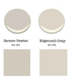
Comments (15)Based on measuring a sample of Revere Pewter and formal colorimetric standards, it belongs to the yellow hue family. Here's a complete Colorography of the color. This is an objective point of view based on the color's spectral curve or "fingerprint" measured in a controlled environment - usually lit with a daylight light source called D65. Which is very different from the very murky, slippery slope of undertones which are painfully subjective and totally determined by individual evaluation. In other words, when it comes to undertone, someone's making their best guess about what they see as far as a color's inherent qualities using random lighting conditions. They could be shuffling paint chips at their kitchen table, in the front seat of their car, out in the garage, standing in their half-built castle. You really have no way of knowing....See MoreBM Light Pewter with Revere Pewter?
Comments (23)I see brown/green undertones in Revere Pewter; I see gray/brown undertones in Light Pewter Revere Pewter is a beautiful wall color. However, like any paint color, it will be affected by natural light. I have it in my living room/dining, which get east, north and south light and it Is perfect thought the day. You have very little natural light in the basement room, so going light isn’t always the answer. If you have a dark room where you need to have lights on all the time, do something deeper which works with the lighting you have. My experience is darker makes a space look bigger because the corner shadows aren’t as obvious....See Morerushing_wind
8 years agolascatx
8 years ago
Micki-Micki
8 years agodarrenjones
4 years ago


Related Stories

DECORATING GUIDESColor Guide: How to Work With Charcoal Gray
The most modern neutral, charcoal gray looks great in dining rooms, living rooms and even nurseries. Here's how to use it best
Full Story
GARDENING GUIDESMake Sure You Read This Before Buying New Plants
Follow these 10 plant-selection tips to avoid buyer’s remorse
Full Story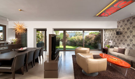
MORE ROOMSWhere to Put the TV When the Wall Won't Work
See the 3 Things You'll Need to Float Your TV Away From the Wall
Full Story

WINTER GARDENING6 Reasons I’m Not Looking Forward to Spring
Not kicking up your heels anticipating rushes of spring color and garden catalogs? You’re not alone
Full Story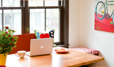
HOME OFFICES10 Ways to Work Your Work Space
The dining room, kitchen or closet can all become your dedicated home office
Full Story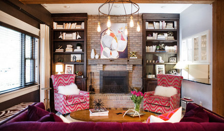
LIVING ROOMSNew This Week: 3 Ways to Work Around a Living Room Fireplace
The size, location and materials of many fireplaces present decorating challenges. Here are a few solutions
Full Story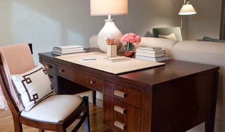
HOME OFFICESMeet Your Desk: How to Create a Workspace That Works
Ask yourself: What should live on your desk and what can live elsewhere?
Full Story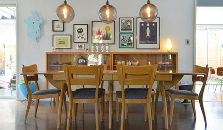
LIGHTINGPersonal Spaces: Homeowners Work Their Pendant Lights
See how all kinds of rooms are getting a lift from hanging lights, both budget-friendly and glam
Full Story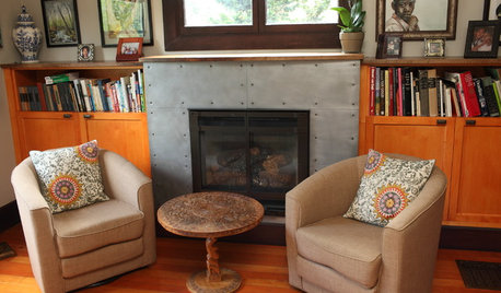
HOUZZ TOURSMy Houzz: Personalized Style in a Portland Painter’s Live-Work Home
Empty nesters bring DIY touches and industrial-style creativity to their 1908 Oregon house
Full Story


IdaClaire