


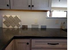
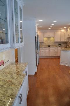
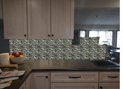
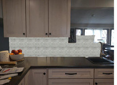
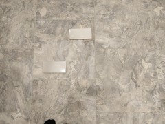
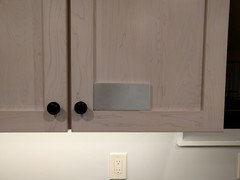
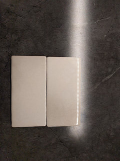
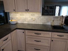
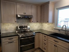
Please help with tile back splash recommendations
laughablemoments
8 years ago
last modified: 8 years ago


Featured Answer
Sort by:Oldest
Comments (55)

laughablemoments
8 years agoRelated Discussions
Granite and back splash help, PLEASE.
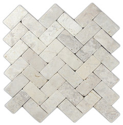
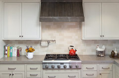
Comments (4)We used Kashmir Gold with our dark-ish cabinets and medium floors (which are more medium than they look here: A better look at the surface, but before the kitchen had a new floor - and a few other things :) Backsplash: this is really personal. We used a travertine, but that is definately an "out" choice around here. Various kinds of subways are ever popular choices, also squares set on point, and some still like various sorts of glass, or even the same granite as your counter or a piece of stainless steel. Some go with just paint, which also works. There are many threads on that subject, but this one is fairly recent and makes many good points to consider. Mostly I'd recommend deciding on a counter first, and then worry about the backsplash. Here is a link that might be useful: Backsplash-a somewhat contentious discussion...See MoreHelp with Name/Source of this back splash tile?
Comments (2)One of the comments on your houzz link gives this link to lunadabaytile agate martini blend. That looks right to me?...See MoreKitchen glass mosaic back-splash recommendations
Comments (9)I don't know what your client has in mind completely. It might be worth asking the client for some inspiration pictures for what she has in mind. I think some glass mosaics might be overpowering for that granite. But there are some glass mosaics that might work as long as they are very plain. Super white glass tile Maybe something like this with a tiny bit of pattern: Silver planks glass tile Or maybe this one which might work with the colour in the counter: glass mosaic - raw silk...See MoreBianco antico, I need back splash help please!
Comments (4)I disagree about the gray tile. A light gray glass subway tile might work nicely. You already have white cabinets everywhere so it won't "dull it down". Get samples to make sure they work with the slab you've chosen: The more elongated version would make it a bit more contemporary; and the traditional 3 x 6 more traditional....See Morelaughablemoments
8 years agolast modified: 8 years agolaughablemoments
8 years agolast modified: 8 years agolaughablemoments
8 years agolaughablemoments
8 years agolaughablemoments
8 years ago
Amy Stickler
8 years ago
eam44
8 years agoAmy Stickler
8 years agoAmy Stickler
8 years agolaughablemoments
8 years ago
rebunky
8 years ago
mayflowers
8 years agoAmy Stickler
8 years agolaughablemoments
8 years agoAmy Stickler
8 years ago
sasandfat
8 years agoAmy Stickler
8 years ago
cpartist
8 years agolaughablemoments
8 years ago
barncatz
8 years agolast modified: 8 years agoAmy Stickler
8 years ago
romy718
8 years agorebunky
8 years ago


Related Stories


HOME OFFICESQuiet, Please! How to Cut Noise Pollution at Home
Leaf blowers, trucks or noisy neighbors driving you berserk? These sound-reduction strategies can help you hush things up
Full Story
SELLING YOUR HOUSE10 Tricks to Help Your Bathroom Sell Your House
As with the kitchen, the bathroom is always a high priority for home buyers. Here’s how to showcase your bathroom so it looks its best
Full Story
BATHROOM WORKBOOKStandard Fixture Dimensions and Measurements for a Primary Bath
Create a luxe bathroom that functions well with these key measurements and layout tips
Full Story
SELLING YOUR HOUSE5 Savvy Fixes to Help Your Home Sell
Get the maximum return on your spruce-up dollars by putting your money in the areas buyers care most about
Full Story
DECORATING GUIDESThe Most Helpful Furniture Piece You May Ever Own
Use it as a table, a seat, a display space, a footrest ... and indoors or out. Meet the ever-versatile Chinese garden stool
Full Story
GARDENING GUIDESGreat Design Plant: Silphium Perfoliatum Pleases Wildlife
Cup plant provides structure, cover, food and water to help attract and sustain wildlife in the eastern North American garden
Full Story
FUN HOUZZDecorated Houses Help Save a Detroit Neighborhood
Art's a start for an inner-city community working to stave off urban blight and kindle a renaissance
Full Story
ORGANIZINGHelp for Whittling Down the Photo Pile
Consider these 6 points your personal pare-down assistant, making organizing your photo collection easier
Full Story
ORGANIZINGDo It for the Kids! A Few Routines Help a Home Run More Smoothly
Not a Naturally Organized person? These tips can help you tackle the onslaught of papers, meals, laundry — and even help you find your keys
Full Story


localeater