


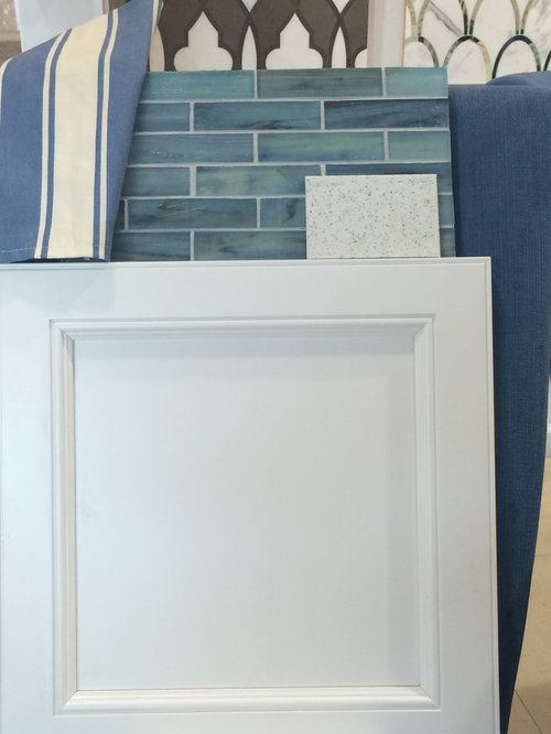
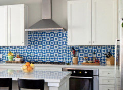
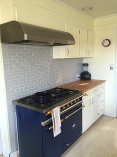
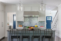
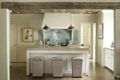
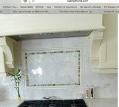
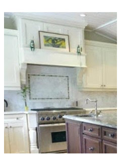
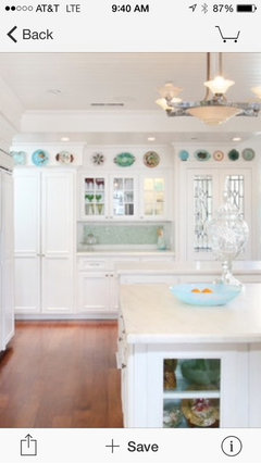
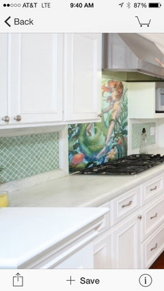
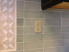
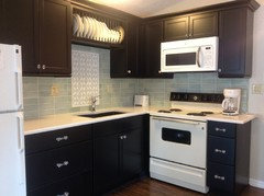
I'm on a countertop/backsplash roller coaster...
kelleg69
9 years ago

Featured Answer
Sort by:Oldest
Comments (99)

Shelley Graham
8 years ago
Jillius
8 years agoRelated Discussions
Looking for info on a sliding backsplash that conceals appliances
Comments (2)Wow, what a nifty idea! I have never really objected to having my appliances in sight but it can become cluttered, especially with cords and other things that tend to accumulate. I just posted a response to someone asking about backsplash material and I suggested using laminate flooring with a tile design. It makes a nice durable backsplash without the issues of dirty grout but you do have to be careful how you install it in wetted areas. I guess one could cut a couple of pieces to size and install them on a double track like patio doors. There is bound to be some hardware out there for protecting and concealing the cut edges and to provide some kind of rollers to reduce friction. Hope this helps your brainstorming. I'm remodeling my kitchen now and it sure gave me some ideas to ponder....See MoreBacksplash dilemma - WWYD?
Comments (13)A good tiler can still hide many counter not-being-flush sins, up to about 3/4" if not a bit more. They can backbutter the tiles, that is, build up the mortar behind the tiles to compensate. Don't sweat about finding thicker tile! But as others say, it's not a crime to have the short countertop-material backsplash, either. :-) Why don't you have them deliver it but not install it, until such time as you've decided whether you want it or not? It's really just a matter of using an epoxy glue and sticking the thing on, as long it's already measured etc....See MoreNeed cabinet color/counter top help
Comments (19)terrilynn, I am confused about what to do for the island and also the desk/coffee bar/bar area. I'm going back and forth on wood or soapstone for the island. I'm pretty sure I want wood on the desk and soapstone on the bar/coffee area. (just for maintenance purposes). I'm not sure if I do the base colors on the other areas the same as the island or different. We aren't doing any stainless except for the range, but that desk is pretty cool! Lavender, thanks, and I love the idea of red accents. I hadn't really thought that far, but that will be perfect and will blend with the rest of our house. I guess I need to figure out if I can really do the painted island and how much maintenance that will be. Here are my options, in case anyone else is as confused as I am: 1. Wood colored island with soapstone top 2. Sage/light green island with soapstone top 3. Sage/light green island with wood top Desk: something with a wood top....I'm thinking base should match the island, unless of course the island base is wood tone, and then it would either match the yellow cabinets or the coffee bar area. Coffee bar/bar: definitely soapstone top- either yellow cabinets like the rest of the kitchen, green, or wood colored. I'm even confusing myself, so if anyone is following this, I'm impressed, and thank you for any thoughts!...See MoreBacksplash for Sea Pearl Quartzite - Help!!
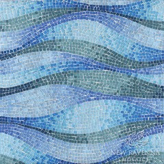
Comments (19)lmgch - I remember your kitchen; so beautiful! Your backsplash is lovely. I recall it's from Porcelanosa, correct? I considered getting a sample when you posted your reveal, but we have no Porcelanosa dealers in my state. I do like that there is a pattern in yours; it adds a nice touch. herbflavor - I understand what you're saying. Agree that we need something that pulls it all together. My concern about mosaics is that they are trendy (of course, the same could be said about white subways with gray grout). eam44 - I loved the Fireclay Hydrangea immediately. My search actually began with glass and glass mosaics. The Sea Pearl evokes feelings of coastal, so I thought glass might work. I almost went with the green glass mosaic below, then thought glass in general would be too trendy. I want something unique (I know...subways are not!) that is neutral enough to not steal the show from the Sea Pearl. I had ruled these out (marble - too bathroomy?, glass - too trendy?)...maybe I should revisit. So unsure!!...See More PRO
PROMDLN
8 years agonosoccermom
8 years agosteph2000
8 years ago
Gracie
8 years ago
beth09
8 years agokelleg69
8 years agokelleg69
8 years agoamg765
8 years agobeth09
8 years ago
rebunky
8 years agofatherdowling
8 years agobeth09
8 years agokelleg69
8 years agofatherdowling
8 years agokelleg69
8 years agoamg765
8 years agorebunky
8 years agokelleg69
8 years agokelleg69
8 years ago
huruta
8 years agokelleg69
8 years agonosoccermom
8 years agorebunky
8 years agobeth09
8 years agokelleg69
8 years agokelleg69
8 years agokelleg69
8 years agokelleg69
8 years agokelleg69
8 years agokelleg69
8 years agoJillius
8 years ago
Bunny
8 years agorebunky
8 years agocindywhitall
8 years agokelleg69
8 years agokelleg69
8 years agokelleg69
8 years agokelleg69
8 years agokelleg69
8 years agosteph2000
8 years agokelleg69
8 years agonosoccermom
8 years agokelleg69
8 years agoJillius
8 years agojess1979
8 years ago


Related Stories
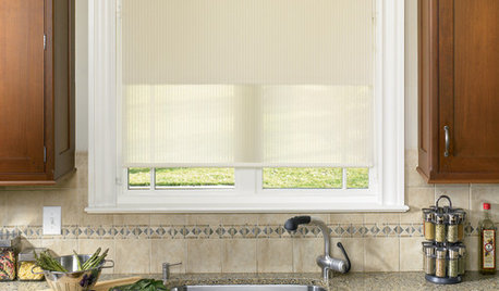
WINDOW TREATMENTSWhat’s the Right Way to Hang Roller Shades?
Over or under? It depends on how you want your shades to look, how much light you want to block and other factors
Full Story
KITCHEN DESIGNCountertop and Backsplash: Making the Perfect Match
Zero in on a kitchen combo you'll love with these strategies and great countertop-backsplash mixes for inspiration
Full Story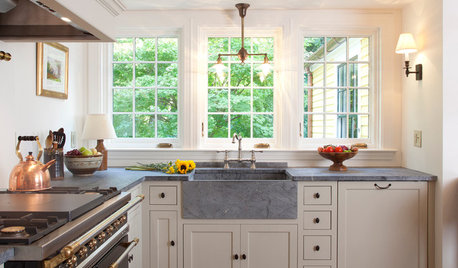
KITCHEN COUNTERTOPS10 Top Backsplashes to Pair With Soapstone Countertops
Simplify your decision-making process by checking out how these styles work with soapstone
Full Story
KITCHEN DESIGNNew This Week: 4 Surprising Backsplash and Countertop Pairings
Make your kitchen workspace stand out with colored ceramic tile, back-painted glass, butcher block and more
Full Story
KITCHEN DESIGNTrick Out Your Kitchen Backsplash for Storage and More
Free up countertop space and keep often-used items handy by making your backsplash more resourceful
Full Story
KITCHEN DESIGNWonderful Wood Countertops for Kitchen and Bath
Yes, you can enjoy beautifully warm wood counters near water sans worry (almost), with the right type of wood and sealer
Full Story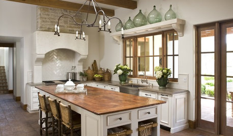
KITCHEN DESIGNSurprise Contender: Copper for Kitchen Countertops
Unexpected and full of character, copper is getting buffed for its growing appearance on the countertop scene
Full Story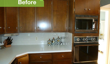
KITCHEN DESIGN3 Dark Kitchens, 6 Affordable Updates
Color advice: Three Houzzers get budget-friendly ideas to spruce up their kitchens with new paint, backsplashes and countertops
Full Story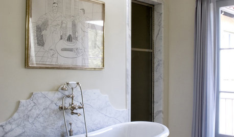
MATERIALS10 Modern Marble Looks
Marble has broken free of the standard kitchen countertop slab and is showing up on bathtub backsplashes, modern dining tables and more
Full Story
KITCHEN COUNTERTOPS7 Low-Maintenance Countertops for Your Dream Kitchen
Fingerprints, stains, resealing requirements ... who needs ’em? These countertop materials look great with little effort
Full StorySponsored
Columbus Area's Luxury Design Build Firm | 17x Best of Houzz Winner!
rebunky