Hi everyone,
So, I have been working hard to incorporate all of your great ideas and insights that came out of my original post a few weeks back - what would I do without you GW? Special thanks to Buehl for all the hardwork reworking my first layout - I'm so grateful.
This is what I changed:
1. Moved doorway - best decision yet!
2. Added 2 flanking cabs on window wall - one for pantry and one for coffee system, speed oven stack, and later: a fridge drawer
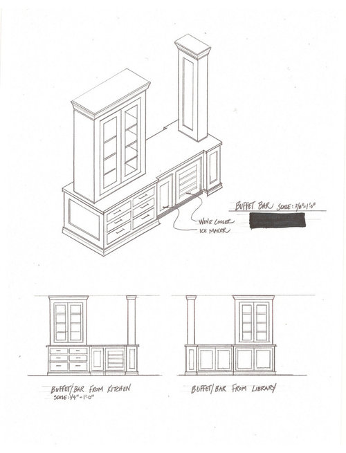
3. Created a buffet/hutch-like library bar with see-through glass cabs (not symmetrical but does it work? Or, do you prefer Option #2 with just the 12” columns on each side?or #3 with equal cabs flanking?) I didn’t put a wider cabinet on the right side of the bar because the architect advised me to try and save a more open view into the living room where people hang out, watch tv, etc.
4. Added more seating and a trash pull-out to the island
5. Lengthened the window wall countertops to 28” and the upper cabs 18” (doesn’t show but it’s planned)
Things I didn’t do:
1. Consolidate dishwashers - I love my prep sink view out to the golf course too much (and the view out the other sink window isn’t very good)
2. Flip refrigerator (to right of range). Ugh. It probably makes more sense to have it on the right since the kids move in and out of the tv room through the door where the fridge would have been. But, I’m thinking I’ll leave a cabinet ready under the stack to put a small fridge drawer there someday. My budget isn’t that elastic so it’ll be a placeholder. Plus, I like the idea of leaving and entering the kitchen with the glass cabs there. Just a personal preference.
3. Didn’t put Miele coffee/espresso maker in the beverage zone (i.e., library bar). It actually works better from a flow perspective to have it in a stack with the Miele speed oven/micro- DH makes his coffee in the morning, which would be away from my zone for making breakfast and the kids’ lunches. (Also, it’s 22” deep so if I put it in the glass hutch area I wouldn’t have the glass cabs. Right? Or am I not thinking outside the box?)
Could you please look this over and tell me what you think? Could you:
1. Comment on the layout
2. Comment on the library bar OPTIONS(Option 1, 2 or 3- or something else :)) I want your opinions!
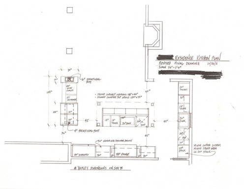
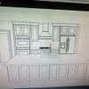
Here's the current floor plan for the kitchen:
">
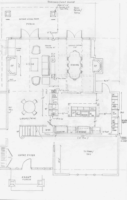
Here's the overall floor plan - so you have a sense of flow into the rooms and how the kitchen is connected to everything:
">
Here's the drawing of the glass hutch (on one side of the library bar) option (OPTION 1):
">
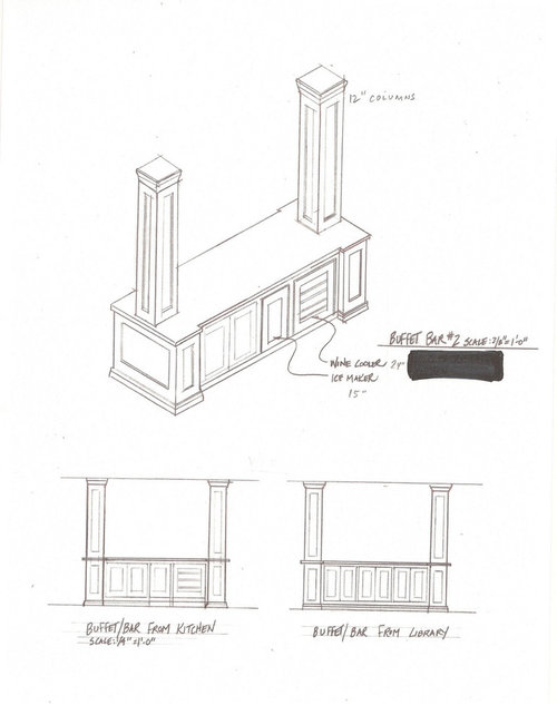
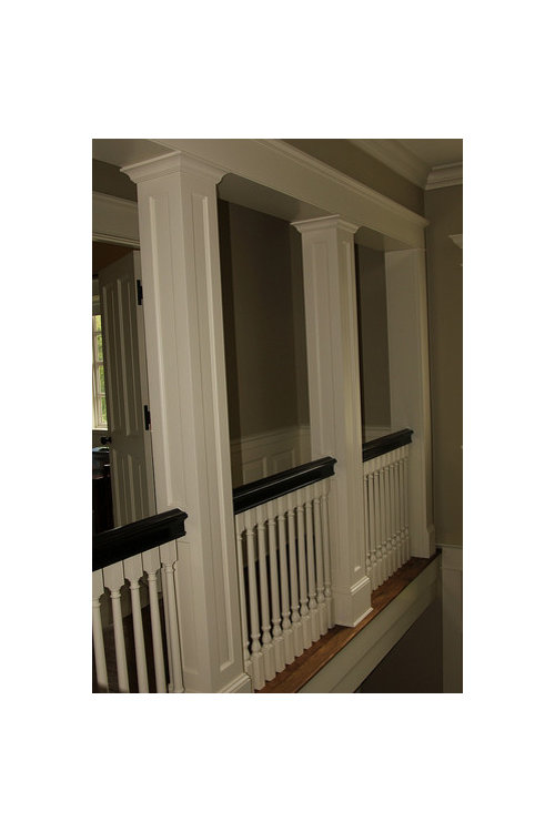
Here's the drawing of the columns only (on the bar) (OPTION #2)
">
Here's an earlier drawing (OPTION 3) I was considering but moved away from because I was nervous that it obscured our view into the living room - what do you think?
">
Here's a similar pic of what columns only would look like:
">
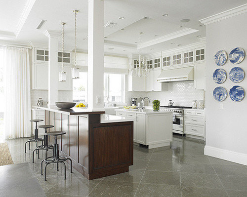
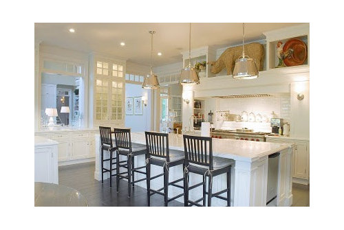
Here are some pix of the glass hutch option:
">
">
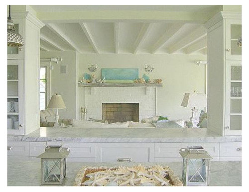
Here's a pic of what the library bar cabinets could look like on the other side of the bar (i.e., the library side). In other words, the cabs could be glass on the kitchen side but paneled on the other/library area side - to hide the 4" and 6" structural beams
">
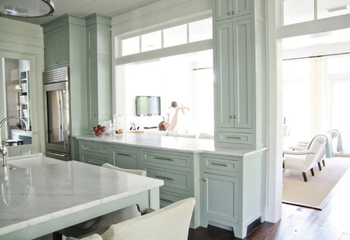
Columns we're doing (traditional/boxed/painted)
">
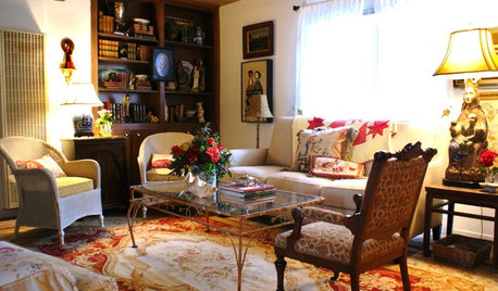
An inspiration pic for our island (I like the legs and the way it accomodates a lot of seating; also, the cab style and color; notice too the Miele stack on the left - that's what we're aiming for on the sink wall; and the lighting I love - but it may be too large/out of proportion with our short 7'9" ceilings :(
">
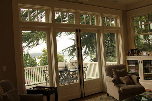
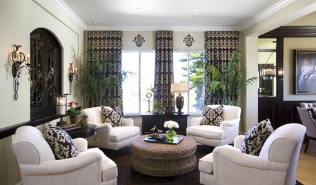
Windows and french doors we're doing for the dining and living rooms leading outside (again very traditional)- you can even see a sliver of a coffered ceiling, which is what we're doing for the dining room (next to the kitchen)
">
P.S. Regarding the library bar---
I really, really, really want a glass hutch in my kitchen -we love to entertain and it would be a great place for glasses, etc. However, the only place that probably works is on the library bar. And since we're taking down the wall where that bar is going to be, we're hesitant about closing that space up again with too much flanking cabinetry on top. And our architect pointed out that (particularly on the right side of the bar), if you add too much depth of cabinetry, then it will significantly cut down on our view into the living room which will basically be our "great room" where people relax, watch tv, sit by the fire, etc. SHOULD THIS BE A GUIDING PRINCIPLE for not beefing up the cabinets on the library bar? If so, then we'll probably just go with the two 12" (half) boxed columns on the bar - to create as much openness into the rooms as possible. This is mostly a form over function question. I think I've worked out the functionality of that zone - i.e., beverage zone. The only thing missing is the coffee system but that is used primarily for the morning - and having my DH out of my way while I'm prepping the kids' lunches is a nice bonus :). You'll see I also included an option for having the glass hutch flanking only one side - but DH worries it's not symmetrical and that the proximity of the half column (which is not the 12"x12" dimension like the new free-standing columns going into the dining room)looks inconsistent and odd. We're adding those free-standing columns because we're knocking down the wall btw the dining and living room. We really want openness but we want some delineation of space - which is why we're so hung up on the library bar and whether the columns or the cabinets on top would be best.


lavender_lass
marg42Original Author
Related Discussions
Layout -- 2nd round, help please!
Q
Hit me again Critique my Layout Round 2
Q
Deciding between 2 layouts - Please help
Q
Layout Help, Round 2
Q