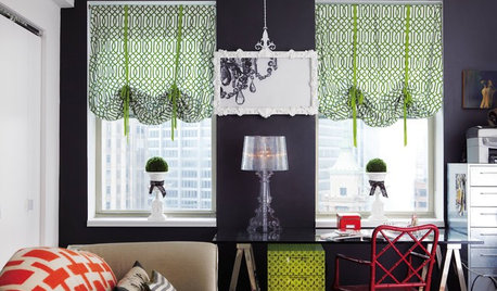
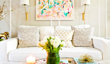
Need some decorating assistance and inspiration - specific colors/brands of paint and sources/ideas for window coverings would great. I may want to get a couple of area rugs as well. , Very definitely open to full spectrum paints - definitely willing to pay a little extra $$$ for the right effect..
I live upstairs in my 1906 two flat and rent out the downstairs. It was originally a single family home divided into two flat in the 1940s. Sadly... a lot of damage was done when they removed woodwork and reconfigured some rooms over the years.. but relative to some of the slumlord damage done to other bldgs around here it's not too bad. This is a high demand rental area, pretty much urban, no driveway but LOTS of public transportation/ bike paths nearby, not much of a yard. While I've had some young families, they mostly move to quieter neighborhoods when the kids get to be the age where they're running around. Potential renters include young married couples (before having kids), students, young (and not so young) urban professionals. People are pretty sophisticated around here re: color and architecture (prairie style is ubiquitous), so while I'm aiming for something not too "out there," I definitely do want some well-chosen COLOR and not some drearly landlord beige/white. If you look at the listings for nearby new condos and urban style loft apartments you'll see a lot of rich color - russets, browns, grays, greens, etc.
In preparation to selling this place in 2 or 3 years Ive talked to a few realtors who have told me that I could, and should, get substantially more rent than I have been getting, as the actual rent history to some degree plays into determining an asking price for the building.
OK, sounds good, except.... I want to make sure that when people walk into the place they get an immediate positive impression. That's where yall come in - I think color is one major factor that shapes the immediate impression, for better or worse.... whether people are cognizant of that or not.
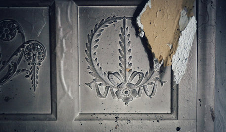
Living Room/Dining Room: its a big open space with archway between the LR and the DR. It was yellow with white ceiling, but it was kind of a cold unfriendly yellow in that light (windows face northeast and southeast - not a lot of sun except in early a.m.). In stripping off the old lumpy wallpaper layers (see pics) I uncovered the original layers of calcimine paint, which are various browns/golds which I've grown to like - very Arts & Crafts - but would those be too heavy for the 21st century renter? Some other lighter version of BROWN or GOLD - if not those exact same shades - might be good though for the space and complement the rich honey butterscotch maple floors better than that cold dingy yellow. Whatya think?
Do LR & DR need to be same color? Don't want the space too visually broken up (people love the spaciousness - combined its about 15 x 25 feet) but I keep imagining the DR as being darker than the LR?
Ceilings: Want some sort of color that isn't white (could be a rich cream though) and relates well to the wall color. You can see in the pics where the picture rail was - would love to put that back (since these are 10 foot ceilings) except the problem is the one arch between LR & DR goes higher than the rail - how would I handle that?
Those arches BTW are a 1940s alteration - liked them at first, but now I'm all too aware of what they did to get rid of the original woodwork and put in the arches. There was probably a square opening framed with woodwork and maybe even pillars between the LR and DR as is typical with houses of this age and style. The white plaster around the arch in the photo is clearly a later addition and not the orginal plaster like was used on the walls & ceiling..
Kitchen: the yellow is nice and sunny when the sun is coming from that direction (southwest) but when sun is lower in the sky (fall-winter) the bldg next door blocks a lot of the light so it's that same situation of the yellow just looking too cold and blah all the rest of the time. Can yall suggest some richer version of yellow, gold, yam (ie yellow bordering on orange), that would still fit in with the white-gray-yellow scheme, as well as ideas for shelving for above the sink and to the right and left of the window.
Oh, the idea with this kitchen was to make it a bit 40s/50s retro-industrial to go along with the bathroom which has a really cool vintage 1940s tub, metal shelves, etc. I've read that in restoring an old home, recreating a remodelling job that MIGHT HAVE BEEN is an acceptable option that won't offend the old house gods. Sadly, the original pine cupboards /pantry are long gone - probably removed during the butchery that occured in the 40s - or I would have just used those.
Other factors: 100 yr birdseye Maple floors - will have very minimal sanding to preserve 100 yr patina so it won't be the light new wood look - more of a deep honey-gold-brown. This apartment doesnt get alot of direct sunlight but lots of indirect light from the windows which are quite large (48 inches wide).
Well there you have it - f you've slogged through and read this far - thanks so much and I look forward to your input!
PHOTOS TO FOLLOW....
Cath in Madison , WI
This post was edited by kashka_kat on Thu, Nov 6, 14 at 16:36


Debbie DownerOriginal Author
Debbie DownerOriginal Author
Related Discussions
Jazzing up my boring Island...what to do and purchase
Q
My last year in this apartment - giving up my gardens
Q
Want to jazz up my kitchen on a budget
Q
Help with Setting Up My Studio Apartment
Q
Debbie DownerOriginal Author
Debbie DownerOriginal Author
Debbie DownerOriginal Author
TxMarti
nhb22
Skypathway1
camlan
Debbie DownerOriginal Author
sprout26
outsideplaying_gw
mdln
Debbie DownerOriginal Author
nosoccermom
rockybird
nosoccermom
robin_DC
Kippy
Debbie DownerOriginal Author
nosoccermom
gmp3
desertsteph
writersblock (9b/10a)
nosoccermom
evenshade
sylviatexas1
juliekcmo
Debbie DownerOriginal Author
Debbie DownerOriginal Author
stuartkweston
Debbie DownerOriginal Author
grapefruit1_ar
Tmnca
mdln
moonshadow