


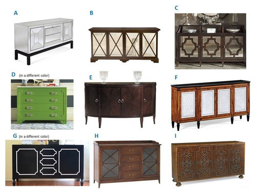
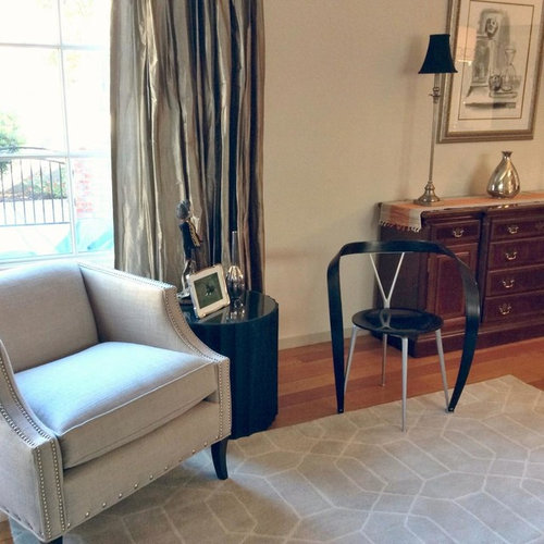
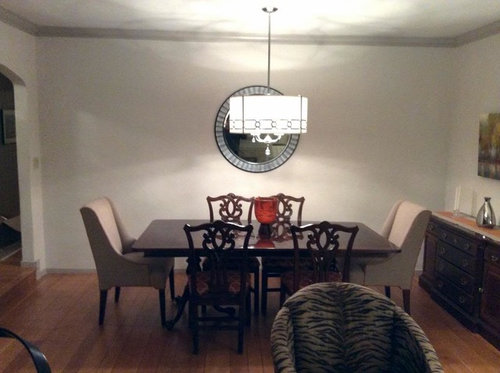
Help me find a server/buffet
Gooster
9 years ago
Sort by:Oldest
Comments (67)
Related Stories

DINING ROOMSBuffet, Sideboard, Server, Credenza: What's the Difference?
Learn the definitions and details to make shopping for dining room storage furniture less confusing
Full Story
DECLUTTERINGDownsizing Help: Choosing What Furniture to Leave Behind
What to take, what to buy, how to make your favorite furniture fit ... get some answers from a homeowner who scaled way down
Full Story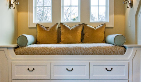
SMALL SPACESDownsizing Help: Storage Solutions for Small Spaces
Look under, over and inside to find places for everything you need to keep
Full Story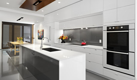
KITCHEN APPLIANCESFind the Right Oven Arrangement for Your Kitchen
Have all the options for ovens, with or without cooktops and drawers, left you steamed? This guide will help you simmer down
Full Story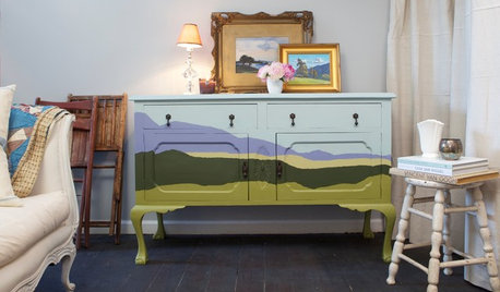
DIY PROJECTSUpcycle Furniture Finds With Paint
There are products out there designed to help you transform your thrift-store scores
Full Story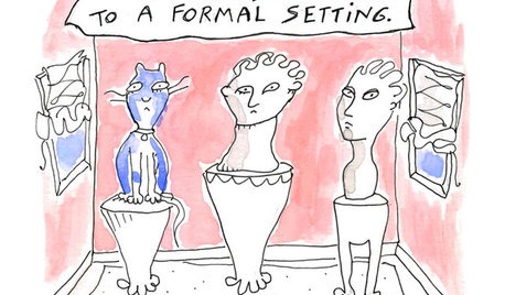
MOST POPULAR7 Ways Cats Help You Decorate
Furry felines add to our decor in so many ways. These just scratch the surface
Full Story
KITCHEN DESIGNKey Measurements to Help You Design Your Kitchen
Get the ideal kitchen setup by understanding spatial relationships, building dimensions and work zones
Full Story
MOST POPULAR7 Ways to Design Your Kitchen to Help You Lose Weight
In his new book, Slim by Design, eating-behavior expert Brian Wansink shows us how to get our kitchens working better
Full Story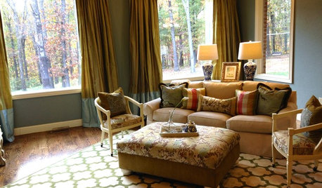
LIVING ROOMSA Living Room Miracle With $1,000 and a Little Help From Houzzers
Frustrated with competing focal points, Kimberlee Dray took her dilemma to the people and got her problem solved
Full Story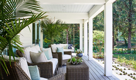
STANDARD MEASUREMENTSThe Right Dimensions for Your Porch
Depth, width, proportion and detailing all contribute to the comfort and functionality of this transitional space
Full Story


nosoccermom
lilylore
Related Discussions
Help me design a 48" bank of cabinets to look like buffet/hutch
Q
QVC's Today Special Double Server Buffet
Q
Help me design a bar/buffet?
Q
Help Me Find This Beautiful Buffet
Q
GoosterOriginal Author
nosoccermom
GoosterOriginal Author
lilylore
lilylore
nosoccermom
GoosterOriginal Author
lilylore
GoosterOriginal Author
GoosterOriginal Author
tibbrix
oldbat2be
mtnrdredux_gw
GoosterOriginal Author
tibbrix
Oakley
raee_gw zone 5b-6a Ohio
GoosterOriginal Author
GoosterOriginal Author
tibbrix
GoosterOriginal Author
busybee3
tibbrix
sas95
amykath
mtnrdredux_gw
sixtyohno
amykath
GoosterOriginal Author
tibbrix
tibbrix
emmarene9
GoosterOriginal Author
tibbrix
jerseygirl_1
GoosterOriginal Author
sjhockeyfan325
sas95
tibbrix
Holly- Kay
Errant_gw
busybee3
GoosterOriginal Author
Jeannine
GoosterOriginal Author
amykath
oldbat2be
GoosterOriginal Author