


Farrow & Ball Question From Ridiculous Red!
redbazel
14 years ago
Sort by:Oldest
Comments (38)
Related Stories
COLOR4 Cool Paint Colors Touted for 2014 — and How to Use Them
Muted but complex, these hues from Farrow & Ball can stand on their own or play supporting roles
Full Story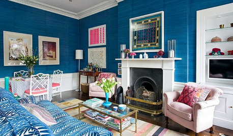
COLORFUL HOMESHouzz Tour: Edinburgh Apartment Goes From Bland to Bold
A designer aims for comfortable luxury as she decorates her home with rich wall colors, family antiques, vintage pieces and travel finds
Full Story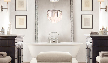
LIGHTING5 Questions to Ask for the Best Room Lighting
Get your overhead, task and accent lighting right for decorative beauty, less eyestrain and a focus exactly where you want
Full Story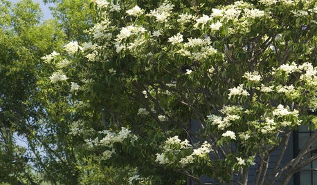
GARDENING GUIDESNo-Regret Plants: 5 Questions Smart Shoppers Ask
Quit wasting money and time at the garden center. This checklist will ensure that the plants you're eyeing will stick around in your yard
Full Story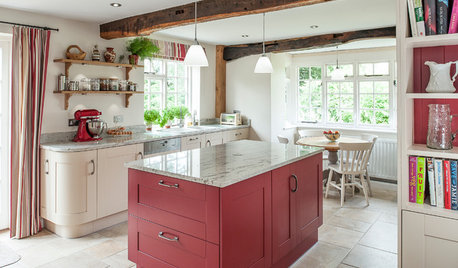
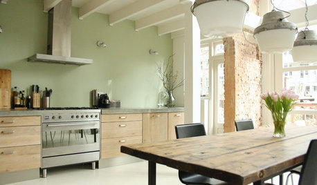
KITCHEN DESIGNKitchen of the Week: Splashes of Red for a Country Classic
Modern touches combine with traditional style in this warmly elegant kitchen in the English countryside
Full Story
DECORATING GUIDES9 Life Lessons From Nordic Style
As Houzz launches in Denmark and Sweden, we provide you with a step-by-step guide to enjoying a real Scandinavian lifestyle in your home
Full Story
DECORATING GUIDESFrom Queasy Colors to Killer Tables: Your Worst Decorating Mistakes
Houzzers spill the beans about buying blunders, painting problems and DIY disasters
Full Story
DECORATING GUIDES7 Ways to Paint Your Trim Fantastic, From Classic to Fearless
Give your rooms an edge with a trim treatment that shows attention to detail
Full Story
COLORWhen Color Could Kill: Stories From the History of Paint
Delve into paint's storied past — what you learn about its history and modern incarnations may surprise you
Full Story
REMODELING GUIDES8 Lessons on Renovating a House from Someone Who's Living It
So you think DIY remodeling is going to be fun? Here is one homeowner's list of what you may be getting yourself into
Full StorySponsored
Zanesville's Most Skilled & Knowledgeable Home Improvement Specialists


DLM2000-GW
budge1
Related Discussions
Farrow and Ball Stone White vs French Gray: pics, opinions?
Q
Old Post about Farrow & Ball...
Q
Farrow & Ball paint vs mixing vs BM equivalent
Q
Farrow&Ball paint question
Q
awm03
graywings123
bellaflora
elle3
parma42
amysrq
redbazelOriginal Author
yogacat
rococogurl
amysrq
saltnpeppa
ttodd
Ideefixe
rococogurl
covingtoncat
lynninnewmexico
redbazelOriginal Author
kitchendetective
loribee
DLM2000-GW
redbazelOriginal Author
kitchendetective
budge1
ttodd
redbazelOriginal Author
DLM2000-GW
gabeach
redbazelOriginal Author
mindstorm
ttodd
gabeach
redbazelOriginal Author
gabeach
loribee
walkin_yesindeed
gabeach