


Farrow & Ball paint vs mixing vs BM equivalent
ella-2010
13 years ago
Featured Answer
Sort by:Oldest
Comments (48)

palimpsest
13 years agoRelated Discussions
Aura vs. Farrow & Ball?
Comments (3)Farrow and Ball is very different paint than Aura. It has far more complexity to the colors and some can be quite changeable in different light. What sets the matte (Estate Emulsion) paint apart is the surface quality it provides when dry. It has amazing ability to hide flaws and I found it improved the looks of my walls by giving them a velvety texture no other brand I've found provides. The Eggshell is a low sheen trim paint with great coverage quality, surface quality and durability. Aura is designed for one-coat coverage and quick drying. It has a very different surface quality. I'd recommend painting samples to see which is preferred. The other issue with Farrow & Ball vs Aura is price and it's a big per gallon difference. My house was repainted with F&B this Spring after just 3 years of BM. I did use some ICI Dulux paint as well -- also excellent coverage and good surface quality so I recommend that, too. One additional thing with F&B is that there was zero odor. Absolutely none, as if the house had not been painted. So the co-solvents they are using in the paint have truly low VOC. All depends what you're going for and how demanding you are of your paint surfaces and color nuance....See MoreFarrow and Ball Paint Match
Comments (15)I kinda agree with Matt & Fun-C... At least in our store, computer-matching is the only option "time-wise". Our scanners usually get real close, & we do "human" corrections after that! * But to have someone fuss over a color for maybe an hour...isn't an option 90% of the time. * Many people think they'll be on their way in 5 minutes. AIN'T gonna happen with some matches!! * If we're busy, we have to ask them if it's OK to pick up their color later, so we can have time to "tweak" if necessary. * I'm very comfortable using the BM & SW C2-equivalents in our software library on the C2 tinter. VERY-CLOSE, if not dead-on matches every time I've had to make a SW or BM color into C2. * I've heard of some stores starting to CHARGE for paint-matching!!! Mainly because it can be tedious getting a color right. Also, it lessens the time store personnel can spend with other sales worth a lot more money than a $12 Quart! >>> I KNOW that was a controversial point there!!! I almost didn't put that in...I'm on the fence on this issue. >>> I s'pose it's like a car lot...where do you want your staff's attention most of the time? >>> I'd rather lose a $12 Quart...than someone waiting for advice on a $500 paint & access. sale. Thankfully, this rarely happens, but.... Faron...See MoreAura vs Farrow & Ball
Comments (5)Christobal, I usually say...'There's lotsa good brands out there. Stay in the upper tier(s) of each line, & you'll do well'. >>> Prep & priming are CRUCIAL though!!! People are kidding themselves if they think priming won't help. >>> It's the single most important step (on sound walls anyway...!) to ensure topcoats develope/bond properly, and give the most uniform sheen. >>> Some deep colors benefit greatly from tinted primers. * Our store has C2, RL, & ACE-Royal. * Sandy's kinda correct in C2 not being that 'forgiving'! You typically have ~ 30 SECONDS to brush it out b4 it starts setting! * The solids content is about as high as a Latex can get...therefore there's not a lot of 'brushability-time'. * It's nicely low in VOC'S...I could hardly smell the stuff...very nice to be around. This June, I painted DD's room in C2's 'Impeccable', C2-114, in Eggshell. A very rich Gold/Brown. I had to do 2 coats of C2's ACS-primer tinted to 75%-formula strength. The room had very pronounced poofs of whites and dark blues! * Are you near a dealer?? * Believe it or no, I've never used BM! * Some C2 dealers out East that have had BM for a long time prefer C2 over BM. * We go through a TON of ACE-Royal, and a fair amount of RL. Whatever ya use, also choose good tools!! And don't push paint too thin...TWO FULL coats on primer. Faron Here is a link that might be useful: C2's website...See MoreOne or two coats of Farrow & Ball?
Comments (4)It's true about the color - you need two coats. Two coats should always be assumed. The brand doesn't make any difference. You already have the prep and mess, might as well swish around and do one more coat and get it done right. The second coat always goes faster than the first. Used F&B several times. My office is Blue Ground. I don't think it goes on any differently. F&B does have an exceptionally lovely final finish. I truly love look....See More
rococogurl
13 years agoella-2010
13 years ago
mtnrdredux_gw
13 years agopalimpsest
13 years agomtnrdredux_gw
13 years agorococogurl
13 years agomtnrdredux_gw
13 years agodee850
13 years agomindstorm
13 years agomtnrdredux_gw
13 years agomindstorm
13 years agoella-2010
13 years agorococogurl
13 years agomindstorm
13 years agoella-2010
13 years agorococogurl
13 years agomindstorm
13 years agokitchendetective
13 years agoella-2010
13 years agorococogurl
13 years agosjmtr
13 years agorococogurl
13 years agosjmtr
13 years agosjmtr
13 years agoallison0704
13 years agoallison0704
13 years agoallison0704
13 years agosjmtr
13 years agoella-2010
13 years agosjmtr
13 years agoella-2010
13 years agosjmtr
13 years agorococogurl
13 years agoella-2010
13 years agorococogurl
13 years agodee850
13 years agoella-2010
13 years agorococogurl
13 years agoella-2010
13 years agogreen
8 years agosomersetlass
8 years agogreen
8 years agorococogurl
8 years agogreen
8 years agogreen
8 years agogreen
8 years ago
Related Stories
COLOR4 Cool Paint Colors Touted for 2014 — and How to Use Them
Muted but complex, these hues from Farrow & Ball can stand on their own or play supporting roles
Full Story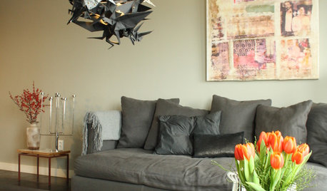
HOUZZ TOURSMy Houzz: Vintage and Asian Styles Mix in Eclectic Home
An interior design couple dress up their home with origami pendant, wallpaper and mid-century pieces
Full Story0
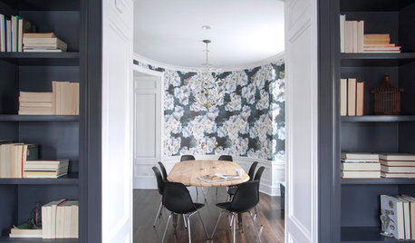
ROOM OF THE DAYRoom of the Day: Dining Room Mixes Modern and Traditional — and Whimsy
An open-plan space is divvied up into a dining room, foyer and library–music room in a family-friendly way
Full Story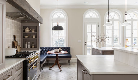
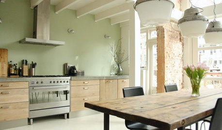
KITCHEN OF THE WEEKKitchen of the Week: Modern and Traditional Elements Mix in Minneapolis
A homeowner’s love for Belgian design is reflected in an updated kitchen that offers great function with transitional style
Full Story
HOMES AROUND THE WORLDHouzz Tour: Gray and Yellow Mix It Up in a London Apartment
A neutral palette gets a jolt of energy from sunny accessories and witty artwork in this new unit in an industrial area
Full Story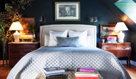
DECORATING GUIDESRoom of the Day: Going Moody in the Master Bedroom
Dark paint and antiques mix with newer pieces and light bedding for a sleeping space that appeals to him and her
Full Story
COLORMore Top Paint Picks for 2014: New Greens, Blues and Neutrals
Valspar’s new colors aim to lift spirits and express creativity. Here’s how to use 9 of them in lively ways
Full Story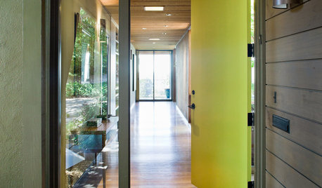
CURB APPEAL5 Bright Palettes for Front Doors
Splash bold green, blue, orange or red on your front door, then balance it with a more restrained hue on the rest of the house
Full Story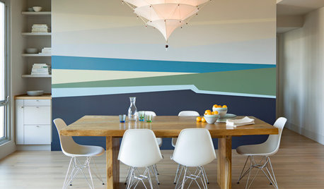
DECORATING GUIDESGet the Scoop on Finding the Best Paint for Your Money
Scoring the best deal on paint for your home may have nothing to do with advertised specials
Full Story
COLOR12 Tried-and-True Paint Colors for Your Walls
Discover one pro designer's time-tested favorite paint colors for kitchens, baths, bedrooms and more
Full Story

mtnrdredux_gw