


How Matchy-matchy for Lighting?
drjoann
13 years ago


Sort by:Oldest
Comments (14)
Related Stories
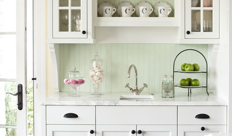
KITCHEN DESIGNHow to Mix Metal Finishes in the Kitchen
Leave matchy-matchy to the catalogs and let your kitchen's personality shine with a mix of metals for hardware and fixtures
Full Story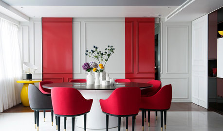
DECORATING GUIDESHaving a Design Moment: The Dining Room
Consider these 14 tweaks to bust your dining room's look out of a matchy-matchy furniture-set slump
Full StoryDINING ROOMS10 Foolproof Ways to Mix Up Your Dining Chairs
Kick matchy-matchy to the curb and go for dining chairs that pull off a cohesive look with personality
Full Story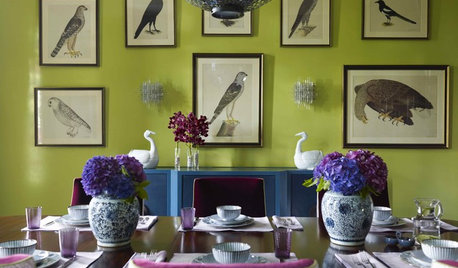
DECORATING GUIDES7 Ways to Play With Symmetry for a Dynamic Design
Forget matchy-matchy. Today's designers are using symmetry and its opposite more loosely — and sometimes even provocatively
Full Story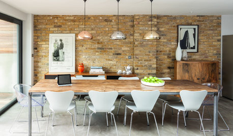
SHOP HOUZZShop Houzz: Mixing Metals
Nix matchy-matchy in favor of a rich assortment of metallic pieces
Full Story
DECORATING GUIDESIdea of the Week: Mix Patterns Like a Pro
Go for a Look That's Not Too Match-y, Not Too Random
Full Story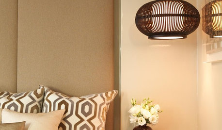
BEDROOMSBedroom Pendants Hang With the Best Styles
Edgy, space saving and unexpected, pendant lights by a bed are as stylish as they are practical
Full Story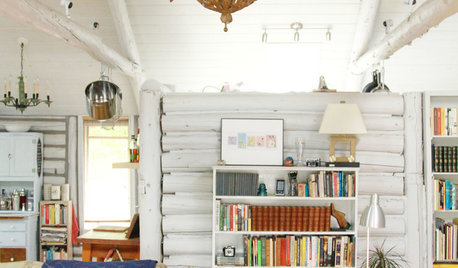
HOUZZ TOURSMy Houzz: A Surprisingly Light Lakeside Log Cabin
Light gray paint and lots of natural light take this cabin on a Michigan lake out of moody country
Full Story
LIGHTINGRecessed Lighting 101
Looking to brighten a drab, dim space? Recessed lighting may be your answer. Here's what you need to know
Full Story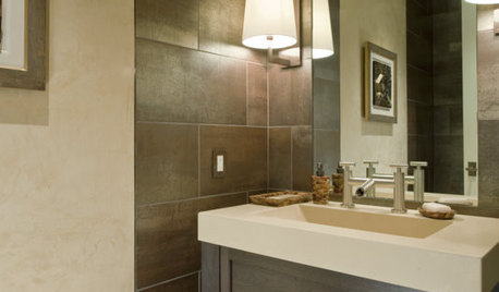
BATHROOM DESIGNHow to Light Your Bathroom Right
Get ready for your close-up in a bath that's a sanctuary with task, accent, decorative and ambient lighting
Full Story


forhgtv
segbrown
Related Discussions
matchy matchy people...should EVERYTHING in bath match?
Q
How do you coordinate without being matchy-matchy?
Q
Lights - matchy matchy or different??
Q
Help me avoid "matchy matchy" without getting too eclectic. Please :)
Q
les917
pps7
palimpsest
nik211
teacats
teacats
teacats
teacats
drjoannOriginal Author
adh673
patty_cakes
chaylabird