Decorating Guides


Idea of the Week: Mix Patterns Like a Pro
Go for a Look That's Not Too Match-y, Not Too Random

Flip through the pages of the latest glossy or scroll through the images on Houzz, and you'll see room after room filled with an eclectic yet expertly crafted mix of patterns and prints. It looks effortless, but anyone who has tried to replicate the look knows that this is far from the case. Can you layer a toile with an animal print on top of a stripe? Los Angeles Interior Designer Betsy Burnham shares the rules for how to pair patterns with ease.
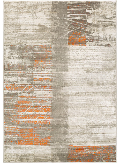
So when does it work to mix pattern? Betsy says, "It's okay when there’s a color or mix of colors consistent between them and when their scales are different."
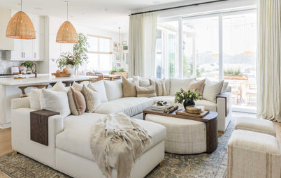
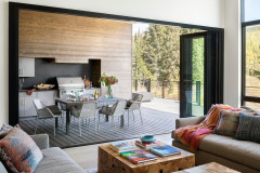
Notice in this photo how the coral of the ikat is picked up in the trim of the window treatments, and the neutral linen tone makes an appearance in many of the pillows. The overall effect is unified but in no way match-y.
"A two-color, medium-scale ikat in grassy green and white will look fabulous with a multicolored paisley that has a bit of the same green in it," Betsy says. "Add to this a small-scale leopard print with a white ground (and perhaps one of the colors from the paisley), and you’ve got a cool room. What’s important is to make it look just random enough; in other words, not too perfect."
Get more design fundamentals from Betsy:
Design Tips from the Countess of California Cool
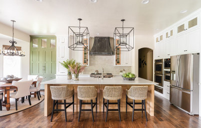
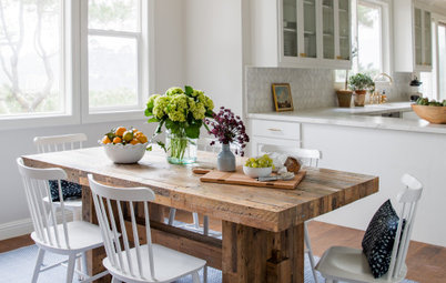
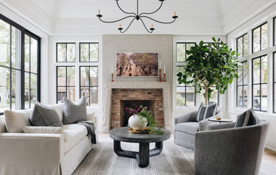
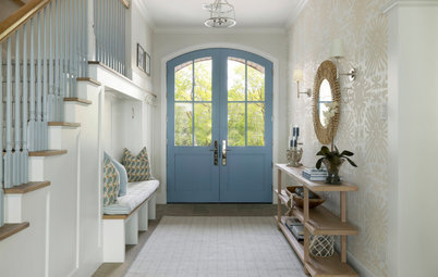
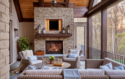
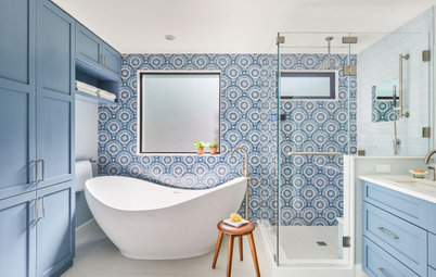
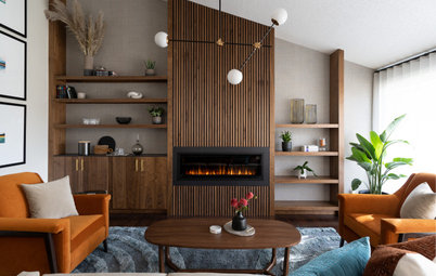
Next: Browse more home design photos
"A two-color, medium-scale ikat in grassy green and white will look fabulous with a multicolored paisley that has a bit of the same green in it," Betsy says. "Add to this a small-scale leopard print with a white ground (and perhaps one of the colors from the paisley), and you’ve got a cool room. What’s important is to make it look just random enough; in other words, not too perfect."
Get more design fundamentals from Betsy:
Design Tips from the Countess of California Cool
Next: Browse more home design photos