


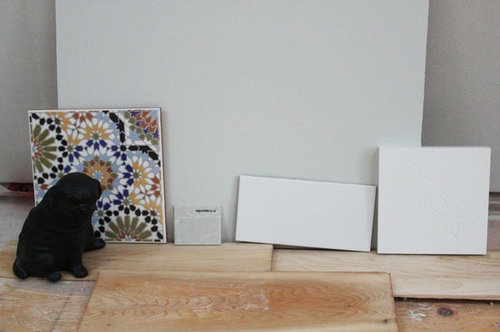
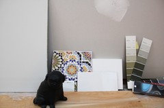
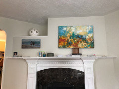
Something between BM Edgecomb and Titanium...
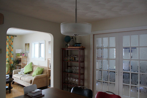
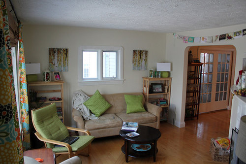
robo (z6a)
10 years ago
Featured Answer
Sort by:Oldest
Comments (30)

robo (z6a)
10 years ago
patiencenotmyvirtue
10 years agoRelated Discussions
Why BM vs something like Behr?
Comments (27)Okay, I’m going to put in my 2 cents here, mostly to educate the DIY’ers out there About paint. I worked in the paint department of both Home Depot & Lowes for a combined 6 yrs up until 2016. I’ve taken ALL the available paint classes. I’m going to tell you guys a secret... the reason it takes a MINIMIUM of 2 coats, is due to several influencing factors. #1) your wall texture. The more porous, or heavily textured your wall is, the more likely you will get less “coverage” out of your paint, because it is either being sucked up by the texture, (usually unprimed) or it is a bumpy texture which has more surface area to cover per brush/roller stroke. #2) your roller. The texture of your roller must match the texture of the wall. Smooth walls require a shorter napp. Heavier textures require a longer napp. When these things don’t “match” so to speak, you’ll get what are called “hollidays” in the painting world. It’s those little spots where the “under Color” shows through, as if the new paint took a “Holliday” in that spot. This happens all the time when using rollers, regardless, but it’s worse when your napp is too short for the texture. #3) the amount of titanium white your paint brand started out with Before tinting. Titanium white is GENERALLY what are Considered “solids” in the paint, although I’m sure there are others I’m forgetting. #4) the COLOR of the new paint. each color has a “depth” which requires a particular amount of tint. Whites, off whites, pastels, and generally lighter colors are tinted using a WHITE tinting base. These cans are the purest whites that company offers, and can be used right off the shelf. They are usually 3/4 or more full of Titanium white. Medium dark colors are tinted into a “medium” tint base. These cans CANNOT be sold directly off the shelf and must be tinted. They have less overall volume inside the can to begin with, (in order to leave room for tint.) & they are around 1/2 titanium white. Dark or deep colors are mixed into a ”DEEP” tint base. These cans have the least overall volume to begin with, and there’s about 1/4 or less of titanium white in each can. Here’s the secret.. titanium white is what provides the coverage! Tint, by itself, doesn’t cover, it’s somewhat like a gel, and is VERY sticky on its own. It is essentially pure pigment, mixed with an additive to make it viscous. when you take a color, let’s say RED, which by itself has a very translucent property, and you dump a whole boatload of it into a can which (in order to achieve that deep rich he’d you’re looking for) has virtually no titanium white in it, you’re going to get a see through paint, no matter the brand. now, have you ever been offered a tinted (usually grey) primer to put on under that red paint? Did you choose against it, thinking it would be unnecessary? Think again! That neutral grey, gives that red paint a dark neutral base to start from! It richens the color on the first coat! You can sometimes have the primer tinted pink, but grey primer or a grey paint base coat works best. (Don’t believe me? Do a sample board painted 1/2 white, 1/2 medium grey, then paint red across the whole thing.... see? 😉) also, don’t expect your deeper colors to dry as quickly. they don’t. Tint, by itself, never stud.. or “cures” because there are zero gardeners in it. All that tint needed for that deep color, created a very sticky situation inside that can. The other secret I’m going to tell you deals with the other additives in your can besides the titanium white. They are the clear liquids. The chemical mixture and amount of each of these, determines the dry time, viscosity, elasticity, yellowing propensity, durability, hardness and water soluabLilith of the paint. They are basically the GLUE holding it all together, and keeping it on your wall. Each company has a different proprietary blend, making its paint unique. Ive found, that for the most part, how well it turns out with YOUR can of paint, is based on the project, the knowledge of the painter, and the teaching/advising capabilities of the sales clerk. Other than that, MOST paints are created FAIRLY equally. Do your research people. There! Now that’s a thing you know. 😉👍...See MoreNeed a cream color for kitchen leading to Edgecomb Gray living room.
Comments (11)That is a very pretty color, but I think the LRV of 88 is a bit too stark for what I'm looking for. LRV doesn't help you out in terms of stark, dull, muted, vivid, etc. LRV strictly speaks to how much light a color reflects back into the room and conversely how much light it absorbs. Chroma is the dimension of color that speaks to grayness, dull, muted, vivid, clean, dirty, etc....See MoreBM Edgecomb Gray & Balboa Mist turn Purple - SW Natural Tan pink. HELP
Comments (24)Neutral colors are a mix of different colors, so depending on what you have next to your neutral the neutral color appears to pink or blue or green or yellow. It really isn't a foreign concept to most women, we just haven't thought about paint color the same way we look at makeup and clothing. My sister has an olive skin tone and medium brown hair, I have an ivory skin tone and dark hair and my sister in law has blond hair, blue eyes and a fair golden skin tone. We don't look good in the same colors. Your home is full of colors. What looks good next to my purples and purple reds and smokey teals won't look good next to my sister's greens and golds and orange reds or next to my sister in law's cornflower blue, peach and butter yellows. We each had to pick neutrals that went with the decor and flooring and woods that fill our home. Can you imagine my purples, reds and teals with a moss green neutral a yellow tan or is it better with a taupe that has slightly purple undertones? Below is a demonstration of how neutrals can look very different based on the colors around them. Both sections have one color in the center of each block. It is the same color in each block all the way across the page, yet the color appears more pink or green or yellow or blue depending on the color next to it. If edgecomb gray is picking up purple you probably have yellow undertones around it. Edgecomb gray is a pretty solid neutral with just a hair more pink and less green than revere pewter. Baby Fawn or tapestry beige may work nicely - just a bit less pink/purple undertones and a hair more yellow. I would recommend that you pick your flooring before picking the paint color because it could also change the perceived wall color. If you can gather together samples of the colors that are staying and lay them out on a white sheet in natural daylight (I like to do this outside on a clear day) and look at a bunch of neutral swatches next to the colors you will start seeing the patterns. More yellow looks better or grayer looks better a little more green looks better....See MoreAnother color similar to the warm side of Edgecomb Gray but lighter?
Comments (24)which is a match to SW creamy. Δ E is the first line of data. It tells you how closely a color matches your target color. Anything over 1.0 isn't that great of a match. For example, at 1.2 I wouldn't bother pulling a chip of Creamy because I know it's not going to be close enough. Δ E less than 1.0 and it's worth taking a look. Δ E less than 0.5 and it's likely to be very close in hue family, value and chroma. LCh works extremely well for whites and neutrals - it's an objective description of color under a controlled and balanced light source. If a color appears different from it's LCh notation, that's a matter of subjective opinion, context and lighting. It's not a matter of fact. For every one person who perceives a color as looking different from its LCh notation in a specific context, under unspecified light sources, you'll find at least one more who perceives the color exactly as the LCh values indicate. There's evidence of that all over this forum. For example, Stonington Gray. Some think it's a blue-gray while others think that's absolutely nuts. Because in their house, in their context and lighting Stonington looks "true neutral gray" no hue bias at all, which is in alignment with it's Green-Yellow hue family notation. And because we have an organized framework of color notations, we can put evidence of color appearance together and study the results. For example, we know that low chroma colors from the Green-Yellow hue family, like Stonington Gray, can absolutely appear with no hue bias and look totally neutral - or - it can shift and look bluish in certain contexts and lighting conditions. Because we're aware, we can sample colors smarter. We know what to look for. That's one of the main reasons it's useful to learn how to use color data values like you see on EasyRGB. I like how the main color stays in the background so you can see how the others are more green, gray, etc. Be careful with that. What you're seeing is 100% about how your device is able to display color than actual and factual color appearance in real life. You can see this for yourself. For example, what you're seeing will look markedly different on your phone vs. your laptop....See Morerobo (z6a)
10 years agopatiencenotmyvirtue
10 years agorobo (z6a)
10 years agorobo (z6a)
10 years agosjhockeyfan325
10 years agorobo (z6a)
10 years agochispa
10 years agopeony4
10 years agorobo (z6a)
10 years ago
Annie Deighnaugh
10 years agorobo (z6a)
10 years ago
done_again_2
10 years agoAnnie Deighnaugh
10 years agorobo (z6a)
10 years agorobo (z6a)
10 years agocrl_
10 years agodaisychain01
10 years agorobo (z6a)
10 years ago
Kathy Stuart
5 years agoEmmaNJ
4 years agorobo (z6a)
4 years agorobo (z6a)
4 years agorobo (z6a)
4 years agorobo (z6a)
4 years agorobo (z6a)
4 years agorobo (z6a)
4 years ago
Related Stories

WHITEHow to Pick the Right White Paint
White is white, right? Not quite. See 8 white paint picks for 8 very different effects
Full Story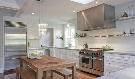
KITCHEN DESIGNCooking With Color: When to Use White in the Kitchen
Make sure your snowy walls, cabinets and counters don't feel cold while you're riding white's popularity peak
Full Story
TRIMTrim Color Tips: Get Your White Trim Right
Set off wood tones, highlight architectural features, go minimalist ... white trim is anything but standard when you know how to use it
Full Story
GRAYChoosing Paint: How To Pick the Right Gray
Which Version of Today's 'It' Neutral Is For You?
Full Story
DECORATING GUIDESThe Case for In-Between Colors
These mutable hues defy easy description, but their appeal all around the home isn't hard to get
Full Story
DECORATING GUIDESGet the Scoop on Finding the Best Paint for Your Money
Scoring the best deal on paint for your home may have nothing to do with advertised specials
Full Story
MOST POPULAR50 Shades of Gray
Gray is hotter than ever, thanks to a hit novel full of risks and dark secrets. Tell us: Which paint shade possesses you?
Full Story
EXTERIOR COLORExterior Color of the Week: 7 Ways With Warm Gray
See why this hue can be the perfect neutral for any house
Full Story
DECORATING GUIDESColor of the Week: Decorating With Warm Gray
Tired of tan? Getting gloomy from cool gray? Make warm gray your new go-to neutral
Full Story
COLORColor of the Year: Off-White Is On Trend for 2016
See why four paint brands have chosen a shade of white as their hot hue for the new year
Full Story


chispa