


Need a cream color for kitchen leading to Edgecomb Gray living room.
22k22
6 years ago
last modified: 6 years ago
Featured Answer
Sort by:Oldest
Comments (11)

22k22
6 years agoRelated Discussions
Grey Paint Color ideas - leaning towards BM edgecomb grey
Comments (19)Gray has an undertone of green, purple or blue... best to match those with the surrounding colors. Maria Killam (of Colour me Happy blog) has a few rules for selecting gray shades. She is working out of Canada, but translation for the paint names should be available. Her posts on gray undertones including color samples are also very informative. -VW Working with Grays: 5 Rules of Thumb By Maria Killam 1. Decide whether you want your gray to have a green, purple or blue undertone, it will make it much easier to choose. 2. Consider your fixed elements when choosing a gray undertone. 3. Work with the light in the room. 4. If the house is empty at the start of a project, do not fill the walls with 10 samples of gray paint colours. 5. Choose your fabrics first. If you look closely at this kitchen (above) the stone countertop and flooring and subway tile have a green undertone while the interior panels of the doors have been painted a blue-gray. It's subtle and doesn't look necessarily wrong (to the untrained eye) but can you see it now that I'm describing the difference? Most people can. Here is a link that might be useful: Image Source: What Everyone should know about Gray...See MoreHelp with a small living/dining room/front door leads to this room)
Comments (4)I think it's a bit tough to give you advice because how you arrange your home depends so much on the lifestyle you lead. That said, I've offered some broad tips to aid in your redesign. Use light furniture with pads, then it can be moved around to make space. You can push the table against the wall and then pull it back when you're entertaining people. This provides some versatility to your space and lets you change your arrangement quickly to suit your needs. Try to find storage solutions that are suspended above the ground. Having a cabinet around the television can provide with a nice dark contrast and additional storage space. Anything high up can be long term storage; all the air space above 7 ft is mostly wasted (Unless you're legendary basketball player Shaq). Experiment! Spend an evening moving furniture around and see how you feel about it! There are many factors about your situation that are hard to consider. Do you watch TV during the day? (if so, moving it across from the window will give you glare!) Is eating together a large part of your family life? What do you see outside of your window? How late do you stay up? etc. Finally, do some critical analysis! What parts of the living room do you spend the most time in? why? Is that chair in the back used often or does it just take up room? Do you spend a lot of time playing with your child and their toys in the little play area against the north(assuming north is up) wall? You can setup a phone to take a timelapse over the course of a day and see exactly what you use your room for and how you enjoy spending your time. I hope this helps and feel free to ask me any more questions! P.S. It seems like your family likes the colour green; I would definitely recommend committing to it and adding some colour to your space! It can be as extreme as painting an entire wall or just getting a new cover for your futon!...See MoreEdgecomb Gray in kitchen clashing with cabinets
Comments (16)Lexie after LOTS of reading, I have a north facing house which can make it pull more blue tones. Also, it could be all my other beige decor (floors, tile, backsplash, etc). When it is next to a more pure bright, I see the warmer tones come out. I have learned to love it but would just like to make my cabinets brighter which they are due for an updated paint job! thanks for all the other comments !...See MoreBM Edgecomb Gray & Balboa Mist turn Purple - SW Natural Tan pink. HELP
Comments (24)Neutral colors are a mix of different colors, so depending on what you have next to your neutral the neutral color appears to pink or blue or green or yellow. It really isn't a foreign concept to most women, we just haven't thought about paint color the same way we look at makeup and clothing. My sister has an olive skin tone and medium brown hair, I have an ivory skin tone and dark hair and my sister in law has blond hair, blue eyes and a fair golden skin tone. We don't look good in the same colors. Your home is full of colors. What looks good next to my purples and purple reds and smokey teals won't look good next to my sister's greens and golds and orange reds or next to my sister in law's cornflower blue, peach and butter yellows. We each had to pick neutrals that went with the decor and flooring and woods that fill our home. Can you imagine my purples, reds and teals with a moss green neutral a yellow tan or is it better with a taupe that has slightly purple undertones? Below is a demonstration of how neutrals can look very different based on the colors around them. Both sections have one color in the center of each block. It is the same color in each block all the way across the page, yet the color appears more pink or green or yellow or blue depending on the color next to it. If edgecomb gray is picking up purple you probably have yellow undertones around it. Edgecomb gray is a pretty solid neutral with just a hair more pink and less green than revere pewter. Baby Fawn or tapestry beige may work nicely - just a bit less pink/purple undertones and a hair more yellow. I would recommend that you pick your flooring before picking the paint color because it could also change the perceived wall color. If you can gather together samples of the colors that are staying and lay them out on a white sheet in natural daylight (I like to do this outside on a clear day) and look at a bunch of neutral swatches next to the colors you will start seeing the patterns. More yellow looks better or grayer looks better a little more green looks better....See More22k22
6 years ago22k22
6 years ago
Related Stories
COLOR PALETTES7 Ideas for Using a Gray Carpet in Your Living Room
Soothing and often practical, gray carpeting can look elegant too, especially if you consider these ways to work with it
Full Story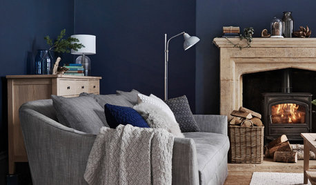
DECORATING GUIDESHow to Combine Blue and Gray in Your Living Room
Let these 10 versions of the versatile color combination inspire you
Full StoryLIVING ROOMSRoom of the Day: Color Wakes Up a Living Room
A modern blue, gray and orange rug is at the center of a redesign that embraces the homeowners’ art collection
Full Story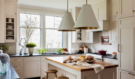
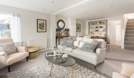
MOST POPULARHouzz Tour: Easygoing and Elegant in White, Cream and Gray
The renovation of an 1860s Massachusetts home creates a sophisticated, serene and comfortable living space
Full Story
KITCHEN OF THE WEEKKitchen of the Week: A Soothing Gray-and-White Open Concept
A smart redesign gives an active family a modern kitchen with soft tones, natural elements and mixed metals
Full Story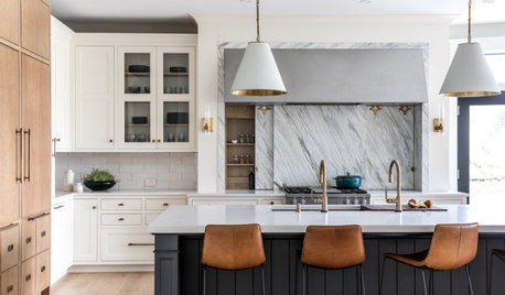
KITCHEN MAKEOVERSKitchen of the Week: White, Wood, Gray and a Backsplash Surprise
A Maine couple with three young daughters ask a designer to help them create a clean space with custom style
Full Story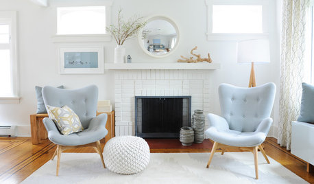
LIVING ROOMSRoom of the Day: A Vancouver Living Room Awash in Light
White surfaces and Scandinavian midcentury modern-inspired decor freshen up a once-dark living space
Full Story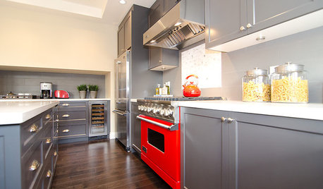
COLORCooking With Color: When to Use Gray in the Kitchen
Try out Trout or shake up some Martini Shaker gray for a neutral-based kitchen that whispers of sophistication
Full Story
DINING ROOMSColor Feast: When to Use Gray in the Dining Room
The right shade of gray pairs nicely with whites and woods to serve up elegance and sophistication
Full Story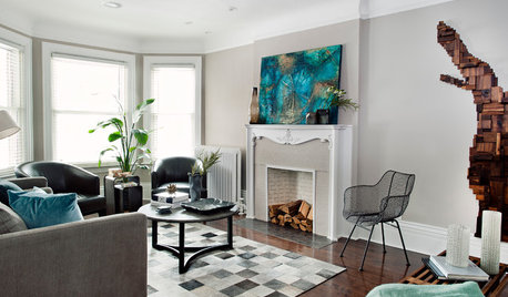
ARTRoom of the Day: Art an Inviting Presence in a Formal Living Room
A redesign brings new energy into the room with a mix of contemporary furniture, forgotten treasures and appealing artworks
Full Story


bkeithaz