


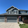
BM Edgecomb Gray & Balboa Mist turn Purple - SW Natural Tan pink. HELP
HU-299733578
4 years ago
Featured Answer
Sort by:Oldest
Comments (24)
Related Discussions
Poor natural light and paint woes! Please HELP!!!
Comments (3)I feel your pain. It took me months to pick the correct color for my dimly lit foyer and stairs. Door open -- one color; door closed, another. Light on? another color. I ended up going with a deeper color than I thought I would because of the differences in light. Also, like palimpsest says, grab color samples that you never thought would work....See MoreLight greige suggestions that don't look pink???
Comments (31)Dang, I wish I would have posted on the forums before picking a greige because I LOVE some of them that are posted here. LOVE Jute. We're in the middle of painting most of our house a greige (yes, still) and we chose Agreeable Gray. Sometimes it has a funny cast to me, and I canNOT figure out what it is to save my life. Pinkish? Purpleish? And I wish I would have known the "it won't look as dark when painted on all walls since you're sampling against white" thing before. We almost went with Revere Pewter but it looked SO dark on our sample spots, that we went with Agreeable Gray. Now I think Agreeable isn't quite dark enough, except at night when it looks really dark. I'm starting to feel like 90% of our house is color mistakes. :( To the OP: Start with considering your lighting. Flourescent makes everything look funny. Can you change your bulbs to something else? And I really like your #2, it doesn't look pink at all to me. :)...See MoreEnough contrast in BM Natural Cream and White Dove? See Pics please!
Comments (28)In response to the most recent posts (not trying to respond to the original from 3 years ago) - Winds Breath is more yellow in hue than green (in terms of the actual color) so if it looks green it is possibly reflecting green from some source (like if there's a lot of greenery outside the window) or it has to do with lighting. White Sand definitely has yellow in it - not "undertones" per se but the hue family is yellow. Every neutral belongs to a hue family so perhaps you need to find a cool white or gray? The conundrum I think for you is that if you want a soft, off-white those are yellow in hue. Sherwin Williams Icicle is a cool very light gray if you're trying to get away from yellow and green. Below is a link is to a great resource. Unfortunately, a year or so ago when I was using the information to choose paint colors there was more free info available that now requires a subscription. A good number of paint colors are analyzed though. If you have the patience you can get away from all the subjective information you see online about undertones with this system - it takes the guesswork out of the equation. Land of Color...See MoreAnother color similar to the warm side of Edgecomb Gray but lighter?
Comments (24)which is a match to SW creamy. Δ E is the first line of data. It tells you how closely a color matches your target color. Anything over 1.0 isn't that great of a match. For example, at 1.2 I wouldn't bother pulling a chip of Creamy because I know it's not going to be close enough. Δ E less than 1.0 and it's worth taking a look. Δ E less than 0.5 and it's likely to be very close in hue family, value and chroma. LCh works extremely well for whites and neutrals - it's an objective description of color under a controlled and balanced light source. If a color appears different from it's LCh notation, that's a matter of subjective opinion, context and lighting. It's not a matter of fact. For every one person who perceives a color as looking different from its LCh notation in a specific context, under unspecified light sources, you'll find at least one more who perceives the color exactly as the LCh values indicate. There's evidence of that all over this forum. For example, Stonington Gray. Some think it's a blue-gray while others think that's absolutely nuts. Because in their house, in their context and lighting Stonington looks "true neutral gray" no hue bias at all, which is in alignment with it's Green-Yellow hue family notation. And because we have an organized framework of color notations, we can put evidence of color appearance together and study the results. For example, we know that low chroma colors from the Green-Yellow hue family, like Stonington Gray, can absolutely appear with no hue bias and look totally neutral - or - it can shift and look bluish in certain contexts and lighting conditions. Because we're aware, we can sample colors smarter. We know what to look for. That's one of the main reasons it's useful to learn how to use color data values like you see on EasyRGB. I like how the main color stays in the background so you can see how the others are more green, gray, etc. Be careful with that. What you're seeing is 100% about how your device is able to display color than actual and factual color appearance in real life. You can see this for yourself. For example, what you're seeing will look markedly different on your phone vs. your laptop....See More
HU-299733578
4 years agoHU-299733578
4 years ago PRO
PROLori A. Sawaya
4 years agoHU-299733578
4 years agoHU-299733578
4 years agohollybar
4 years agoHU-299733578
4 years ago PRO
PROJudyG Designs
4 years agolast modified: 4 years agoHU-299733578
4 years ago
Abby Mac
4 years ago- PRO
JudyG Designs
4 years agolast modified: 4 years ago 
Jennifer Hogan
4 years agoHU-299733578
4 years ago


Related Stories

GRAYDesigners Share Their Favorite Light Gray Paints
These versatile neutrals can help create a range of moods in any room
Full Story
DECORATING GUIDESColor of the Week: Decorating With Warm Gray
Tired of tan? Getting gloomy from cool gray? Make warm gray your new go-to neutral
Full Story
DECORATING GUIDESColor Guide: How to Work With Charcoal Gray
The most modern neutral, charcoal gray looks great in dining rooms, living rooms and even nurseries. Here's how to use it best
Full Story
GRAYColor Guide: How to Work With Light Gray
The hottest new neutral can be cool or warm, formal or casual, and feminine or masculine. Talk about versatile
Full Story
MOST POPULAR50 Shades of Gray
Gray is hotter than ever, thanks to a hit novel full of risks and dark secrets. Tell us: Which paint shade possesses you?
Full Story
MOST POPULARRethinking Beige in a World Gone Gray
Gray, the ‘it’ neutral of recent years, has left beige in the shade. But is it time to revisit this easy-on-the-eyes wall color?
Full Story
COLORCooking With Color: When to Use Gray in the Kitchen
Try out Trout or shake up some Martini Shaker gray for a neutral-based kitchen that whispers of sophistication
Full Story
MOST POPULARWhat’s Your Neutral: Beige or Gray?
A designer shares 10 tips for using the neutral shade that works best for you
Full Story
EXTERIOR COLORExterior Color of the Week: 7 Ways With Warm Gray
See why this hue can be the perfect neutral for any house
Full Story
DINING ROOMSColor Feast: When to Use Gray in the Dining Room
The right shade of gray pairs nicely with whites and woods to serve up elegance and sophistication
Full Story


cawaps