


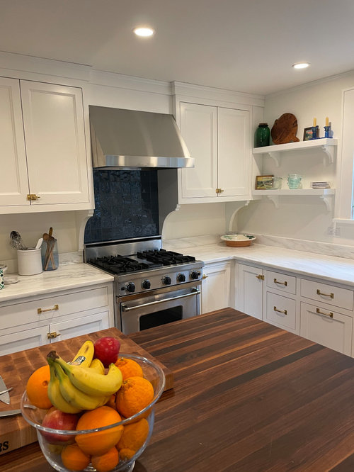
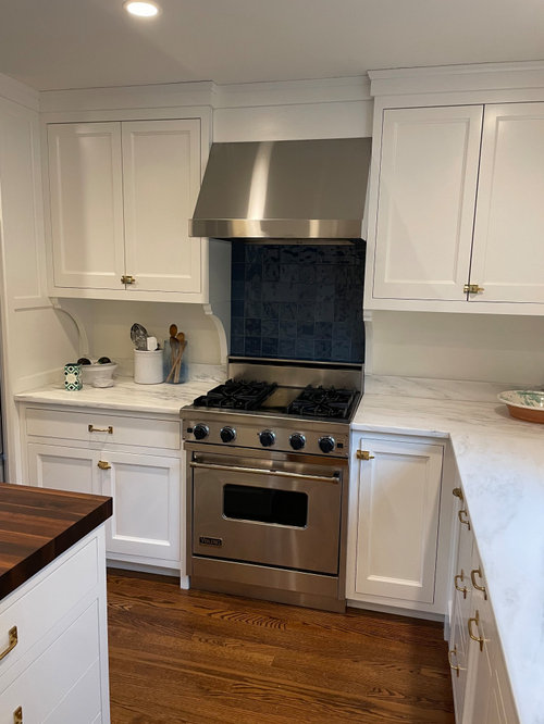
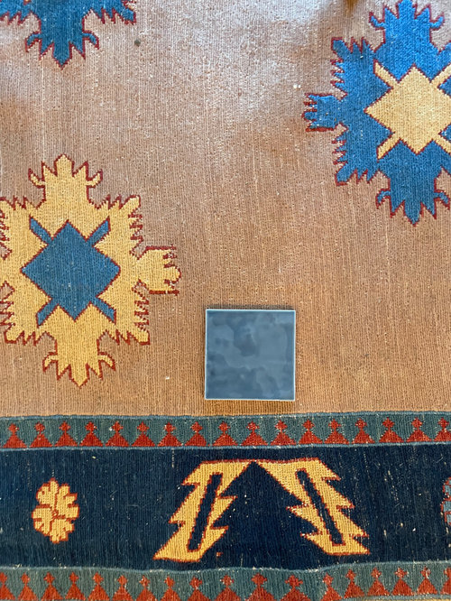
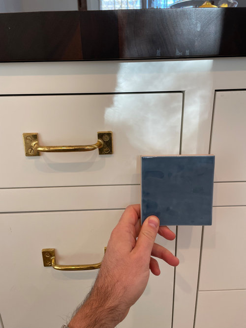
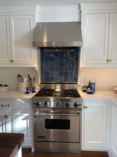
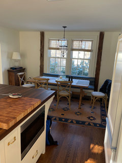
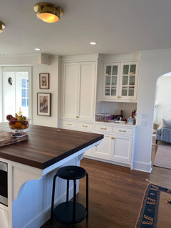
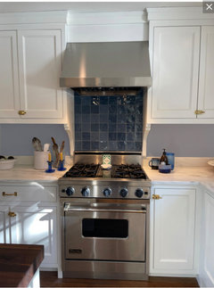
I hate my new backsplash!
HU-918119203
3 months ago


Featured Answer
Sort by:Oldest
Comments (65)

rebunky
3 months agoRelated Discussions
listello on 18' backsplash('I hate my kitchen' poster) pic
Comments (4)Hi Susanka I was excited to see your choices because we just installed a very similar backsplash and listello. The size will be fine and the positioning is key. We placed ours so that the bottom of the window cut the listello in half. Sounds weird but it actually looks good and therefore doesn't fun into any other outlets or switches. I will send photos as soon as I can figure out how to make them smaller. Good Luck...See MoreI hate my kitchen backsplash - part 2
Comments (2)I prefer contrast with cabinets and walls so I would not paint walls the exact same color as the cabinets. If you really want to coordinate, pick a color on the same strip of colors, either Crushed Ice or On the Rocks. I like the accent tile between the range and the hood, but I think yours is set too high. I would bring it down a row....See MoreI hate my backsplash
Comments (9)Can we see the full kitchen? The mosaic that you have installed if often chosen when one can not find a match for the counter. People think that by putting all the same colors Of the counter, it a sure bet. But instead, What you have are two busy elements competing with each other. Again, let’s see a picture further back, we might be able to come up with ideas. In the meantime, start saving up for a replacement. You are not alone in this situation. Many of us have had to to a redo right after we installed a backsplash. In my case my brown counter was fighting with the white if my cabinets. One would think the answer was to put in a white BS since it has worked for others. Not in my case. I had it torn out immediately, but it took me 6 months of visiting every tile shop to get a tile that would transition between the white and the brown. We also changed our light bulbs to soften the white cabinets. Cabinets are darker brown in person. But, I went from hating my kitchen to loving it all because I found the right tile. This happened to be a Gracia Rixi tile in cream. But this particular cream matches the light color in my granite, which was key to making it all work....See MoreI hate my new backsplash! Help with possible paint color?
Comments (23)If you want to try to save the backsplash before changing it, you could try painting the walls the same white as the cabinets. If possible, paint the ceiling also. Paint would eliminate one if not two warm tones that the tile is currently competing with. From there you could also try changing out your hardware (fairly easy and inexpensive). If you have stainless appliances, go with a silver color, which will provide another gray tone; or else brushed brass/gold, which would work well if you can't change the ceiling color. Mixed metals in the kitchen are in right now so you don't have to worry about the sink faucet :) white walls and ceiling, silver hardware white wall, original ceiling, gold/brushed brass hardware...See More
BPMBA
3 months ago
just_janni
3 months ago PRO
PRONorwood Architects
3 months agoKate Cowers
3 months agoHU-918119203
3 months agolast modified: 3 months ago
deegw
3 months agolast modified: 3 months agoConnecticut Yankeeeee
3 months agodoods
3 months agoKendrah
3 months agoHU-918119203
3 months agolast modified: 3 months agochicagoans
3 months ago PRO
PRODeWayne
3 months agoPaul F.
3 months agolast modified: 3 months ago
RedRyder
3 months ago PRO
PROBeth H. :
3 months agolast modified: 3 months agoHU-187528210
3 months agoPaul F.
3 months ago
cpartist
3 months agoKendrah
3 months agorebunky
3 months agolast modified: 3 months ago PRO
PROJAN MOYER
3 months agolast modified: 3 months agojkt107
3 months ago
kculbers
3 months ago PRO
PRODiana Bier Interiors, LLC
3 months agoHU-918119203
3 months agolast modified: 3 months ago
Jilly
3 months agolast modified: 3 months ago- PRO
JAN MOYER
3 months agolast modified: 3 months ago HU-918119203
3 months ago
raee_gw zone 5b-6a Ohio
3 months agoJilly
3 months agolast modified: 3 months ago
Lee M
3 months agomaddie260
3 months agolast modified: 3 months agoHU-918119203
3 months agolast modified: 3 months agoHU-918119203
3 months agoHU-918119203
3 months ago- PRO
Diana Bier Interiors, LLC
3 months ago Paul F.
3 months agoHU-918119203
3 months ago


Related Stories
DECORATING GUIDESChartreuse: Love It or Hate It?
Try a Sip of Yellow-Green With Blue, Chocolate, Hot Pink, Eggplant and Teal
Full Story
GREAT HOME PROJECTSHate Hauling Laundry? Give Dirty Clothes the Chute
New project for a new year: Install a quick route to the laundry room
Full Story
GARDENING GUIDES8 Plants That Snobs Love to Hate — and You'll Love to Grow
Don't dismiss these common annuals, perennials and shrubs — there are reasons they've been popular for so long
Full Story
FURNITUREWhy It's OK to Hate Your New Custom Sofa
It takes time to get used to bold new furniture, but dry your tears — the shock can be good for you. Here's what to expect
Full Story
LIFEYou Said It: ‘The Wrong Sink Can Make You Hate Your Kitchen’
Design advice, inspiration and observations that struck a chord this week
Full Story
SHOP HOUZZShop Houzz: Love It or Hate It? Controversial Home Decor
Take your pick of taxidermy, antlers, faux plants, cowhides and reproductions of famous art
Full Story
DIY PROJECTSDIY Backsplash Makeover: Get a New Tile Look for Less Than $50
Give old tile a painted faux-stone facade for a brand-new look at a superaffordable price
Full Story
KITCHEN DESIGNThe Best Backsplashes to Pair With Wood Counters
Simplify your decision-making with these ideas for materials that work well with wood counters
Full Story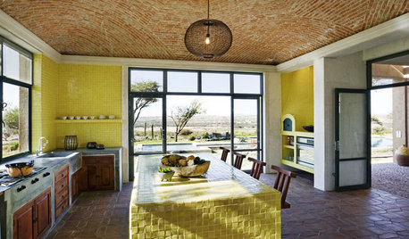
KITCHEN DESIGNKitchen Color: 7 Sensational Yellow Backsplashes
Warm up a white kitchen or add some zing to wood tones with a backsplash that glows
Full Story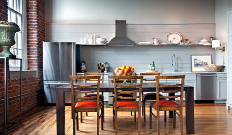
KITCHEN DESIGNSingle-Wall Galley Kitchens Catch the 'I'
I-shape kitchen layouts take a streamlined, flexible approach and can be easy on the wallet too
Full Story


Diana Bier Interiors, LLC