


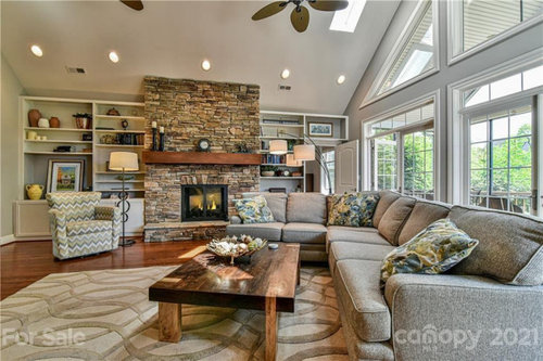
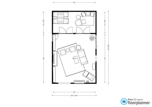
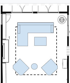
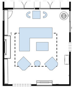
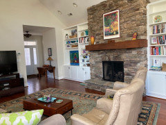
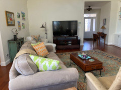
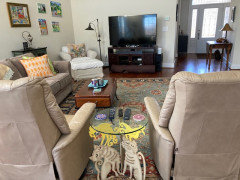
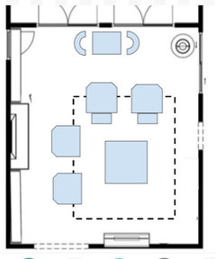
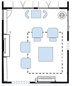
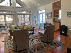
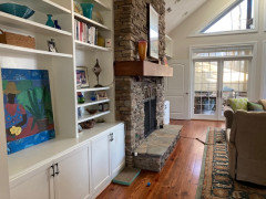
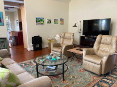
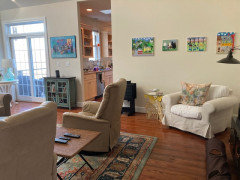
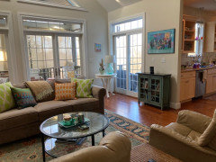
Updated room layout and could use more input
Patty C
last year
last modified: last year
Featured Answer
Sort by:Oldest
Comments (13)

houssaon
last year
Cynthia
last yearRelated Discussions
updated layout could use your help to optimize
Comments (17)I really appreciate the time everyone has taken to give suggestions- please keep them coming! The first layout I had posted above (I will call it Plan A) was done after my husband and I thought about how we cook and use the space. (Is this what you were suggesting for me to do bmore?). This is the basic information we had used to come up with Plan A: -I only use a space about 24" wide when I prep for a meal, even with abundant space around. I like to be within a step or two of the sink and I like to be between the sink and stove- preferably on a straight piece of counter. I do not like to carry pots of water over "land" to drain them and I only want 1 sink (for now!). -We lived in our last house for 5 years and were told it still smelled new after we moved out, so I am certain cooking smells will not be an issue, because there was just a recirculating OTR MW there. -I would like to keep the fridge less visible when entering the house from the front door (babs711, I agree that fridges are on the verge of ugly and I tried to eliminate a large one entirely but people here talked some sense into me!) so moving it closer to the bay window wall will accomplish that. This also gives us room for our Saeco coffeemaker to reside (I owe it that much since I almost wore it out making hot water to warm up bottles when the boys were babies!) and maybe keep my husband in the area to the right of the fridge while I am trying to prepare meals! And any further away from the bay window wall and it seemed like any island we put in would be a barrier within the magic triangle. -We pretended there were no windows to deal with and put in the sink and stove where they made sense to us and then realized that it might actually be a functional layout for us. A little asymmetrical but not as awkward IRL as it definitely looks on paper. And I get to chop things up in front of the window (which momo7 is right about- it is really nice especially because of the direction it faces). 70% of the time prepping... -Cleaning the counter will be a challenge but as Bart might say "I'll wash my s(h)elf with a rag on a stick". The window in the middle is stationary and we are even considering the sides being fixed glass since we would still have 2 more opening windows in the kitchen. -We were also originally determined to put something in that corner because it does seem logical in our setup, but again my husband really thinks it is a pain to have the sink there now. We had considered swapping out the funny sink for a regular one and rigging a counter top to see what it would be like that way. I think we could do something pretty quickly to assess real life function. Some things are hard to imagine. lisa_a- my husband requested straightening the counter because we mocked it up and it just seemed pointy and disjointed. I had to agree with him. Not trying to convince anyone except myself with so much detail, but just putting out there all the thoughts we have had during this process. Thanks again everyone!...See MoreUpdated layout (3D pics), input please?
Comments (17)measurements of appliances would help. It's difficult to know how they would fit into the space w/o them. is the m/w used a lot? in cooking process or just for snacks? the first thing I'd do is draw up a layout of a galley type kitchen/work area with a 3.5 - 4' doorway to the DR/FR centered on that wall. That gives you about 4' on either side of the work area. I'd put the fridge about where it is (w/o cab to it's left), move the sink a bit (a foot?) to the the right of where it is. that's gives you several ft of work space between fridge and sink. fridge is close to prep/cook area and to DR/FR. On the stove side I'd move the stove a bit to it's left (hard to tell how much w/o knowing size of the stove). put a 'wing' on the corner to the right of the stove w/ a prep sink on the end that turns (so is 'backed' to the DR wall). if mw is needed for cooking process, possibly it could be smaller and put on an 'under an upper cabinet' shelf - be it to the left or right of the stove. My choice would be putting it in the corner area. I'd consider another short cab/counter 'wing' on the right end of the sink run. That gives a bit more counter space at the end of that run and a slight barrier to a table put in front of the window. I wouldn't put a bench up against a peninsula there - that places the heads of people (and their hair) too close to counter range for me. The other end and opposite the table area could be a baking/other work space with pantry area. Possible 2nd oven/wall oven. on the end wall (in front of ext door - that goes where? garage? backyard?) I'd put a halltree/bench w/hooks over it for my sweater, sun hat, dog leash. open space under bench for incoming dirty/muddy shoes/boots. what I call an end 'wing' - I think this is from buehl's kitchen. it's at the end of a run. it's just a short 'turned' section of cab and counter. The corner area of it can open (doors or drawers) into the space behind it, be it the DR or the kitchen table area. this is another sample - from a gw'er whose name i don't remember. to the left of the dw (if I remember correctly) the cab/counter angles off to the back door. it's just a bit of a triangular cab (you can see the knob on it). i wouldn't use a diagonal across the corner area tho - it cuts into the space too much....See MoreI'm getting there - More Layout Input needed
Comments (6)Briana and LL - thanks. LL - yes - the big X is the frige (and it's about the only thing that I didn't type out with a label - oops.) Mthouse - I actually had it that way originally but we tend to entertain more casually than formally so I envision people hanging out in the keeping room and at the island more than toward th dining room (which currently is a playroom). In my previous designs, this was corner was an L and it just felt too far away from the rest of the kitchen. However, I think you made a GREAT point about unloading groceries. Thanks for the suggestion. I love the 'idea' of a butler's pantry (they are beautiful) but I just don't think it is right for how we live....See MoreAnswers to questions about layout - need more input!
Comments (5)First......What are the full dimensions of your space? All the walls, windows, doorways, etc. Very good reasons for switching. Traffic...OK Architects...yes, they're very good at designing structural elements and adding "interest", but when it comes to functionality, they pretty much get an F. The majority of architects are poor Kitchen Designers. A better idea is to get the general structural setup of the space and then design a very functional kitchen and tweak the architectural items to fit the layout. If you rarely used your kitchen (and yes, there are some people who have kitchens for "show" only), I would say go with what looks "nice" over functionality if that's what you want. But, you do use your kitchen, so I think functionality should be considered. For me, functionality usually trumps form. YMMV "island & range are on axis with the french doors"...is anyone going to notice this one way or the other? If it is noticeable, will it look too symmetrical and/or contrived? Sometimes this type of thing can actually look "too much" and stops being a nice feature and becomes more "show" or "commercial" looking. Aisle widths...if the measurements are cabinet-to-cabinet, then your aisles are actually 3" narrower than you think. Counter edges usually extend approx 1.5" beyond cabinets (to direct spills away from cabinets & doors to protect finishes). This means a 42" aisle is really 39" and 44.5" is really 41.5". With all the traffic you will probably have when you have get togethers, I highly recommend a minimum of 42" and, possibly, 48" aisles. Zone issues... Trash & Recycle...You need the larger trash bin and the recycle bin in the Prep & Cooking Zones more than you need them in the Cleanup Zone. Also, if the small trash bin is under the prep sink, every time someone needs to use it...prepping or cooking...the person at the sink will need to move out of the way. If it were me, I'd put the double-bin trash/recycle pullout in the Prep Zone and either put in a 12" single-bin trash pullout or a trash can under the sink in the Cleanup Zone...assuming the double-bin pullout is not also easily accessed from the Cleanup Zone (ideal setup). Cooking Zone/Range work & landing space if switch w/sink...do you need those shallow walls that flank both the current sink location and the entrance to the new sitting room? If not, you would gain approx 4.5" per wall that could be used for work & landing space. 18" is a little small, especially since both sides are 18" (i.e., there isn't one side w/more to make up for the lack of space on the other side). I suspect they're "architectural interest" items, at least the one b/w the DW & stair area. (This also applies to item #6.) Island orientation...have you also considered turning the island 90o clockwise so the seats back into the new Sitting Room? That might enable you to leave the range, refrigerator, etc. where they all are now. If you can provide the dimensions of the space, I could play with your layout to see how it would work... (Dimensions: overall length & width of the room, doorway/opening/window widths, widths of each section of wall space) If you can also reduce the width of those walls flanking the new Sitting Room, you add inches for the aisle b/w the island and walls. No comments right now. Moving refrigerator...aesthetic as well as function...unless you have a true blank slate and can make any changes you want, you will have to compromise on some things. In this case, ask yourself when is the refrigerator used the most and how can you mitigate the impact of the move (compromise). For example, it was mentioned that you could have a beverage refrigerator for drinks and condiments that is close to the Breakfast area. Generally, drinks and condiments aren't used for cooking but are used for meals and usually all that's needed from a Breakfast area is drinks & condiments! So, perhaps you could make the compromise on the refrigerator location functionally by putting it closer to the island workspace and have a beverage refrigerator for snackers. As to the "symmetry", I actually think moving the refrigerator is better b/c it balances the rather long wall on the Breakfast area end. You have a lot of partial walls cutting up the kitchen space, so work with those walls and use the refrigerator to at least "balance" them....See More
Patty C
last yearPatty C
last year
tracefloyd
last yearlast modified: last yearPatty C
last yearPatty C
last yeartracefloyd
last yearlast modified: last yearPatty C
last yeartracefloyd
last yearPatty C
last yearPatty C
last year


Related Stories
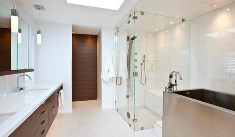
BATHROOM DESIGNRoom of the Day: New Layout, More Light Let Master Bathroom Breathe
A clever rearrangement, a new skylight and some borrowed space make all the difference in this room
Full StoryTRANSITIONAL HOMESHouzz Tour: More Living Room and Light in a Minnesota Update
New high-contrast siding, contemporary furnishings and a 10-foot addition refresh this roomy home
Full Story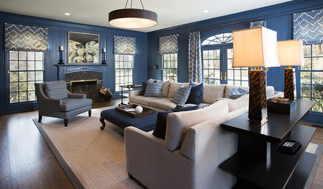
ROOM OF THE DAYRoom of the Day: Moody Blue Update for a Family Room
Comfort, function and style bring this room up to par for a stately Georgian home on Long Island’s Gold Coast
Full Story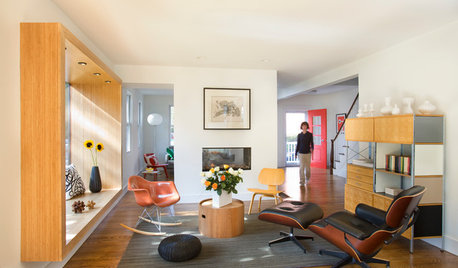
LIVING ROOMSRoom of the Day: Living Room Update for an 1800s New England House
Major renovation gives owners the open, contemporary feel they love
Full Story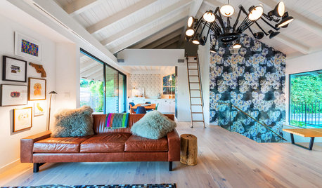
ROOM OF THE DAYRoom of the Day: More Fun for a Los Angeles Living Room
Bright furnishings and a newly open floor plan give a 1964 living room suffering from an identity crisis a new look
Full Story
HOMES AROUND THE WORLDHouzz Tour: More Room for an Architect’s Family
A new Japanese-style entry courtyard and a new bedroom and bath update this ’70s home in Australia
Full Story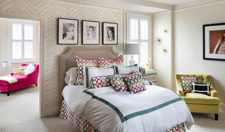
KIDS’ SPACESRoom of the Day: Girl’s Bedroom Gets a Little More Grown-Up
Zebra wallpaper, custom bedding and a hot-pink chaise update a teen’s bedroom, sitting area and workspace
Full Story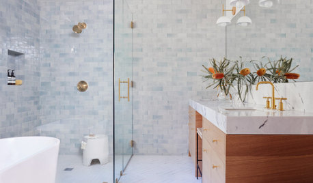
BATHROOM MAKEOVERSBathroom of the Week: Fresh, Bright Look With More Breathing Room
An airy layout with a curbless shower and light finishes helps open and brighten a once-dark primary bathroom
Full Story
HOUZZ TOURSHouzz Tour: Modern Materials, More Light Update a Suburban Home
A California home gets a major makeover, resulting in a space with sleek lines and an open layout
Full Story
MOST POPULAR8 Ranch House Renovations Make More Room for Living
See how homeowners have updated vintage homes to preserve their charm and make them function beautifully in today’s world
Full Story


tracefloyd