SHOP PRODUCTS
Houzz Logo Print
julie_mccloskey

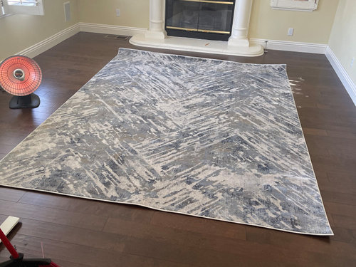
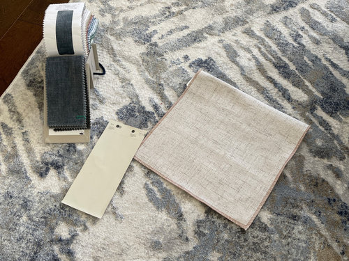
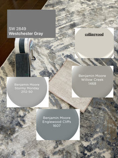
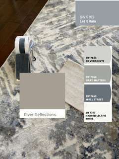
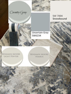
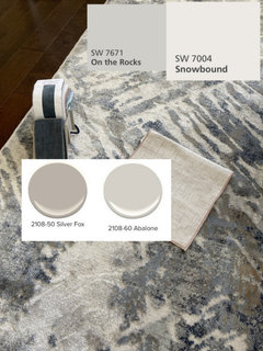
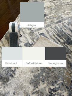
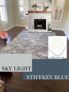
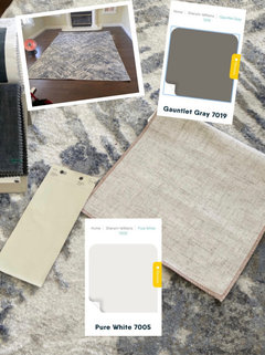
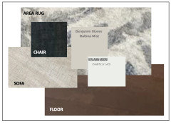
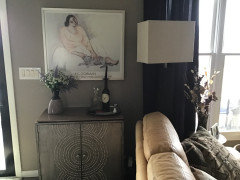
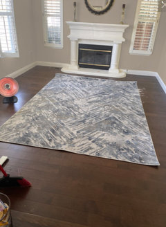
What is a good paint color that is grey & beige

Julie McCloskey
2 years ago
last modified: 2 years ago

Redoing my living room and have dark hard wood floors with a blue, grey and taupe rug. Couch is light colored greige with 2 blue grey chairs. Fireplace, shutters and molding are white. Having a hard time picking a color that compliments the room and doesnt make the walls look dull and dirty.

Thank you for the replies and help!! Here are some pictures.

picture 1 is fabric of couch with Edgecomb gray I was looking at:) to similar? I want to possibly take this color throughout my house

pictute 2 - rug with hardwood floor and blue fabric for chairs


Evening


couch tan/gray fabric which will be against large no window wall blue/gray fabric for chairs next to window


Comments (45)

  • littlebug zone 5 Missouri
    2 years ago
    last modified: 2 years ago

    White.

    If your walls look drab and dingy: 1) you don’t have enough light, and/or 2) your furnishings (grey/blue/taupe) and your dark hardwood are reflected on the wall color.

    Julie McCloskey thanked littlebug zone 5 Missouri
  • Mary Elizabeth
    2 years ago

    Benjamin Moore Edgecomb Gray - just enough "color", and picks up beige or gray, depending on what else is in the room. Not at all drab, like a "cool" grey. I used it with Benjamin Moore Vapor for cabinets and trim. Works well with wood.

    Julie McCloskey thanked Mary Elizabeth
  • Related Discussions

    Picking out Kitchen Paint color - gray/greige/beige?

    Q

    Comments (25)
    I have balanced beige and tony taupe by SW in my house. They might look good with your floor. I like all of the colors you have tried besides the two that look too blue. Edge comb is probably my favorite of your samples. It seems to have just a hint of taupe to mix well with your floors and might be a bit warmer. Good luck and please show after pictures.
    ...See More

    paint color choice: accessible beige or gray?

    Q

    Comments (4)
    Try SW Gossamer Veil. i am currently going back and forth trying to decide between SW Accessible Beige, BM Edgecomb Gray, SW City Loft, and SW Gossamer Veil. I think the Accessible Beige is a bit too yellow for my taste and too dark in the evening in our east facing family room. We have a great view of Mt. Rainier, but get a LOT of rain in the fall and winter, and some days are dark all day long. I'm leaning toward either the Edgecomb Gray or the Gossamer Veil. I think the Gossamer Veil may have tiny bit warmer tone than the Edgecomb, which leans more towards a warm grey. I'll be glad when we can move past the paint decision!
    ...See More

    Good whole-house paint color? Gray with blue undertones?
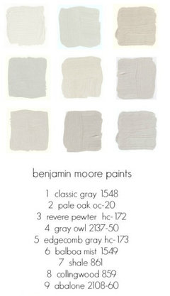
    Q

    Comments (10)
    Gray Owl looks greenish to me, too...and that's the danger of recommending or looking at colors online, sadly. However, the guidelines can help... For example, the picture above with all the "grays"? To me: Top row are gray, second row are beige with the exception of repose gray which I find gray/green. Third row, I would classify as green with the exception of aloof gray witch, again, looks like repose gray...a gray/green. So it's all about perception and monitors :-/ It sounds to me like you "did" beige and this time out want gray. Nothing wrong with that. It's just paint. So find a gray that's acceptably warm to you, while still looking gray. Off to the paint store with you! Or, find a "white" that leans warmer...
    ...See More

    Changing interior paint from taupe/gray to beige. Suggestions please?

    Q

    Comments (7)
    I have a custom-modified version of Sherwin-Williams's oyster bar throughout my house. The "custom" part is that I asked the paint specialist to "double it", so it's slightly darker and more saturated than the original SW oyster bar color. A color consultant advised me on the color, which I originally thought was a boring beige, but in hindsight was a great choice because it's very neutral. It has slight undertones of gray/green, depending on the light. It looks great with just about any other color accessories, including Persian-type rugs with reddish, blue, and green hues.
    ...See More
  • kandrewspa
    2 years ago

    BM Edgecomb Gray and SW Accessible Beige are the most popular greiges, but if those colors are too close to the color of your furniture that will be a boring look. To go lighter I suggest BM Classic Gray which contrary to its name isn't too gray. Since you haven't posted any pictures we're all having to guess a little bit here. Whatever you do, sample before you commit to painting the whole room. Every color, but especially greige, is going to look different depending on the type of light in your room. It also may be a good time to think about the lighting in the room if you haven't thought about it in a while and you feel like the room is dark.

    Julie McCloskey thanked kandrewspa
  • chloebud
    2 years ago

    Just posting this since I saw it today.

    https://julieblanner.com/greige-paint-colors/

    Julie McCloskey thanked chloebud
  • pricklypearcactus
    2 years ago

    I've seen a lot of people rave about Benjamin Moore Pale Oak as well.

    Julie McCloskey thanked pricklypearcactus
  • PRO
    Beth H. :
    2 years ago
    last modified: 2 years ago

    correct, no yellow! you want cooler, blue or slightly red undertones.

    these ought to be enough to choose from


    some darker combos in case you want to paint a cabinet, doors, accent wall,,,Snowbound is the perfect white (slightly pink undertone which will work w/your brown floors)


    coventry gray may be too green. depends on your light.


    these warmer gray tones are nice. I have LightPewter in my kitchen. On the Rocks is a perfec gray that isn't blue or yellow.


    pick what you like, bring home some samples, and see how they look

    paint out the gold in this surround. I wouldn't keep the mirror either. do some art.

    any plans for this fireplace mantle? I think redoing it with something like this, 10X better


    Julie McCloskey thanked Beth H. :
  • Melissa R
    2 years ago

    my fav greige is SW Popular Grey


    Julie McCloskey thanked Melissa R
  • Julie McCloskey
    Original Author
    2 years ago

    Thank you so much everyone for your wonderful comments and advice! Beth thanks for all the time you took to add so many color options and dos and donts for the mantle This is the first time using this app and loving it! Thank You all so much!!!

  • K R
    2 years ago

    The Poplar gray looks really good! If you want a lighter “vanilla gray” as I call it try BM Classic Gray. It’s a neutral white/gray.

    Julie McCloskey thanked K R
  • K R
    2 years ago

    Classic gray

    Julie McCloskey thanked K R
  • twocats
    2 years ago

    Like most people on here, I would also go for a light, warm grey. It will look good with your dark floor and your white trim and shutters. Good luck with your project!

    Julie McCloskey thanked twocats
  • sandyhenn
    2 years ago

    almost my whole house is painted in BM Balboa Mist. Great greige that changes in each room depending on the light.

    Julie McCloskey thanked sandyhenn
  • paddlerchick
    2 years ago

    White would be my choice. Although popular, I think greys look dirty. You could use a very white, white on the trim and a warmer white on the walls. I've just spent the last year repainting our entire house where the seller had painted every wall and celing with Agreeable Grey. My life has been miserable as most rooms where I went lighter have take 3-4 coats (including a coat of Kilz) to cover it. Really a pain and when you see the grey next to the lighter colors as you paint, you realize how dirty the grey looks. My two cents.

    Julie McCloskey thanked paddlerchick
  • boxingdaybabe
    2 years ago

    I have painted a whole house in Edgecombe Grey and my most recent home in Pale Oak...I prefer Pale Oak. Both are Benjamin Moore. It's a great neutral and goes with all my accessories, which I change with each season. I also have dark floors. Good luck!

    Julie McCloskey thanked boxingdaybabe
  • dorothymooney
    2 years ago

    If you want a gray/beige color, go with Ben Moore Revere Pewter. It's BM's most popular color and it's dead center between gray and beige. It's a warm color too, which you need with all that gray and blue. It also looks great with white trim.

    Julie McCloskey thanked dorothymooney
  • atortorici07
    2 years ago

    I would paint most of the walls with Pure White7005 from SW and the accent wall withGauntlet Gray 7019 SW

    Julie McCloskey thanked atortorici07
  • Mary Wiggenhorn
    2 years ago

    I have used BM Bunny gray in the past and it worked quite well.

    Julie McCloskey thanked Mary Wiggenhorn
  • kautry
    2 years ago

    I have similar colors in a guest room and used Benjamin Moore aura ” Worn Leather Shoes”, a rich color thatcworked well with the taupes, grays and blue

    Julie McCloskey thanked kautry
  • Ana Maria Suarez
    2 years ago

    I agree that the paint chips is too yellow/green undertone. Have you read Maria Killiam's blog re grey & white paints? She is a true color expert. https://mariakillam.com/?s=wall+undertones

    Julie McCloskey thanked Ana Maria Suarez
  • HU-966718201
    2 years ago

    Stay away from yellow tones. We have used BM Silver Satin in many rooms now. It goes with everything and has no yellow undertones (that I can see). In my guest room it is accented with light blue/green spread and drapes. In our mbr we have navy: white accents. In yet another room we’ve used beige accents.

    Julie McCloskey thanked HU-966718201
  • HU-966718201
    2 years ago

    One more thing, we’ve used Edgecomb Gray and Pale Oak. They definitely have yellow undertones.,

    Julie McCloskey thanked HU-966718201
  • aniluap2
    2 years ago

    People can suggest colors, but you need to experience them in your room, since each location is unique depending on the light exposure. Colors look different during the day and night as well, so you need to put samples up on the wall and look at them at different times of the day. In certain light conditions, what may look gray in the store. might look pale blue or mint green, depending on the tints used to make it, since those are the colors pulled out of the light spectrum in that exposure.
    If you like the color of your griege fabric sample you can take it to the paint store and they can make you a custom sample to match it, and that service is free. You might want to try that and see if you like it.

    Julie McCloskey thanked aniluap2
  • eurekahd
    2 years ago

    We used Revere Pewter (matte) in our south-facing living room, with Simply White (semigloss) trim and Gray Owl (flat) on the ceiling and really love the combination (all Benjamin Moore). Collingwood is almost a lighter version of Revere Pewter, if you find RP too dark in your space.

    Julie McCloskey thanked eurekahd
  • Kimberly Jessee-Weir
    2 years ago

    I also have Revere Pewter in my home. I have Wolf Gray above my mantle inside some trim and crown molding, and an accent wall in my living room. I only will use Benjamin Moore paint (not a spokesman just a fan) because it holds up to kids and pets without chipping,fading or anything! I have navy blue accents like pillows and a blue and white striped chair. I’ve been living with this color scheme for years and absolutely love it!

    Julie McCloskey thanked Kimberly Jessee-Weir
  • paperdiva
    2 years ago

    Sherwin Williams White Dove is a really nice griege paint color. i painted my whole house with it. it looks great with my dark brown/grey floors and carpets that also has browns and greys in it.

    Julie McCloskey thanked paperdiva
  • felizlady
    2 years ago

    I would get several (5-8) very light gray color chip cards at the paint store to bring home and see in your space, but keep them away from the yellowish walls. Watch for undertones.
    How do they look with the greige sofa? The rug? The floors?

    Julie McCloskey thanked felizlady
  • stellarceline
    2 years ago
    last modified: 2 years ago

    I think it might be too much gray if you do walls a similar color. I would go with a white (like White Dove) and also bring in some color in your art, plants, throw pillows, etc. (Unless you really like the all neutrals monochromatic work!)

    Julie McCloskey thanked stellarceline
  • krystalmoon2009
    2 years ago

    i got samples of pale oak, balboa mist and edgecomb gray and they were all to gray in the room I was looking to paint. southwest facing family room, lots of natural light. I moved sample board to my bedroom and edgecomb gray is a possibilty in there. Seeing a little more of the beige I was looking for.

    Julie McCloskey thanked krystalmoon2009
  • PRO
    lisedv
    2 years ago

    I would opt for BM Balboa Mist, it's has a warm grey touch and I find it coordinates better with your samples.Chantilly Lace is a nice crisp white that is good for ceiling and trim, and goes well with Balboa Mist.


    Julie McCloskey thanked lisedv
  • CHarlotte
    2 years ago
    last modified: 2 years ago

    Sherman Wiliams Uterly Beige is a beautify neutral I have dark HW floors and looks great (‘d say it’s toward taupe beige—NO YELLOW)


    Julie McCloskey thanked CHarlotte
  • Sharma
    2 years ago

    Hello Julie,

    Beautiful floors by the way! When I first looked at your photo the fireplace caught my eye. It is the major focal point of the room, of course. I’d paint the fireplace wall a darker color, such as the blue colors in Beth H’s examples to complement your chairs and rug. A darker color would highlight the fireplace mantle. As for the other walls, the suggestions by Beth H. are also very good. Perhaps just a hint of gray/cream to differentiate the white molding and shutters. Then I’d find a large, bold, colorful print to place above the fireplace (or rest on the mantle) and use brass candle holders and perhaps a brass frame around the artwork with a small plant or blue, glass vase opposite the candle holders. A large plant, real or artificial, in a corner next to the fireplace would add some greenery to the room in a complementary gray-colored pot. Beth H. also suggested modifying the fireplace, I would suggest using tile on the firebox around the inset only or even peel & stick wallpaper that resembles tile. I don’t know if your flooring is vinyl planks or engineered hardwood, but if you have pieces left over perhaps building a 3-sided box to set atop the mantle (attaching to wall from underneath) to give some contrast to the all-white mantle. Don’t know if you plan to use a coffee table, but if so, maybe one with a black metal base (or wrought iron) and glass top.

    Don’t keep us in suspense, post photos once finished! 😊

    Julie McCloskey thanked Sharma
  • Julie McCloskey
    Original Author
    2 years ago

    @mxk3 z5b_MI

    The sample paint color showing is actually BM Edgecomb Grey. Photos dont always show true color however it does show most yellow, 2nd black, then Red then grey in paint breakdown. I sampled it on my wall and agree with comments that I need a warmer color. May try BM Reere Pewter or go with SW Accessible Beige. I want to possibly bring this color to the rest of my home and my kitchen has warmer tones.

  • Sandra Lundgren
    2 years ago

    I've used Balboa Mist from Benjamin Moore. I like it, but it may be lighter than what you are looking for.

    Julie McCloskey thanked Sandra Lundgren
  • acowher
    2 years ago

    Try Silverplate by Sherwin Williams. I have it throughout my house and it compliments both my cherry wood floors and gray furniture.

    Julie McCloskey thanked acowher
  • Nina Dee
    2 years ago

    Horizon by BM (NoT horizon grey)

    Julie McCloskey thanked Nina Dee
  • Laura
    2 years ago

    Try Shoreline by Ben Moore. Those fabrics are the colors I have in my living room (yes a blue velvet sofa from MG+BW) and it is a perfect neutral light grey

    Julie McCloskey thanked Laura
  • sxb2053
    2 years ago

    We have both Shoreline and Pale Oak in our home. Paint chips are fine up to a point of winnowing down to the finalists, but I bought sample cans of the ‘contenders’ and painted hunks of discarded drywall (ours was a new home) that were a decent size. I moved them around the target areas at different times of day to see how they performed under changing light conditions. It was very telling. I’m glad I did.

    Julie McCloskey thanked sxb2053
  • Jj J
    2 years ago

    SW Alpaca is a lovely, soft greige color in my house. Some say it leans purplish which is not my experience with it in the Pacific Northwest.

    Julie McCloskey thanked Jj J
  • Cath_space
    2 years ago

    Sherwin Williams Versatile Gray

    Julie McCloskey thanked Cath_space
  • Mari Nicholson
    2 years ago

    SW Accessible Beige is a beautiful neutral that goes with both warm and cool colors. On the cooler side SW Agreeable Gray.

    Julie McCloskey thanked Mari Nicholson
  • Julie McCloskey
    Original Author
    2 years ago

    Thank you all for your very helpful comments....Narrowing it down to SW Balanced Beige and Accessible Beige. Furniture I ordered in taking a lot longer so wont have pictures of the room with furniture till April/May:( . Will keep you posted as plan to paint end of March. Also, plan to work on the fireplace:) . Thank you all again and still appreciate any comments you with to share.

  • Melissa R
    2 years ago


    SW Accessible Beige


    SW Balanced Beige

    Julie McCloskey thanked Melissa R
  • George Neuendorf
    2 years ago

    SW Agreeable gray will cover your gray,blue and beige flow

    Julie McCloskey thanked George Neuendorf
  • decoenthusiaste
    2 years ago


    Julie McCloskey thanked decoenthusiaste