


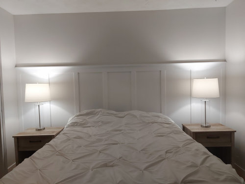
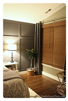
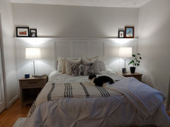
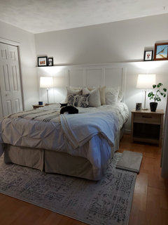
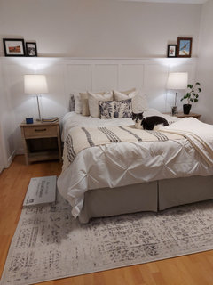
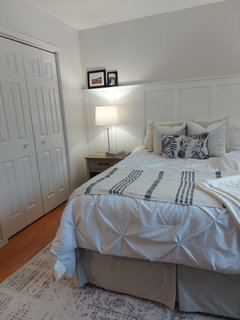
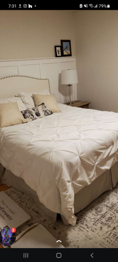
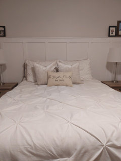
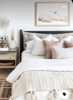
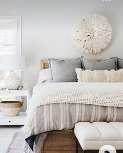
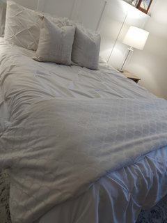
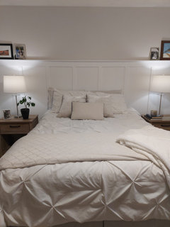
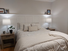
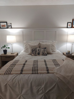
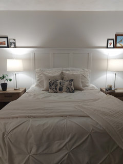
How to style board and batten wall?
Girlmom101
2 years ago
Featured Answer
Sort by:Oldest
Comments (65)

acm
2 years ago PRO
PROCelery. Visualization, Rendering images
2 years agolast modified: 2 years agoRelated Discussions
Painted wainscoting (Board and Batten style) with stained trim?
Comments (5)I have an older home with V-groove wainscoting and board-and-batten paneling, and when I've painted have always painted them the same color as the baseboards and other trim. I think it would be really awkward to try and transition from stained baseboard and door casing to painted paneling. Maybe someone else can come up with some encouraging inspiration pics....See MoreBoard and Batten Accent Wall - Thoughts?
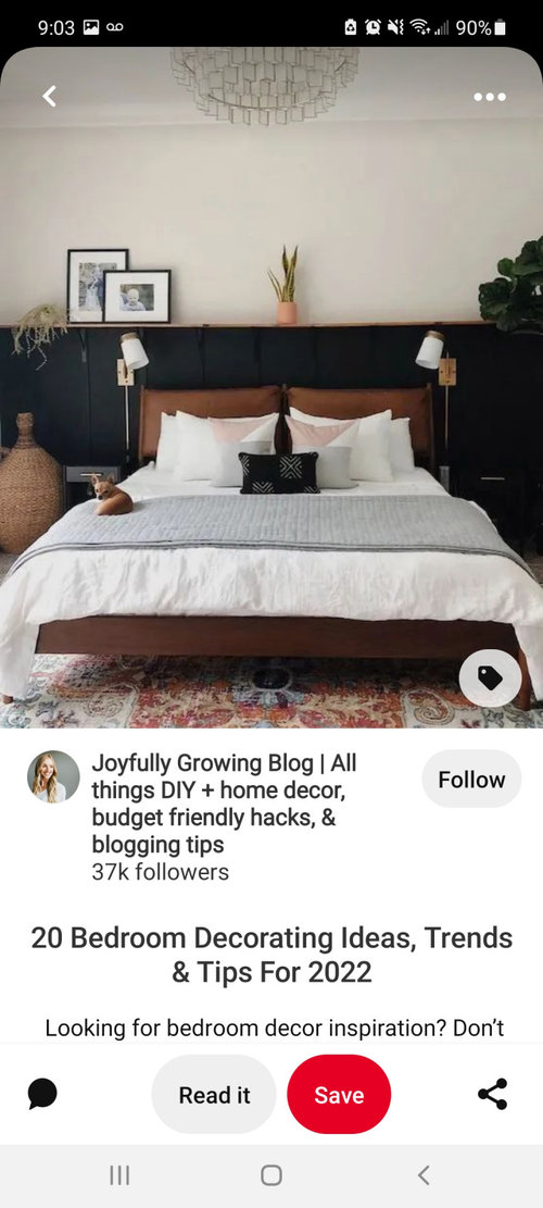
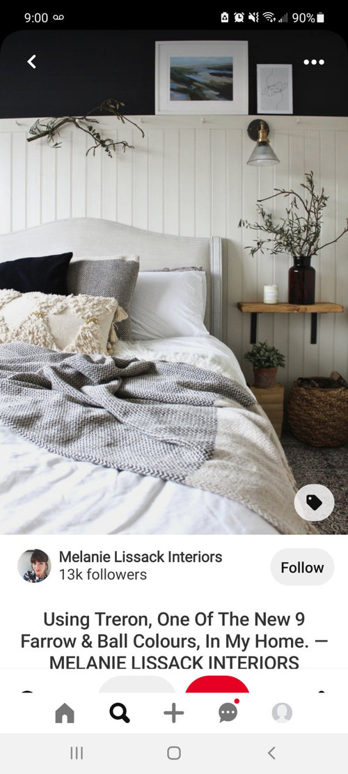
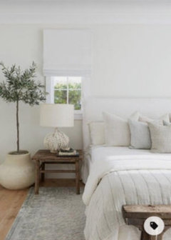
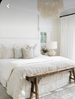
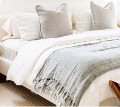
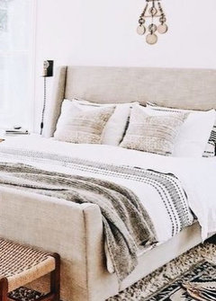
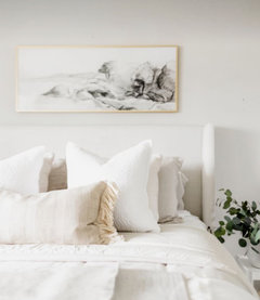
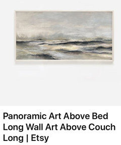
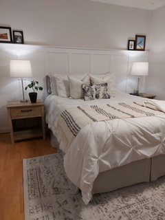
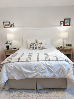
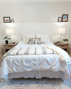
Comments (31)@houssaon - haven’t painted yet! Beach glass is lighter than what’s currently on the walls with a bit more green. I like option 3 @Jennifer Hogan - those are neat but too modern for the aesthetic I’m going for in this house. @modpod - haven’t painted yet. The only trim in the room is baseboards/door/window casements. I’m concerned the room would look quite anemic being all white with one accent wall. I do agree it’s classic but as the room gets very low natural light I feel like it might look a bit like a hospital ward? Once I remove the carpet and have the floors done I’ll be adding a large rug under the bed (to extend around it as well) with blues, greens, and creams. I might add a lighter throw and body pillow cover but bedding is set for now, just bought it and love it. I’ll think about the curved option but feng shui discourages mirrors in bedrooms and I feel like adding more things (art/mirrors) above the bed will make the room feel even more lopsided than it already does. Definitely in the very early stages of design but I very much appreciate all of the feedback! Thanks all!...See MoreBoard & Batten/Judges Panel Accent Wall
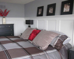
Comments (10)Accent walls are falling out of favor because they are not really a substitute for all around cohesive architectural interest. It's like wearing one red shoe. Yup. Everyone sees the one red shoe. But that shoe will look much better with another red shoe, a paisley printed shirt with red in it, and a red belt for the pants....See MoreGeometric board & batten walls
Comments (4)I do not go as afar as ridiculous but they do look better in the right space . I actually like tem netter than wainscoting but not in every space either ....See More PRO
PROBeverlyFLADeziner
2 years ago
Girlmom101
2 years agoGirlmom101
2 years agoGirlmom101
2 years agoGirlmom101
2 years ago
WestCoast Hopeful
2 years ago
barncatz
2 years agolast modified: 2 years ago
Maureen
2 years agolast modified: 2 years ago- PRO
Celery. Visualization, Rendering images
2 years agolast modified: 2 years ago 
la_la Girl
2 years agoGirlmom101
2 years agoWestCoast Hopeful
2 years agoGirlmom101
2 years agoWestCoast Hopeful
2 years ago PRO
PROBeth H. :
2 years agolast modified: 2 years agoGirlmom101
2 years ago- PRO
Beth H. :
2 years ago 
amykath
2 years agoMaureen
2 years agolast modified: 2 years agoGirlmom101
2 years agoWestCoast Hopeful
2 years agoGirlmom101
2 years agoamykath
2 years agoWestCoast Hopeful
2 years ago- PRO
Beth H. :
2 years agolast modified: 2 years ago Girlmom101
2 years agoGirlmom101
2 years agoMaureen
2 years agolast modified: 2 years ago- PRO
Beth H. :
2 years agolast modified: 2 years ago Girlmom101
2 years agoWestCoast Hopeful
2 years ago- PRO
Beth H. :
2 years agolast modified: 2 years ago Girlmom101
2 years agonjmomma
2 years agoMaureen
2 years agolast modified: 2 years ago
niccidhg
2 years agoanneemae
2 years agolast modified: 2 years ago- PRO
Beth H. :
2 years ago Girlmom101
2 years agoGirlmom101
2 years agoamykath
2 years agoGirlmom101
2 years agoamykath
2 years ago
2pups4me
2 years agoGirlmom101
2 years ago2pups4me
2 years agolast modified: 2 years agoWestCoast Hopeful
2 years agoGirlmom101
2 years ago


Related Stories
REMODELING GUIDESRenovation Detail: Board and Batten Siding
Classic board and batten siding adds timeless appeal to traditional homes, modern structures and every style in between
Full Story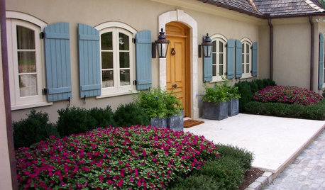
WINDOWSBoard and Batten Shutters Offer Pretty Protection
If you're looking for a traditional window dressing that's decorative and practical, board and batten shutters are flat-out appealing
Full Story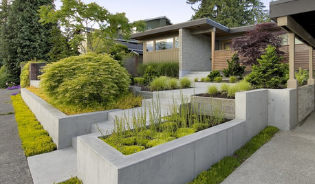
LANDSCAPE DESIGNGarden Walls: Pour On the Style With Concrete
There's no end to what you — make that your contractor — can create using this strong and low-maintenance material
Full Story
DECORATING GUIDES13 Inspiring Ways To Style Your Inspiration Board
Step it up beyond square corkboards and plastic push pins
Full Story
HOUZZ TOURSMy Houzz: Moody Wall Treatments and Eclectic Style
Heirlooms, flea market finds and collectibles mix with modern touches in this stylist’s family home in Austin, Texas
Full Story
DECORATING GUIDESCasual Wall Art Arrangements Show Deliberate Style
No time or desire to carefully plot a wall-art arrangement? Grab a hammer and throw tradition to the wind
Full Story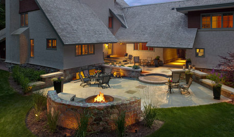
GARDENING AND LANDSCAPING10 Rock Wall Ideas for a Style-Strong Patio
Strengthen the look of your yard — and solve landscape design dilemmas — with a rock wall that fits right in
Full Story
REMODELING GUIDES11 Reasons to Love Wall-to-Wall Carpeting Again
Is it time to kick the hard stuff? Your feet, wallet and downstairs neighbors may be nodding
Full Story
KITCHEN DESIGNShaker Style: 5 Details to Introduce to Any Style of Kitchen
Whether your taste leans contemporary, country, rustic or Victorian, these Shaker details can add beauty and function
Full Story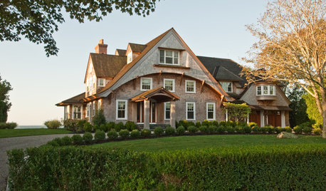
ARCHITECTURERoots of Style: Shingle Style Is Back — Here's How to Spot It
Intimate or rambling, in the coast or by the sea, Shingle homes are seeing a revival. Has your home joined in?
Full Story


calidesign