SHOP PRODUCTS
Houzz Logo Print
cdisimone

Classic Gray vs Shoji White - how to tone down warm kitchen cabinets

cdisimone
3 years ago

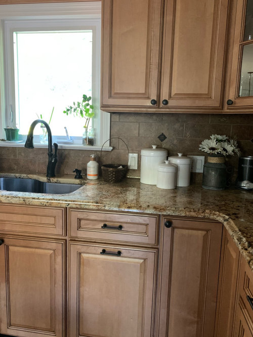
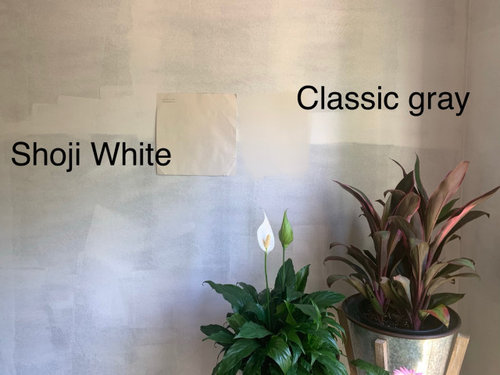
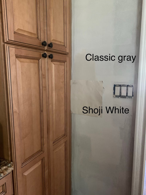
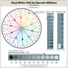
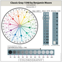
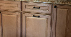
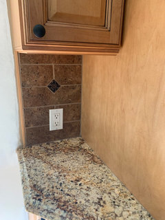
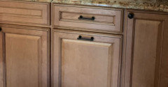
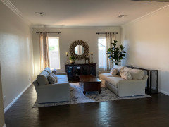
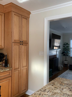
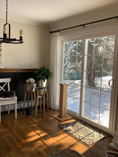
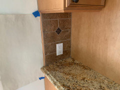
Im painting my open concept kitchen and I’m confused about the general idea of choosing a paint color to tone down kitchen cabinets, granite, or any other fixed elements. I get that putting a warmer color next to orangey cabinets might make the cabinets look less-orange, but then you have this overall very warm orangey room. So I’m choosing between BM Classic Gray and SW Shoji White, and painting over a big accent wall that was chocolate brown before. In certain lighting these 2 colors actually look the same, but at other times the warmth of Shoji White shows while the gray in Classic Gray shows, however Classic Gray comes off more beige in my home most times. So, choosing between 2 similar colors, if I’m wanting to cool down the space, do I pick the warmer color, or the cooler color? I think Shoji White goes better with the cabinets but I’m afraid of it looking too yellow in my home, especially at night with lights on... but also Classic Gray might be too gray for the tones in my kitchen. Can someone help me... I hate choosing paint colors! Thanks.
Comments (70)

  • Marylee H
    3 years ago


  • eam44
    3 years ago
    last modified: 3 years ago

    You see orange, but what you want to deal with is the pink, or red value in the space. Consider a white that has an RGB value slightly higher in R. This is SW 7000 Ibis White. And it won’t make your space look pink.

    Any plans to change the backsplash?


  • Related Discussions

    Does "warm" grey paint color with blue tone exist?

    Q

    Comments (32)
    Okay...all the junk is out! Plan: clean up/mop dust, mortar chips, etc. and spend the evening with my paint samples...narrow down to three or four...paint sample boards, and pick a color. I would love to have time to see the sample boards in different light etc.; but my get-er-done DH scheduled plumbers on Monday and convinced the tile setters to partially grout the shower and come back to finish on Monday too....Grrrr! So...I plan to only paint behind the toilet and area and by bullnose edging. If I pick wrong.....I will not have to do redo the whole room. If I pick the wrong color, I am not worried about repainting near the bullnose; it is the toilet area that worries me. Anyone have a tip for painting behind a toilet that is 1/2 inch from the wall just in case. This is our attempt to correct a horrible inefficient layout...not thrilled about looking at the side of a toilet; but that compromise meant a towel closet in the bathroom (finally), a 60x60 angle shower, and room for a 77" double vanity while eliminating the 3 right angles in the second entrance from the master bath.
    ...See More

    Help! Trying to tone down brand new SW Dover White cabinet-too yellow

    Q

    Comments (33)
    Can any color experts out there tell me if SW Moth Wing would be a good choice for the island? Would it give an ample contrast to the SW Dover White. First, I loveDover White. I think it's a pretty white. Some whites are "okay" and some are "pretty" and I think Dover White is pretty, so you could have done a lot worse, IMO. Dover White belongs to the yellow hue family. So, the data validates exactly what you're seeing. If I painted the walls SW Accessible Beige with a PPG Delicate White Trim, would that clash? I'm hoping the paint color I choose will help neutralize the yellow I see. They would not clash. Those three colors go together well - they relate nicely. And it is possible that Accessible will lessen how yellow Dover White looks. Moth Wing doesn't really fit in. It's too close in terms of hue family and chroma to Accessible Beige and I don't care for the relationship on paper or lookin' at the chips. I know Moth Wing and Accessible Beige are on the same strip but that doesn't really mean anything. Color harmony is not built-in guaranteed just because colors are on the same strip. Very often the similar color attributes that land colors on the same strip are the very reasons they don't go together - Accessible Beige and Moth Wing are a good example. If you're not happy with Balanced Beige and don't want to just leave it and see how it works out, then I'd get off that strip of colors and go another color direction.
    ...See More

    Amazing Gray vs Mindful Gray for kitchen Cabinets

    Q

    Comments (21)
    Amazing Gray and Mindful Gray are somewhat similar near neutral colours from the Yellow Hue Family. Examining their attributes allows you to compare and contrast them without guessing. They differ the most in Chroma. ( colourfulness ) Mindful Gray is a more neutral colour than Amazing Gray. (The lower to Chroma the nearer to neutral ). Amazing Gray is likely to read slightly warmer as it sits just a little closer to the Yellow-Red Hue Family. Mindful Gray is just a tiny touch darker than Amazing Gray. This combined with the lower Chroma is why it offers slightly more contrast to the colourful flooring. All low Chroma colours are more affected by changes in light. In imbalanced lighting both are susceptible to shifting purple-ish. - this is why it’s so useful to test in situ. But you don’t mention this as a problem with either in your space - which is good. So both work with your flooring - just decide which attributes you prefer next to the flooring and with your available light,
    ...See More

    Classic paint color for interior of the house. No Grey/Grey tone

    Q

    Comments (32)
    I have Brazilian cherry floors throughout the first floor and also have walnut furniture. I have the following colors in various rooms: BM Bunny Gray, BM Moonshine, Behr Clear Moon. Greens, grays and creams are recommended for red-toned furniture/floors. I picked those colors 16 years ago before I knew that, LOL! I would really look at Moonshine, it is a very subtle grayed green color and is gorgeous.
    ...See More
  • cdisimone
    Original Author
    3 years ago

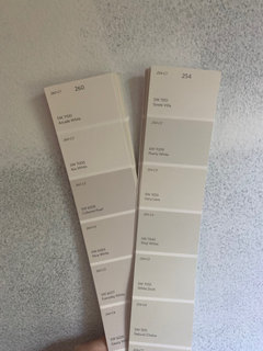
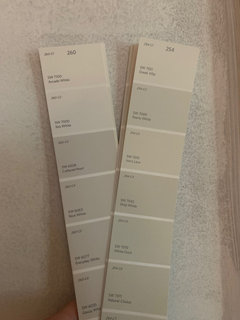
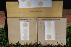
    I see what you mean- that whole strip on the SW fan deck looks “pink” and makes the Shoji White strip look green. However when I hold up the Ibis White strip in my house, it actually turns very gray and looks cold compared with the other colors I’ve been looking at. There is actually very little wall space that borders the cabinets but it is one big space. I was not planning on changing the backsplash but I was planning on painting the island. I am not sure how accurate my cabinet color is coming across in these photos either - the phone camera never looks like what I see in person. But maybe I will pick up a sample of something with more red in it and just see how it looks on the wall. Thank you!

  • cdisimone
    Original Author
    3 years ago

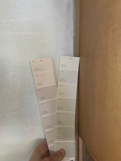
    In evening natural light..

  • cdisimone
    Original Author
    3 years ago

    Eam44, Ibis White is a bit too light. Are nice white and gauzy white in the same family as what you’re suggesting? Nice white looks the most warm to me. The other colors are reading very gray in here. At least on the tiny swatch :)

  • eam44
    3 years ago
    last modified: 3 years ago

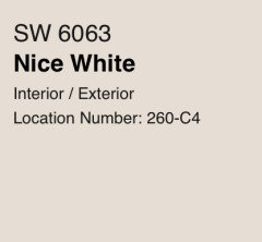
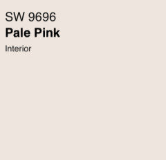
    SW 6063 Nice White might work. So may (stay with me here) SW 9696 Pale Pink.


  • cdisimone
    Original Author
    3 years ago

    Pale pink! Lol, now we’re getting a little crazy :) My fan deck doesn’t even have that color. But maybe I’ll try a sample of nice white. Or every day white. Have to check it out tomorrow in daylight but looks ok right now. It’s funny how there are popular colors and then colors no one ever talks about. I think nice white is in the second category! It’s soo different from the other colors I was looking at that I think I will know right away which direction to go once I have a sample... thanks again for the direction. I will update once I get a sample.

  • eam44
    3 years ago
    last modified: 3 years ago

    A rose by any other name would smell as sweet! If that fan deck teaches us anything, it’s that the name of the color doesn't always coincide with the color you see. Let’s look at the math!

    The values for Nice White are:

    • R:230 G:221 B:213
    • Hex Value:#e6ddd5
    • LRV:74

    The values for Pale Pink are:

    • R:238 G:230 B:222
    • Hex Value:#eee6de
    • LRV:80

    You don’t have Pale Pink in your fan deck because it’s part of the Emerald Designer series. These two colors are very similar, both are neutral, but Pale Pink is little less muddy and a tiny bit brighter than Nice White. Either way, I hope you find something you really like.

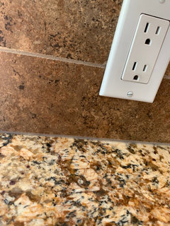
    The reason I mentioned the backsplash is that much of your kitchen is dominated by that tile. Paint will help the space, you will see a difference, but new backsplash tile would transform it, bring light and life to it. So when you’re done with the paint, if you still need a change, consider changing the tile.

  • PRO
    Lori A. Sawaya
    3 years ago

    RGB values are instructions for a device. They tell a device, like your phone for example, how much of each channel of light (red, green and blue) needs to light up to digitally mimic a paint color


    RGB Values don't describe what colors look like in real life; they're the wrong numbers to use for comparing color appearance.


    There are several reasons why but the main reason RGB values don't describe what colors look like in real life is because RGB values lack the dimensions of value (lightness/brightness) and chroma (clean/dirty).


    The reason why Sherwin-Williams includes RGB Values and HEX codes is for designers to create digital swatches for concept/mood boards.

  • cdisimone
    Original Author
    3 years ago

    Eam44, thanks again. Off topic but what blacksplash do you think would work? I hadn’t considered but if I ever do, I’m not sure what works with the busy granite. Lori, thanks, I know what you’re saying and it may not be a precise way to go about it, but it still allowed me to see her point about neutrals with a pinky undertone, which I definitely had not been considering. I appreciate all of your input.

  • Jennifer Hogan
    3 years ago

    RGB and LCH can be mathmatically calculated from one another, but RGB doesn't make sense to most people. You can't look at the numbers and explain what the color will look like.

    LCH can help us better describe the 3 attributes of a color, (Hue, chroma (how colorful or neutral) and light) but it doesn't completely relate to how the mind interprets the colors that we see. That is truly complicated.


    What you need to know is that you are keeping the flooring, the counters, cabinets and back splash and need a white that will work with those colors.


    You noticed that the Sherwin Williams fan deck is organized by hue with strips of whites that go from lighter to darker versions of similar colors.


    My advice is to first figure out what is close to what you want. Look at the deck and pick the white from each page that is close to the depth of color you want. Even if it looks really pink or really yellow or really blue. Go to SW and pick up 4 of the paper samples of each.


    If you have samples that you can take outside to look at these with your colors, do it. Do it at 2:00 in the afternoon on a clear day. Take a sample of the flooring, cabinet, counter and back splash and set them up outside just like they are in your house - horizontal for the flooring and counter, vertical for the back splash and cabinets. Then lay the 4 samples together against the cabinet - step back 10 - 15 feet and look.


    One or 2 of the samples will really speak to you without telling you to gag. The rest will say nothing at all or tell you to gag.


    If you can't do it outside (Natural daylight is the best way to see those pesky blues and greens and purples that sometimes are hiding) do it in the kitchen when you have the brightest natural daylight streaming through the windows.


    Now you are close. You have the family you are looking for and can find that one color that is slightly this or that to get to the perfect color.


    Never look at two whites at the same time unless one is the trim color you are keeping. - Our minds automatically compare them to each other. You want to compare them to the elements that are staying in your home.


    Once you have the colors narrowed down to a color family and are picking a few similar to try paint large samples. I like using 140 lb watercolor paper - it is a good weight and not expensive and has a similar texture to flat drywall. When I test white for my home I like using an 18x24 sample. Have done it with 8 1/2 x 11 but feel more confident that I will see all the nuances with the bigger size. Do 2 coats and let it dry - then tape them up in your space or with your samples outside.


    BTW - you have done this a million times before without knowing it. Every time you bought an outfit or coordinated an outfit or picked your lipstick or jewelry you were coordinating colors. The only real difference here is you are covering hundreds of square feet with a solid color. It is the amount of area that makes those subtle blues or greens in an apparent white come to life and turn your walls baby blue or light green.


    Alabaster looked green in your space because it is green. To understand what color a white will look compare it to BM Chantilly Lace. You were seeing exactly what was there.


    Part of what is making this tough is that your cabinets have more pink/red tones and your counter has more gold/green tones. Not being in the space and only having pictures to work with I am leaning toward Toque White and thinking it will pull the pinker tones from the granite, but that is an educated guess. I like doing things in person and trusting my eyes.I would be excited to test that and Creamy and see which drew the prettiest colors from the stone and wood.


    Hope this helps.


    cdisimone thanked Jennifer Hogan
  • PRO
    ProSource Memphis
    3 years ago

    What else are you willing to change? You can’t do this as a series of chain events. You have to stop and choose a big picture color plan now. Plus you have to be willing to change major things to go the direction you seem to want to go.


    If you aren’t willing to change the cabinets, counters, or backsplash, then you are in a pickle. You have yellow, red, green, color clashes happening between them. Paint won’t harmonize that. This is more than choosing a paint color! It’s choosing a whole coordinated palette. You definitely should consider working with professional help!

  • itsourcasa
    3 years ago

    Again, paint isn't permanent! You can make other changes down the road and easily change paint colors. Get a few more samples to be sure, but don't let others make this be bigger than it is. Go get a few more samples so you can paint bigger swatches if you need to. But, it's just paint!!!

    cdisimone thanked itsourcasa
  • cdisimone
    Original Author
    3 years ago

    Again, thanks everyone. Funny you mention Toque White Jennifer, it was one of the 3 whites I ordered from Samplize to try (Shoji, Toque, Aesthetic). It looked good on the chip but eliminated it immediately when I got the sample. It looks very "blah" in here. Aesthetic too - no good. I think part of the problem here is doing this with photos - the phone camera doesn't do a great job of translating the colors and then everyone's monitors are calibrated differently. Prosource- in person, the cabinet color, backsplash and countertops actually go quite well together as far as the tones. Maybe you don't believe me but I believe my photos are doing something weird. Without hiring professional help to come here in person, which is just not an option for me right now, itsourcasa is right - it's just a coat of paint to freshen things up and if I choose wrong and end up not loving it, I can always repaint it down the road. I appreciate everyone's input!

  • cdisimone
    Original Author
    3 years ago

    The camera changes the color of the cabinets - it does not look like it does in person compared with the screen when I’m taking the picture. This is about as close as I can get it looking like my eyes see, but it’s desaturating the cabinets a tad and making them look pink, which it doesn’t look like at all in person.

  • Jennifer Hogan
    3 years ago

    Computers always translate code from one machine to the next and it really does change the colors we see on the screen. Your camera and the internet are using two different color translation languages and they don't always translate identically. Kind of like the game we played as kids where one person whispers a message in the next persons ear and by the time it has been heard by 10 people it isn't the same at all.


    It isn't that brown isn't brown, but now it is a bit off - more pink or more yellow or more something.

  • eam44
    3 years ago

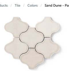
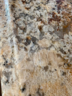
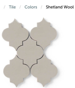
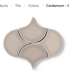
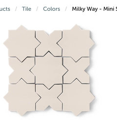
    For future reference then! I would choose a glazed ceramic tile in a beautiful shape. I’d pull the color from the stone. Here are some ideas for you. This is Fireclay Tile.


  • eam44
    3 years ago
    last modified: 3 years ago

    So this is what your choices might look like together.


    OR


  • cdisimone
    Original Author
    3 years ago

    Thanks! I can tell you really enjoy doing this. Looks so good in the photos.. but I’ll have to apply the same concepts with the real elements in person. I don’t think there’s quite as much pink in here as it’s coming across and the photos are toned down in general. Everything looks a bit more vibrant in person and the tones look more orange and yellow than the photos which look more pink and taupe. Appreciate your time! Love those tiles by the way.

  • Jennifer Hogan
    3 years ago

    It is because the colors look so different on the screen than in person that I suggested grabbing a variety of 2x4 paper samples - put 4 together so you can see the color - a one inch square doesn't work.


    Sometimes it feels like there may not be a good answer, I had pink undertones in tile and orange undertones in my teak furnishings and every beige I looked at was drab and looked awful. Then an artist friend of mine (it was spring, just after Easter) asked me what color I would add to a spring bouquet with pink and orange flowers - the answer was purple - I used a taupe with purple undertones on my walls and everything worked.


    Internet photos don't ever render color quite right - but here is a photo.


    You can see the pink undertones in the tile in this picture: I had every color in the rainbow and couldn't afford to replace cabinets or flooring or buy all new furniture.


    colors · More Info


    I did hire 2 color consultants - both were disasters.

    One told me I could only have white.

    The other gave me a color to buy, when I brought it home it was a perfect builders beige and looked like theater pancake makeup smeared on my wall. When I called her she explained that it was the perfect paint color, but I would need to replace all the tile.


    You can do this.

  • eam44
    3 years ago
    last modified: 3 years ago

    Oh absolutely. You have to look at the colors in your space and in your light, same for the tile. But you have to start somewhere. Suggestions can help you to identify paint swatches you might want to try on your walls, and help you to identify tiles you might want to sample down the road. Let us know what you end up choosing. Good luck!

  • PRO
    Lori A. Sawaya
    3 years ago
    last modified: 3 years ago

    I don’t think there’s quite as much pink in here as it’s coming across and the photos are toned down in general. Everything looks a bit more vibrant in person and the tones look more orange and yellow than the photos which look more pink and taupe.

    That's because your devices are using RGB values to display color. All devices do - phones, tablets, laptops, etc.

    And each device has its own, independent capability to display those colors.

    Which is why devices don't display colors the same way - it's why they don't match. For example, when you walk into Best Buy and look at the wall of TVs and none of the colors match.

    That's why I mentioned you shouldn't use RGB values to compare colors and try to use those values to calculate how they're different.

    The RGB color space is the wrong color space to use for this purpose.

    The correct color space is CIELAB. CIELAB (which includes Lab and LCh) is the color space that every industry uses to make products and materials for the built environment because it quantifies - extremely well - how the human eye sees color. ETA: a healthy human eye with normal color vision.

    If it didn't work extremely well, then paint companies as well as other industries wouldn't use Lab and LCh in every aspect of production.

  • ulisdone
    3 years ago

    Regardless of what you paint your walls, your island could be a navy blue, and then with a few navy pillows and a blue vase or 2 you could add a cooling to the overall warmth.

  • claire larece
    3 years ago

    Why do yo want to to tone down your cabinets is it too dark? What color was on your walls before? Have you thought of this shade from Sherwin Williams

  • chicagoans
    3 years ago
    last modified: 3 years ago

    (not a pro) FWIW I have similar cabinet, counter, and backsplash finishes, but my kitchen walls are a deep clay color. (I thought it was great at the time...) I'm repainting my entire first and second floor (hitting the market soon) so I had a designer come through. She/we settled on BM Baby Fawn. It's dark enough that my white trim will pop, warm enough to go with my warm finishes, with enough grey so that all the people enthralled with Restoration Hardware and the like can (hopefully) envision their furniture in my space, and I like it enough that if I stay here I'll be happy with it. I painted a few large foam boards with a sample, and placed them around various rooms to see them in different lights/times of day. Runner up was Cedar Oak.

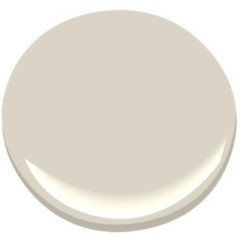
    Baby Fawn:


    ETA: Now that I see your counter close-ups, I realize my counters are darker. But I'll leave this post here just in case it helps. Paint samples and foam boards are cheap so I painted several sample boards.

  • claire larece
    3 years ago

    There’s also this paint by Behr which is

  • cdisimone
    Original Author
    3 years ago

    Claire, if you scroll towards the beginning of this post there are pictures from before I primed the walls (you'll have to click "read more" on that post to see the photos if you're on the Houzz website). I had a darkish tan (I think BM Bar Harbor Beige) on some of the walls with 2 big dark chocolate accent walls. It's open concept with living room and everything has just started to feel very dark, heavy and brown. So I'm trying to freshen things up, but I have these cabinets to deal with, which are like a natural maple with yellow/orange undertones (despite them coming across pink in my photos as several have pointed out). Anew Gray is much darker than the shades I'm looking at and much too gray for my needs. I'm more in the off-white category. I don't have a Behr fan deck to check your last suggestion so it's near impossible to know if it will work or not, but I can check it out. Thanks for your feedback!

  • cdisimone
    Original Author
    3 years ago

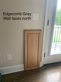
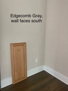
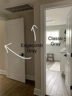
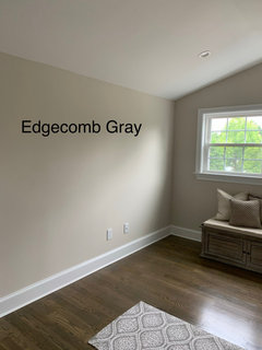
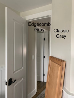
    Chicagoans - appreciate you chiming in here! Funny you mention Baby Fawn - It's a near match to Edgecomb Gray (I've seen people say it's the same but I think I see a SLIGHT difference on the samples). Most of my second floor is painted Edgecomb Gray.. Hallway, bedroom, spare bedroom, etc. I love it up there and am considering that color for the living room downstairs, but wanted to go with something a little more white for the kitchen area, and I need to make sure the colors ultimately go together once I do. Also, that color (Baby Fawn/Edgecomb Gray) looks gorgeous when you have a lot of light, but my living room is north facing and shady, and on some walls, the grays and greens are feeling a little too strong and it actually looks dingy, whereas upstairs it's totally light, airy, and neutral (and more beige) while still coordinating with gray if you want. I think I posted a photo of my bedroom somewhere on this post if you feel like digging for it. It's a great color - but I still think I want to go a tad lighter for the kitchen area. I'll post some photos in a minute I just took comparing Edgecomb Gray to Shoji White, one of the colors I started off considering for the kitchen. Thanks for your input!

  • claire larece
    3 years ago

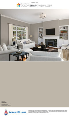
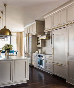
    You’re Welcome. I know this color appears to have a darker look but actually the color you had previously is much darker and has an orangey tone. I see that you want to cool off your kitchen. I suggested this color it’s much lighter. Here are a few suggestions from Pinterest.

  • cdisimone
    Original Author
    3 years ago

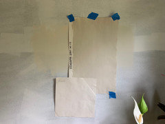
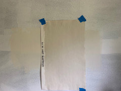
    Chicagoans- the big oak tag next to backsplash is edgecomb gray, and it’s labeled in the other photos. Shoji white is the peel and stick 12” square, which is looking quite beat up from all the peeling and sticking I’ve been doing lol. Edgecomb gray looks so much lighter upstairs where I actually have it on the walls compared with this sample especially in the photos

  • Jennifer Hogan
    3 years ago

    At one time RGB was determined using a red, green and blue light, but there wasn't a standard for what red or green or blue was used - hence the term device dependent. A standard was created in 1931 by CIE that specified the three colors (long before there were any computers). the RGB color model has the same colors as the CIE xyz Color model.


    Color profiles/color spaces are ways computers translate a color value into numbers. Those numbers are then used to tell your display device what to display.


    The Commodore 64 could display a whopping 16 colors!.

    In the early days of the internet we had 216 web safe colors.


    Now the standard is 16.7 million colors, although there are computers and monitors that can display over a billion different colors. Using different standards to define a color and translating those colors to the sRGB color profile used by the internet is usually what causes the color shift we see in internet displays of photos. Having a true color monitor that is properly calibrated ensures that the same color is displayed that was defined by the color space or color profile.

    Using sRGB as the color profile on your device will ensure that the definition of the colors is appropriately translated when the image goes to the internet.


    Benjamin Moore produces over 3,500 colors. . . what is the likelihood that the colors they make are in the 16.7 million colors that can be displayed on your computer?

  • cdisimone
    Original Author
    3 years ago
    last modified: 3 years ago

    Chicagoans, here’s some more experimenting upstairs with a spare cabinet door from the kitchen. Posting in case this helps someone in the future! Just took these, it's a gloomy overcast day here around 11 am. No sun.


  • cdisimone
    Original Author
    3 years ago
    last modified: 3 years ago

    Cabinet next to BM classic gray. Just took these, it's a gloomy overcast day here around 11 am. No sun. By the way, take these with a grain of salt - I have 3 screens here. My iphone, my laptop, and an external monitor. My iphone looks fairly somewhat close but slightly more gray/green in photo compared with real life (more beige).. External monitor looks pretty good actually. Laptop screen looks TOTALLY off. Greens/Blues coming out of nowhere that aren't really there. Same goes for the photos in my previous post.


  • PRO
    Lori A. Sawaya
    3 years ago

    My iphone looks fairly somewhat close but slightly more gray/green in photo compared with real life (more beige).. External monitor looks pretty good actually. Laptop screen looks TOTALLY off. Greens/Blues coming out of nowhere that aren't really there.


    The RGB color space is tiny compared to all the colors we can see in real life.


    Your device's algorithm does what it can to make in real life colors fit in to that tiny color space that it is capable of displaying; and because the blue-green/green-blue region of the color space is especially small, colors have to be clipped and remapped sometimes to an extreme. Oftentimes resulting in some wonky or "off" colors.


    Your first-hand experience is a great example of how it actually works vs. imagining how it might work based on nothing but theory.

  • cdisimone
    Original Author
    3 years ago

    Lori, not only that, but the problem starts in the iPhone camera (or any camera) where it is trying to figure out the correct white balance setting based on what’s in its view, and I’d bet it’s also optimized to look for skin tones and do something pretty with those. You know it’s bad when you can’t even get it right WHILE TAKING THE PICTURE, watching it change on the screen from pink to blue to green as you shift an inch left or an inch right before you even take the picture :)

  • PRO
    Lori A. Sawaya
    3 years ago

    @cdisimone exactly right.


    Digital cameras imitate color vision by measuring the intensities of red, green, and blue light reflected from the objects being photographed, whereas a computer monitor [or device] simulates colors by displaying different intensities of red, green, and blue light.


    Here's some great info about all of it from Pantone.

  • Jennifer Hogan
    3 years ago
    last modified: 3 years ago

    Obviously a device that is capturing an image has to measure reflected light and a device that displaying an image has to use different light wavelengths to produce an image. One is an input device and the other an output device.

    The simple fact that three devices are showing the same image differently tells you that it is the translation and display that is being altered not the image that was captured.

    Professional photographers and artist use the sRGB color space to create images that will be displayed on the internet. Most are pretty accurate representations of the work, but may display quite differently depending on the device that is being used to display the item. Cell phone displays must be small, flexible, work as touchscreens and can't eat your battery balanced against the need for good color representation.

  • benhogan1
    3 years ago

    What color did you end up using?

  • cdisimone
    Original Author
    3 years ago

    Neither! In fact I haven’t even painted yet but will be soon. I decided on a feature wall in SW Alabaster with the remaining walls also in Alabaster. If more color is needed after I may go back in and paint the remaining walls (there’s not a lot of wall space other than one huge blank wall behind dining room table) a slightly darker color but going to try all Alabaster first.

  • benhogan1
    3 years ago

    cdisimone - I have very similar color cabinets and granite in my kitchen except my backsplash is lighter and floors are very dark porcelain, wood look tile. I've been looking for a color that will work throughout the majority of my house too. After weeks of deliberating, I started with my dining room and painted Shoji White last night. Not sure I like it....it does not look warm or creamy in my house at all. It looks like a very light cool gray. :-( I was going more for a warm white so I can brighten things up but still have the warm, cozy feel. I'm going to give it a few days before continuing on through the rest of my house. My suggestion is to paint an entire wall or much larger sample on your wall before deciding!

  • cdisimone
    Original Author
    3 years ago

    Benhogan1- it’s so tough because what looks good on one wall looks bad on another. Makes me wish I could paint each wall something different! lol. What other colors did you try? Shoji white looked so yellow in my south facing room when I tried it. I didn’t paint the whole wall, but I painted a big section. But also I had Benjamin Moore color match for the sample and I wonder if it was a little off. I also had the Samplize peel and stick sample with real SW paint on it before I got the actual paint sample but that was satin and my sample was flat, so they look different to begin with, but the Samplize read a little cooler to me. Post pictures of your room!

  • benhogan1
    3 years ago

    cdisimone - hard to get good pics. My walls are bare but I have large canvas paintings and etageres coming! I’m hoping it softens the rooms. Still deciding color for rest of my house.

  • benhogan1
    3 years ago

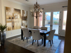
    Dining / Living rooms across from each other.

  • cdisimone
    Original Author
    3 years ago

    I think it looks pretty! At least in the photos. It looks creamy, not gray at all. Especially where the lights hitting it in the dining room on the far left. Almost looks yellow there!

  • beckyharris87
    3 years ago

    We are in midst of updating kitchen (without changing cabinet color, because I love the tone of that wood!


    Your cabinets looks EXACTLY like mine, and I am in the same camp of finding a wall color to update the sagey/fern green we moved into. All colors here were ones I am considering.


    Thanks for posting! Update when you decide!


    Can't wait to read through this thread!


  • cdisimone
    Original Author
    3 years ago

    I ended up using BM Winds Breath in the whole first floor. Here are some photos I just took. You can see in the room in the background that isn’t getting the sunlight like the kitchen does, the color looks much cooler. But I think it works in the kitchen because it looks warmer in there with the sunlight and also at night with lights on. Good luck!

  • Brian Dowdall
    2 years ago

    Having the same issues picking a neutral paint for south facing living room that will coordinate with mid toned beige in adjacent areas which I did try but it came out dark orange along with other beiges which showed too yellow, orange, or dark looking and not a nice neutral colour. Edgecomb Gray looks more dark beige and tan but is great in all the bedrooms. Revere Pewter too dark and green toned. I am hoping that if Classic Gray goes a nice light beige then it might be a contender but also interested in how it compares to Wind's Breath as that is also very nice and exactly the colour that I wanted but I was not looking for that light of a colour. Appreciate your advice. Thanks.

  • beckyharris87
    2 years ago
    last modified: 2 years ago

    We have almost identical

    cabinetry to the OP and finally chose a countertop and paint color and the tedious amount of time and thought have paid off. We used BM revere pewter (which was NOT an original contender, but we decided to be open to ”lightening” colors on our own) and lightened it 40%. I love it and it looks wonderfully toned in the southern exposure but grey enough to remain neutral. especially next to the cabinetry. We found most greys to be too ”grey” or cool toned. Will take photos later and hope it helps.

  • Heather Pecikonis
    2 years ago

    What about the Accessible Beige? It's a beautiful color that looks good in Southern and Northern and won't read super Grey in northern light. Anyway havw you made a decision? I havw same type id kitchen, and counter with darker cabinets. Did Accessible in hallway leading to it. And ot other rooms and up the stairs away from it. And am thinking of going all accessible. I also have a TV room connected to my kitchen that's open floor. Same thing.