


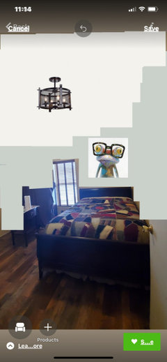
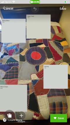
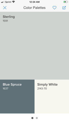
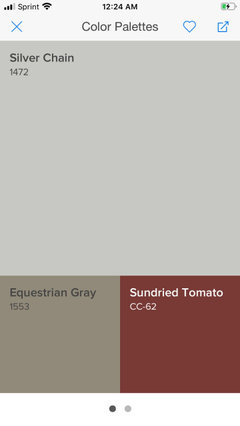
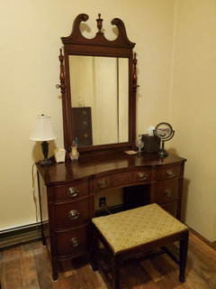
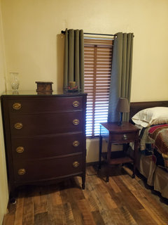
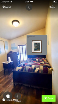
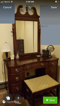
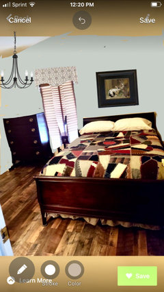
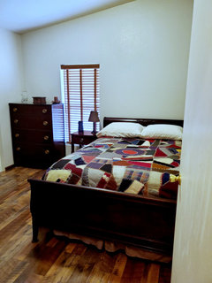
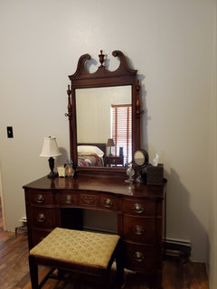
Help with paint colors please
Leslie Wood
4 years ago
Featured Answer
Sort by:Oldest
Comments (42)
 PRO
PROLori A. Sawaya
4 years ago
Leslie Wood
4 years agoRelated Discussions
Need some help with paint color please!
Comments (1)Pictures would help...See Morehelp with paint color please.
Comments (1)I think you are right. I would prefer the China white....See Morehelp with paint color please
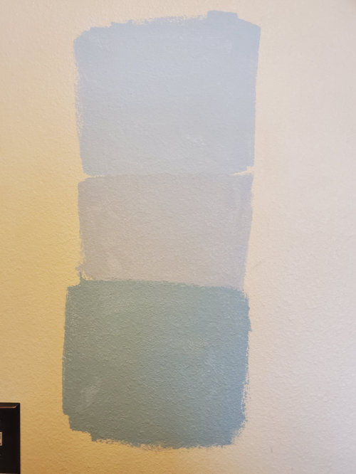
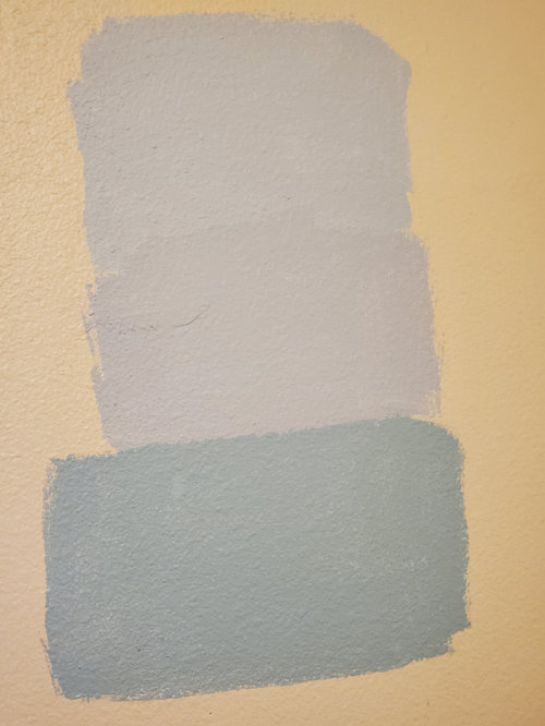
Comments (1)From top to bottom, in your space with your lighting, these colours should read increasingly less pink. And here's a wild-card to offset your orangey wood flooring,...See MoreHelp with paint colors, please.
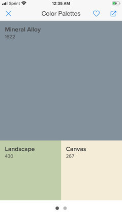
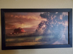
Comments (7)Greens are tricky (actually, all colors are tricky). It's nice that someone is going to do the painting, but if you want to use a green you should sample before you tell them what color you want. Even if the sampling is on your own nickel it's a good idea because you're the one who will be living with it. What you're considering has the potential to be overwhelming and not pleasant in a small room. However, everyone has a favorite color and is inspired by different things, so if this speaks to you, go for it. I totally agree with landscape art. Everywhere I worked I had a landscape across from my desk so that was what I saw when I looked up. Nature is very refreshing. If you go with a green close to what you're picturing I would choose a black desk. If you end up going with a lighter green then white might be better....See More- PRO
Lori A. Sawaya
4 years ago Leslie Wood
4 years ago PRO
PROFlo Mangan
4 years ago- PRO
Flo Mangan
4 years ago Leslie Wood
4 years ago
lynartist
4 years agolynartist
4 years ago
sloyder
4 years ago- PRO
Flo Mangan
4 years ago Leslie Wood
4 years agolynartist
4 years agoLeslie Wood
4 years agolynartist
4 years agolynartist
4 years agoLeslie Wood
4 years agolynartist
4 years ago
Jennifer Hogan
4 years agonjmomma
4 years agolast modified: 4 years agoJennifer Hogan
4 years agoJennifer Hogan
4 years agolynartist
4 years agolynartist
4 years agoLeslie Wood
4 years agoLeslie Wood
4 years agolynartist
4 years ago- PRO
Flo Mangan
4 years ago - PRO
Flo Mangan
4 years ago lynartist
4 years agoLeslie Wood
4 years agolynartist
4 years ago- PRO
Flo Mangan
4 years ago 
dsimber
4 years agoLeslie Wood
4 years agodsimber
4 years agonjmomma
4 years ago- PRO
Flo Mangan
4 years ago Leslie Wood
4 years agoLeslie Wood
4 years agoLeslie Wood
4 years ago


Related Stories


EXTERIORSHelp! What Color Should I Paint My House Exterior?
Real homeowners get real help in choosing paint palettes. Bonus: 3 tips for everyone on picking exterior colors
Full Story
COLORPick-a-Paint Help: How to Create a Whole-House Color Palette
Don't be daunted. With these strategies, building a cohesive palette for your entire home is less difficult than it seems
Full Story
COLORPaint-Picking Help and Secrets From a Color Expert
Advice for wall and trim colors, what to always do before committing and the one paint feature you should completely ignore
Full Story
HOUZZ TOURSMy Houzz: Saturated Colors Help a 1920s Fixer-Upper Flourish
Bright paint and cheerful patterns give this Spanish-style Los Angeles home a thriving new personality
Full Story
DECORATING GUIDESDownsizing Help: Color and Scale Ideas for Comfy Compact Spaces
White walls and bitsy furniture aren’t your only options for tight spaces. Let’s revisit some decorating ‘rules’
Full Story
DECORATING GUIDES10 Bedroom Design Ideas to Please Him and Her
Blend colors and styles to create a harmonious sanctuary for two, using these examples and tips
Full Story
COLORColor Palette Extravaganza: Room-by-Room Help for Your Paint Picks
Take the guesswork out of choosing paint colors with these conveniently collected links to well-considered interior palettes
Full Story
ENTRYWAYSHelp! What Color Should I Paint My Front Door?
We come to the rescue of three Houzzers, offering color palette options for the front door, trim and siding
Full Story
COLORPick-a-Paint Help: 11 Ways to Mine Your World for Colors
Color, color everywhere. Discover the paint palettes that are there for the taking in nature, shops and anywhere else you roam
Full Story

Leslie WoodOriginal Author